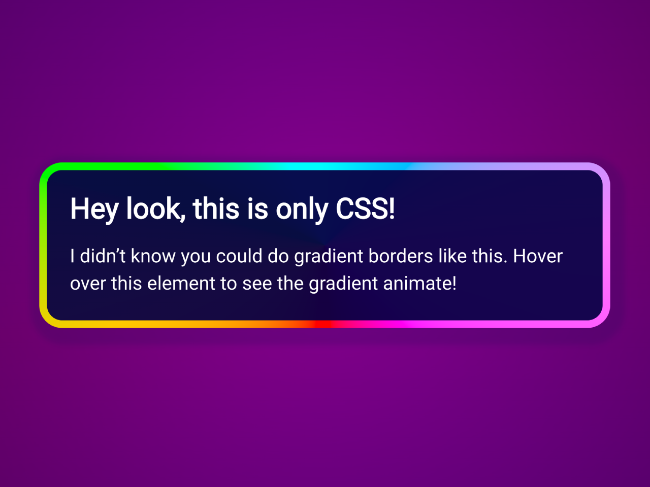

This CSS code snippet helps you to create a stylish box with an animated gradient border that comes to life when you hover over the element. The animation is achieved by cleverly manipulating custom properties and keyframes. The article element showcases a stunning border made up of two gradients, styled with OKLCH to enhance visual appeal.
Furthermore, this code is perfect for adding a touch of elegance and interactivity to your web projects without relying on JavaScript.
How to Create CSS Stylish Box With Animated Gradient Border
1. First of all, create your HTML with a main container and an article element. Inside the article, add a heading and a paragraph to showcase the content of your stylish box.
<main>
  <article>
    <h1>Hey look, this is only CSS!</h1>
    <p>
      I didn’t know you could do gradient borders like this. Hover over this element to see the gradient animate!
    </p>
  </article>
</main>
2. Finally, let’s bring the magic to life with the CSS styles. Copy and paste the following CSS code into your project. This code includes custom properties, keyframes, and gradient styling to achieve the desired animated effect.
@charset "UTF-8";
/**
 * `@property` is required for the animation to work.
 * Without it, the angle values won’t interpolate properly.
 *
 * @see https://dev.to/afif/we-can-finally-animate-css-gradient-kdk
 */
@property --bg-angle {
  inherits: false;
  initial-value: 0deg;
  syntax: "<angle>";
}
/**
 * To animate the gradient, we set the custom property to 1 full
 * rotation. The animation starts at the default value of `0deg`.
 */
@keyframes spin {
  to {
    --bg-angle: 360deg;
  }
}
article {
  /* add the animation, but pause it by default */
  animation: spin 2.5s infinite linear paused;
  /**
   * Using `background-origin` we can create a “border” using two gradients. And to
   * make the gradients better-looking, we use OKLCH.
   *
   * @see https://developer.mozilla.org/en-US/docs/Web/CSS/background-origin
   * @see https://evilmartians.com/chronicles/oklch-in-css-why-quit-rgb-hsl
   */
  background: linear-gradient(to bottom, oklch(0.1 0.2 240/0.95), oklch(0.1 0.2 240/0.95)) padding-box, conic-gradient(from var(--bg-angle) in oklch longer hue, oklch(0.85 0.37 0) 0 0) border-box;
  /* extends to outer border edges */
  /* a clear border lets the background gradient shine through */
  border: 6px solid transparent;
  /* unpause the animation on hover */
}
article:hover {
  animation-play-state: running;
}

/******************************************************************
 * Other styles to make the demo look nice
 ******************************************************************/
* {
  box-sizing: border-box;
}

html {
  font-family: -apple-system, BlinkMacSystemFont, "Segoe UI", Roboto, Helvetica, Arial, sans-serif, "Apple Color Emoji", "Segoe UI Emoji", "Segoe UI Symbol";
  font-size: 18px;
  line-height: 1.45;
}

body {
  margin: 0;
  background: radial-gradient(circle, oklch(0.15 0.2 330/0), oklch(0.15 0.2 330/1)), linear-gradient(344deg in oklch, oklch(0.3 0.37 310), oklch(0.35 0.37 330), oklch(0.3 0.37 310)) !important;
  display: grid;
  height: 100svh;
  place-items: center;
}

article {
  border-radius: 1rem;
  box-shadow: 0.125rem 0.25rem 0.25rem 0.5rem oklch(0.1 0.37 315/0.25);
  color: white;
  padding: 1rem;
  width: min(400px, 90vw);
}
article h1 {
  line-height: 1.1;
  margin: 0;
}
article p {
  margin: 0.75rem 0 0;
}
The background property combines two gradients, creating a visually appealing border effect. The border property is set to transparent, allowing the background gradient to shine through.
On the other hand, the animation-play-state: running; property ensures the rotation effect starts when the user hovers over the article.
That’s all! hopefully, you have successfully created a box with an animated gradient border on your website. If you have any questions or suggestions, feel free to comment below.
Similar Code Snippets:
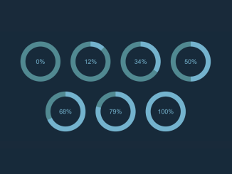
 Pure CSS Percentage Circle
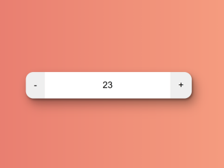
- Increment and Decrement Button in HTML
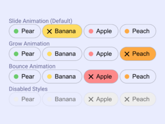
- Animated Toggle Pills Using CSS
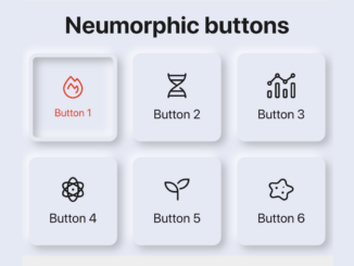
- Neumorphic Buttons with Icons Using CSS
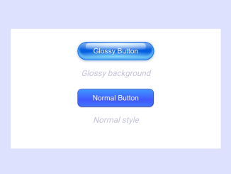
- CSS Button With Glossy Background Color


I code and create web elements for amazing people around the world. I like work with new people. New people new Experiences.
I truly enjoy what I’m doing, which makes me more passionate about web development and coding. I am always ready to do challenging tasks whether it is about creating a custom CMS from scratch or customizing an existing system.