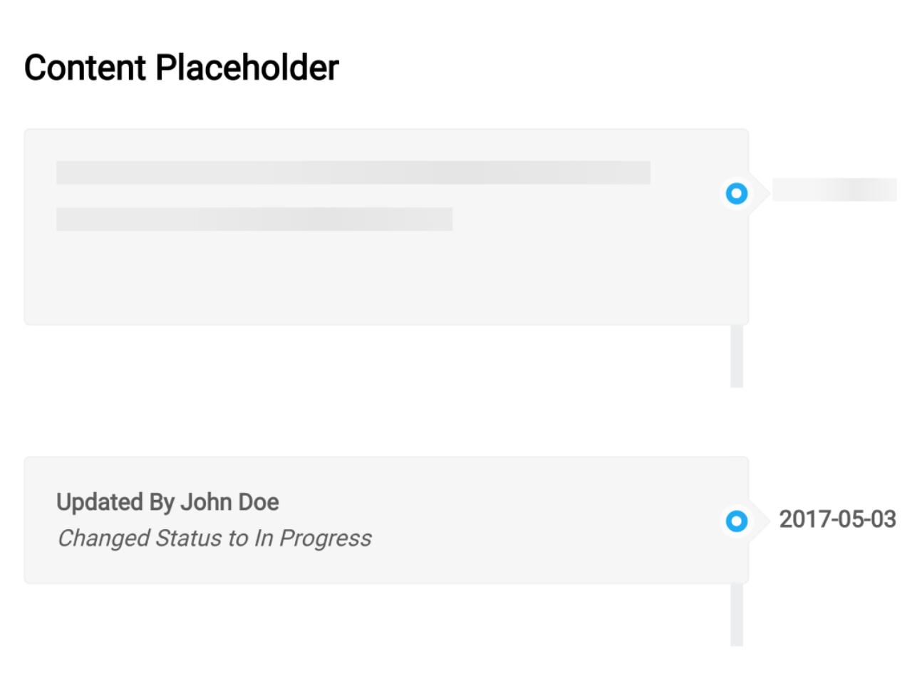

The code creates an animated content placeholder using CSS. It generates loading-like visuals for content.
The key function animates content placeholders using linear gradients. It helps simulate content loading or placeholders.
The CSS animation ‘content-placeholder-animation’ moves placeholders horizontally. It’s useful for indicating content loading progress.
You can use this code on websites or apps while loading content. It’s handy for displaying placeholder animations, indicating ongoing content loading. One benefit is it enhances user experience by visually signaling content progress.
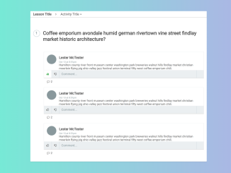
How to Create Content Placeholder Animation Using CSS
1. First of all, load the Normalize CSS by adding the following CDN link into the head tag of your HTML document.
<link rel="stylesheet" href="https://cdnjs.cloudflare.com/ajax/libs/normalize/5.0.0/normalize.min.css">
2. Create the HTML structure where you want the content placeholder to appear. Use <div> elements and classes to structure the content. Insert the HTML structure into your web page or app where you want the content placeholder to display. Test the animation to ensure it works correctly.
<div class="container">
  <h2>Content Placeholder</h3>
  <ul class="tl tl--content-placeholder">
    <li class="">
      <div class="tl-badge"><i class="fa fa-circle"></i></div>
      <div class="tl-date">
                <span class="content-placeholder-background"></span>
      </div>
      <div class="tl-panel">
        <div class="content-placeholder-text">
                <span class="content-placeholder-background"></span>

</div>
        <div class="content-placeholder-text">
                <span class="content-placeholder-background"></span>

</div>
      </div>
    </li>
  </div>
</div>
<div class="container">
  <ul class="tl">
    <li class="">
      <div class="tl-badge"><i class="fa fa-circle"></i></div>
      <div class="tl-date">2017-05-03</div>
      <div class="tl-panel">
        <div class="tl-heading">
        <h4 class="tl-title">
          Updated By John Doe
        </h4>
        <i>
          Changed Status to In Progress
        </i>
      </div>
      </div>
    </li>
  </div>
</div>
3. Apply CSS styles to create the placeholder animation and structure. Adjust CSS properties like colors, sizes, and positioning to match your design preferences.
html {
  font-size: 12px;
}

body {
  background-color: #fefefe;
}

* {
  box-sizing: border-box;
}

h1 {
  margin-bottom: 0.5rem;
}

h2 {
  margin-bottom: 0.5rem;
}

h3 {
  margin-bottom: 0.5rem;
}

h4 {
  margin-bottom: 0.5rem;
}

h5 {
  margin-bottom: 0.5rem;
}

h6 {
  margin-bottom: 0.5rem;
}

@keyframes content-placeholder-animation {
  0% {
    transform: translateX(-50%);
  }
  100% {
    transform: translateX(300%);
  }
}
.container {
  margin: 0 auto;
  max-width: 600px;
  padding: 1rem;
}

.content-placeholder-background {
  animation: content-placeholder-animation 1s linear infinite;
  background: -moz-linear-gradient(left, rgba(15, 15, 15, 0) 0%, rgba(219, 219, 219, 0.4) 50%, rgba(255, 255, 255, 0) 100%);
  background: -webkit-linear-gradient(left, rgba(15, 15, 15, 0) 0%, rgba(219, 219, 219, 0.4) 50%, rgba(255, 255, 255, 0) 100%);
  background: linear-gradient(to right, rgba(15, 15, 15, 0) 0%, rgba(219, 219, 219, 0.4) 50%, rgba(255, 255, 255, 0) 100%);
  filter: progid:DXImageTransform.Microsoft.gradient( startColorstr="#000f0f0f", endColorstr="#00ffffff",GradientType=1 );
  display: block;
  height: inherit;
  left: 0;
  position: absolute;
  top: 0;
  width: 70%;
  will-change: transform;
}

.content-placeholder-text {
  background-color: #ebebeb;
  display: block;
  height: 1em;
  margin-bottom: 1em;
  overflow: hidden;
  position: relative;
  width: 90%;
}
.content-placeholder-text:last-of-type {
  width: 60%;
}

.tl {
  color: #5b5b5b;
  font-weight: 400;
  list-style: none;
  padding: 20px 0;
  position: relative;
}
.tl--content-placeholder .tl-panel {
  height: 85px;
}
.tl--content-placeholder .tl-date {
  background-color: #f6f6f6;
  height: 15px;
  overflow: hidden;
  width: 80px;
}

.tl:before {
  background-color: #ecedef;
  bottom: 0;
  content: " ";
  margin-left: -1.5px;
  position: absolute;
  right: 137px;
  top: 20px;
  width: 8px;
}

.tl > li {
  margin-bottom: 20px;
  position: relative;
}

.tl > li:before,
.tl > li:after {
  content: " ";
  display: table;
}

.tl > li:after {
  clear: both;
}

.tl-panel {
  background-color: #f6f6f6;
  border: 1px solid #edf0f2;
  border-radius: 4px;
  float: left;
  padding: 20px;
  position: relative;
  width: calc(100% - 175px);
}

.tl-panel:before {
  border-bottom: 15px solid transparent;
  border-left: 15px solid #edf0f2;
  border-right: 0 solid #edf0f2;
  border-top: 15px solid transparent;
  content: " ";
  display: inline-block;
  position: absolute;
  right: -15px;
  top: 26px;
}

.tl-panel:after {
  border-bottom: 14px solid transparent;
  border-left: 14px solid #F6F6F6;
  border-right: 0 solid #F6F6F6;
  border-top: 14px solid transparent;
  content: " ";
  display: inline-block;
  position: absolute;
  right: -14px;
  top: 27px;
}

.tl-badge {
  background-color: #03a9f4;
  border: 4px solid #fcfcfc;
  border-bottom-left-radius: 50%;
  border-bottom-right-radius: 50%;
  border-top-left-radius: 50%;
  border-top-right-radius: 50%;
  color: #fff;
  font-size: 0.5em;
  line-height: 50px;
  margin-left: -25px;
  padding: 7px;
  position: absolute;
  right: 130px;
  text-align: center;
  top: 31px;
  z-index: 1;
}
.tl-badge > i {
  position: absolute;
  right: 4px;
  line-height: 0;
}

.tl-title {
  margin-top: 0;
  color: #5b5b5b;
  font-weight: 600;
}

.tl-date {
  color: #5b5b5b;
  font-weight: 700;
  position: absolute;
  right: 38px;
  text-align: left;
  top: 32px;
}
That’s all! hopefully, you have successfully created Content Placeholder Animation Using CSS. If you have any questions or suggestions, feel free to comment below.
Similar Code Snippets:


I code and create web elements for amazing people around the world. I like work with new people. New people new Experiences.
I truly enjoy what I’m doing, which makes me more passionate about web development and coding. I am always ready to do challenging tasks whether it is about creating a custom CMS from scratch or customizing an existing system.