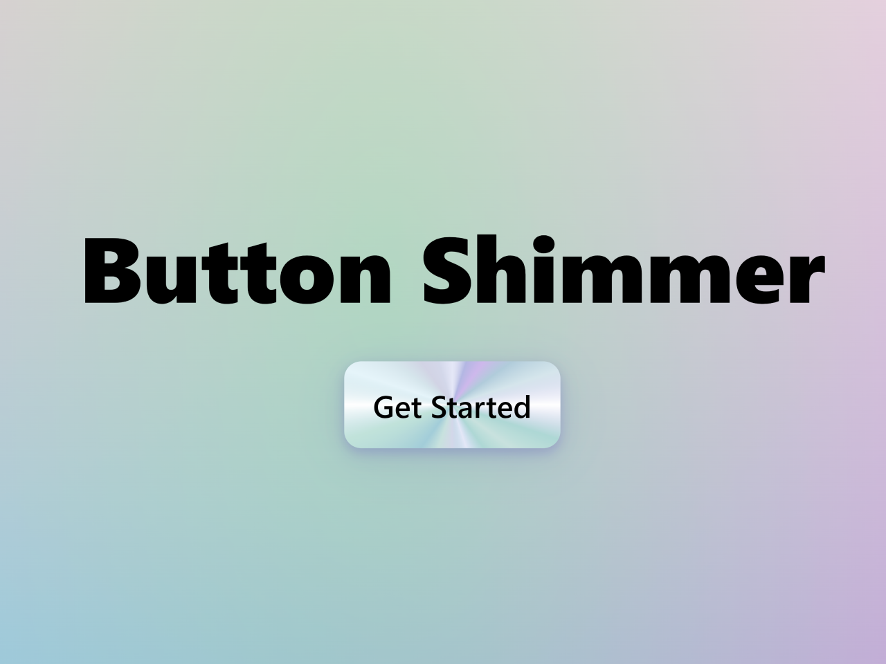

This code creates a shimmer effect on a button when hovered. It uses CSS animations to create a shiny hover effect. The button appears to shine and shimmer, adding a dynamic touch. This effect enhances user interaction and engagement on web buttons.
You can use this button code on your website’s call-to-action sections to grab attention. It enhances user interaction by making buttons more visually appealing.
How to Create Button Shimmer Effect On Hover Using CSS
1. First of all, create the HTML structure for the button as follows:
<h1>Button Shimmer</h1>
  <button><span>Get Started<span></button>
2. Style the button using the following CSS styles:
* {
  box-sizing: border-box;
}

html, body {
  width: 100%;
  height: 100%;
  margin: 0;
  padding: 0;
}

.cd__main {
  display: flex;
  flex-direction: column !important;
  gap: 2rem;
  align-items: center;
  justify-content: center;
  height: 100%;
  background-size: 100% 100%;
  background-position: 0px 0px, 0px 0px, 0px 0px, 0px 0px, 0px 0px;
  background-image: radial-gradient(49% 81% at 45% 47%, #03FF6D45 0%, #073AFF00 100%), radial-gradient(113% 91% at 17% -2%, #F8DDD4 1%, #FF000000 99%), radial-gradient(142% 91% at 83% 7%, #FAE5F4 1%, #FF000000 99%), radial-gradient(142% 91% at -6% 74%, #71CEEBFF 0%, #FF000000 99%), radial-gradient(142% 91% at 111% 84%, #E583B9 0%, #AC23D7FF 100%) !important;
}

h1 {
  font-family: system-ui;
  font-weight: 800;
  margin: 0;
  line-height: 1;
  font-size: 5.4vw;
}

@property --start-angle {
  syntax: "<angle>";
  initial-value: 0deg;
  inherits: false;
}
@keyframes rotateTo {
  to {
    --start-angle: 18deg;
  }
}
@keyframes rotateBack {
  from {
    --start-angle: 18deg;
  }
  to {
    --start-angle: 0deg;
  }
}
button {
  display: inline-block;
  position: relative;
  appearance: none;
  border: none;
  outline: none;
  padding: 1.33vw 1.66vw;
  text-rendering: geometricPrecision;
  font-family: system-ui;
  font-smooth: always;
  font-weight: 600;
  font-size: 1.8vw;
  overflow: hidden;
  border-radius: 1vw;
  box-shadow: 0 5px 10px rgba(124, 125, 190, 0.33), 0 5px 20px rgba(124, 125, 190, 0.22), 0 10px 50px rgba(124, 125, 190, 0.22);
  background: conic-gradient(from 0deg at 50% 50%, #D3D7E9 0%, #B3B6E3 5%, #CEB8EC 10%, #B0CBDA 15%, #D5E5EC 20%, #B3B6E3 25%, #AED8D5 30%, #C8E1DE 35%, #AED8D5 40%, #A3CEDB 45%, #D3D7E9 50%, #C8E1DE 55%, #A2CDD8 60%, #C1E2DA 70%, #A3CEDB 75%, #E5F4FA 80%, #D5E5EC 85%, #D1D3E4 90%, #D3D7E9 95%, #D3D7E9 100%);
  transition: all 0.18s ease-in-out;
   margin: 10px auto;
}
button:before {
  content: "";
  display: block;
  position: absolute;
  top: 0;
  left: 0;
  width: 100%;
  height: 100%;
  opacity: 1;
  background: conic-gradient(from var(--start-angle) at 50% 50%, #E4E7F7 0%, #FFFFFF00 5%, #FFFFFF00 20%, white 25%, #FFFFFF00 30%, #FFFFFF00 40%, #E4E7F7 45%, #FFFFFF00 50%, #FFFFFF00 70%, white 75%, #FFFFFF00 80%, #FFFFFF00 95%, #E4E7F7 100%);
  animation: rotateBack 0.33s ease-in-out forwards;
  transition: all 0.18s ease-in-out;
}
button span {
  position: relative;
}
button:hover {
  cursor: pointer;
  box-shadow: 0 5px 10px rgba(90, 91, 173, 0.33), 0 10px 40px rgba(79, 80, 159, 0.22);
}
button:hover:before {
  opacity: 0.66;
  animation: rotateTo 0.33s ease-in-out forwards;
}
When you’re making your button look special, think about changing the colors to match your style. Play with background-color, color, and box-shadow to get the right vibe. Want the text to look good? Adjust font-family, font-size, and font-weight to make it easy to read.
If the button looks too big or small, try changing padding and border-radius to fix its size and shape. And hey, for a cool effect when someone hovers over it, try different transition effects and colors to make it stand out!
That’s all! hopefully, you have successfully created the Button Shimmer Effect On Hover Using CSS. If you have any questions or suggestions, feel free to comment below.
Similar Code Snippets:

- Animated Project Download Button UI
- 9+ Simple Speech Bubble in CSS
- CSS Show Hide Div On Click without JavaScript
- Color Palette Generator From Hex Code
- HTML Table with Fixed Header and First Column

I code and create web elements for amazing people around the world. I like work with new people. New people new Experiences.
I truly enjoy what I’m doing, which makes me more passionate about web development and coding. I am always ready to do challenging tasks whether it is about creating a custom CMS from scratch or customizing an existing system.