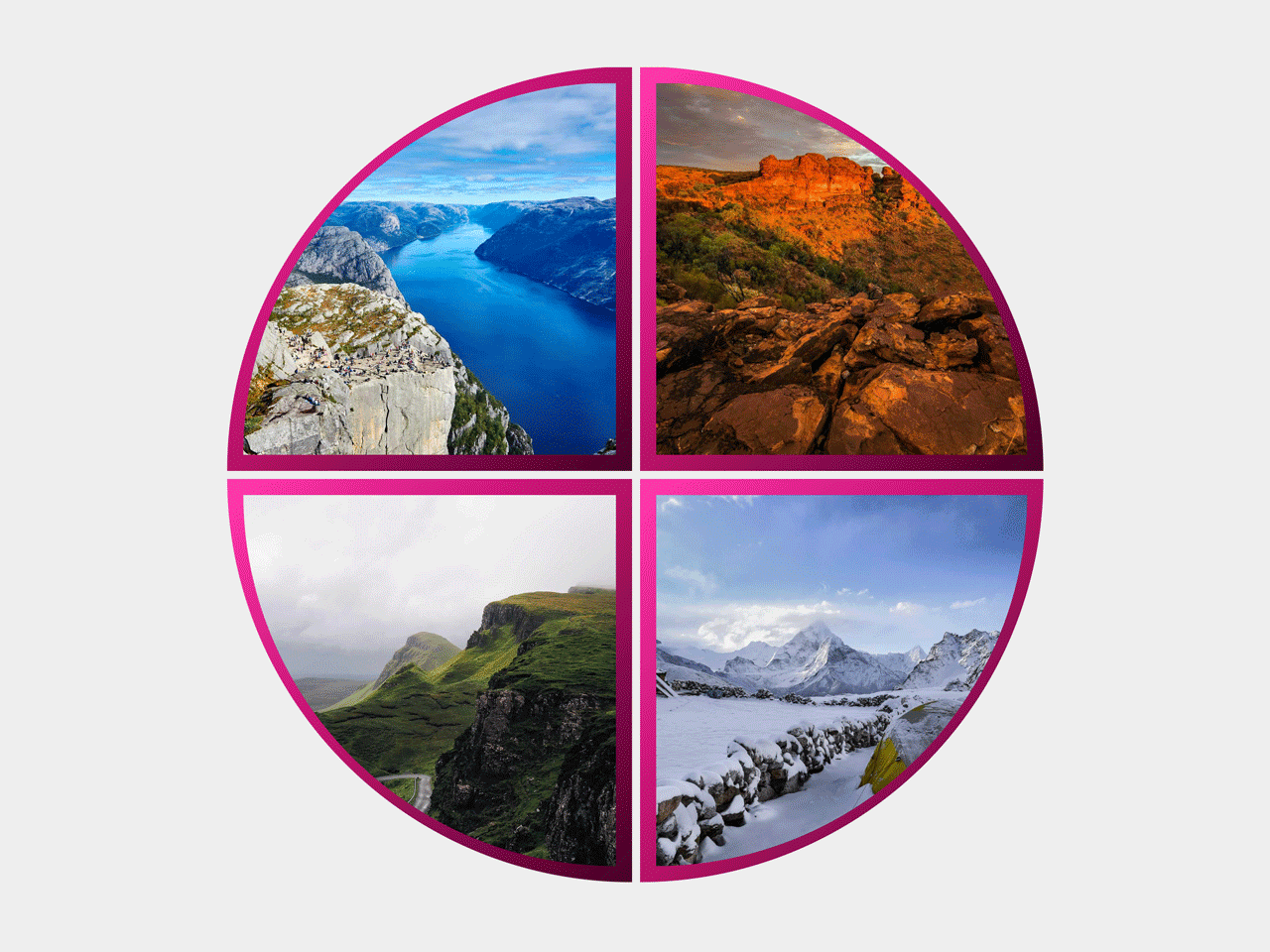

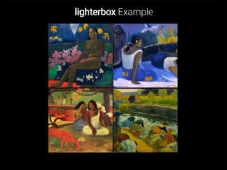
This CSS code snippet helps you to create a quarter circle grid gallery. It uses CSS clip-path property to slice the circle and place images inside it. It’s a creative way to showcase set of four images in a minimum space.
How to Create Quarter Circle Grid Gallery using CSS
1. First of all, create the HTML structure for circle grid gallery as follows:
<div class="grid">
	<div class="shape-outer quarter-circle-tl">
		<div class="shape-inner shape-inner-one quarter-circle-tl"></div>
	</div>

	<div class="shape-outer quarter-circle-tr">
		<div class="shape-inner shape-inner-two quarter-circle-tr"></div>
	</div>

	<div class="shape-outer quarter-circle-bl">
		<div class="shape-inner shape-inner-three quarter-circle-bl"></div>
	</div>

	<div class="shape-outer quarter-circle-br">
		<div class="shape-inner shape-inner-four quarter-circle-br"></div>
	</div>
</div>
2. Style the quarter circle grid gallery using the following CSS styles:
* {
	padding: 0;
	margin: 0;
	box-sizing: border-box;
}
body {
	display: flex;
	flex-wrap: wrap;
    justify-content: space-around;
    align-items: center;
    min-height: 100vh;
    background-color: coral;
}
.grid {
	display: grid;
	grid: auto / 1fr 1fr;
	gap: 5px;
}


/* inner pic outer border */
.shape-outer {
    display: flex;
    flex-shrink: 0;
    height: calc(150px + 8vw);
    width: calc(150px + 8vw);
    background-image: linear-gradient(to bottom right, #ff3cac, #b70067, #460028);
}
.shape-inner {
    height: calc(130px + 8vw);
    width: calc(130px + 8vw);
    margin: auto;
}
.shape-inner-one {
    background: url(https://picsum.photos/id/1015/2000/2000) no-repeat center;
    background-size: cover;
}
.shape-inner-two {
    background: url(https://picsum.photos/id/1016/2000/2000) no-repeat center;
    background-size: cover;
}
.shape-inner-three {
    background: url(https://picsum.photos/id/1018/2000/2000) no-repeat center;
    background-size: cover;
}
.shape-inner-four {
    background: url(https://picsum.photos/id/1036/2000/2000) no-repeat center;
    background-size: cover;
}

.quarter-circle-tl {
	clip-path: circle(100% at 100% 100%);
}
.quarter-circle-tr {
	clip-path: circle(100% at 0% 100%);
}
.quarter-circle-bl {
	clip-path: circle(100% at 100% 0%);
}
.quarter-circle-br {
	clip-path: circle(100% at 0% 0%);
}
That’s all! hopefully, you have successfully created circular gallery using CSS. If you have any questions or suggestions, feel free to comment below.
Similar Code Snippets:

- Slideshow JavaScript with Buttons


I code and create web elements for amazing people around the world. I like work with new people. New people new Experiences.
I truly enjoy what I’m doing, which makes me more passionate about web development and coding. I am always ready to do challenging tasks whether it is about creating a custom CMS from scratch or customizing an existing system.