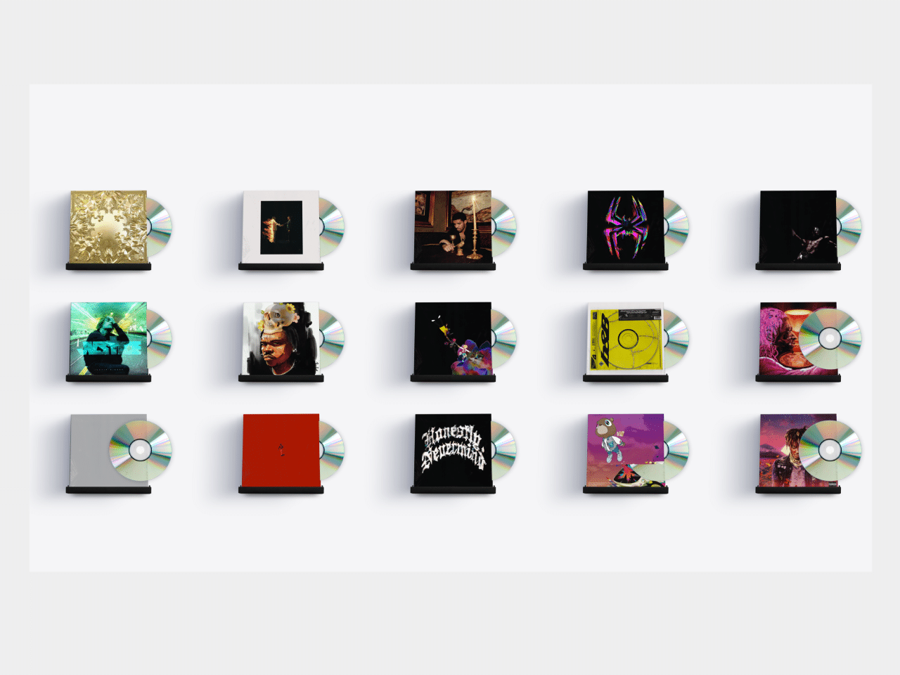

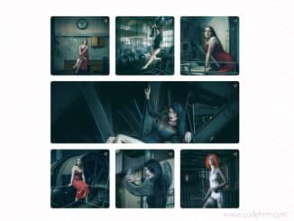
This code creates an album cover gallery using HTML and CSS. It displays various album covers in a grid layout. Each cover is presented with a 3D perspective effect and a shadow. It helps users visually browse through different album covers.
How to Create Album Cover Gallery Using HTML and CSS
1. First of all, preload the following gif images by adding the following links to the head tag of your HTML document.
<link rel="preload" as="image" href="https://raw.githubusercontent.com/hluebbering/web-design/main/assets/images/postmalone.gif" />
<link rel="preload" as="image" href="https://raw.githubusercontent.com/hluebbering/web-design/main/assets/images/punk.gif" />
<link rel="preload" as="image" href="https://raw.githubusercontent.com/hluebbering/web-design/main/assets/images/graduation.gif" />
<link rel="preload" as="image" href="https://raw.githubusercontent.com/hluebbering/web-design/main/assets/images/metroboomin4.gif" />
<link rel="preload" as="image" href="https://raw.githubusercontent.com/hluebbering/web-design/main/assets/images/metroboomin2.gif" />
<link rel="preload" as="image" href="https://raw.githubusercontent.com/hluebbering/web-design/main/assets/images/gunna.gif" />
<link rel="preload" as="image" href="https://raw.githubusercontent.com/hluebbering/web-design/main/assets/images/diddy.gif" />
2. Create the HTML structure for the gallery. Open your HTML file and create a <div> element with the class name "cover-score-wrapper". Inside this div, create another div with the class name "cover-score". This will serve as the container for our album covers.
Within the "cover-score" div, you can add individual album covers by creating multiple <div> elements with the class name "cover". Inside each cover div, include the necessary elements to display the album cover image.
<div class="cover-score-wrapper">
  <div class="cover-score" style="opacity: 1;">

    <!-- Jay Z -->
    <div class="cover" style="width: 120px;">
      <div class="shelf"></div>
      <div class="shelf-shadow"></div>
      <div class="cover-img cover-img-active" data-shadow-color="16,26,64" style="height: 120px; transform: perspective(730px) rotateX(14deg) rotateY(-1deg); box-shadow: rgba(16, 26, 64, 0) 0px 0px 1px, rgba(16, 26, 64, 0.1) -4px 1px 3px, rgba(16, 26, 64, 0.1) -11px 4px 6px, rgba(16, 26, 64, 0.1) -22px 8px 10px, rgba(16, 26, 64, 0.1) -37px 14px 15px, rgba(16, 26, 64, 0.1) -57px 21px 21px;">
        <div class="plastic" style="transform: translate(-1px, 0px);"></div>

        <div class="image-card" style="background-image:url(https://raw.githubusercontent.com/hluebbering/web-design/main/assets/images/jayz.gif); background-size: cover;"></div>

        <div style="background-image: url(https://i.scdn.co/image/ab67616d0000b2732a0e1044519b4da374703952);" class="img-fake"></div>

        <div class="cd"></div>
      </div>
    </div>


    <!-- Metro Boomin -->
    <div class="cover" style="width: 120px;">
      <div class="shelf"></div>
      <div class="shelf-shadow"></div>
      <div class="cover-img cover-img-active" data-shadow-color="16,26,64" style="height: 120px; transform: perspective(730px) rotateX(14deg) rotateY(-1deg); box-shadow: rgba(16, 26, 64, 0) 0px 0px 1px, rgba(16, 26, 64, 0.1) -4px 1px 3px, rgba(16, 26, 64, 0.1) -11px 4px 6px, rgba(16, 26, 64, 0.1) -22px 8px 10px, rgba(16, 26, 64, 0.1) -37px 14px 15px, rgba(16, 26, 64, 0.1) -57px 21px 21px;">
        <div class="plastic" style="transform: translate(-1px, 0px);"></div>

        <div class="image-card" style="background-image:url(https://raw.githubusercontent.com/hluebbering/web-design/main/assets/images/metroboomin2.gif); background-size: cover;"></div>

        <div style="background-image: url(https://assets.codepen.io/4927073/316743021_465848998921282_3524130263655009747_n.jpg);" class="img-fake"></div>

        <div class="cd"></div>
      </div>
    </div>


    <!-- Take Care Drake -->
    <div class="cover" style="width: 120px;">
      <div class="shelf"></div>
      <div class="shelf-shadow"></div>
      <div class="cover-img cover-img-active" data-shadow-color="16,26,64" style="height: 120px; transform: perspective(730px) rotateX(14deg) rotateY(-1deg); box-shadow: rgba(16, 26, 64, 0) 0px 0px 1px, rgba(16, 26, 64, 0.1) -4px 1px 3px, rgba(16, 26, 64, 0.1) -11px 4px 6px, rgba(16, 26, 64, 0.1) -22px 8px 10px, rgba(16, 26, 64, 0.1) -37px 14px 15px, rgba(16, 26, 64, 0.1) -57px 21px 21px;">
        <div class="plastic" style="transform: translate(-1px, 0px);"></div>


        <div class="image-card" style="background-image:url(https://raw.githubusercontent.com/hluebbering/web-design/main/assets/images/drake4.gif); background-size: cover;"></div>

        <div style="background-image: url(https://raw.githubusercontent.com/hluebbering/web-design/main/assets/images/drake4.gif);" class="img-fake"></div>


        <div class="cd"></div>
      </div>
    </div>


    <!-- Metro Boomin 2 -->
    <div class="cover" style="width: 120px;">
      <div class="shelf"></div>
      <div class="shelf-shadow"></div>
      <div class="cover-img cover-img-active" data-shadow-color="16,26,64" style="height: 120px; transform: perspective(730px) rotateX(14deg) rotateY(-1deg); box-shadow: rgba(16, 26, 64, 0) 0px 0px 1px, rgba(16, 26, 64, 0.1) -4px 1px 3px, rgba(16, 26, 64, 0.1) -11px 4px 6px, rgba(16, 26, 64, 0.1) -22px 8px 10px, rgba(16, 26, 64, 0.1) -37px 14px 15px, rgba(16, 26, 64, 0.1) -57px 21px 21px;">
        <div class="plastic" style="transform: translate(-1px, 0px);"></div>

        <div class="image-card" style="background-image:url(https://raw.githubusercontent.com/hluebbering/web-design/main/assets/images/metroboomin4.gif); background-size: cover; filter: brightness(1.25) saturate(1.25); background-position: 50% 50%;"></div>

        <div style="background-image: url(https://raw.githubusercontent.com/hluebbering/web-design/main/assets/images/metroboomin4.gif);" class="img-fake"></div>

        <div class="cd"></div>
      </div>
    </div>

    <!-- Chris Brown New -->
    <div class="cover" style="width: 120px;">
      <div class="shelf"></div>
      <div class="shelf-shadow"></div>
      <div class="cover-img cover-img-active" data-shadow-color="16,26,64" style="height: 120px; transform: perspective(730px) rotateX(14deg) rotateY(-1deg); box-shadow: rgba(16, 26, 64, 0) 0px 0px 1px, rgba(16, 26, 64, 0.1) -4px 1px 3px, rgba(16, 26, 64, 0.1) -11px 4px 6px, rgba(16, 26, 64, 0.1) -22px 8px 10px, rgba(16, 26, 64, 0.1) -37px 14px 15px, rgba(16, 26, 64, 0.1) -57px 21px 21px;">
        <div class="plastic" style="transform: translate(-1px, 0px);"></div>

        <div class="image-card" style="background-image:url(https://raw.githubusercontent.com/hluebbering/web-design/main/assets/images/travisscott.gif); background-size: cover; background-position: 50% 50%;"></div>

        <div style="background-image: url(https://raw.githubusercontent.com/hluebbering/web-design/main/assets/images/travisscott.gif);" class="img-fake"></div>

        <div class="cd"></div>
      </div>
    </div>


    <!-- Justin BIeber -->
    <div class="cover" style="width: 120px;">
      <div class="shelf"></div>
      <div class="shelf-shadow"></div>
      <div class="cover-img cover-img-active" data-shadow-color="16,26,64" style="height: 120px; transform: perspective(730px) rotateX(14deg) rotateY(-1deg); box-shadow: rgba(16, 26, 64, 0) 0px 0px 1px, rgba(16, 26, 64, 0.1) -4px 1px 3px, rgba(16, 26, 64, 0.1) -11px 4px 6px, rgba(16, 26, 64, 0.1) -22px 8px 10px, rgba(16, 26, 64, 0.1) -37px 14px 15px, rgba(16, 26, 64, 0.1) -57px 21px 21px;">
        <div class="plastic" style="transform: translate(-1px, 0px);"></div>


         <div class="image-card" style="background-image:url(https://raw.githubusercontent.com/hluebbering/web-design/main/assets/images/justin.gif); background-size: cover;"></div>

        <div style="background-image: url(https://thatgrapejuice.net/wp-content/uploads/2021/02/justin-bieber-justice-tgj.jpeg);" class="img-fake"></div>


        <div class="cd"></div>
      </div>
    </div>


    <!-- Mac Miller -->
    <div class="cover" style="width: 120px;">
      <div class="shelf"></div>
      <div class="shelf-shadow"></div>
      <div class="cover-img cover-img-active" data-shadow-color="16,26,64" style="height: 120px; transform: perspective(730px) rotateX(14deg) rotateY(-1deg); box-shadow: rgba(16, 26, 64, 0) 0px 0px 1px, rgba(16, 26, 64, 0.1) -4px 1px 3px, rgba(16, 26, 64, 0.1) -11px 4px 6px, rgba(16, 26, 64, 0.1) -22px 8px 10px, rgba(16, 26, 64, 0.1) -37px 14px 15px, rgba(16, 26, 64, 0.1) -57px 21px 21px;">
        <div class="plastic" style="transform: translate(-1px, 0px);"></div>

         <div class="image-card" style="background-image:url(https://raw.githubusercontent.com/hluebbering/web-design/main/assets/images/gunna.gif); background-size: cover;"></div>

        <div style="background-image: url(https://i.scdn.co/image/ab67616d0000b273017d5e26552345c4b1575b6c);" class="img-fake"></div>


        <div class="cd"></div>
      </div>
    </div>

    <!--Erase your Social -->
    <div class="cover" style="width: 120px;">
      <div class="shelf"></div>
      <div class="shelf-shadow"></div>
      <div class="cover-img cover-img-active" data-shadow-color="16,26,64" style="height: 120px; transform: perspective(730px) rotateX(14deg) rotateY(-1deg); box-shadow: rgba(16, 26, 64, 0) 0px 0px 1px, rgba(16, 26, 64, 0.1) -4px 1px 3px, rgba(16, 26, 64, 0.1) -11px 4px 6px, rgba(16, 26, 64, 0.1) -22px 8px 10px, rgba(16, 26, 64, 0.1) -37px 14px 15px, rgba(16, 26, 64, 0.1) -57px 21px 21px;">
        <div class="plastic" style="transform: translate(-1px, 0px);"></div>


        <div class="image-card" style="background-image:url(https://raw.githubusercontent.com/hluebbering/web-design/main/assets/images/erasesocial.gif); background-size: cover;"></div>

        <div style="background-image: url(https://i.scdn.co/image/ab67616d0000b2732143db1c88358d70dd898aa3);" class="img-fake"></div>


        <div class="cd"></div>
      </div>
    </div>

    <!-- Post Malone -->
    <div class="cover" style="width: 120px;">
      <div class="shelf"></div>
      <div class="shelf-shadow"></div>
      <div class="cover-img cover-img-active" data-shadow-color="16,26,64" style="height: 120px; transform: perspective(730px) rotateX(14deg) rotateY(-1deg); box-shadow: rgba(16, 26, 64, 0) 0px 0px 1px, rgba(16, 26, 64, 0.1) -4px 1px 3px, rgba(16, 26, 64, 0.1) -11px 4px 6px, rgba(16, 26, 64, 0.1) -22px 8px 10px, rgba(16, 26, 64, 0.1) -37px 14px 15px, rgba(16, 26, 64, 0.1) -57px 21px 21px;">
        <div class="plastic" style="transform: translate(-1px, 0px);"></div>

        <div class="image-card" style="background-image:url(https://raw.githubusercontent.com/hluebbering/web-design/main/assets/images/postmalone.gif); background-size: cover;"></div>

        <div style="background-image: url(https://i.scdn.co/image/ab67616d0000b273b1c4b76e23414c9f20242268);" class="img-fake"></div>

        <div class="cd"></div>
      </div>
    </div>

    <!-- Young Thug -->
    <div class="cover" style="width: 120px;">
      <div class="shelf"></div>
      <div class="shelf-shadow"></div>
      <div class="cover-img cover-img-active" data-shadow-color="16,26,64" style="height: 120px; transform: perspective(730px) rotateX(14deg) rotateY(-1deg); box-shadow: rgba(16, 26, 64, 0) 0px 0px 1px, rgba(16, 26, 64, 0.1) -4px 1px 3px, rgba(16, 26, 64, 0.1) -11px 4px 6px, rgba(16, 26, 64, 0.1) -22px 8px 10px, rgba(16, 26, 64, 0.1) -37px 14px 15px, rgba(16, 26, 64, 0.1) -57px 21px 21px;">
        <div class="plastic" style="transform: translate(-1px, 0px);"></div>

        <div class="image-card" style="background-image:url(https://raw.githubusercontent.com/hluebbering/web-design/main/assets/images/punk.gif); background-size: cover;"></div>

        <div style="background-image: url(https://i.scdn.co/image/ab67616d0000b273f8d415dab5ed7e3747bd38dd);" class="img-fake"></div>

        <div class="cd"></div>
      </div>
    </div>

    <!-- YG -->
    <div class="cover" style="width: 120px;">
      <div class="shelf"></div>
      <div class="shelf-shadow"></div>
      <div class="cover-img cover-img-active" data-shadow-color="16,26,64" style="height: 120px; transform: perspective(730px) rotateX(14deg) rotateY(-1deg); box-shadow: rgba(16, 26, 64, 0) 0px 0px 1px, rgba(16, 26, 64, 0.1) -4px 1px 3px, rgba(16, 26, 64, 0.1) -11px 4px 6px, rgba(16, 26, 64, 0.1) -22px 8px 10px, rgba(16, 26, 64, 0.1) -37px 14px 15px, rgba(16, 26, 64, 0.1) -57px 21px 21px;">
        <div class="plastic" style="transform: translate(-1px, 0px);"></div>

        <div class="image-card" style="background-image:url(https://raw.githubusercontent.com/hluebbering/web-design/main/assets/images/yg.gif); background-size: cover;"></div>

        <div style="background-image: url(https://raw.githubusercontent.com/hluebbering/web-design/main/assets/images/yg.gif);" class="img-fake"></div>

        <div class="cd"></div>
      </div>
    </div>

    <!-- Diddy -->
    <div class="cover" style="width: 120px;">
      <div class="shelf"></div>
      <div class="shelf-shadow"></div>
      <div class="cover-img cover-img-active" data-shadow-color="16,26,64" style="height: 120px; transform: perspective(730px) rotateX(14deg) rotateY(-1deg); box-shadow: rgba(16, 26, 64, 0) 0px 0px 1px, rgba(16, 26, 64, 0.1) -4px 1px 3px, rgba(16, 26, 64, 0.1) -11px 4px 6px, rgba(16, 26, 64, 0.1) -22px 8px 10px, rgba(16, 26, 64, 0.1) -37px 14px 15px, rgba(16, 26, 64, 0.1) -57px 21px 21px;">
        <div class="plastic" style="transform: translate(-1px, 0px);"></div>

        <div class="image-card" style="background-image:url(https://raw.githubusercontent.com/hluebbering/web-design/main/assets/images/diddy.gif); background-size: cover;"></div>

        <div style="background-image: url(https://i.scdn.co/image/ab67616d0000b273ac6a6549a4cacee199916f0b);" class="img-fake"></div>

        <div class="cd"></div>
      </div>
    </div>

    <!-- Drake -->
    <div class="cover" style="width: 120px;">
      <div class="shelf"></div>
      <div class="shelf-shadow"></div>
      <div class="cover-img cover-img-active" data-shadow-color="16,26,64" style="height: 120px; transform: perspective(730px) rotateX(14deg) rotateY(-1deg); box-shadow: rgba(16, 26, 64, 0) 0px 0px 1px, rgba(16, 26, 64, 0.1) -4px 1px 3px, rgba(16, 26, 64, 0.1) -11px 4px 6px, rgba(16, 26, 64, 0.1) -22px 8px 10px, rgba(16, 26, 64, 0.1) -37px 14px 15px, rgba(16, 26, 64, 0.1) -57px 21px 21px;">
        <div class="plastic" style="transform: translate(-1px, 0px);"></div>


        <div class="image-card" style="background-image:url(https://assets.codepen.io/4927073/0_drakeir-ezgif.com-optimize.gif); background-size: cover; filter: brightness(1.25) saturate(1.25); background-position: 50% 50%;"></div>

        <div style="background-image: url(https://assets.codepen.io/4927073/0_drakeir-ezgif.com-optimize.gif);" class="img-fake"></div>

        <div class="cd"></div>
      </div>
    </div>


    <!-- Kanye Graduation -->
    <div class="cover" style="width: 120px;">
      <div class="shelf"></div>
      <div class="shelf-shadow"></div>
      <div class="cover-img cover-img-active" data-shadow-color="16,26,64" style="height: 120px; transform: perspective(730px) rotateX(14deg) rotateY(-1deg); box-shadow: rgba(16, 26, 64, 0) 0px 0px 1px, rgba(16, 26, 64, 0.1) -4px 1px 3px, rgba(16, 26, 64, 0.1) -11px 4px 6px, rgba(16, 26, 64, 0.1) -22px 8px 10px, rgba(16, 26, 64, 0.1) -37px 14px 15px, rgba(16, 26, 64, 0.1) -57px 21px 21px;">
        <div class="plastic" style="transform: translate(-1px, 0px);"></div>

        <div class="image-card" style="background-image:url(https://raw.githubusercontent.com/hluebbering/web-design/main/assets/images/graduation.gif); background-size: cover;"></div>

        <div style="background-image: url(https://i.scdn.co/image/ab67616d0000b27326f7f19c7f0381e56156c94a);" class="img-fake"></div>

        <div class="cd"></div>
      </div>
    </div>

    <div class="cover" style="width: 120px;">
      <div class="shelf"></div>
      <div class="shelf-shadow"></div>
      <div class="cover-img cover-img-active" data-shadow-color="16,26,64" style="height: 120px; transform: perspective(730px) rotateX(14deg) rotateY(-1deg); box-shadow: rgba(16, 26, 64, 0) 0px 0px 1px, rgba(16, 26, 64, 0.1) -4px 1px 3px, rgba(16, 26, 64, 0.1) -11px 4px 6px, rgba(16, 26, 64, 0.1) -22px 8px 10px, rgba(16, 26, 64, 0.1) -37px 14px 15px, rgba(16, 26, 64, 0.1) -57px 21px 21px;">
        <div class="plastic" style="transform: translate(-1px, 0px);"></div>

        <div class="image-card" style="background-image:url(https://raw.githubusercontent.com/hluebbering/web-design/main/assets/images/juicewrld.gif); background-size: cover;"></div>

        <div style="background-image: url(https://i.scdn.co/image/ab67616d0000b2733e0698e4ae5ffb82a005aeeb);" class="img-fake"></div>

        <div class="cd"></div>
      </div>
    </div>

  </div>
</div>
3. Now, let’s style our album covers using CSS. You can customize the appearance of the album covers, including their size, position, and shadow effects. Utilize CSS properties like background-image, background-size, box-shadow, and transform to achieve the desired look.
/*! CSS Used from: Embedded */
* {
  -webkit-box-sizing: border-box;
  box-sizing: border-box;
}

body {
    background: #f5f5f7;
    height: 100vh;
    margin: auto;
  background-image: url(https://assets.codepen.io/4927073/irtexture3.jpg);
  background-size: cover;
  background-position: 50% 50%;
}

div,
img {
  margin: 0;
  padding: 0;
  border: 0;
  font-size: 100%;
  font: inherit;
  vertical-align: baseline;
}
img {
  display: block;
  width: 100%;
}
.cover-score {
  display: -webkit-box;
  display: -ms-flexbox;
  display: flex;
  -webkit-transform: translate3d(0, 0, 0);
  transform: translate3d(0, 0, 0);
  height: 100%;
  position: fixed;
  z-index: 100000;
  pointer-events: none;
}

.cover-score {
  justify-content: flex-start;
  position: absolute;
  display: grid;
  grid-template-columns: 2fr 2fr 2fr 2fr 2fr;
  left: auto;
  right: auto;
  margin: auto;
  width: 100%;
  padding: 30px;
  overflow: visible;
  height: 100%;
  justify-items: center;
  align-content: center;
  gap: 30px;
}

.cover-score .cover {
  margin-right: 50px;
  -ms-flex-item-align: end;
  align-self: flex-end;
  margin-bottom: 26px;
  position: relative;
}
.cover-score .cover:after {
  background: url("https://pudding.cool/2020/12/judge-my-spotify/assets/images/shelf-2.png");
  content: "";
  position: absolute;
  display: none;
  left: 50%;
  width: 300%;
  height: 300%;
  top: 0;
  -webkit-transform: translate(-50%, -41px);
  -ms-transform: translate(-50%, -41px);
  transform: translate(-50%, -41px);
  z-index: -1;
  background-size: contain;
  background-repeat: no-repeat;
}
.cover-score .cover .cover-img {
  -webkit-transform: perspective(1090px) rotateX(10deg);
  transform: perspective(1090px) rotateX(10deg);
  z-index: -1;
  width: 100%;
  height: 100%;
}
.cover-score .cover .cover-img img {
  -webkit-filter: saturate(0.9);
  filter: saturate(0.9);
}
.cover-score .cover .cover-img .img-fake {
  position: absolute;
  z-index: -1;
      top: -1px;
    left: 0;
    width: calc(100% + 2px);
    height: calc(100% + 2px);
  background-size: cover;
  -webkit-transform: translate(-1px, 0) scaleY(0.99);
  -ms-transform: translate(-1px, 0) scaleY(0.99);
  transform: translate(-1px, 0) scaleY(0.99);
  -webkit-filter: brightness(0.94) blur(0.2px) saturate(0.9);
  filter: brightness(0.94) blur(0.2px) saturate(0.9);
}
.cover-score .cover .cover-img .plastic {
  position: absolute;
  top: 0;
  left: 0;
  content: "";
  width: calc(100% + 2px);
  height: calc(100% - 1px);
  background: url(https://pudding.cool/2021/10/judge-my-music/assets/images/plastic-small.jpg);
  background-size: contain;
  mix-blend-mode: screen;
  opacity: 1;
  z-index: 100000;
  mix-blend-mode: difference;
  opacity: 0.35;
}
.cover-score .cover .shelf {
  background: url("https://pudding.cool/2021/10/judge-my-music/assets/images/shelf-3.png");
  width: 155px;
  height: 10px;
  background-size: contain;
  background-repeat: no-repeat;
  height: 17px;
  position: absolute;
  bottom: 0;
  -webkit-transform: translate(-8px, 11px);
  -ms-transform: translate(-8px, 11px);
  transform: translate(-8px, 11px);
  z-index: 100;
  -webkit-transform: translate(calc((100% + 15px) * -0.0516129032), calc(65%));
  -ms-transform: translate(calc((100% + 15px) * -0.0516129032), calc(65%));
  transform: translate(calc((100% + 15px) * -0.0516129032), calc(65%));
  height: calc((100% + 15px) * 0.109677419);
  width: calc(100% + 15px);
}
.cover-score .cover .shelf:after {
  content: "";
  background: -o-linear-gradient(
      330deg,
      rgba(255, 255, 255, 0) 42%,
      rgba(0, 0, 0, 0.15) 45%,
      rgba(0, 0, 0, 0.35) 65%
    ),
    -o-linear-gradient(70deg, rgba(255, 255, 255, 0) 38%, rgba(0, 0, 0, 0.25)
          45%, rgba(0, 0, 0, 0.23) 55%, rgba(0, 0, 0, 0.13) 75%),
    -o-radial-gradient(50% 100%, ellipse, rgba(0, 0, 0, 0.15) 3%, rgba(
            255,
            255,
            255,
            0
          )
          40%);
  background: linear-gradient(
      120deg,
      rgba(255, 255, 255, 0) 42%,
      rgba(0, 0, 0, 0.15) 45%,
      rgba(0, 0, 0, 0.35) 65%
    ),
    linear-gradient(
      20deg,
      rgba(255, 255, 255, 0) 38%,
      rgba(0, 0, 0, 0.25) 45%,
      rgba(0, 0, 0, 0.23) 55%,
      rgba(0, 0, 0, 0.13) 75%
    ),
    radial-gradient(
      ellipse at 50% 100%,
      rgba(0, 0, 0, 0.15) 3%,
      rgba(255, 255, 255, 0) 40%
    );
  width: 100%;
  height: 100%;
  background-repeat: no-repeat;
  position: absolute;
  bottom: 9px;
  left: 0;
  -webkit-transform: translate(0, 100%) scaleY(-0.5) scaleX(0.85);
  -ms-transform: translate(0, 100%) scaleY(-0.5) scaleX(0.85);
  transform: translate(0, 100%) scaleY(-0.5) scaleX(0.85);
  background: rgba(0, 0, 0, 0.5);
  -webkit-filter: blur(6px);
  filter: blur(6px);
}
.cover-score .cover .shelf-shadow {
  width: 151px;
  height: 13px;
  position: absolute;
  right: 0;
  margin: 0 auto;
  left: 0;
  bottom: -1px;
  z-index: -1;
  -webkit-transform: translate(-6px, 0);
  -ms-transform: translate(-6px, 0);
  transform: translate(-6px, 0);
  display: none;
}
.cover-score .cover img {
  width: 100%;
  height: 100%;
  -o-object-fit: cover;
  object-fit: cover;
}
.cover-score-wrapper {
  max-width: 100%;
  width: 100%;
  overflow: hidden;
  position: absolute;
  pointer-events: none;
  top: 0;
  left: 0;
  height: 100%;
}

.cd {
  background-image: url(https://accord.dk/cdn/shop/t/9/assets/cd.png?v=42367682729110643861600767949);
  width: 120px;
  height: 120px;
  position: absolute;
  z-index: -1;
  background-size: cover;
  top: 0;
  left: 50px;
}

.image-card {
  height: 120px;
  width: 100%;
  height: 100%;
  object-fit: cover;
}

@media (max-width: 985px) {
  .cover-score {
    gap: 20px 10px;
  }
}

@media (max-width: 885px) {
  .cover-score {
    gap: 20px 10px;
    grid-template-columns: 2fr 2fr 2fr 2fr;
  }
}

@media (max-width: 720px) {
  .cover-score {
    gap: 20px 10px;
    grid-template-columns: 2fr 2fr 2fr;
  }


}

@media (max-width: 540px) {
  .cover-score {
    gap: 20px 10px;
    grid-template-columns: 2fr 2fr 2fr;
  }

  .cover {
    width: 100px !important;
  }
  .cover-img.cover-img-active {
    height: 100px !important;
  }
  .cd {
    width: 100px;
    height: 100px;
    left: 44px;
  }
}
That’s all! hopefully, you have successfully created an Album Cover Gallery on your website. Feel free to customize the gallery to suit your preferences by experimenting with different styling options. Enjoy showcasing your favorite album covers in a visually appealing way!
Similar Code Snippets:
 Horizontal Scrolling Parallax Gallery in CSS
- Stylish Photo Gallery Grid in HTML CSS


I code and create web elements for amazing people around the world. I like work with new people. New people new Experiences.
I truly enjoy what I’m doing, which makes me more passionate about web development and coding. I am always ready to do challenging tasks whether it is about creating a custom CMS from scratch or customizing an existing system.