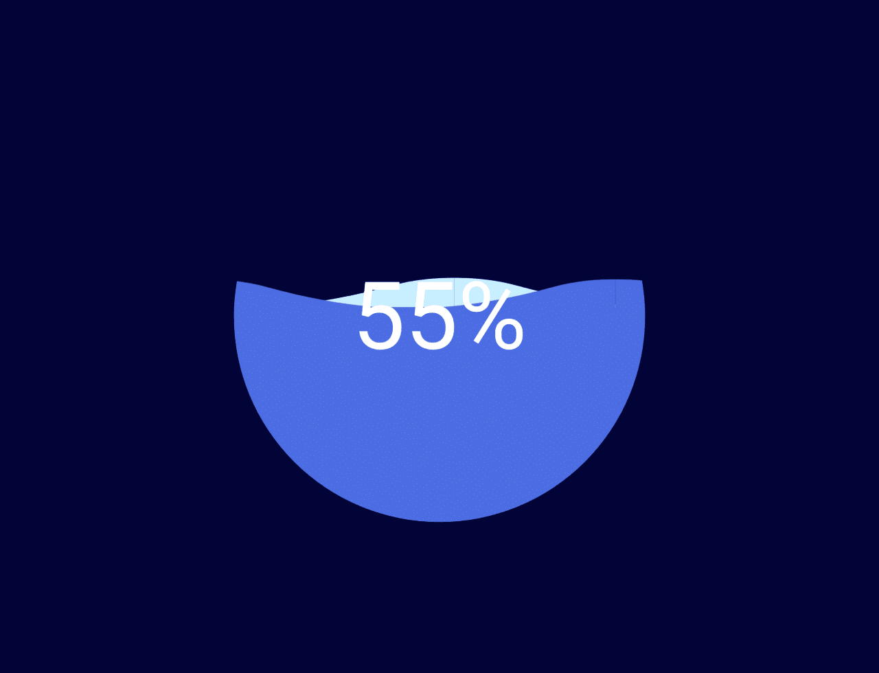

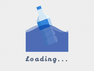
This code creates a circular loading animation with a percentage display. It uses SVG and CSS animations. The JavaScript dynamically updates the percentage and animates the waves. It helps show progress visually.
You can use this code on websites to display loading progress. It’s great for giving users a visual cue about loading times, enhancing user experience.
How to Create a Circular Waves Loading Animation with Percentage
1. First of all, copy the following HTML code into your HTML file. This includes an SVG element defining the wave shape and a container div for the loading animation and percentage display.
<svg version="1.1" xmlns="http://www.w3.org/2000/svg" xmlns:xlink="http://www.w3.org/1999/xlink" x="0px" y="0px" style="display: none;">
  <symbol id="wave">
    <path d="M420,20c21.5-0.4,38.8-2.5,51.1-4.5c13.4-2.2,26.5-5.2,27.3-5.4C514,6.5,518,4.7,528.5,2.7c7.1-1.3,17.9-2.8,31.5-2.7c0,0,0,0,0,0v20H420z"></path>
    <path d="M420,20c-21.5-0.4-38.8-2.5-51.1-4.5c-13.4-2.2-26.5-5.2-27.3-5.4C326,6.5,322,4.7,311.5,2.7C304.3,1.4,293.6-0.1,280,0c0,0,0,0,0,0v20H420z"></path>
    <path d="M140,20c21.5-0.4,38.8-2.5,51.1-4.5c13.4-2.2,26.5-5.2,27.3-5.4C234,6.5,238,4.7,248.5,2.7c7.1-1.3,17.9-2.8,31.5-2.7c0,0,0,0,0,0v20H140z"></path>
    <path d="M140,20c-21.5-0.4-38.8-2.5-51.1-4.5c-13.4-2.2-26.5-5.2-27.3-5.4C46,6.5,42,4.7,31.5,2.7C24.3,1.4,13.6-0.1,0,0c0,0,0,0,0,0l0,20H140z"></path>
  </symbol>
</svg>
<div class="box">
  <div class="percent">
    <div class="percentNum" id="count">0</div>
    <div class="percentB">%</div>
  </div>
  <div id="water" class="water">
    <svg viewBox="0 0 560 20" class="water_wave water_wave_back">
      <use xlink:href="#wave"></use>
    </svg>
    <svg viewBox="0 0 560 20" class="water_wave water_wave_front">
      <use xlink:href="#wave"></use>
    </svg>
  </div>
</div>
2. Copy the CSS code into your CSS file or embed it within <style> tags in your HTML. This CSS defines the styles for the loading animation, container, and percentage display.
*, *:before, *:after {
  box-sizing: border-box;
  outline: none;
}

body {
  background: #020438;
  font: 14px/1 "Open Sans", helvetica, sans-serif;
  -webkit-font-smoothing: antialiased;
}

.box {
  height: 280px;
  width: 280px;
  position: absolute;
  top: 50%;
  left: 50%;
  transform: translate(-50%, -50%);
  background: #020438;
  border-radius: 100%;
  overflow: hidden;
}
.box .percent {
  position: absolute;
  left: 0;
  top: 0;
  z-index: 3;
  width: 100%;
  height: 100%;
  display: flex;
  display: -webkit-flex;
  align-items: center;
  justify-content: center;
  color: #fff;
  font-size: 64px;
}
.box .water {
  position: absolute;
  left: 0;
  top: 0;
  z-index: 2;
  width: 100%;
  height: 100%;
  transform: translate(0, 100%);
  background: #4D6DE3;
  transition: all 0.3s;
}
.box .water_wave {
  width: 200%;
  position: absolute;
  bottom: 100%;
}
.box .water_wave_back {
  right: 0;
  fill: #C7EEFF;
  -webkit-animation: wave-back 1.4s infinite linear;
          animation: wave-back 1.4s infinite linear;
}
.box .water_wave_front {
  left: 0;
  fill: #4D6DE3;
  margin-bottom: -1px;
  -webkit-animation: wave-front 0.7s infinite linear;
          animation: wave-front 0.7s infinite linear;
}

@-webkit-keyframes wave-front {
  100% {
    transform: translate(-50%, 0);
  }
}

@keyframes wave-front {
  100% {
    transform: translate(-50%, 0);
  }
}
@-webkit-keyframes wave-back {
  100% {
    transform: translate(50%, 0);
  }
}
@keyframes wave-back {
  100% {
    transform: translate(50%, 0);
  }
}
3. Finally, include the JavaScript code in your HTML file or link it as an external script. This script dynamically updates the percentage and controls the animation of the waves.
var cnt=document.getElementById("count");
var water=document.getElementById("water");
var percent=cnt.innerText;
var interval;
interval=setInterval(function(){
  percent++;
  cnt.innerHTML = percent;
  water.style.transform='translate(0'+','+(100-percent)+'%)';
  if(percent==100){
    clearInterval(interval);
  }
},60);
You can customize the appearance of the loading animation by modifying CSS properties like colors, sizes, or positioning to match your website’s design.
That’s all! hopefully, you have successfully created Circular Waves Loading Animation With Percentage. If you have any questions or suggestions, feel free to comment below.
Similar Code Snippets:
 Falling Snow Effect HTML Code
- CSS Button Animation Library
- Background Parallax Effect on Mouse Move
- Fade In On Scroll Using CSS and JavaScript
- CSS Background Blur Effect
- Multi Layer Parallax Effect in JavaScript
- Success Check Animation CSS


I code and create web elements for amazing people around the world. I like work with new people. New people new Experiences.
I truly enjoy what I’m doing, which makes me more passionate about web development and coding. I am always ready to do challenging tasks whether it is about creating a custom CMS from scratch or customizing an existing system.