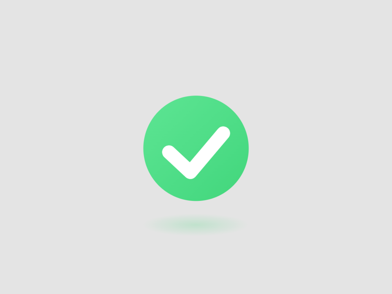

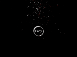
Adding a success check animation to your website can be a fun and engaging way to provide instant feedback to your users. This CSS code snippet helps you to create an animated success check animation. It utilizes SVG to animate a checkmark inside a circle with a gradient background. The animation adds a dynamic visual effect for success checks, making it ideal for enhancing user interfaces.
You can use this code in web applications, forms, or confirmation messages to visually signify a successful action, such as a completed registration or a successful transaction. The animation provides immediate user feedback, enhancing the user experience.
How to Create Success Check Animation CSS
1. First, load the Normalize CSS by adding the following CDN link into the head tag of your HTML document.
<link rel="stylesheet" href="https://cdnjs.cloudflare.com/ajax/libs/normalize/5.0.0/normalize.min.css">
2. Create the HTML structure for your success check animation. You can place this animation in a <div> element to easily integrate it into your web page.
<div class="main-container">
	<div class="check-container">
		<div class="check-background">
			<svg viewBox="0 0 65 51" fill="none" xmlns="http://www.w3.org/2000/svg">
				<path d="M7 25L27.3077 44L58.5 7" stroke="white" stroke-width="13" stroke-linecap="round" stroke-linejoin="round" />
			</svg>
		</div>
		<div class="check-shadow"></div>
	</div>
</div>
3. Add the CSS styles for the animation to your web page. You can link to an external CSS file or include the styles in your HTML file within a <style> tag. You can customize the animation duration, colors, and sizes to match your website’s design.
html,
body {
  font-size: 24px;
}

.main-container {
  width: 100%;
  height: 100vh;
  display: flex;
  flex-flow: column;
  justify-content: center;
  align-items: center;
}

.check-container {
  width: 6.25rem;
  height: 7.5rem;
  display: flex;
  flex-flow: column;
  align-items: center;
  justify-content: space-between;
}
.check-container .check-background {
  width: 100%;
  height: calc(100% - 1.25rem);
  background: linear-gradient(to bottom right, #5de593, #41d67c);
  box-shadow: 0px 0px 0px 65px rgba(255, 255, 255, 0.25) inset, 0px 0px 0px 65px rgba(255, 255, 255, 0.25) inset;
  transform: scale(0.84);
  border-radius: 50%;
  animation: animateContainer 0.75s ease-out forwards 0.75s;
  display: flex;
  align-items: center;
  justify-content: center;
  opacity: 0;
}
.check-container .check-background svg {
  width: 65%;
  transform: translateY(0.25rem);
  stroke-dasharray: 80;
  stroke-dashoffset: 80;
  animation: animateCheck 0.35s forwards 1.25s ease-out;
}
.check-container .check-shadow {
  bottom: calc(-15% - 5px);
  left: 0;
  border-radius: 50%;
  background: radial-gradient(closest-side, #49da83, transparent);
  animation: animateShadow 0.75s ease-out forwards 0.75s;
}

@keyframes animateContainer {
  0% {
    opacity: 0;
    transform: scale(0);
    box-shadow: 0px 0px 0px 65px rgba(255, 255, 255, 0.25) inset, 0px 0px 0px 65px rgba(255, 255, 255, 0.25) inset;
  }
  25% {
    opacity: 1;
    transform: scale(0.9);
    box-shadow: 0px 0px 0px 65px rgba(255, 255, 255, 0.25) inset, 0px 0px 0px 65px rgba(255, 255, 255, 0.25) inset;
  }
  43.75% {
    transform: scale(1.15);
    box-shadow: 0px 0px 0px 43.334px rgba(255, 255, 255, 0.25) inset, 0px 0px 0px 65px rgba(255, 255, 255, 0.25) inset;
  }
  62.5% {
    transform: scale(1);
    box-shadow: 0px 0px 0px 0px rgba(255, 255, 255, 0.25) inset, 0px 0px 0px 21.667px rgba(255, 255, 255, 0.25) inset;
  }
  81.25% {
    box-shadow: 0px 0px 0px 0px rgba(255, 255, 255, 0.25) inset, 0px 0px 0px 0px rgba(255, 255, 255, 0.25) inset;
  }
  100% {
    opacity: 1;
    box-shadow: 0px 0px 0px 0px rgba(255, 255, 255, 0.25) inset, 0px 0px 0px 0px rgba(255, 255, 255, 0.25) inset;
  }
}
@keyframes animateCheck {
  from {
    stroke-dashoffset: 80;
  }
  to {
    stroke-dashoffset: 0;
  }
}
@keyframes animateShadow {
  0% {
    opacity: 0;
    width: 100%;
    height: 15%;
  }
  25% {
    opacity: 0.25;
  }
  43.75% {
    width: 40%;
    height: 7%;
    opacity: 0.35;
  }
  100% {
    width: 85%;
    height: 15%;
    opacity: 0.25;
  }
}
That’s all! hopefully, you have successfully created a Success Check Animation using CSS. If you have any questions or suggestions, feel free to comment below.
Similar Code Snippets:
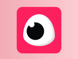
 Eye Blink Animation using CSS
- Floating Balloons HTML Code
- Animate when Scrolled into View JavaScript

I code and create web elements for amazing people around the world. I like work with new people. New people new Experiences.
I truly enjoy what I’m doing, which makes me more passionate about web development and coding. I am always ready to do challenging tasks whether it is about creating a custom CMS from scratch or customizing an existing system.