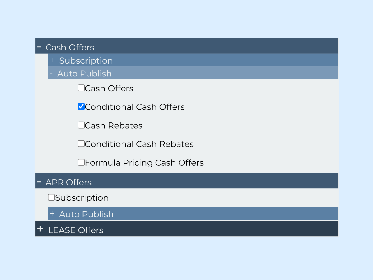

This code implements a Nested Accordion With Checkboxes Inside. It allows users to expand and collapse sections of content with checkboxes. The major functionality is to toggle the “active” and “show” states of panels when the buttons are clicked, making it easier for users to select options.
This code is helpful for creating organized and interactive content sections with nested accordions and checkboxes.
How to Create Nested Accordion With Checkboxes Inside
1. Create an HTML structure with accordion containers and buttons for each section. Place your content and checkboxes inside the corresponding “panel” div. Customize the content and titles for each section to suit your needs.
<div class="accordion">
    <button class="accordion-btn"> <span>Cash Offers</span></button>
    <div class="panel">
        <button class="accordion-btn inner-accord"><span>Subscription</span></button>
        <div class="panel">
            <div class="content1"><input type="checkbox">Subscription</div>
        </div>
        <button class="accordion-btn inner-accord"><span>Auto Publish</span></button>
        <div class="panel">
            <div class="content1"><input type="checkbox">Cash Offers</div>
            <div class="content1"><input type="checkbox">Conditional Cash Offers</div>
            <div class="content1"><input type="checkbox">Cash Rebates</div>
            <div class="content1"><input type="checkbox">Conditional Cash Rebates</div>
            <div class="content1"><input type="checkbox">Formula Pricing Cash Offers</div>
        </div>

    </div>
    <!-- panel -->
</div>

<div class="accordion">
    <button class="accordion-btn"><span>APR Offers</span></button>
    <div class="panel">
        <div class="content"><input type="checkbox">Subscription</div>
        <button class="accordion-btn inner-accord"><span>Auto Publish</span></button>
        <div class="panel">
            <div class="content1"><input type="checkbox">APR Offers</div>
            <div class="content1"><input type="checkbox">Conditional APR Offers</div>
            <div class="content1"><input type="checkbox">APR Rebates</div>
            <div class="content1"><input type="checkbox">Conditional APR Rebates</div>
                    <div class="content1"><input type="checkbox">Formula Pricing APR Rebates</div>
        </div>
    </div>
    <!-- panel -->
</div>
<div class="accordion">
    <button class="accordion-btn"><span>LEASE Offers</span></button>
    <div class="panel">
        <div class="content"><input type="checkbox">Subscription</div>
        <button class="accordion-btn inner-accord"><span>Auto Publish</span></button>
        <div class="panel">
            <div class="content1"><input type="checkbox">Lease Offers</div>
            <div class="content1"><input type="checkbox">Lease Rebates</div>
        </div>
    </div>
    <!-- panel -->
</div>
2. Add the following CSS code to your project. Customize the styles for buttons, panels, checkboxes, and any other elements to match your design preferences.
@import 'https://fonts.googleapis.com/css?family=Montserrat';
.accordion .content {
  padding: 0.5em 1.5em 0.5em;
}

.content1 {
  padding: 0.5em 5em 0.5em;
}

* {
  font-size: 16px;
  font-family: "Montserrat", Helvetica, sans-serif;
}

/* Accordion Styles */
.accordion {
  width: 60%;
  margin: 0 auto;
  border: 1px solid #ECF0F1;
}

/* Button Styles */
.accordion-btn {
  background-color: #2C3E50;
  font-size: 1.5em;
  color: #ECF0F1;
  cursor: pointer;
  width: 100%;
  text-align: left;
  border: none;
  transition: 0.5s;
}

.accordion-btn span {
  padding-left: 0.5em;
}

.accordion-btn:after {
  content: "+";
  font-size: 1em;
  color: #ECF0F1;
  float: left;
  margin-left: 2px;
}

/* Active and Hover Button Styles */
.accordion-btn.active,
.accordion-btn:hover {
  background-color: #3f5973;
}

.accordion-btn.active:after {
  content: "-";
}

/* Panel Styles */
.panel {
  background-color: #ECF0F1;
  max-height: 0;
  overflow: hidden;
  transition: 0.5s ease-in-out;
  opacity: 0;
}

.panel p {
  font-size: 1.2em;
  padding: 0 2em;
}

/* Show Panel onclick */
.panel.show {
  display: block;
  opacity: 1;
  max-height: 500px;
}

/* Inner Accordion Style */
.inner-accord {
  background-color: #5b80a4;
  font-size: 1.2em;
  margin-left: 1.25em;
}

.inner-accord.active,
.inner-accord:hover {
  background-color: #7b99b7;
}
3. The JavaScript code adds interactivity to the accordion. It toggles the “active” and “show” states of panels when the buttons are clicked. This enables users to expand and collapse sections. Include the following JavaScript code between the <script> tag just before closing the <body> element.
// Toggle 'active' and 'show' states of panels

var accord = document.getElementsByClassName("accordion-btn");
var i;

for (i = 0; i < accord.length; i++) {
    accord[i].onclick = function() {
        this.classList.toggle("active");
        this.nextElementSibling.classList.toggle("show");
    }
}
That’s it! You’ve now implemented a Nested Accordion, providing an organized and interactive way for users to navigate and make selections within your content. If you have any questions or suggestions, feel free to comment below.
Similar Code Snippets:

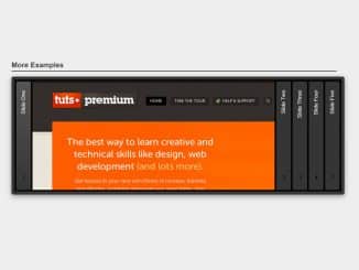
- HTML Multilevel Accordion Navigation Menu

I code and create web elements for amazing people around the world. I like work with new people. New people new Experiences.
I truly enjoy what I’m doing, which makes me more passionate about web development and coding. I am always ready to do challenging tasks whether it is about creating a custom CMS from scratch or customizing an existing system.