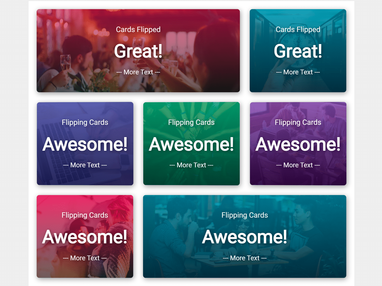

This JavaScript code snippet helps you to create card flip animation. It uses the JavaScript intervals function to flip cards at certain time intervals. The cards have been designed with background images using CSS that can be used for featured content on a webpage.
Basically, the cards come with an automatically flipping animation but you can attach an event like a mouseover or click to flip the card on that event. Do you want to flip a card on click event? Well! here is a Bootstrap code snippet to flip the card on click. Similarly, you can customize the size, background image, and flipping speed according to your needs.
How to Create Card Flip Animation using JavaScript
1. Create a div element with a class name “card” and place two divs elements for the front and back of the card. Place your content in both of these divs. Inside the card, you can create a div element with a class name “text-box”. In the text box, you can use the three classes to set text at the top, middle and lower of the card. The complete HTML structure for a card is as follows:
<div class="card">
  <div class="card__side card__side--front" id="front-1">
    <div class="text-box">
      <h3 class="text-box-top">Flipping Cards</h3>
      <h1 class="text-box-middle">Awesome!</h1>
      <h3 class="text-box-lower">--- More Text ---</h3>
    </div>
  </div>
  <div class="card__side card__side--back" id="back-1">
    <div class="text-box">
      <h3 class="text-box-top">Cards Flipped</h3>
      <h1 class="text-box-middle">Great!</h1>
      <h3 class="text-box-lower">--- More Text ---</h3>
    </div>
  </div>
</div>
2. Style the card using the following CSS styles. You can set the custom background images inside the “#front-1” and “#front-1” id selectors. Similarly, you can set the custom value for transition property (to change flip speed) inside the “card” class selector.
.card {
  perspective: 150rem;
  -moz-perspective: 150rem;
  position: relative;
  height: 25rem;
  width: 100%;
  transition: all ease-in-out 5s;
  cursor: pointer;
}

.card:hover {
  transform: scale(1.05);
}

.card:active {
  transform: translateY(-1px);
}

.card__side {
  transition: all 0.8s ease;
  color: white;
  font-size: 2rem;
  position: absolute;
  top: 0;
  left: 0;
  height: 25rem;
  width: 100%;
  backface-visibility: hidden;
  box-shadow: 2px 4px 16px rgba(0, 0, 0, 0.4);
  border-radius: 8px;
}

.card__side--front {
  background-color: #2196f3;
  position: relative;
  background-position: center;
  background-repeat: no-repeat;
  background-size: cover;
}

.card__side--back {
  background-color: #303f9f;
  transform: rotateY(180deg);
  background-position: center;
  background-repeat: no-repeat;
  background-size: cover;
}

.showGreen {
  transform: rotateY(-180deg);
}

.showRed {
  transform: rotateY(0);
}

.text-box {
  position: absolute;
  top: 50%;
  left: 50%;
  transform: translate(-50%, -50%);
  text-align: center;
  width: 100%;
}

.text-box-top {
  font-size: 2.2rem;
  text-shadow: 2px 2px 10px #0000006c;
  font-weight: 400;
}

.text-box-middle {
  font-size: 5.5rem;
  font-weight: 700;
  text-shadow: 2px 2px 10px #0000006c;
}

.text-box-lower {
  font-size: 2rem;
  text-shadow: 2px 2px 10px #0000006c;
  font-weight: 400;
}

.heading {
  transition: all 0.6s linear;
}

.hide {
  visibility: hidden;
  opacity: 0;
}

.show {
  visibility: visible;
  opacity: 1;
}

#front-1 {
  background-image: linear-gradient(
      rgba(204, 30, 88, 0.6),
      rgba(20, 20, 20, 0.6)
    ),
    url("https://images.unsplash.com/photo-1527529482837-4698179dc6ce?ixlib=rb-1.2.1&ixid=eyJhcHBfaWQiOjEyMDd9&auto=format&fit=crop&w=600&q=80");
}
#front-2 {
  background-image: linear-gradient(
      rgba(31, 136, 168, 0.767),
      rgba(14, 46, 65, 0.9)
    ),
    url("https://images.unsplash.com/photo-1508599804355-8ce5238b44b1?ixlib=rb-1.2.1&ixid=eyJhcHBfaWQiOjEyMDd9&auto=format&fit=crop&w=600&q=80");
}
3. Finally, add the following JavaScript function to initialize the card flip animation.
var flipCheck = 0;

function rotateCards() {
  if (flipCheck === 0) {
    document.getElementById("front-2").classList.add("showGreen");
    document.getElementById("back-2").classList.add("showRed");

    document.getElementById("front-1").classList.add("showGreen");
    document.getElementById("back-1").classList.add("showRed");

    flipCheck = 1;

  } else {
    document.getElementById("front-2").classList.remove("showGreen");
    document.getElementById("back-2").classList.remove("showRed");

    document.getElementById("front-1").classList.remove("showGreen");
    document.getElementById("back-1").classList.remove("showRed");

    flipCheck = 0;
  }
}

setInterval(rotateCards, 3000); // Time in milliseconds
That’s all! Hopefully, you have successfully integrated this JavaScript code for card flip animation into your project. If you have any questions or facing any issues, feel free to comment below.
Similar Code Snippets:
 JavaScript Get Browser Name and Version
- Fade In On Scroll Using CSS and JavaScript
- Simple Temperature Converter in JavaScript
- Background Image Slideshow using JavaScript
- Crop Image in Canvas Using JavaScript
- Weight Loss Calculator using JavaScript
- Border Animation using CSS with Infinite Loop
- Emoji Spinner in Vanilla JavaScript
- Expand and Collapse div using JavaScript


I code and create web elements for amazing people around the world. I like work with new people. New people new Experiences.
I truly enjoy what I’m doing, which makes me more passionate about web development and coding. I am always ready to do challenging tasks whether it is about creating a custom CMS from scratch or customizing an existing system.