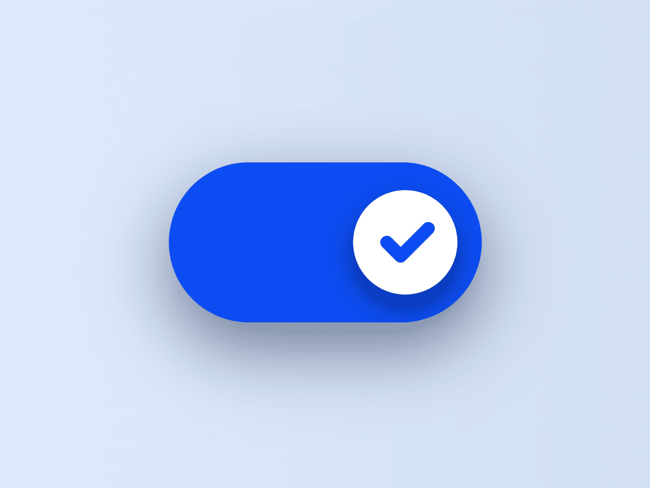

This code creates a toggle button with a check animation using HTML and CSS. The button indicates the power status. It visually toggles between on and off states. This button can serve various purposes in your web projects, such as indicating power status or enabling/disabling certain features.
How to Create Toggle Button With Check Animation Using HTML CSS
1. Start by creating a new HTML file and open it in your preferred text editor. Then, copy the following HTML code into your file:
<label class="switch">
	<input class="switch__input" type="checkbox" role="switch">
	<svg class="switch__check" viewBox="0 0 16 16" width="16px" height="16px">
		<polyline class="switch__check-line" fill="none" stroke="hsl(var(--hue),10%,50%)" stroke-dasharray="9 9" stroke-dashoffset="3.01" stroke-linecap="round" stroke-linejoin="round" stroke-width="2" points="5,8 11,8 11,11" />
	</svg>
	<span class="switch__sr">Power</span>
</label>
This HTML code sets up the basic structure for our toggle button. It includes a label with an input checkbox and an SVG for the check animation.
2. Next, let’s style our button to make it visually appealing. Create a new file named styles.css and copy the provided CSS code into it.
* {
	border: 0;
	box-sizing: border-box;
	margin: 0;
	padding: 0;
}
:root {
	--hue: 223;
	--bg: hsl(var(--hue),90%,90%);
	--fg: hsl(var(--hue),90%,10%);
	--trans-dur: 0.3s;
	--trans-timing: cubic-bezier(0.65,0,0.35,1);
	font-size: calc(40px + (80 - 40) * (100vw - 320px) / (2560 - 320));
}

body,
input {
	font: 1em/1.5 sans-serif;
}

body {
	background-color: var(--bg);
	color: var(--fg);
	display: grid;
	place-items: center;
	height: 100vh;
	transition:
		background-color var(--trans-dur),
		color var(--trans-dur);
}
.switch,
.switch__input {
	-webkit-tap-highlight-color: transparent;
}
.switch {
	position: relative;
	width: 3em;
	height: 1.5em;
}
.switch__check {
	display: block;
	transform: translateX(0) rotate(0);
	transition: transform var(--trans-dur) var(--trans-timing);
	z-index: 1;
}
.switch__check-line {
	transform: translate(0,0);
	transition:
		stroke var(--trans-dur) var(--trans-timing),
		stroke-dashoffset var(--trans-dur) var(--trans-timing),
		transform var(--trans-dur) var(--trans-timing);
}
.switch__input {
	background-color: hsla(var(--hue),90%,50%,0);
	border-radius: 1.5em;
	box-shadow:
		0 0 0 0.0625em hsl(var(--hue),10%,50%) inset,
		0 0.25em 1em hsla(var(--hue),90%,10%,0);
	cursor: pointer;
	display: block;
	outline: transparent;
	width: 100%;
	height: 100%;
	transition:
		background-color var(--trans-dur) var(--trans-timing),
		box-shadow var(--trans-dur) var(--trans-timing);
	-webkit-appearance: none;
	appearance: none;
}
.switch__input:before,
.switch__input:after {
	content: "";
	display: block;
}
.switch__input:before {
	background-color: hsl(0,0%,100%);
	border-radius: 50%;
	box-shadow: 0 0.125em 0.25em hsla(var(--hue),90%,10%,0);
	transition:
		box-shadow var(--trans-dur) var(--trans-timing),
		transform var(--trans-dur) var(--trans-timing);
}
.switch__input:after {
	border-radius: 0.75em;
	box-shadow: 0 0 0 0.125em hsla(var(--hue),90%,70%,0);
	width: 100%;
	height: 100%;
	transition: box-shadow 0.15s linear;
}
.switch__input:focus-visible:after {
	box-shadow: 0 0 0 0.125em hsla(var(--hue),90%,70%,1);
}
.switch__check,
.switch__input:before {
	position: absolute;
	top: 0.25em;
	left: 0.25em;
	width: 1em;
	height: 1em;
}
.switch__input:checked {
	background-color: hsla(var(--hue),90%,50%,1);
	box-shadow:
		0 0 0 0.0625em hsl(var(--hue),90%,50%) inset,
		0 0.25em 1em hsla(var(--hue),90%,10%,0.5);
}
.switch__input:checked:before {
	box-shadow: 0 0.125em 0.25em hsla(var(--hue),90%,10%,0.5);
	transform: translateX(1.5em);
}
.switch__input:checked + .switch__check {
	animation: switch-check var(--trans-dur) var(--trans-timing);
	transform: translateX(1.5em) rotate(-225deg);
}
.switch__input:checked + .switch__check .switch__check-line {
	stroke: hsl(var(--hue),90%,50%);
	stroke-dashoffset: 0;
	transform: translate(-1px,-1px);
	transition-delay: 0s, calc(var(--trans-dur) / 2), 0s;
}
.switch__sr {
	overflow: hidden;
	position: absolute;
	width: 1px;
	height: 1px;
}

/* Dark theme */
@media (prefers-color-scheme: dark) {
	:root {
		--bg: hsl(var(--hue),90%,10%);
		--fg: hsl(var(--hue),90%,90%);
	}
}

/* Animations */
@keyframes switch-check {
	from {
		transform: translateX(0) rotate(0);
	}
	to {
		transform: translateX(1.5em) rotate(135deg);
	}
}
Feel free to customize the colors, sizes, or animations according to your preferences. You can modify the CSS variables in the :root selector to change the button’s appearance. The toggle button is now ready to be used to indicate various states or trigger specific actions on your website
That’s it! You’ve successfully created a toggle button with a check animation in your web/app project. Feel free to integrate it into your web projects to add stylish functionality.
Similar Code Snippets:

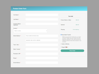
- Product Order Form HTML Code
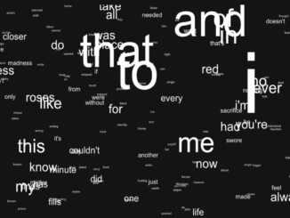
- Floating Words Animation Using Vanilla JavaScript
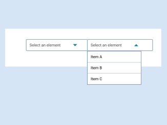
- Custom Select Dropdown Using ul li in JavaScript
- Encrypt and Decrypt In JavaScript with Key


I code and create web elements for amazing people around the world. I like work with new people. New people new Experiences.
I truly enjoy what I’m doing, which makes me more passionate about web development and coding. I am always ready to do challenging tasks whether it is about creating a custom CMS from scratch or customizing an existing system.