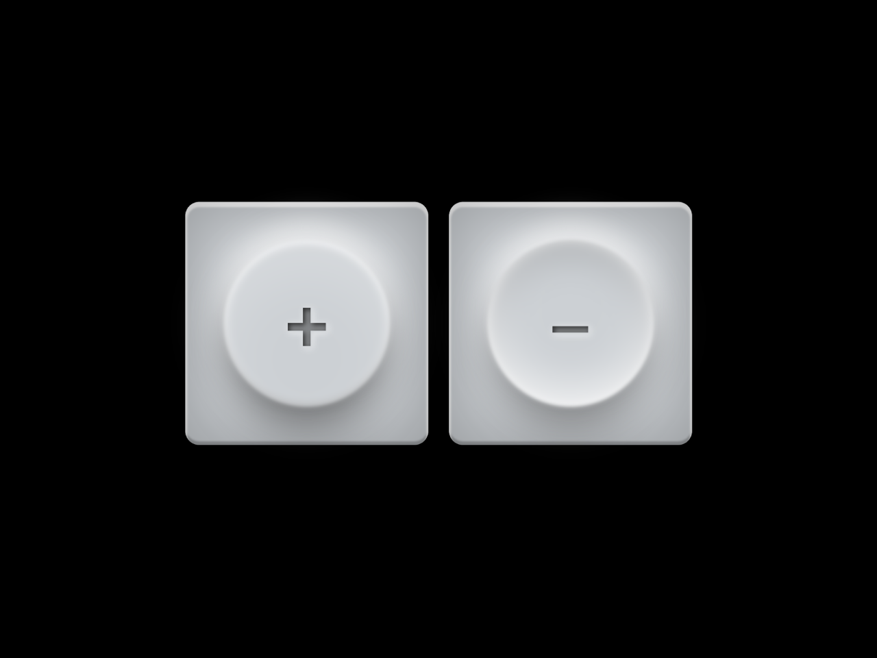

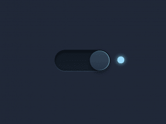
This code snippet helps you to create squishy toggle buttons using pure CSS. The buttons respond dynamically to user interaction, delivering a visually appealing design. Designed with CSS, it offers an easy way to enhance your website’s user interface. Incorporating elegant shadows and subtle transitions, these buttons bring a modern touch to your web projects. Its perfect for adding interactive elements without the need for complex JavaScript.
How to Create Squishy Toggle Buttons Using Pure CSS
1. First of all, load Reset CSS and Prefixfree JS by adding the following CDN links into the head tag of your HTML document.
<link rel="stylesheet" href="https://cdnjs.cloudflare.com/ajax/libs/meyer-reset/2.0/reset.min.css">
<script src="https://cdnjs.cloudflare.com/ajax/libs/prefixfree/1.0.7/prefixfree.min.js"></script>
2. Include the necessary HTML structure to create the toggle buttons. Use the following code snippet inside the <div class="container"> element.
<div class="container">
  <div class="toggle">
    <input type="checkbox">
    <span class="button"></span>
    <span class="label">+</span>
  </div>
  <div class="toggle">
    <input type="checkbox" checked>
    <span class="button"></span>
    <span class="label">–</span>
  </div>
</div>
3. Copy and paste the CSS code into your stylesheets or in a <style> tag within your HTML file. This CSS code defines the appearance and animations of the toggle buttons.
@import url(https://fonts.googleapis.com/css?family=Lato:700);
html, body {
  font-family: "Lato", sans-serif;
  background: url(https://s.cdpn.io/1715/dark_stripes.png);
  text-align: center;
  height: 100%;
}

.container {
  text-align: center;
  position: absolute;
  margin-top: -80px;
  width: 100%;
  top: 50%;
}

.toggle {
  margin: 4px;
  display: inline-block;
}

.toggle {
  box-shadow: inset 0 0 35px 5px rgba(0, 0, 0, 0.25), inset 0 2px 1px 1px rgba(255, 255, 255, 0.9), inset 0 -2px 1px 0 rgba(0, 0, 0, 0.25);
  border-radius: 8px;
  background: #ccd0d4;
  position: relative;
  height: 140px;
  width: 140px;
}
.toggle:before {
  box-shadow: 0 0 17.5px 8.75px #fff;
  border-radius: 118.3px;
  background: #fff;
  position: absolute;
  margin-left: -50.4px;
  margin-top: -50.4px;
  opacity: 0.2;
  content: "";
  height: 100.8px;
  width: 100.8px;
  left: 50%;
  top: 50%;
}
.toggle .button {
  -webkit-filter: blur(1px);
  -moz-filter: blur(1px);
  filter: blur(1px);
  transition: all 300ms cubic-bezier(0.23, 1, 0.32, 1);
  box-shadow: 0 15px 25px -4px rgba(0, 0, 0, 0.5), inset 0 -3px 4px -1px rgba(0, 0, 0, 0.2), 0 -10px 15px -1px rgba(255, 255, 255, 0.6), inset 0 3px 4px -1px rgba(255, 255, 255, 0.2), inset 0 0 5px 1px rgba(255, 255, 255, 0.8), inset 0 20px 30px 0 rgba(255, 255, 255, 0.2);
  border-radius: 96.32px;
  position: absolute;
  background: #ccd0d4;
  margin-left: -48.16px;
  margin-top: -48.16px;
  display: block;
  height: 96.32px;
  width: 96.32px;
  left: 50%;
  top: 50%;
}
.toggle .label {
  transition: color 300ms ease-out;
  text-shadow: 1px 1px 3px #ccd0d4, 0 0 0 rgba(0, 0, 0, 0.8), 1px 1px 4px #fff;
  line-height: 139px;
  text-align: center;
  position: absolute;
  font-weight: 700;
  font-size: 42px;
  display: block;
  opacity: 0.9;
  height: 100%;
  width: 100%;
  color: rgba(0, 0, 0, 0.4);
}
.toggle input {
  opacity: 0;
  position: absolute;
  cursor: pointer;
  z-index: 1;
  height: 100%;
  width: 100%;
  left: 0;
  top: 0;
}
.toggle input:active ~ .button {
  box-shadow: 0 15px 25px -4px rgba(0, 0, 0, 0.4), inset 0 -8px 30px 1px rgba(255, 255, 255, 0.9), 0 -10px 15px -1px rgba(255, 255, 255, 0.6), inset 0 8px 25px 0 rgba(0, 0, 0, 0.4), inset 0 0 10px 1px rgba(255, 255, 255, 0.6);
}
.toggle input:active ~ .label {
  font-size: 40px;
  color: rgba(0, 0, 0, 0.45);
}
.toggle input:checked ~ .button {
  box-shadow: 0 15px 25px -4px rgba(0, 0, 0, 0.4), inset 0 -8px 25px -1px rgba(255, 255, 255, 0.9), 0 -10px 15px -1px rgba(255, 255, 255, 0.6), inset 0 8px 20px 0 rgba(0, 0, 0, 0.2), inset 0 0 5px 1px rgba(255, 255, 255, 0.6);
}
.toggle input:checked ~ .label {
  font-size: 40px;
  color: rgba(0, 0, 0, 0.4);
}
Feel free to customize the buttons by adjusting the CSS properties such as colors, sizes, or shadows. Experiment with the code to match your website’s design.
That’s all! hopefully, you have successfully created squishy toggle buttons on your website/app. If you have any questions or suggestions, feel free to comment below.
Similar Code Snippets:

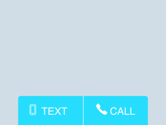
- Click To Call and Text Button HTML Code
- 10 Digit Phone Number Validation in HTML


I code and create web elements for amazing people around the world. I like work with new people. New people new Experiences.
I truly enjoy what I’m doing, which makes me more passionate about web development and coding. I am always ready to do challenging tasks whether it is about creating a custom CMS from scratch or customizing an existing system.