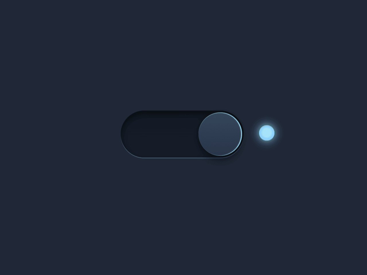

This CSS only code snippet helps you to create a toggle button with smooth transition. It converts the checkbox inputs to a beautiful switch toggle button. You just need to wrap your checkbox input to a div element and define its class name “switch”, then it will converted to a toggle button. Furthermore, you can also place a span element inside it that will show as an indicator.
How to Create CSS Only Toggle Button with Smooth Transition
1. First of all, create an input element with type checkbox and define its name attribute “toggle”. Define the label and span element, warp all these elements into a div element and define its class name “switch”. The complete HTML structure for the toggle switch button is as follows:
<div class="switch">
  <input type="checkbox" name="toggle">
  <label for="toggle"><i></i></label>
  <span></span> </div>
2. Style the toggle button using the following CSS.
.cd__main { background: #202838 !important; }

.switch input {
  top: 0;
  right: 0;
  bottom: 0;
  left: 0;
  -ms-filter: "progid:DXImageTransform.Microsoft.Alpha(Opacity=0)";
  filter: alpha(opacity=0);
  -moz-opacity: 0;
  opacity: 0;
  z-index: 100;
  position: absolute;
  width: 100%;
  height: 100%;
  cursor: pointer;
}

.switch {
  width: 180px;
  height: 55px;
  position: relative;
  margin: 100px auto;
}

.switch label {
  display: block;
  width: 80%;
  height: 100%;
  position: relative;
  background: #1F2736; /*#121823*/
  background: linear-gradient(#121823, #161d2b);
  border-radius: 30px 30px 30px 30px;
  box-shadow: inset 0 3px 8px 1px rgba(0,0,0,0.5),  inset 0 1px 0 rgba(0,0,0,0.5),  0 1px 0 rgba(255,255,255,0.2);
  -webkit-transition: all .5s ease;
  transition: all .5s ease;
}

.switch input ~ label i {
  display: block;
  height: 51px;
  width: 51px;
  position: absolute;
  left: 2px;
  top: 2px;
  z-index: 2;
  border-radius: inherit;
  background: #283446; /* Fallback */
  background: linear-gradient(#36455b, #283446);
  box-shadow: inset 0 1px 0 rgba(255,255,255,0.2),  0 0 8px rgba(0,0,0,0.3),  0 12px 12px rgba(0,0,0,0.4);
  -webkit-transition: all .5s ease;
  transition: all .5s ease;
}

.switch label + span {
  content: "";
  display: inline-block;
  position: absolute;
  right: 0px;
  top: 17px;
  width: 18px;
  height: 18px;
  border-radius: 10px;
  background: #283446;
  background: gradient-gradient(#36455b, #283446);
  box-shadow: inset 0 1px 0 rgba(0,0,0,0.2),  0 1px 0 rgba(255,255,255,0.1),  0 0 10px rgba(185,231,253,0),  inset 0 0 8px rgba(0,0,0,0.9),  inset 0 -2px 5px rgba(0,0,0,0.3),  inset 0 -5px 5px rgba(0,0,0,0.5);
  -webkit-transition: all .5s ease;
  transition: all .5s ease;
  z-index: 2;
}

/* Toggle */

.switch input:checked ~ label + span {
  content: "";
  display: inline-block;
  position: absolute;
  width: 18px;
  height: 18px;
  border-radius: 10px;
  -webkit-transition: all .5s ease;
  transition: all .5s ease;
  z-index: 2;
  background: #b9f3fe;
  background: gradient-gradient(#ffffff, #77a1b9);
  box-shadow: inset 0 1px 0 rgba(0,0,0,0.1),  0 1px 0 rgba(255,255,255,0.1),  0 0 10px rgba(100,231,253,1),  inset 0 0 8px rgba( 61,157,247,0.8),  inset 0 -2px 5px rgba(185,231,253,0.3),  inset 0 -3px 8px rgba(185,231,253,0.5);
}

.switch input:checked ~ label i {
  left: auto;
  left: 63%;
  box-shadow: inset 0 1px 0 rgba(255,255,255,0.2),  0 0 8px rgba(0,0,0,0.3),  0 8px 8px rgba(0,0,0,0.3),  inset -1px 0 1px #b9f3fe;
  -webkit-transition: all .5s ease;
  transition: all .5s ease;
}
That’s all! hopefully, you have successfully created CSS only toggle button. If you have any questions or suggestions, feel free to comment below.
Similar Code Snippets:
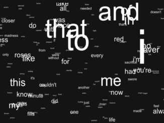
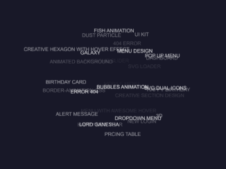
 Floating Words Animation Using Vanilla JavaScript
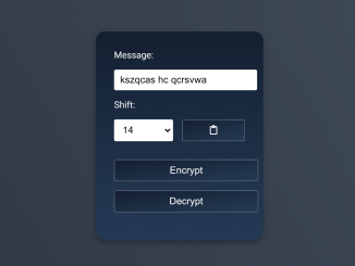
- Caesar Cipher Encrypt and Decrypt in JavaScript
- 10 Digit Phone Number Validation in HTML


I code and create web elements for amazing people around the world. I like work with new people. New people new Experiences.
I truly enjoy what I’m doing, which makes me more passionate about web development and coding. I am always ready to do challenging tasks whether it is about creating a custom CMS from scratch or customizing an existing system.