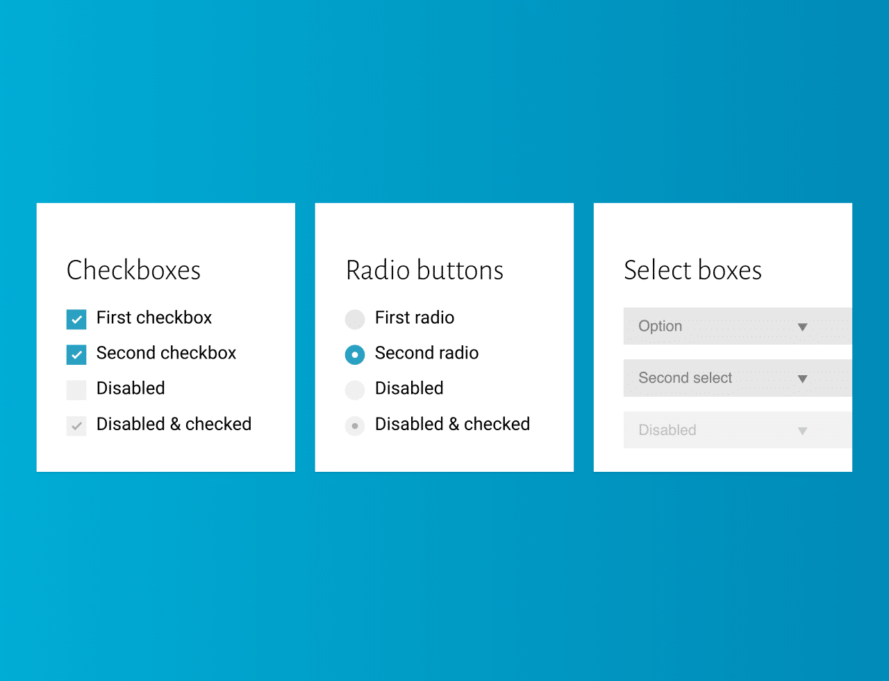

This CSS code snippet helps you to set the custom styles the radio input, checkbox, and select box. It enhances their appearance. The CSS creates interactive, visually appealing form elements. It improves the look and feel of basic HTML form controls. These styles offer better user interaction. The code employs CSS classes for a clean, modern design.
You can use this code to style checkboxes, radio buttons, and select boxes on your website. It gives a sleek, modern look to your forms, improving user experience.
How to Create Custom Styles For Radio Checkbox And Select Box
1. First of all, load the Google Fonts and Normalize CSS by adding the following CDN links into the head tag of your HTML document.
<link href='https://fonts.googleapis.com/css?family=Alegreya+Sans:300,400|Source+Sans+Pro:400,300' rel='stylesheet' type='text/css'>
<link rel="stylesheet" href="https://cdnjs.cloudflare.com/ajax/libs/normalize/5.0.0/normalize.min.css">
2. Copy the following HTML and CSS code into your project. The HTML includes the structure for checkboxes, radio buttons, and select boxes. The CSS contains the styles needed to customize these elements.
<div class="container">
  <div class="control-group">
    <h1>Checkboxes</h1>
    <label class="control control--checkbox">First checkbox
      <input type="checkbox" checked="checked"/>
      <div class="control__indicator"></div>
    </label>
    <label class="control control--checkbox">Second checkbox
      <input type="checkbox"/>
      <div class="control__indicator"></div>
    </label>
    <label class="control control--checkbox">Disabled
      <input type="checkbox" disabled="disabled"/>
      <div class="control__indicator"></div>
    </label>
    <label class="control control--checkbox">Disabled & checked
      <input type="checkbox" disabled="disabled" checked="checked"/>
      <div class="control__indicator"></div>
    </label>
  </div>
  <div class="control-group">
    <h1>Radio buttons</h1>
    <label class="control control--radio">First radio
      <input type="radio" name="radio" checked="checked"/>
      <div class="control__indicator"></div>
    </label>
    <label class="control control--radio">Second radio
      <input type="radio" name="radio"/>
      <div class="control__indicator"></div>
    </label>
    <label class="control control--radio">Disabled
      <input type="radio" name="radio2" disabled="disabled"/>
      <div class="control__indicator"></div>
    </label>
    <label class="control control--radio">Disabled & checked
      <input type="radio" name="radio2" disabled="disabled" checked="checked"/>
      <div class="control__indicator"></div>
    </label>
  </div>
  <div class="control-group">
    <h1>Select boxes</h1>
    <div class="select">
      <select>
        <option>First select</option>
        <option>Option</option>
        <option>Option</option>
      </select>
      <div class="select__arrow"></div>
    </div>
    <div class="select">
      <select>
        <option>Second select</option>
        <option>Option</option>
        <option>Option</option>
      </select>
      <div class="select__arrow"></div>
    </div>
    <div class="select">
      <select disabled="disabled">
        <option>Disabled</option>
        <option>Option</option>
        <option>Option</option>
      </select>
      <div class="select__arrow"></div>
    </div>
  </div>
</div>
3. Now, use the following CSS code to style the radio inputs, and checkboxes and select inputs. You can adjust these styles or class names to suit your design preferences.
html,
body {
  height: 100%;
}

body {
  background: #e6e6e6;
  font-family: 'Source Sans Pro', sans-serif;
}
.container {
  width: 100%;
  height: 100%;
  display: flex;
  flex-wrap: wrap;
  justify-content: center;
  align-items: center;
}
h1 {
  font-family: 'Alegreya Sans', sans-serif;
  font-weight: 300;
  margin-top: 0;
}
.control-group {
  display: inline-block;
  vertical-align: top;
  background: #fff;
  text-align: left;
  box-shadow: 0 1px 2px rgba(0,0,0,0.1);
  padding: 30px;
  width: 200px;
  height: 210px;
  margin: 10px;
}
.control {
  display: block;
  position: relative;
  padding-left: 30px;
  margin-bottom: 15px;
  cursor: pointer;
  font-size: 18px;
}
.control input {
  position: absolute;
  z-index: -1;
  opacity: 0;
}
.control__indicator {
  position: absolute;
  top: 2px;
  left: 0;
  height: 20px;
  width: 20px;
  background: #e6e6e6;
}
.control--radio .control__indicator {
  border-radius: 50%;
}
.control:hover input ~ .control__indicator,
.control input:focus ~ .control__indicator {
  background: #ccc;
}
.control input:checked ~ .control__indicator {
  background: #2aa1c0;
}
.control:hover input:not([disabled]):checked ~ .control__indicator,
.control input:checked:focus ~ .control__indicator {
  background: #0e647d;
}
.control input:disabled ~ .control__indicator {
  background: #e6e6e6;
  opacity: 0.6;
  pointer-events: none;
}
.control__indicator:after {
  content: '';
  position: absolute;
  display: none;
}
.control input:checked ~ .control__indicator:after {
  display: block;
}
.control--checkbox .control__indicator:after {
  left: 8px;
  top: 4px;
  width: 3px;
  height: 8px;
  border: solid #fff;
  border-width: 0 2px 2px 0;
  transform: rotate(45deg);
}
.control--checkbox input:disabled ~ .control__indicator:after {
  border-color: #7b7b7b;
}
.control--radio .control__indicator:after {
  left: 7px;
  top: 7px;
  height: 6px;
  width: 6px;
  border-radius: 50%;
  background: #fff;
}
.control--radio input:disabled ~ .control__indicator:after {
  background: #7b7b7b;
}
.select {
  position: relative;
  display: inline-block;
  margin-bottom: 15px;
  width: 100%;
}
.select select {
  display: inline-block;
  width: 100%;
  cursor: pointer;
  padding: 10px 15px;
  outline: 0;
  border: 0;
  border-radius: 0;
  background: #e6e6e6;
  color: #7b7b7b;
  appearance: none;
  -webkit-appearance: none;
  -moz-appearance: none;
}
.select select::-ms-expand {
  display: none;
}
.select select:hover,
.select select:focus {
  color: #000;
  background: #ccc;
}
.select select:disabled {
  opacity: 0.5;
  pointer-events: none;
}
.select__arrow {
  position: absolute;
  top: 16px;
  right: 15px;
  width: 0;
  height: 0;
  pointer-events: none;
  border-style: solid;
  border-width: 8px 5px 0 5px;
  border-color: #7b7b7b transparent transparent transparent;
}
.select select:hover ~ .select__arrow,
.select select:focus ~ .select__arrow {
  border-top-color: #000;
}
.select select:disabled ~ .select__arrow {
  border-top-color: #ccc;
}
That’s all! hopefully, you have successfully created custom styles for the radio input, checkboxes, and select box. If you have any questions or suggestions, feel free to comment below.
Similar Code Snippets:

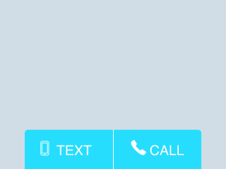
- Click To Call and Text Button HTML Code
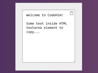
- Textarea Copy To Clipboard Button
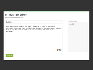
- HTML5 Text Editor With File Reader API
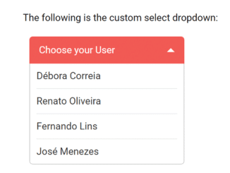
- JavaScript Custom Select Dropdown with Description

I code and create web elements for amazing people around the world. I like work with new people. New people new Experiences.
I truly enjoy what I’m doing, which makes me more passionate about web development and coding. I am always ready to do challenging tasks whether it is about creating a custom CMS from scratch or customizing an existing system.