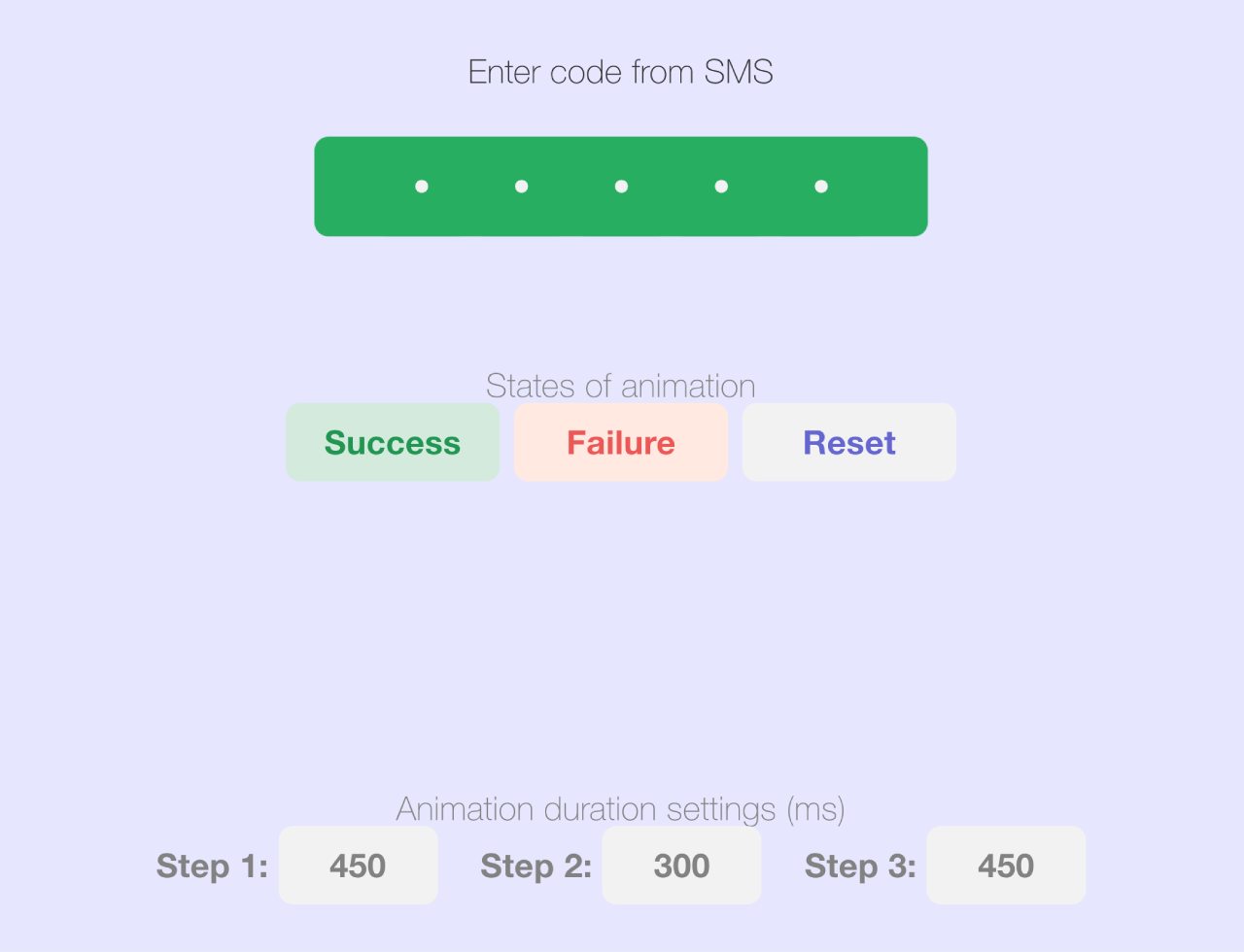

This HTML & CSS code snippet helps you to create an engaging SMS OTP code input animation. It allows users to enter a code with visually pleasing feedback. The animation reacts to success or failure, enhancing user experience. Additionally, you can customize animation durations for a personalized touch. Perfect for adding a dynamic and user-friendly SMS input feature to your web projects.
How to Create SMS OTP Input Animation Using HTML CSS
1. First of all, Copy the following HTML code. It includes the main container, SMS input fieldset, animation controls, and settings controls. Ensure you maintain the class names for proper styling and functionality.
<div>
  <div class="main">
    <p class="label">Enter code from SMS</p>
    <!-- SMS Code input -->
      <div class="fieldset">
      <! –– container should be fieldset element but there is bug in Chromium https://bugs.chromium.org/p/chromium/issues/detail?id=262679 ––>
        <label class="box"><input class="field" type="text" placeholder="•" /></label>
        <label class="box"><input class="field" type="text" placeholder="•" /></label>
        <label class="box"><input class="field" type="text" placeholder="•" /></label>
        <label class="box"><input class="field" type="text" placeholder="•" /></label>
        <label class="box"><input class="field" type="text" placeholder="•" /></label>
    </div>
    <!-- End SMS Code input -->
  </div>
  <div class="animation-controls">
    <p class="label is-muted">States of animation</p>
    <div class="animation-controls__content">
      <button class="btn success-btn" type="button">Success</button>
      <button class="btn failure-btn" type="button">Failure</button>
      <button class="btn reset-btn" type="button">Reset</button>
    </div>
  </div>
  <div class="settings-controls">
    <p class="label is-muted">Animation duration settings (ms)</p>
    <div class="settings-controls__content">
      <div>
        <label class="settings-controls__label" for="step-1">Step 1:</label>
        <input id="step-1" name="step-1" class="settings-controls__input" data-step="1" type="text" placeholder="Value" value="450">
      </div>
      <div>
        <label class="settings-controls__label" for="step-2">Step 2:</label>
        <input id="step-2" name="step-2" class="settings-controls__input" data-step="2" type="text" placeholder="Value" value="300">
      </div>
      <div>
        <label class="settings-controls__label" for="step-3">Step 3:</label>
        <input id="step-3" name="step-3" class="settings-controls__input" data-step="3" type="text" placeholder="Value" value="450">
      </div>
    </div>
  </div>
</div>
2. Copy the entire CSS code into your project. These styles define the look and behavior of the SMS input and animation. The CSS includes color palettes, transition properties, and responsive design for various screen sizes.
:root {
  /* colors palette */
  --placeholder-color: hsl(240, 54%, 87%);
  --bg-color: hsl(240, 54%, 97%);
  --focus-color: hsla(240, 54%, 61%, 0.6);
  --shadow-color: hsla(240, 54%, 61%, 0.2);
  --text-color: hsl(0, 0%, 20%);
  --text-color-inversed: hsl(0, 0%, 95%);
  --success-color: hsl(145, 63%, 42%);
  --success-color-desaturated: hsl(145, 0%, 42%);
  --failure-color: hsl(0, 79%, 63%);

  /* border-radius */
  --border-radius: 6px;

  /* z-index */
  --z-index-xs: 1;
  --z-index-sm: 10;
  --z-index-md: 100;

  /* easing */
  --easing: cubic-bezier(0.25, 0.01, 0.25, 1);

  /* transition durations */
  --transition-duration-step-1: 450ms;
  --transition-duration-step-2: 300ms;
  --transition-duration-step-3: 300ms;

  /* transition delays */
  --transition-delay-step-2: calc(var(--transition-duration-step-1));
  --transition-delay-step-3: calc(
    var(--transition-duration-step-1) + var(--transition-duration-step-2)
  );

  /* transition properties */
  --transition-step-1: var(--transition-duration-step-1) var(--easing);
  --transition-step-2: var(--transition-duration-step-2) var(--easing)
    var(--transition-delay-step-2);
  --transition-step-3: var(--transition-duration-step-3) var(--easing)
    var(--transition-delay-step-3);
}

/* General styles */
*,
*::after,
*::before {
  box-sizing: border-box;
  font-family: Helvetica Neue;
}
body {
  display: flex;
  justify-content: center;
  align-items: center;
  height: 100vh;
  width: 100vw;
  margin: 0;
}
.main {
  display: grid;
  justify-content: center;
}
.label {
  font-size: 14px;
  line-height: 15px;
  text-align: center;
  letter-spacing: 0.01em;
  color: var(--text-color);
}
.label.is-muted {
  color: #828282;
}
.animation-controls {
  margin-top: 55px;
}
.animation-controls__content {
  display: grid;
  grid-auto-flow: column;
  justify-content: center;
  gap: 6px;
}
.btn {
  min-width: 90px;
  padding: 9px 0;
  border: 0;
  border-radius: 6px;
  font-size: 14px;
  line-height: 15px;
  letter-spacing: 0.01em;
  font-weight: bold;
  cursor: pointer;
  transition: opacity 150ms ease-in;
}
.btn:hover,
.btn:focus {
  opacity: 0.7;
}
.btn:active {
  position: relative;
  top: 1px;
}
.btn.success-btn {
  color: #219653;
  background-color: #d3eadd;
}
.btn.failure-btn {
  color: #eb5757;
  background-color: #ffe9e0;
}
.btn.reset-btn {
  color: #6666d1;
  background-color: #f2f2f2;
}
.settings-controls {
  margin-top: 130px;
}
.settings-controls__content {
  display: grid;
  justify-content: center;
  gap: 18px;
}
.settings-controls__input {
  width: 67px;
  height: 33px;
  border: 0;
  border-radius: 6px;
  font-size: 14px;
  line-height: 15px;
  font-weight: bold;
  letter-spacing: 0.01em;
  color: #828282;
  background-color: #f2f2f2;
  text-align: center;
}
.settings-controls__label {
  font-size: 14px;
  line-height: 15px;
  letter-spacing: 0.01em;
  font-weight: bold;
  color: #828282;
}

@media (min-width: 768px) {
  .settings-controls__content {
    grid-auto-flow: column;
  }
}

/* SMS Code input styles */
/* base styles */

.fieldset {
  position: relative;
  display: grid;
  grid-auto-flow: column;
  justify-content: center;
  column-gap: 12px;
  border-radius: 6px;
  overflow: hidden;
  will-change: transform;
  /* make shadows of inner elements visible */
  padding: 6px;
  margin: -6px;
}
.fieldset::before {
  content: "";
  position: absolute;
  top: 0;
  left: 0;
  height: 100%;
  width: 100%;
  transform: translateX(-100%);
}


.box {
  position: relative;
  display: flex;
  align-items: center;
  justify-content: center;
  height: 42px;
  width: 42px;
  border-radius: var(--border-radius);
  box-shadow: 0 0 6px 1px var(--shadow-color);
  overflow: hidden;
  will-change: transform;
}
.box:focus-within {
  box-shadow: 0 0 6px 1px var(--shadow-color), 0 0 0 2px var(--focus-color);
}
.box::before,
.box::after {
  content: "";
  position: absolute;
  height: 100%;
  width: 100%;
  top: 0;
  left: 0;
  border-radius: var(--border-radius);
  overflow: hidden;
}
.box::before {
  background: var(--bg-color);
  z-index: var(--z-index-xs);
  transition: background-color var(--transition-step-1);
}
.box::after {
  transform: translateY(100%);
  background-color: var(--success-color-desaturated);
  opacity: 0;
  z-index: var(--z-index-sm);
  transition: transform var(--transition-step-1),
    opacity var(--transition-step-1), background-color var(--transition-step-1);
}

.field {
  position: relative;
  border: 0;
  outline: 0;
  font-size: 25.21px;
  line-height: 42px;
  color: var(--text-color);
  background-color: transparent;
  text-align: center;
  z-index: var(--z-index-md);
}
.field::placeholder {
  color: var(--placeholder-color);
}

/* animate-success styles  */

.animate-success.fieldset {
  padding: 0;
  margin: 0;
}
.animate-success.fieldset::before {
  background-color: var(--success-color);
  transform: translateX(0);
  transition: transform var(--transition-step-2);
}

.animate-success > .box {
  box-shadow: none;
  transition: transform var(--transition-step-3);
}
.animate-success > .box:nth-child(1) {
  transform: translateX(24px);
}
.animate-success > .box:nth-child(2) {
  transform: translateX(12px);
}
.animate-success > .box:nth-child(4) {
  transform: translateX(-12px);
}
.animate-success > .box:nth-child(5) {
  transform: translateX(-24px);
}

.animate-success > .box::before {
  background-color: transparent;
}
.animate-success > .box::after {
  background-color: var(--success-color);
  transform: translateY(0);
  opacity: 1;
}

.animate-success > .box > .field,
.animate-success > .box > .field::placeholder {
  color: var(--text-color-inversed);
  transition: color var(--transition-step-1);
}

/* animate-failure styles  */

.animate-failure.fieldset {
  animation-name: shaking;
  animation-duration: var(--transition-duration-step-2);
  animation-timing-function: var(--easing);
  animation-delay: var(--transition-delay-step-2);
}

.animate-failure > .box::before {
  background-color: transparent;
}
.animate-failure > .box::after {
  background-color: var(--failure-color);
  transform: translateY(0);
  opacity: 1;
}

.animate-failure > .box > .field,
.animate-failure > .box > .field::placeholder {
  color: var(--text-color-inversed);
  transition: color var(--transition-step-1);
}

@keyframes shaking {
  0%,
  100% {
    transform: translateX(0);
  }

  25%,
  75% {
    transform: translateX(10px);
  }

  50% {
    transform: translateX(-10px);
  }
}
/* End SMS Code input styles */
3. Finally, copy the following JavaScript code to implement the logic behind the SMS input and animation. This script handles user input, success and failure animations, and allows customization of animation durations through the settings controls.
const root = document.documentElement;

function getCustomPropertyValue(name) {
  const styles = getComputedStyle(root);
  return styles.getPropertyValue(name);
}

/*
  SMS Code input logic
  primitive implementation of multi-input

  Disclaimer: this «pen» was made for presentational pruposes.
  It's not a production-ready solution, because it lacks of many best UX and a11y
  practices. Let it inspire you and I hope you will enjoy it 🙂
*/

const fieldset = document.querySelector(".fieldset");
const fields = document.querySelectorAll(".field");
const boxes = document.querySelectorAll(".box");

function handleInputField({ target }) {
  const value = target.value.slice(0, 1);
  target.value = value;

  const step = value ? 1 : -1;
  const fieldIndex = [...fields].findIndex((field) => field === target);
  const focusToIndex = fieldIndex + step;

  if (focusToIndex < 0 || focusToIndex >= fields.length) return;

  fields[focusToIndex].focus();
}
fields.forEach((field) => {
  field.addEventListener("input", handleInputField);
});

/* End SMS Code input logic */

// Controls
const successBtn = document.querySelector(".success-btn");
const failureBtn = document.querySelector(".failure-btn");
const resetBtn = document.querySelector(".reset-btn");

successBtn.addEventListener("click", (event) => {
  fieldset.classList.add("animate-success");
});
resetBtn.addEventListener("click", (event) => {
  fieldset.classList.remove("animate-failure");
  fieldset.classList.remove("animate-success");
});
failureBtn.addEventListener("click", (event) => {
  function getDelay() {
    const firstStepDuration = getCustomPropertyValue(
      "--transition-duration-step-1"
    );
    const secondStepDuration = getCustomPropertyValue(
      "--transition-duration-step-2"
    );

    return parseInt(firstStepDuration) + parseInt(secondStepDuration);
  }

  function animateFailure() {
    fieldset.classList.add("animate-failure");
    const delay = getDelay();

    setTimeout(() => {
      fieldset.classList.remove("animate-failure");
    }, delay);
  }

  if (fieldset.classList.contains("animate-success")) {
    fieldset.classList.remove("animate-success");

    const delay = parseInt(getCustomPropertyValue("--transition-duration-step-1"))

    setTimeout(() => {
      animateFailure();
    }, delay)

    return;
  }

  animateFailure();
});

const inputs = document.querySelectorAll(".settings-controls__input");

function setAnimationDuration({ target }) {
  const {
    value,
    dataset: { step }
  } = target;
  const safeValue = parseInt(value);
  const propertyValue = Number.isNaN(safeValue) ? null : safeValue + "ms";

  root.style.setProperty(`--transition-duration-step-${step}`, propertyValue);
}
inputs.forEach((node) => {
  node.addEventListener("input", setAnimationDuration);
});
That’s all! hopefully, you have successfully created SMS OTP Input Animation on your webpage. If you have any questions or suggestions, feel free to comment below.
Similar Code Snippets:
 Generate 4 Digit Random Pin and Validate in JavaScript
- JavaScript Copy to Clipboard with Callback Function


I code and create web elements for amazing people around the world. I like work with new people. New people new Experiences.
I truly enjoy what I’m doing, which makes me more passionate about web development and coding. I am always ready to do challenging tasks whether it is about creating a custom CMS from scratch or customizing an existing system.