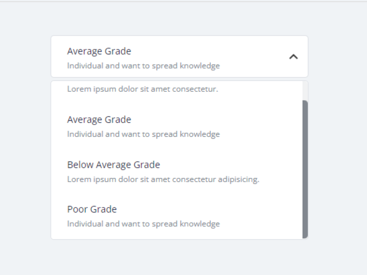

This code creates a custom select-option dropdown with description using CSS and Vanilla JavaScript. It replaces the standard select-option menu with radio buttons and labels to display relevant information. The user can select an option, and the chosen content is displayed.
It enhances user experience by providing detailed descriptions for each option, making it easier for users to select the right choice. Moreover, you can customize the select dropdown with additional CSS according to your needs.
How to Create Custom Select Dropdown with Description in JavaScript
1. First, create the HTML structure for the select dropdown as follows. Replace “Option Title” and “Option Description” with your specific content. You can add more options by duplicating this structure.
<div class="container">
	<div class="top-text-wrapper">
		<h2>Select Option Dropdown with CSS & Vanilla JS</h2>
		<p>Custom select-option dropdown menu instead <code>select-option</code>. Here I use <code>input[type=radio]</code> and <code>label</code> to store the required information to display</p>
		<hr>
	</div>

	<div class="select-box">
		<div class="options-container">
			<div class="option">
				<input
							 type="radio"
							 class="radio"
							 id="grade-a"
							 name="category"
							 />
				<label for="grade-a">
					<h3>Highest Grade</h3>
					<h5>Lorem ipsum dolor sit amet consectetur.</h5>
				</label>
			</div>

			<div class="option">
				<input type="radio" class="radio" id="grade-b" name="category" />
				<label for="grade-b">
					<h3>Average Grade</h3>
					<h5>Individual and want to spread knowledge </h5>
				</label>
			</div>

			<div class="option">
				<input type="radio" class="radio" id="grade-c" name="category" />
				<label for="grade-c">
					<h3>Below Average Grade</h3>
					<h5>Lorem ipsum dolor sit amet consectetur adipisicing.</h5>
				</label>
			</div>
			<div class="option">
				<input type="radio" class="radio" id="grade-c" name="category" />
				<label for="grade-c">
					<h3>Poor Grade</h3>
					<h5>Individual and want to spread knowledge</h5>
				</label>
			</div>
		</div>
		<div class="selected">
			<h3>Highest Grade</h3>
			<h5>Individual and want to spread knowledge </h5>
			<!-- <svg xmlns="http://www.w3.org/2000/svg" id="icon-arrow" width="14" height="8">
						<path d="M13.508.174a.57.57 0 00-.809 0l-5.86 6.43L.976.175a.57.57 0 00-.81 0 .577.577 0 000 .813l6.238 6.844c.119.12.277.17.433.163a.564.564 0 00.433-.163L13.508.987a.577.577 0 000-.813z"/>
					</svg> -->
		</div>
	</div>
	<!-- 		/.select-box -->
</div>
<!-- 		/.container -->
2. Now, include the necessary CSS styles in your HTML file or link to an external CSS file. These styles define the appearance of your custom select dropdown. You can use the following CSS code or customize it to match your design.
@import url('https://fonts.googleapis.com/css?family=Open+Sans:300,300i,400,400i,600,600i,700,700i,800,800i&display=swap');
* {
  margin: 0;
  box-sizing: border-box;
}

body{
  font-family: 'Open Sans', sans-serif;
  font-size: 15px;
  line-height: 1.5;
  font-weight: 400;
  background: #f0f3f6;
  color: #3a3a3a;
}
hr {
  margin: 20px 0;
  border: none;
  border-bottom: 1px solid #d9d9d9;
}
label, input{
	cursor: pointer;
}
h2,h3,h4,h5{
	font-weight: 600;
	line-height: 1.3;
	color: #1f2949;
}
h2{
	font-size: 24px;
}
h3 {
	font-size: 18px;
}
h4 {
	font-size: 14px;
}
h5 {
	font-size: 12px;
	font-weight: 400;
}
img{
	max-width: 100%;
	display: block;
	vertical-align: middle;
}

.container {
  padding: 0 15px;
	display: grid;
	grid-template-columns: 1fr;
	place-items: center;
}

.top-text-wrapper {
	margin: 20px 0 30px 0;
}
.top-text-wrapper h4{
	font-size: 24px;
  margin-bottom: 10px;
}
.top-text-wrapper code{
  font-size: .85em;
  background: linear-gradient(90deg,#fce3ec,#ffe8cc);
  color: #ff2200;
  padding: .1rem .3rem .2rem;
  border-radius: .2rem;
}
.tab-section-wrapper{
  padding: 30px 0;
}

.select-box {
  display: flex;
  width: 400px;
  flex-direction: column;
	position: relative;
}

.select-box .options-container {
  max-height: 0;
  width: calc( 100% - 12px);
  opacity: 0;
  transition: all 0.4s;
  overflow: hidden;
  border-radius: 5px;
  border: solid 1px #dcdfe5;
  background-color: #ffffff;
  order: 1;
	position: absolute;
	top: 68px;
  box-sizing: border-box;
}

.selected {
  background: #2f3640;
  margin-bottom: 8px;
  position: relative;
  width: 388px;
  height: 64px;
  border-radius: 5px;
  border: solid 1px #dcdfe5;
  background-color: #ffffff;
  order: 0;
}

.selected::after {
	/* Font Awesome	 */
	content: "⌄";
	font-weight: 900;
	-webkit-font-smoothing: antialiased;
	display: inline-block;
	font-style: normal;
	font-variant: normal;
	text-rendering: auto;
	line-height: 1;
	/* BG Img	 */
/* 	content:  url("img/arrow-down.svg");	 */
	position: absolute;
	right: 15px;
	top: 50%;
	transition: transform .5s;
	transform: translateY(-50%);
}


.selected h3, .select-box label h3 {
  font-family: "Open Sans", sans-serif;
  font-size: 14px;
  font-weight: 400;
  line-height: 1.57;
  color: #1f2949;
}
.selected h5, .select-box label h5{
  font-family: "Open Sans", sans-serif;
  font-size: 12px;
  font-weight: 400;
  line-height: 1.83;
  color: #81878f;
}

.select-box .options-container.active {
  max-height: 240px;
  opacity: 1;
  overflow-y: scroll;
}

.select-box .options-container.active + .selected::after {
  transform: translateY(-50%) rotateX(180deg);
}

.select-box .options-container::-webkit-scrollbar {
  width: 8px;
  background: #0d141f;
  background: #81878f;
  background: #f1f2f3;
  border-radius: 0 5px 5px 0;
}

.select-box .options-container::-webkit-scrollbar-thumb {
  background: #525861;
  background: #81878f;
  border-radius: 0 5px 5px 0;
}
.select-box .option,
.selected {
  padding: 12px 24px;
  cursor: pointer;
}

.select-box .option:hover {
  background: #dcdfe5;
}

.select-box label {
  cursor: pointer;
}

.select-box .option .radio {
  display: none;
}
3. Finally, add the JavaScript code to enable user interaction. This code allows users to click on options and see their descriptions in the selected area. Insert the provided JavaScript code in your HTML file, just before the closing </body> tag.
const selected = document.querySelector(".selected");
const optionsContainer = document.querySelector(".options-container");
const optionsList = document.querySelectorAll(".option");

selected.addEventListener("click", () => {
	optionsContainer.classList.toggle("active");
});

optionsList.forEach(option => {
	option.addEventListener("click", () => {
		selected.innerHTML = option.querySelector("label").innerHTML;
		optionsContainer.classList.remove("active");
	});
});
That’s it! You’ve successfully created a custom select dropdown with descriptions using JavaScript. This user-friendly interface enhances the selection process on your website or web application. If you have any questions or suggestions, feel free to comment below.
Similar Code Snippets:

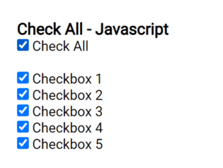
- Flight Reservation Form HTML Code
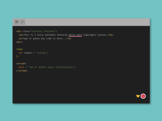
- Textarea Code Editor With Syntax Highlighting
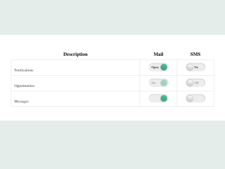
- iOS Style Toggle Buttons Using CSS
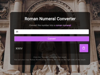
- Roman Numeral Converter Using JavaScript
- Dashed Text Shadow Using CSS


I code and create web elements for amazing people around the world. I like work with new people. New people new Experiences.
I truly enjoy what I’m doing, which makes me more passionate about web development and coding. I am always ready to do challenging tasks whether it is about creating a custom CMS from scratch or customizing an existing system.