
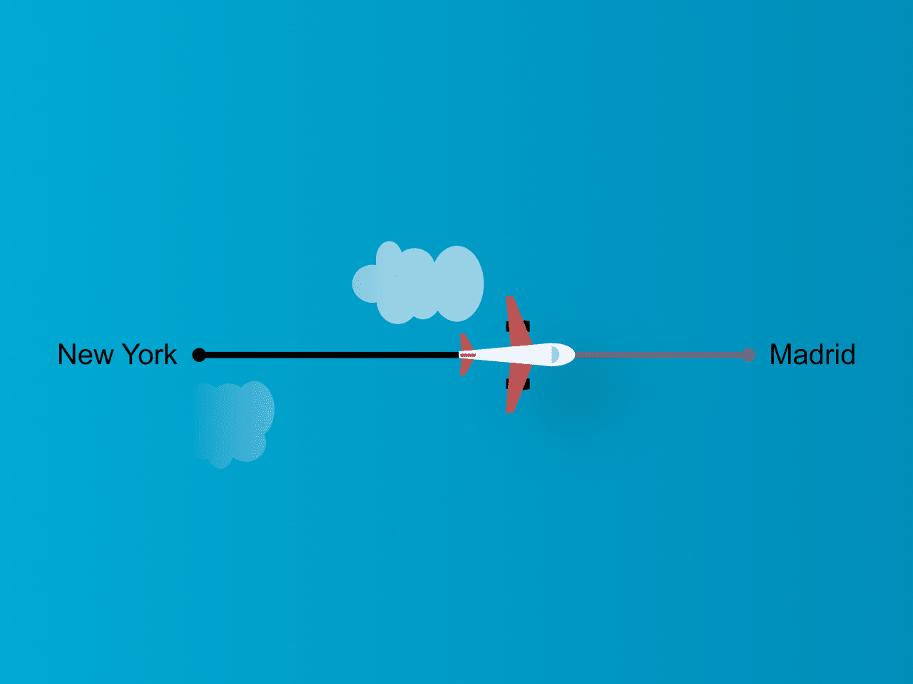
This code creates a custom range slider with a flight icon using HTML and CSS. The slider represents a flight path from one destination to another, allowing users to visualize the journey’s progress. The flight icon moves along the slider as it’s adjusted, simulating a plane’s movement. The slider’s appearance dynamically changes based on the selected percentage flown, enhancing user interaction and experience.
How to Create Custom Range Slider With Flight Icon in CSS
1. Start by creating the HTML structure for the slider. We’ll use a <div> element with the class flight-component to contain the slider, along with <span> elements to label the departure and destination cities.
<div class="flight-component">
  <span>New York</span>
  <input type="range" class="flight" style="--val:0" value="0" min="0" max="100" oninput="this.style=&singleQuote;--val:&singleQuote;+this.value" aria-label="percentage flown" />
  <span>Madrid</span>
</div>
2. Next, apply CSS styles to customize the appearance of the slider and add the flight icon. The CSS code provided will handle the styling and animation of the slider and flight icon.
body {
  min-height: 100vh;
  margin: 0;
  display: grid;
  place-items: center;
  background: #c2e5f9;
}

.flight-component {
  --w: min(700px, 90vw);
  width: var(--w);
  display: flex;
  align-items: center;
  justify-content: space-between;
  gap: 0.5em;
  font-family:  Helvetica, Arial, sans-serif;
  font-weight: 200;
  font-size: 1.25rem;
}

/*
Didn&singleQuote;t nest this one, in case I wanted to use the input by itself
without the div/span structure (in that case: add width!!)
*/
.flight-component input,
input.flight {
  --bg: #6c6c84;
  --scale: clamp(1, calc(1 + 0.5 * sin(pi * var(--val) / 100)), 2);
  --shadow: clamp(0.15em, calc(1em * sin(pi * var(--val) / 100)), 1em);
  --opacity: clamp(0.2, calc(1 - sin(pi * var(--val) / 100)), 0.4);
  --color: rgb(0 0 0 / var(--opacity));
  --primary: #f0f4fc;
  --secondary: #b55;
  --val: 0;
  --height: 3em;
  appearance: none;
  container-type: inline-size;
  flex: 1;
  height: var(--height);
  border: none; /* Firefox adds a default border */
  border-radius: 10em;
  position: relative;
  background:
    radial-gradient(circle at 0.35em 50%, var(--bg) 0.35em, #0000 0) no-repeat,
    radial-gradient(circle at calc(100% - 0.35em) 50%, var(--bg) 0.35em, #0000 0) no-repeat,
    linear-gradient(#0000 45%, var(--bg) 0 55%, #0000 0) 50% 50% / 99% 100%,
    #f000;
  border: 0;
  -webkit-print-color-adjust: exact;
  print-color-adjust: exact;

  /*
  the ::before and ::after won&singleQuote;t work on Firefox for input range,
  so only use for decoration on the other browsers
  */
  &::before {
    content: "";
    width: calc(var(--val)  * 1%);
    min-width: 0.5em;
    height: 100%;
    position: absolute;
    top: 0;
    left: 0;
    background:
      radial-gradient(circle at 0.35em 50%, #000 0.35em, #0000 0) no-repeat,
      linear-gradient(#0000 45%, #000 0 55%, #0000 0) 50% 50% / calc(100% - 1em) 100% no-repeat,
      #f000;
  }

  &::after {
    content: "";
    width: 100%;
    height: 12em;
    position: absolute;
    top: 50%;
    left: 0;
    transform: translate(0, -50%);
    pointer-events: none;
    background:
      /* cloud 1 */
      radial-gradient(3% 20% at 50% 20%, #fff 40%, #0000 0),
      radial-gradient(3% 20% at 52.5% 13%, #fff 40%, #0000 0),
      radial-gradient(2% 20% at 51% 10%, #fff 40%, #0000 0),
      radial-gradient(2.5% 20% at 51.5% 27%, #fff 50%, #0000 0),
      radial-gradient(2% 20% at 53% 23%, #fff 60%, #0000 0),
      radial-gradient(4% 40% at 55% 20%, #fff 40%, #0000 0),
      /* cloud 2 */
      radial-gradient(3% 20% at 40% 80%, #fff 40%, #0000 0),
      radial-gradient(3% 20% at 42.5% 87%, #fff 40%, #0000 0),
      radial-gradient(2% 20% at 41% 90%, #fff 40%, #0000 0),
      radial-gradient(2.5% 20% at 41.5% 72%, #fff 50%, #0000 0),
      radial-gradient(2% 20% at 43% 73%, #fff 60%, #0000 0),
      radial-gradient(4% 40% at 40% 78%, #fff 40%, #0000 0);
    background-size: 300% 100%;
    background-position: calc(var(--val) * 1%) 0;
    -webkit-mask: linear-gradient(90deg, #0000, #0008 35% 65%, #0000);
    mask: linear-gradient(90deg, #0000, #0008 35% 65%, #0000);
  }

  /* track for Chrome and Safari (Firefox is ok) */
  &::-webkit-slider-runnable-track {
    height: 100%;
    /* so the plane is above the clouds */
    position: relative;
    z-index: 1;
    -webkit-print-color-adjust: exact;
    print-color-adjust: exact;
  }


  /* Thumb for Chrome and Safari */
  &::-webkit-slider-thumb {
    -webkit-appearance: none; /* Override default look */
    appearance: none;
    transform: translateY(calc(-50% + var(--height) / 2)) scale(var(--scale));
    width: 4em;
    aspect-ratio: 1;
    pointer-events: none;
    background:
      linear-gradient(var(--secondary) 0 0) 2% 50% / 13% 2.5% no-repeat,
      /* main frame */
      conic-gradient(at -40% 50%, #0000 84.75deg, var(--primary) 85deg 95deg, #0000 95.25deg) 0 0 / 80% 100%,
      /* pilot */
      radial-gradient(closest-side circle at calc(100% - 0.85em) 50%, #9cf 0.3em, #0000 0),
      radial-gradient(20% 10% at 80% 50%, var(--primary) 99%, #0000),
      /* tail */
      conic-gradient(at 45% -45%, #0000 150deg, var(--secondary) 151deg 174deg, #0000 175deg) -50% 40% / 53% 20%,
      conic-gradient(at 45% 145%, #0000 5deg, var(--secondary) 6deg 29deg, #0000 30deg) -50% 60% / 53% 20%,
      /* wings */
      conic-gradient(at 38% -45%, #0000 158deg, var(--secondary) 158.5deg 174deg, #0000 174.5deg) 0 0 / 100% 50%,
      conic-gradient(at 38% 145%, #0000 5deg, var(--secondary) 5.5deg 21deg, #0000 21.5deg) 0 100% / 100% 50%,
      /* engines */
      radial-gradient(80% 50%, #000 99%, #0000) 51% 22% / 21% 11%,
      radial-gradient(80% 50%, #000 99%, #0000) 51% 78% / 21% 11%;
    background-repeat: no-repeat;
    border-radius: 20% / 100%;
    filter: drop-shadow(calc(var(--shadow) * 2) calc(var(--shadow) * 1.25) var(--shadow) var(--color));
    box-shadow: none; /* Safari adds a box-shadow when using drop-shadow on iOS, remove manually */
    -webkit-print-color-adjust: exact;
    print-color-adjust: exact;
  }

  /* Thumb for Firefox */
  &::-moz-range-thumb {
    -webkit-appearance: none; /* Override default look */
    appearance: none;
    transform: scale(var(--scale));
    width: 4em;
    height: 4em;
    border: none;
    pointer-events: none;
    background:
      linear-gradient(var(--secondary) 0 0) 2% 50% / 13% 2.5% no-repeat,
      /* main frame */
      conic-gradient(at -40% 50%, #0000 84.75deg, var(--primary) 85deg 95deg, #0000 95.25deg) 0 0 / 80% 100%,
      /* pilot */
      radial-gradient(closest-side circle at calc(100% - 0.85em) 50%, #9cf 0.3em, #0000 0),
      radial-gradient(20% 10% at 80% 50%, var(--primary) 99%, #0000),
      /* tail */
      conic-gradient(at 45% -45%, #0000 150deg, var(--secondary) 151deg 174deg, #0000 175deg) -50% 40% / 53% 20%,
      conic-gradient(at 45% 145%, #0000 5deg, var(--secondary) 6deg 29deg, #0000 30deg) -50% 60% / 53% 20%,
      /* wings */
      conic-gradient(at 38% -45%, #0000 158deg, var(--secondary) 158.5deg 174deg, #0000 174.5deg) 0 0 / 100% 50%,
      conic-gradient(at 38% 145%, #0000 5deg, var(--secondary) 5.5deg 21deg, #0000 21.5deg) 0 100% / 100% 50%,
      /* engines */
      radial-gradient(80% 50%, #000 99%, #0000) 51% 22% / 21% 11%,
      radial-gradient(80% 50%, #000 99%, #0000) 51% 78% / 21% 11%;
    background-repeat: no-repeat;
    border-radius: 20% / 100%;
    filter: drop-shadow(calc(var(--shadow) * 2) calc(var(--shadow) * 1.25) var(--shadow) var(--color));
    box-shadow: none;
    -webkit-print-color-adjust: exact;
    print-color-adjust: exact;
  }
}


@media (prefers-contrast: more) {
  .flight-component input,
  input.flight {

    &::-webkit-slider-runnable-track {
      border: 2px solid #666;
      height: 0;
    }

    &::-webkit-slider-thumb {
      transform: translateY(-50%) scale(var(--scale));
      box-sizing: border-box;
      border: 2em solid Highlight;
      clip-path: polygon(0.00% 47.00%,3.00% 46.62%,0.88% 31.62%,5.38% 31.25%,13.38% 45.75%,44.38% 42.50%,43.00% 29.50%,40.25% 29.00%,40.00% 21.50%,42.75% 20.88%,40.00% 0.00%,47.12% 0.12%,55.00% 19.88%,60.88% 19.88%,60.88% 29.12%,58.88% 29.38%,63.75% 40.62%,81.75% 39.75%,88.00% 40.38%,93.00% 42.00%,97.25% 44.38%,99.25% 46.62%,100.00% 50.00%,99.25% 53.38%,97.25% 55.62%,93.00% 58.00%,88.00% 59.62%,81.75% 60.25%,63.75% 59.38%,58.88% 70.62%,60.88% 70.88%,60.88% 80.12%,55.00% 80.12%,47.12% 100.00%,40.00% 100.00%,42.75% 79.12%,40.00% 78.50%,40.25% 71.00%,43.00% 70.50%,44.38% 57.50%,13.38% 54.25%,5.38% 68.75%,0.88% 68.38%,3.00% 53.38%,0.00% 53.00%);
    }

    &::-moz-range-track {
      border: 2px solid #000;
      height: 0;
    }

    &::-moz-range-thumb {
      box-sizing: border-box;
      border: 2em solid Highlight;
      clip-path: polygon(0.00% 47.00%,3.00% 46.62%,0.88% 31.62%,5.38% 31.25%,13.38% 45.75%,44.38% 42.50%,43.00% 29.50%,40.25% 29.00%,40.00% 21.50%,42.75% 20.88%,40.00% 0.00%,47.12% 0.12%,55.00% 19.88%,60.88% 19.88%,60.88% 29.12%,58.88% 29.38%,63.75% 40.62%,81.75% 39.75%,88.00% 40.38%,93.00% 42.00%,97.25% 44.38%,99.25% 46.62%,100.00% 50.00%,99.25% 53.38%,97.25% 55.62%,93.00% 58.00%,88.00% 59.62%,81.75% 60.25%,63.75% 59.38%,58.88% 70.62%,60.88% 70.88%,60.88% 80.12%,55.00% 80.12%,47.12% 100.00%,40.00% 100.00%,42.75% 79.12%,40.00% 78.50%,40.25% 71.00%,43.00% 70.50%,44.38% 57.50%,13.38% 54.25%,5.38% 68.75%,0.88% 68.38%,3.00% 53.38%,0.00% 53.00%);
    }
  }
}

/* the clouds look bad in smaller screens, hide them */
@container (max-width: 400px) {
  .flight-component input,
  input.flight {
    &::after {
      display: none;
    }

    /* replace the place with a helicopter */
    &::-webkit-slider-thumb {
      width: 3em;
      background:
        /* rotors */
        radial-gradient(closest-side circle at 50% 50%, var(--secondary) 10%, #0001 11% 90%, #0000 91%) 100% 50% / 90% 90%,
        radial-gradient(closest-side circle at 50% 50%, #0000 0 20%, #0001 0 40%, #0000 0 60%, #0001 0 80%, #0000 0) 100% 50% / 91% 91%,
        /* main frame */
        conic-gradient(at -65% 50%, #0000 84.75deg, var(--primary) 85deg 95deg, #0000 95.25deg) 0 0 / 80% 100%,
        /* pilot */
        radial-gradient(farthest-side circle at calc(100% - 0.5em) 50%, #9cf 0.4em, #0000 0),
        radial-gradient(25% 20% at 75% 50%, var(--primary) 99%, #0000),
        /* tail */
        conic-gradient(at 45% -45%, #0000 150deg, var(--secondary) 151deg 174deg, #0000 175deg) -49% 40% / 53% 25%,
        conic-gradient(at 45% 145%, #0000 5deg, var(--secondary) 6deg 29deg, #0000 30deg) -49% 60% / 53% 25%,
        /* legs? */
        linear-gradient(#000 0 0) 100% 33% / 60% 4%,
        linear-gradient(#000 0 0) 100% 67% / 60% 4%
        ;
      background-repeat: no-repeat;
    }

    &::-moz-range-thumb {
      width: 3em;
      height: 3em;
      background:
        /* rotors */
        radial-gradient(closest-side circle at 55% 50%, var(--secondary) 10%, #0001 11% 90%, #0000 91%),
        radial-gradient(closest-side circle at 50% 50%, #0000 0 20%, #0001 0 40%, #0000 0 60%, #0001 0 80%, #0000 0) 50% 50% / 91% 91%,
        /* main frame */
        conic-gradient(at -65% 50%, #0000 84.75deg, var(--primary) 85deg 95deg, #0000 95.25deg) 0 0 / 80% 100%,
        /* pilot */
        radial-gradient(farthest-side circle at calc(100% - 0.5em) 50%, #9cf 0.4em, #0000 0),
        radial-gradient(25% 20% at 75% 50%, var(--primary) 99%, #0000),
        /* tail */
        conic-gradient(at 45% -45%, #0000 150deg, var(--secondary) 151deg 174deg, #0000 175deg) -49% 40% / 53% 25%,
        conic-gradient(at 45% 145%, #0000 5deg, var(--secondary) 6deg 29deg, #0000 30deg) -49% 60% / 53% 25%,
        /* legs? */
        linear-gradient(#000 0 0) 100% 33% / 60% 4%,
        linear-gradient(#000 0 0) 100% 67% / 60% 4%
        ;
      background-repeat: no-repeat;
    }
  }
}
If desired, you can adjust the CSS styles to ensure the slider looks good on different screen sizes. The provided CSS includes media queries for adjusting styles based on screen width.
That’s all! hopefully, you have successfully created a Custom Range Slider With a Flight Icon in your web/app project. If you have any questions or suggestions, feel free to comment below.
Similar Code Snippets:
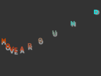
 Floating Words Animation Using Vanilla JavaScript
- CSS Multiline Text With Ellipsis
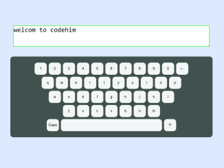
- Virtual Keyboard JavaScript Source Code
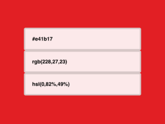
- Convert Hex Color to RGB and HSL
- Animated Text Using CSS and JavaScript


I code and create web elements for amazing people around the world. I like work with new people. New people new Experiences.
I truly enjoy what I’m doing, which makes me more passionate about web development and coding. I am always ready to do challenging tasks whether it is about creating a custom CMS from scratch or customizing an existing system.