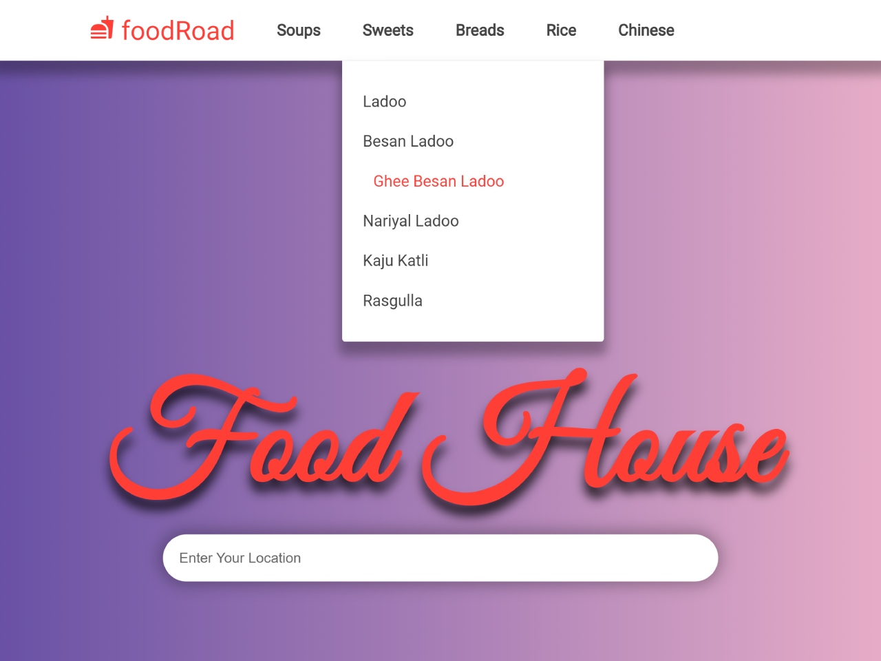

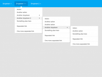
This HTML and CSS code snippet helps you to create a dropdown menu with a smooth transition. When you hover over a menu item, it smoothly reveals a dropdown with links.
You can use this code for your website’s navigation menu to create a stylish and responsive dropdown effect. It enhances user interaction and improves navigation, making your website more user-friendly.
How to Create Transition Dropdown Menu Css
1. First of all, load Google Fonts by adding the following CDN links into the head tag of your HTML document. (Optional)
<link rel='stylesheet' href='https://fonts.googleapis.com/icon?family=Material+Icons'> <link rel='stylesheet' href='https://fonts.googleapis.com/css?family=Great+Vibes&display=swap'> <link rel='stylesheet' href='https://fonts.googleapis.com/css?family=Lato:100,300,400,700,900&display=swap'>
2. Create the HTML structure for your navigation menu. In your HTML file, include the necessary links and menu items. Each dropdown menu should be wrapped in a container.
<nav class="navbar">
      <a href="#" class="navbar-logo"><i class="material-icons">fastfood</i> foodRoad</a>
      <ul class="navbar-links">
        <li class="navbar-dropdown">
          <a href="#">Soups</a>
          <div class="dropdown">
            <a href="#">Tomato Soup</a>
            <a href="#">Veg Manchow Soup</a>
            <a href="#">Veg Hot Soup</a>
          </div>
        </li>
        <li class="navbar-dropdown">
          <a href="#">Sweets</a>
          <div class="dropdown">
            <a href="#">Ladoo</a>
            <a href="#">Besan Ladoo</a>
            <a href="#">Ghee Besan Ladoo</a>
            <a href="#">Nariyal Ladoo</a>
            <a href="#">Kaju Katli</a>
            <a href="#">Rasgulla</a>
          </div>
        </li>
        <li class="navbar-dropdown">
          <a href="#">Breads</a>
          <div class="dropdown">
            <a href="#">Lachha Paratha</a>
            <a href="#">Rumali Roti</a>
            <a href="#">Tandoori Roti</a>
            <a href="#">Butter Roti</a>
            <a href="#">Plain Naan</a>
            <a href="#">Butter Naan</a>
          </div>
        </li>
        <li class="navbar-dropdown">
          <a href="#">Rice</a>
          <div class="dropdown">
            <a href="#">Plain Rice</a>
            <a href="#">Veg Pulao</a>
            <a href="#">Veg Biryani</a>
            <a href="#">Paneer Biryani</a>
            <a href="#">Lemon Rice</a>
            <a href="#">Veg Kashmiri Pulao</a>
          </div>
        </li>
        <li class="navbar-dropdown">
          <a href="#">Chinese</a>
          <div class="dropdown">
            <a href="#">Paneer Chill Dry</a>
            <a href="#">Paneer Garlic</a>
            <a href="#">Veg Garlic</a>
            <a href="#">Veg Chilli</a>
          </div>
        </li>
      </ul>
    </nav>
    <header class="header">
      <div class="header-inner">
        <h1>Food House</h1>
        <form>
          <input type="search" placeholder="Enter Your Location" />
          <div class="overlay"></div>
        </form>
      </div>
    </header>
3. Next, add the following CSS code to your project. This code will style your navigation menu and create the transition effect.
* {
  padding: 0;
  margin: 0;
  box-sizing: border-box;
}

body {
  font-family: "Lato", sans-serif;
}

.overlay {
  position: fixed;
  top: 0;
  left: 0;
  width: 100vw;
  height: 100vh;
  background-color: rgba(0, 0, 0, 0.9);
  z-index: -1;
  opacity: 0;
  transition: 1s all;
}

.navbar {
  display: flex;
  align-items: center;
  width: 100vw;
  background-color: #fff;
  box-shadow: 0px 10px 10px 3px rgba(0, 0, 0, 0.3);
  position: relative;
  padding: 0px 70px;
  background-color: #fff;
}
.navbar-logo {
  color: #ff3f34;
  text-decoration: none;
  font-size: 25px;
  padding: 0px 20px;
}

.navbar-links {
  list-style-type: none;
  display: flex;
}
.navbar-links li a {
  display: block;
  text-decoration: none;
  color: #444;
  padding: 20px 20px;
  font-weight: 700;
  transition: 0.4s all;
}

.navbar-links li.navbar-dropdown {
  position: relative;
}

.navbar-links li.navbar-dropdown:hover .dropdown {
  visibility: visible;
  opacity: 1;
  transform: translateY(0px);
}

.navbar-links li.navbar-dropdown .dropdown {
  visibility: hidden;
  opacity: 0;
  position: absolute;
  padding: 20px 0;
  top: 100%;
  transform: translateY(50px);
  left: 0;
  width: 250px;
  background-color: #fff;
  box-shadow: 0px 10px 10px 3px rgba(0, 0, 0, 0.3);
  border-bottom-left-radius: 3px;
  border-bottom-right-radius: 3px;
  z-index: 111;
  transition: 0.4s all;
}
.navbar-links li.navbar-dropdown .dropdown a {
  padding-top: 10px;
  padding-bottom: 10px;
  font-weight: 400;
}
.navbar-dropdown .dropdown a:hover {
  padding-left: 30px;
}
.navbar-links li a:hover {
  color: #ff3f34;
}

.header {
  display: flex;
  justify-content: center;
  align-items: center;
  width: 100vw;
  height: 90vh;
  /* background-color: #f00; */
  background-image: url("http://lorempixel.com/1366/698/food/");
  background-size: cover;
}

.header-inner {
  text-align: center;
  color: #ff3f34;
  text-shadow: 0px 10px 10px rgba(0, 0, 0, .8);
}

.header-inner h1 {
  font-family: "Great Vibes", cursive;
  font-size: 130px;
}

.header-inner form input[type="search"] {
  position: relative;
  width: 500px;
  border: none;
  padding: 15px;
  border-radius: 27px;
  box-shadow: 0px 0px 15px 3px rgba(0, 0, 0, 0.3);
  z-index: 11;
}
.header-inner form input[type="search"]:focus {
  outline: none;
}

.header-inner form input[type="search"]:focus + div {
  z-index: 1;
  opacity: 1;
}

::placeholder {
  color: #666;
  font-weight: 400;
}
Feel free to customize the CSS to match your website’s design and branding. You can modify colors, fonts, and sizes to make the menu uniquely yours.
By following this tutorial, you can create an elegant transition dropdown menu for your website using CSS. This simple addition will enhance user experience and give your website a professional touch. Customize it to match your design, and you’re ready to impress your visitors.
Similar Code Snippets:

- Dock Navbar Using HTML and CSS
- Open Dropdown on Button Click JavaScript
- Responsive Navigation with Dropdown and Search Box
- JavaScript Tab Navigation with Indicator

I code and create web elements for amazing people around the world. I like work with new people. New people new Experiences.
I truly enjoy what I’m doing, which makes me more passionate about web development and coding. I am always ready to do challenging tasks whether it is about creating a custom CMS from scratch or customizing an existing system.