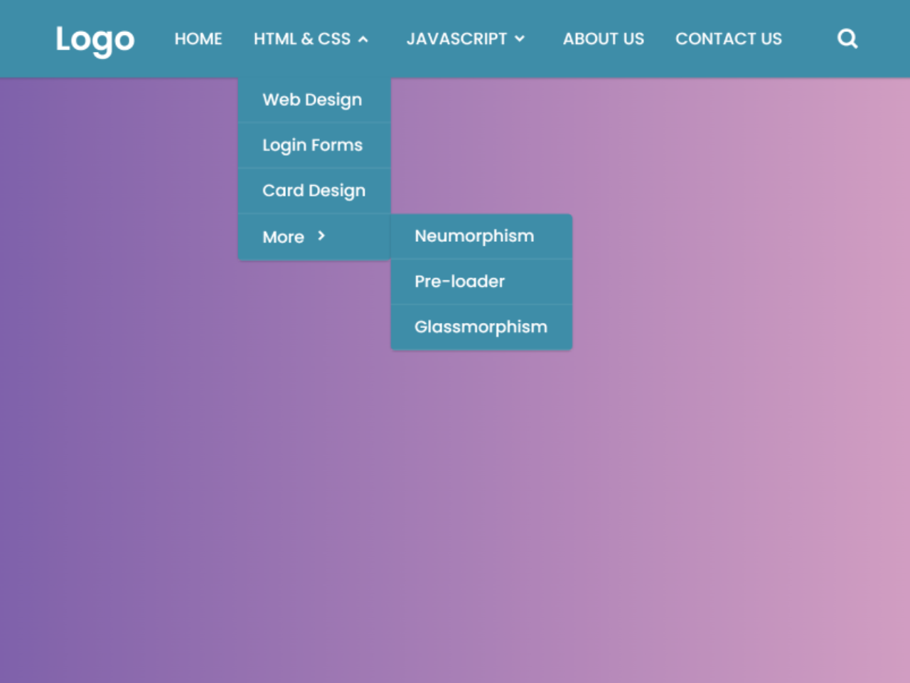

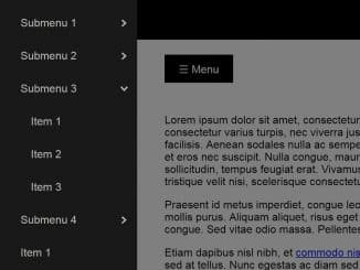
The code helps you to create a responsive navigation menu with dropdown and search box. It allows users to navigate through different sections of a website efficiently and perform searches.
The menu comes with a horizontal menubar with a log, nav links, and a toggle button for the search box. The dropdowns show when you hover over them and the search box smoothly slides up when you click the search icon.
How to Create Responsive Navigation with Dropdown and Search Box
1. First of all, load the Box Icons CSS by adding the following CDN link into the head tag of your HTML document.
<link rel='stylesheet' href='https://unpkg.com/boxicons@2.0.7/css/boxicons.min.css'>
2. Create the HTML structure for the menu as follows. Inside the <nav> element, build the navigation bar structure as shown in the provided code. You can customize the menu items, links, and logo to fit your website’s needs.
<nav>
  <div class="navbar">
    <i class='bx bx-menu'></i>
    <div class="logo"><a href="#">Logo</a></div>
    <div class="nav-links">
      <div class="sidebar-logo">
        <span class="logo-name">Logo</span>
        <i class='bx bx-x' ></i>
      </div>
      <ul class="links">
        <li><a href="#">HOME</a></li>
        <li>
          <a href="#">HTML & CSS</a>
          <i class='bx bxs-chevron-down htmlcss-arrow arrow  '></i>
          <ul class="htmlCss-sub-menu sub-menu">
            <li><a href="#">Web Design</a></li>
            <li><a href="#">Login Forms</a></li>
            <li><a href="#">Card Design</a></li>
            <li class="more">
              <span><a href="#">More</a>
                <i class='bx bxs-chevron-right arrow more-arrow'></i>
              </span>
              <ul class="more-sub-menu sub-menu">
                <li><a href="#">Neumorphism</a></li>
                <li><a href="#">Pre-loader</a></li>
                <li><a href="#">Glassmorphism</a></li>
              </ul>
            </li>
          </ul>
        </li>
        <li>
          <a href="#">JAVASCRIPT</a>
          <i class='bx bxs-chevron-down js-arrow arrow '></i>
          <ul class="js-sub-menu sub-menu">
            <li><a href="#">Dynamic Clock</a></li>
            <li><a href="#">Form Validation</a></li>
            <li><a href="#">Card Slider</a></li>
            <li><a href="#">Complete Website</a></li>
          </ul>
        </li>
        <li><a href="#">ABOUT US</a></li>
        <li><a href="#">CONTACT US</a></li>
      </ul>
    </div>
    <div class="search-box">
      <i class='bx bx-search'></i>
      <div class="input-box">
        <input type="text" placeholder="Search...">
      </div>
    </div>
  </div>
</nav>
3. Now, add the following CSS code into your stylesheet or link to it using a <link> tag in the <head> section. This CSS code styles the navigation bar and makes it responsive.
/* Googlefont Poppins CDN Link */
@import url('https://fonts.googleapis.com/css2?family=Poppins:wght@200;300;400;500;600;700&display=swap');
*{
  margin: 0;
  padding: 0;
  box-sizing: border-box;
  font-family: 'Poppins', sans-serif;
}

body{
  min-height: 100vh;
}
nav{
  position: fixed;
  top: 0;
  left: 0;
  width: 100%;
  height: 100%;
  height: 70px;
  background: #3E8DA8;
  box-shadow: 0 1px 2px rgba(0, 0, 0, 0.2);
  z-index: 99;
}
nav .navbar{
  height: 100%;
  max-width: 1250px;
  width: 100%;
  display: flex;
  align-items: center;
  justify-content: space-between;
  margin: auto;
  /* background: red; */
  padding: 0 50px;
}
.navbar .logo a{
  font-size: 30px;
  color: #fff;
  text-decoration: none;
  font-weight: 600;
}
nav .navbar .nav-links{
  line-height: 70px;
  height: 100%;
}
nav .navbar .links{
  display: flex;
}
nav .navbar .links li{
  position: relative;
  display: flex;
  align-items: center;
  justify-content: space-between;
  list-style: none;
  padding: 0 14px;
}
nav .navbar .links li a{
  height: 100%;
  text-decoration: none;
  white-space: nowrap;
  color: #fff;
  font-size: 15px;
  font-weight: 500;
}
.links li:hover .htmlcss-arrow,
.links li:hover .js-arrow{
  transform: rotate(180deg);
  }

nav .navbar .links li .arrow{
  /* background: red; */
  height: 100%;
  width: 22px;
  line-height: 70px;
  text-align: center;
  display: inline-block;
  color: #fff;
  transition: all 0.3s ease;
}
nav .navbar .links li .sub-menu{
  position: absolute;
  top: 70px;
  left: 0;
  line-height: 40px;
  background: #3E8DA8;
  box-shadow: 0 1px 2px rgba(0, 0, 0, 0.2);
  border-radius: 0 0 4px 4px;
  display: none;
  z-index: 2;
}
nav .navbar .links li:hover .htmlCss-sub-menu,
nav .navbar .links li:hover .js-sub-menu{
  display: block;
}
.navbar .links li .sub-menu li{
  padding: 0 22px;
  border-bottom: 1px solid rgba(255,255,255,0.1);
}
.navbar .links li .sub-menu a{
  color: #fff;
  font-size: 15px;
  font-weight: 500;
}
.navbar .links li .sub-menu .more-arrow{
  line-height: 40px;
}
.navbar .links li .htmlCss-more-sub-menu{
  /* line-height: 40px; */
}
.navbar .links li .sub-menu .more-sub-menu{
  position: absolute;
  top: 0;
  left: 100%;
  border-radius: 0 4px 4px 4px;
  z-index: 1;
  display: none;
}
.links li .sub-menu .more:hover .more-sub-menu{
  display: block;
}
.navbar .search-box{
  position: relative;
   height: 40px;
  width: 40px;
}
.navbar .search-box i{
  position: absolute;
  height: 100%;
  width: 100%;
  line-height: 40px;
  text-align: center;
  font-size: 22px;
  color: #fff;
  font-weight: 600;
  cursor: pointer;
  transition: all 0.3s ease;
}
.navbar .search-box .input-box{
  position: absolute;
  right: calc(100% - 40px);
  top: 80px;
  height: 60px;
  width: 300px;
  background: #3E8DA8;
  border-radius: 6px;
  opacity: 0;
  pointer-events: none;
  transition: all 0.4s ease;
}
.navbar.showInput .search-box .input-box{
  top: 65px;
  opacity: 1;
  pointer-events: auto;
  background: #3E8DA8;
}
.search-box .input-box::before{
  content: '';
  position: absolute;
  height: 20px;
  width: 20px;
  background: #3E8DA8;
  right: 10px;
  top: -6px;
  transform: rotate(45deg);
}
.search-box .input-box input{
  position: absolute;
  top: 50%;
  left: 50%;
  border-radius: 4px;
  transform: translate(-50%, -50%);
  height: 35px;
  width: 280px;
  outline: none;
  padding: 0 15px;
  font-size: 16px;
  border: none;
}
.navbar .nav-links .sidebar-logo{
  display: none;
}
.navbar .bx-menu{
  display: none;
}
@media (max-width:920px) {
  nav .navbar{
    max-width: 100%;
    padding: 0 25px;
  }

  nav .navbar .logo a{
    font-size: 27px;
  }
  nav .navbar .links li{
    padding: 0 10px;
    white-space: nowrap;
  }
  nav .navbar .links li a{
    font-size: 15px;
  }
}
@media (max-width:800px){
  nav{
    /* position: relative; */
  }
  .navbar .bx-menu{
    display: block;
  }
  nav .navbar .nav-links{
    position: fixed;
    top: 0;
    left: -100%;
    display: block;
    max-width: 270px;
    width: 100%;
    background:  #3E8DA8;
    line-height: 40px;
    padding: 20px;
    box-shadow: 0 5px 10px rgba(0, 0, 0, 0.2);
    transition: all 0.5s ease;
    z-index: 1000;
  }
  .navbar .nav-links .sidebar-logo{
    display: flex;
    align-items: center;
    justify-content: space-between;
  }
  .sidebar-logo .logo-name{
    font-size: 25px;
    color: #fff;
  }
    .sidebar-logo  i,
    .navbar .bx-menu{
      font-size: 25px;
      color: #fff;
    }
  nav .navbar .links{
    display: block;
    margin-top: 20px;
  }
  nav .navbar .links li .arrow{
    line-height: 40px;
  }
nav .navbar .links li{
    display: block;
  }
nav .navbar .links li .sub-menu{
  position: relative;
  top: 0;
  box-shadow: none;
  display: none;
}
nav .navbar .links li .sub-menu li{
  border-bottom: none;

}
.navbar .links li .sub-menu .more-sub-menu{
  display: none;
  position: relative;
  left: 0;
}
.navbar .links li .sub-menu .more-sub-menu li{
  display: flex;
  align-items: center;
  justify-content: space-between;
}
.links li:hover .htmlcss-arrow,
.links li:hover .js-arrow{
  transform: rotate(0deg);
  }
  .navbar .links li .sub-menu .more-sub-menu{
    display: none;
  }
  .navbar .links li .sub-menu .more span{
    /* background: red; */
    display: flex;
    align-items: center;
    /* justify-content: space-between; */
  }

  .links li .sub-menu .more:hover .more-sub-menu{
    display: none;
  }
  nav .navbar .links li:hover .htmlCss-sub-menu,
  nav .navbar .links li:hover .js-sub-menu{
    display: none;
  }
.navbar .nav-links.show1 .links .htmlCss-sub-menu,
  .navbar .nav-links.show3 .links .js-sub-menu,
  .navbar .nav-links.show2 .links .more .more-sub-menu{
      display: block;
    }
    .navbar .nav-links.show1 .links .htmlcss-arrow,
    .navbar .nav-links.show3 .links .js-arrow{
        transform: rotate(180deg);
}
    .navbar .nav-links.show2 .links .more-arrow{
      transform: rotate(90deg);
    }
}
@media (max-width:370px){
  nav .navbar .nav-links{
  max-width: 100%;
}
}
4. Copy the following JavaScript code into a separate script file or include it within a <script> tag at the end of your HTML body, just before the closing </body> tag. This JavaScript code handles the opening and closing of the search box and sidebar menu, as well as the dropdown sub-menus.
// search-box open close js code
let navbar = document.querySelector(".navbar");
let searchBox = document.querySelector(".search-box .bx-search");
// let searchBoxCancel = document.querySelector(".search-box .bx-x");

searchBox.addEventListener("click", ()=>{
  navbar.classList.toggle("showInput");
  if(navbar.classList.contains("showInput")){
    searchBox.classList.replace("bx-search" ,"bx-x");
  }else {
    searchBox.classList.replace("bx-x" ,"bx-search");
  }
});

// sidebar open close js code
let navLinks = document.querySelector(".nav-links");
let menuOpenBtn = document.querySelector(".navbar .bx-menu");
let menuCloseBtn = document.querySelector(".nav-links .bx-x");
menuOpenBtn.onclick = function() {
navLinks.style.left = "0";
}
menuCloseBtn.onclick = function() {
navLinks.style.left = "-100%";
}


// sidebar submenu open close js code
let htmlcssArrow = document.querySelector(".htmlcss-arrow");
htmlcssArrow.onclick = function() {
 navLinks.classList.toggle("show1");
}
let moreArrow = document.querySelector(".more-arrow");
moreArrow.onclick = function() {
 navLinks.classList.toggle("show2");
}
let jsArrow = document.querySelector(".js-arrow");
jsArrow.onclick = function() {
 navLinks.classList.toggle("show3");
}
Customize the navigation bar to match your website’s design and menu items. You can change the colors, fonts, and icons as needed. Test your responsive navigation bar on various screen sizes to ensure it functions correctly.
That’s all! hopefully, you have successfully created Responsive Navigation With Dropdown And Search Box. If you have any questions or suggestions, feel free to comment below.
Similar Code Snippets:
 Transition Dropdown Menu CSS
- CSS 3D Folding Dropdown Animation


I code and create web elements for amazing people around the world. I like work with new people. New people new Experiences.
I truly enjoy what I’m doing, which makes me more passionate about web development and coding. I am always ready to do challenging tasks whether it is about creating a custom CMS from scratch or customizing an existing system.