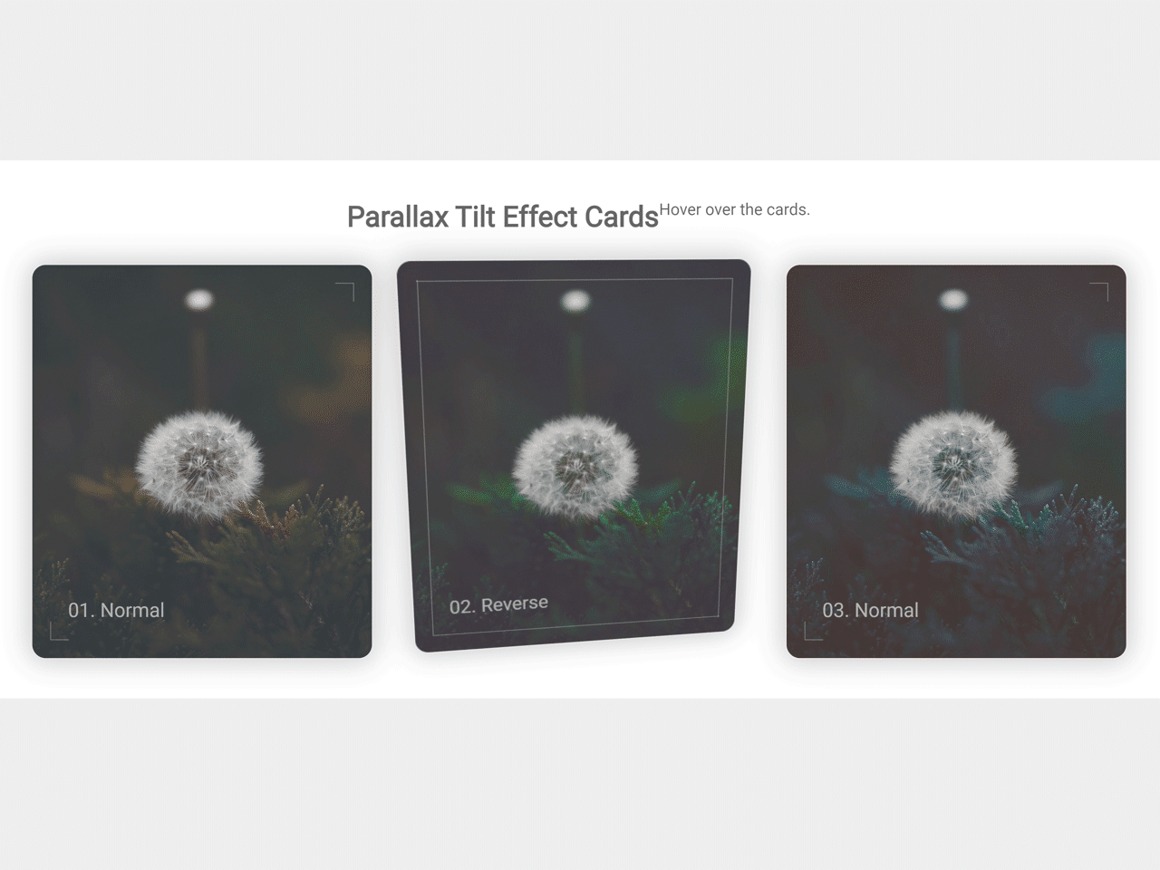

Parallax tilt effect is one of the creative animations in web design. In this animation, the selected element tilts by a corner according to the mouse position. This JavaScript code snippet helps you to create cards with parallax tilt effect on hover event.
It gets the page offsetX and offsetY and applies the CSS reserve-3d transformation to make a tilt effect. Besides this, it also change the direction of gradient colors to make this effect realistic.
How to Create JavaScript Parallax Tilt Effect Cards on Hover
1. First of all, create the HTML structure for cards element as follows:
<h1>Parallax Tilt Effect Cards</h1>
<p>Hover over the cards.</p>

<section class="main">

  <div class="wrap wrap--1">
    <div class="container container--1">
      <p>01. Normal</p>
    </div>
  </div>

  <div class="wrap wrap--2">
    <div class="container container--2">
      <p>02. Reverse</p>
    </div>
  </div>

  <div class="wrap wrap--3">
    <div class="container container--3">
      <p>03. Normal</p>
    </div>
  </div>

</section>
2. After that, style the cards using the following CSS. You can set the custom size and color of the cards according to your needs.
*,
*::after,
*::before {
  margin: 0;
  padding: 0;
  box-sizing: border-box;
}

html {
  font-size: 62.5%;
}

body {
  --background-color: hsl(180, 20%, 90%);

  font-family: -apple-system, BlinkMacSystemFont, 'Segoe UI', Roboto, Oxygen, Ubuntu, Cantarell, 'Open Sans', 'Helvetica Neue', sans-serif;

  min-height: 100vh;
  padding: 2rem;

  color: hsla(0, 0%, 0%, .6);
  background: var(--background-color);
  text-align: center;
}

h1 {
  font-size: 3.2rem;
  padding-top: 2rem;
}

h1+p {
  font-size: 1.8rem;
  padding: 2rem 0 3rem;
}

.main {
  display: flex;
  flex-wrap: wrap;
  justify-content: center;
  align-items: center;
}

.wrap {
  margin: 2rem;

  transform-style: preserve-3d;
  transform: perspective(100rem);

  cursor: pointer;
}

.container {
  --rX: 0;
  --rY: 0;
  --bX: 50%;
  --bY: 80%;

  width: 30rem;
  height: 36rem;
  border: 1px solid var(--background-color);
  border-radius: 1.6rem;
  padding: 4rem;

  display: flex;
  align-items: flex-end;

  position: relative;
  transform: rotateX(calc(var(--rX) * 1deg)) rotateY(calc(var(--rY) * 1deg));

  background: linear-gradient(hsla(0, 0%, 100%, .1), hsla(0, 0%, 100%, .1)), url("https://images.unsplash.com/photo-1559113513-d5e09c78b9dd?ixlib=rb-1.2.1&q=80&fm=jpg&crop=entropy&cs=tinysrgb&w=1080&fit=max&ixid=eyJhcHBfaWQiOjF9");
  background-position: var(--bX) var(--bY);
  background-size: 40rem auto;
  box-shadow: 0 0 3rem .5rem hsla(0, 0%, 0%, .2);

  transition: transform .6s 1s;
}

.container::before,
.container::after {
  content: "";

  width: 2rem;
  height: 2rem;
  border: 1px solid #fff;

  position: absolute;
  z-index: 2;

  opacity: .3;
  transition: .3s;
}

.container::before {
  top: 2rem;
  right: 2rem;

  border-bottom-width: 0;
  border-left-width: 0;
}

.container::after {
  bottom: 2rem;
  left: 2rem;

  border-top-width: 0;
  border-right-width: 0;
}

.container--active {
  transition: none;
}

.container--2 {
  filter: hue-rotate(80deg) saturate(140%);
}

.container--3 {
  filter: hue-rotate(160deg) saturate(140%);
}

.container p {
  color: hsla(0, 0%, 100%, .6);
  font-size: 2.2rem;
}

.wrap:hover .container::before,
.wrap:hover .container::after {
  width: calc(100% - 4rem);
  height: calc(100% - 4rem);
}

.abs-site-link {
  position: fixed;
  bottom: 20px;
  left: 20px;
  color: hsla(0, 0%, 0%, .6);
  font-size: 1.6rem;
}
3. Finally, add the following JavaScript function to apply the tilt effect on cards.
// by
// abubakersaeed.netlify.com | @AbubakerSaeed96
// ============================================

// Inspiration:
// Tilt.js: https://gijsroge.github.io/tilt.js/
// Andy Merskin's parallax depth cards pen: https://codepen.io/andymerskin/full/XNMWvQ/

// Thank You for Viewing

class parallaxTiltEffect {

  constructor({element, tiltEffect}) {

    this.element = element;
    this.container = this.element.querySelector(".container");
    this.size = [300, 360];
    [this.w, this.h] = this.size;

    this.tiltEffect = tiltEffect;

    this.mouseOnComponent = false;

    this.handleMouseMove = this.handleMouseMove.bind(this);
    this.handleMouseEnter = this.handleMouseEnter.bind(this);
    this.handleMouseLeave = this.handleMouseLeave.bind(this);
    this.defaultStates = this.defaultStates.bind(this);
    this.setProperty = this.setProperty.bind(this);
    this.init = this.init.bind(this);

    this.init();
  }

  handleMouseMove(event) {
    const {offsetX, offsetY} = event;

    let X;
    let Y;

    if (this.tiltEffect === "reverse") {
      X = ((offsetX - (this.w/2)) / 3) / 3;
      Y = (-(offsetY - (this.h/2)) / 3) / 3;
    }

    else if (this.tiltEffect === "normal") {
      X = (-(offsetX - (this.w/2)) / 3) / 3;
      Y = ((offsetY - (this.h/2)) / 3) / 3;
    }

    this.setProperty('--rY', X.toFixed(2));
    this.setProperty('--rX', Y.toFixed(2));

    this.setProperty('--bY', (80 - (X/4).toFixed(2)) + '%');
    this.setProperty('--bX', (50 - (Y/4).toFixed(2)) + '%');
  }

  handleMouseEnter() {
    this.mouseOnComponent = true;
    this.container.classList.add("container--active");
  }

  handleMouseLeave() {
    this.mouseOnComponent = false;
    this.defaultStates();
  }

  defaultStates() {
    this.container.classList.remove("container--active");
    this.setProperty('--rY', 0);
    this.setProperty('--rX', 0);
    this.setProperty('--bY', '80%');
    this.setProperty('--bX', '50%');
  }

  setProperty(p, v) {
    return this.container.style.setProperty(p, v);
  }

  init() {
    this.element.addEventListener('mousemove', this.handleMouseMove);
    this.element.addEventListener('mouseenter', this.handleMouseEnter);
    this.element.addEventListener('mouseleave', this.handleMouseLeave);
  }

}

const $ = e => document.querySelector(e);

const wrap1 = new parallaxTiltEffect({
  element: $('.wrap--1'),
  tiltEffect: 'reverse'
});

const wrap2 = new parallaxTiltEffect({
  element: $('.wrap--2'),
  tiltEffect: 'normal'
});

const wrap3 = new parallaxTiltEffect({
  element: $('.wrap--3'),
  tiltEffect: 'reverse'
});
That’s all! hopefully, you have successfully created parallax tilt effect. If you have any questions or suggestions, feel free to comment below.
Similar Code Snippets:

- JavaScript Random Number Generator Between Range
- Drag and Drop Task List in JavaScript
- Movie Comparison App in JavaScript
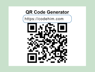
- Pure JavaScript QR Code Generator


I code and create web elements for amazing people around the world. I like work with new people. New people new Experiences.
I truly enjoy what I’m doing, which makes me more passionate about web development and coding. I am always ready to do challenging tasks whether it is about creating a custom CMS from scratch or customizing an existing system.