
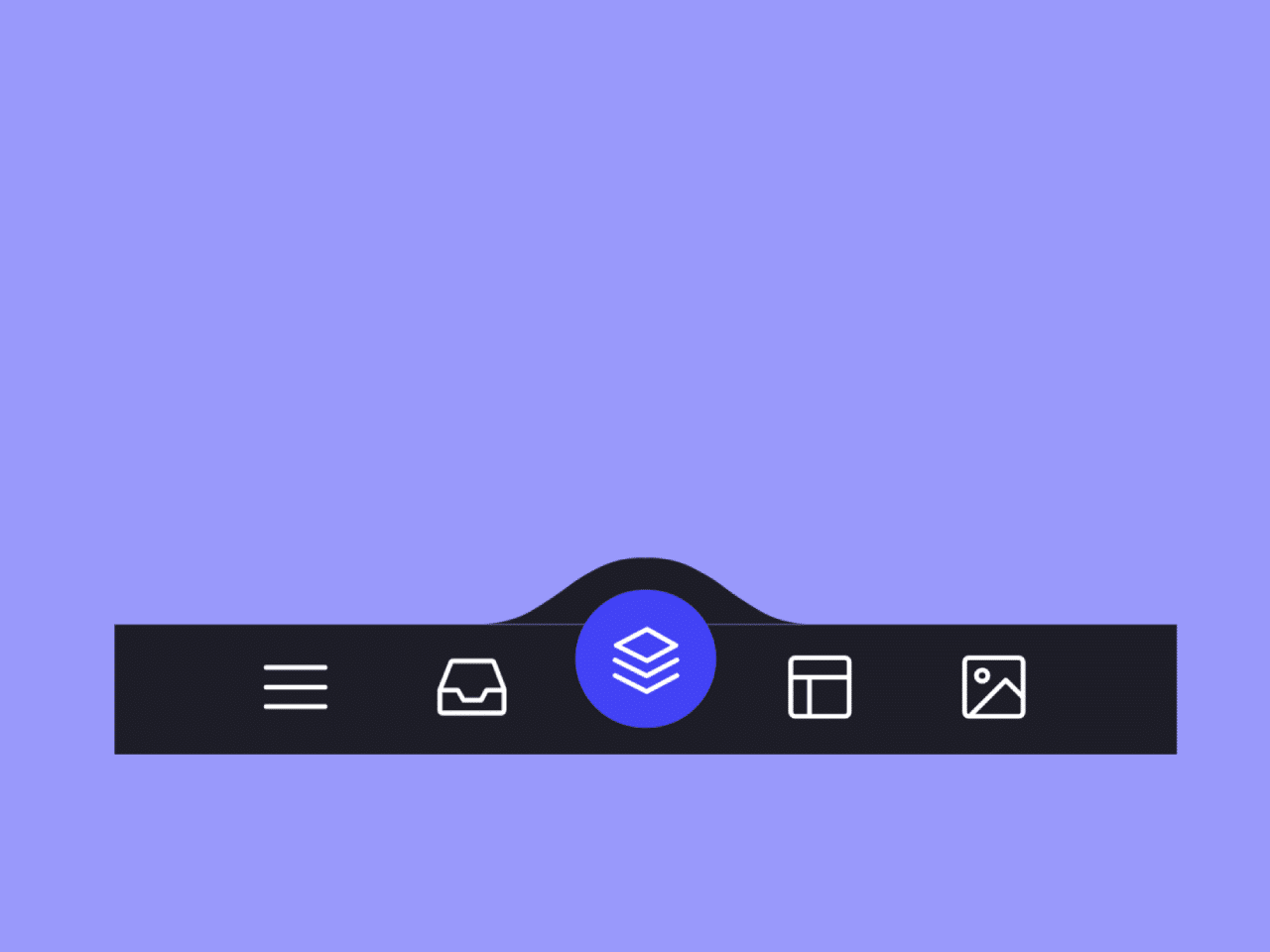
This code creates an animated tab navigation menu with SVG icons. It allows you to switch between tabs, each represented by a button with a unique SVG icon. Clicking a button changes the tab’s background color and animates the SVG icon. This code enhances user interface design by providing a visually appealing and interactive way to navigate through different sections or features.
You can use this code for website navigation menus, enhancing user experience with animated icons and smooth transitions. It’s perfect for showcasing different sections or features of your website, making it more visually engaging.
How to Create Tab Navigation with Animated SVG Icons
1. Start by creating the HTML structure for your navigation menu. The code snippet provided in the question contains the necessary HTML structure. It includes a menu container and buttons for each tab.
<menu class="menu">

    <button class="menu__item active" style="--bgColorItem: #ff8c00;" >
      <svg class="icon" viewBox="0 0 24 24">
        <path d="M3.8,6.6h16.4"/>
        <path d="M20.2,12.1H3.8"/>
        <path d="M3.8,17.5h16.4"/>
      </svg>
    </button>

    <button class="menu__item" style="--bgColorItem: #f54888;">
      <svg class="icon" viewBox="0 0 24 24">
        <path  d="M6.7,4.8h10.7c0.3,0,0.6,0.2,0.7,0.5l2.8,7.3c0,0.1,0,0.2,0,0.3v5.6c0,0.4-0.4,0.8-0.8,0.8H3.8
        C3.4,19.3,3,19,3,18.5v-5.6c0-0.1,0-0.2,0.1-0.3L6,5.3C6.1,5,6.4,4.8,6.7,4.8z"/>
        <path  d="M3.4,12.9H8l1.6,2.8h4.9l1.5-2.8h4.6"/>
      </svg>
    </button>

    <button class="menu__item" style="--bgColorItem: #4343f5;" >
      <svg class="icon" viewBox="0 0 24 24">
      <path  d="M3.4,11.9l8.8,4.4l8.4-4.4"/>
      <path  d="M3.4,16.2l8.8,4.5l8.4-4.5"/>
      <path  d="M3.7,7.8l8.6-4.5l8,4.5l-8,4.3L3.7,7.8z"/>
    </button>

    <button class="menu__item" style="--bgColorItem: #e0b115;" >
      <svg class="icon" viewBox="0 0 24 24" >
        <path  d="M5.1,3.9h13.9c0.6,0,1.2,0.5,1.2,1.2v13.9c0,0.6-0.5,1.2-1.2,1.2H5.1c-0.6,0-1.2-0.5-1.2-1.2V5.1
          C3.9,4.4,4.4,3.9,5.1,3.9z"/>
        <path  d="M4.2,9.3h15.6"/>
        <path  d="M9.1,9.5v10.3"/>
    </button>

    <button class="menu__item" style="--bgColorItem:#65ddb7;">
      <svg class="icon" viewBox="0 0 24 24" >
        <path  d="M5.1,3.9h13.9c0.6,0,1.2,0.5,1.2,1.2v13.9c0,0.6-0.5,1.2-1.2,1.2H5.1c-0.6,0-1.2-0.5-1.2-1.2V5.1
          C3.9,4.4,4.4,3.9,5.1,3.9z"/>
        <path  d="M5.5,20l9.9-9.9l4.7,4.7"/>
        <path  d="M10.4,8.8c0,0.9-0.7,1.6-1.6,1.6c-0.9,0-1.6-0.7-1.6-1.6C7.3,8,8,7.3,8.9,7.3C9.7,7.3,10.4,8,10.4,8.8z"/>
      </svg>
    </button>

    <div class="menu__border"></div>

  </menu>

  <div class="svg-container">
    <svg viewBox="0 0 202.9 45.5" >
      <clipPath id="menu" clipPathUnits="objectBoundingBox" transform="scale(0.0049285362247413 0.021978021978022)">
        <path  d="M6.7,45.5c5.7,0.1,14.1-0.4,23.3-4c5.7-2.3,9.9-5,18.1-10.5c10.7-7.1,11.8-9.2,20.6-14.3c5-2.9,9.2-5.2,15.2-7
          c7.1-2.1,13.3-2.3,17.6-2.1c4.2-0.2,10.5,0.1,17.6,2.1c6.1,1.8,10.2,4.1,15.2,7c8.8,5,9.9,7.1,20.6,14.3c8.3,5.5,12.4,8.2,18.1,10.5
          c9.2,3.6,17.6,4.2,23.3,4H6.7z"/>
      </clipPath>
    </svg>
  </div>
Each button in the menu has an SVG icon. You can replace these icons with your own by modifying the <path> elements within the SVG. This step allows you to personalize the icons to suit your website’s theme.
2. Apply styles to your menu using CSS. You can customize the background colors, button sizes, and other visual elements to match your website’s design. Refer to the CSS code provided for guidance.
html {

    box-sizing: border-box;
    --bgColorMenu : #1d1d27;
    --duration: .7s;

}

html *,
html *::before,
html *::after {

    box-sizing: inherit;

}

body{
    margin: 0;
    display: flex;
    height: 100vh;
    overflow: hidden;
    align-items: center;
    justify-content: center;
    background-color: #ffb457;
    -webkit-tap-highlight-color: transparent;
    transition: background-color var(--duration);

}

.menu{

    margin: 0;
    display: flex;
    /* Works well with 100% width  */
    width: 32.05em;
    font-size: 1.5em;
    padding: 0 2.85em;
    position: relative;
    align-items: center;
    justify-content: center;
    background-color: var(--bgColorMenu);

}

.menu__item{

    all: unset;
    flex-grow: 1;
    z-index: 100;
    display: flex;
    cursor: pointer;
    position: relative;
    border-radius: 50%;
    align-items: center;
    will-change: transform;
    justify-content: center;
    padding: 0.55em 0 0.85em;
    transition: transform var(--timeOut , var(--duration));

}

.menu__item::before{

    content: "";
    z-index: -1;
    width: 4.2em;
    height: 4.2em;
    border-radius: 50%;
    position: absolute;
    transform: scale(0);
    transition: background-color var(--duration), transform var(--duration);

}


.menu__item.active {

    transform: translate3d(0, -.8em , 0);

}

.menu__item.active::before{

    transform: scale(1);
    background-color: var(--bgColorItem);

}

.icon{

    width: 2.6em;
    height: 2.6em;
    stroke: white;
    fill: transparent;
    stroke-width: 1pt;
    stroke-miterlimit: 10;
    stroke-linecap: round;
    stroke-linejoin: round;
    stroke-dasharray: 400;

}

.menu__item.active .icon {

    animation: strok 1.5s reverse;

}

@keyframes strok {

    100% {

        stroke-dashoffset: 400;

    }

}

.menu__border{

    left: 0;
    bottom: 99%;
    width: 10.9em;
    height: 2.4em;
    position: absolute;
    clip-path: url(#menu);
    will-change: transform;
    background-color: var(--bgColorMenu);
    transition: transform var(--timeOut , var(--duration));

}

.svg-container {

    width: 0;
    height: 0;
}


@media screen and (max-width: 50em) {
    .menu{
        font-size: .8em;
    }
}
3. The JavaScript code controls the menu’s interactivity. It ensures that when a button is clicked, it becomes active, the background color changes, and the SVG icon animates. Ensure that you include the following JavaScript code in your project.
// Designed by:  Mauricio Bucardo
// Original image:
// https://dribbble.com/shots/5619509-Animated-Tab-Bar

"use strict";

const body = document.body;
const bgColorsBody = ["#ffb457", "#ff96bd", "#9999fb", "#ffe797", "#cffff1"];
const menu = body.querySelector(".menu");
const menuItems = menu.querySelectorAll(".menu__item");
const menuBorder = menu.querySelector(".menu__border");
let activeItem = menu.querySelector(".active");

function clickItem(item, index) {

    menu.style.removeProperty("--timeOut");

    if (activeItem == item) return;

    if (activeItem) {
        activeItem.classList.remove("active");
    }


    item.classList.add("active");
    body.style.backgroundColor = bgColorsBody[index];
    activeItem = item;
    offsetMenuBorder(activeItem, menuBorder);


}

function offsetMenuBorder(element, menuBorder) {

    const offsetActiveItem = element.getBoundingClientRect();
    const left = Math.floor(offsetActiveItem.left - menu.offsetLeft - (menuBorder.offsetWidth  - offsetActiveItem.width) / 2) +  "px";
    menuBorder.style.transform = `translate3d(${left}, 0 , 0)`;

}

offsetMenuBorder(activeItem, menuBorder);

menuItems.forEach((item, index) => {

    item.addEventListener("click", () => clickItem(item, index));

})

window.addEventListener("resize", () => {
    offsetMenuBorder(activeItem, menuBorder);
    menu.style.setProperty("--timeOut", "none");
});
That’s all! hopefully, you have successfully created Tab Navigation with Animated SVG Icons. If you have any questions or suggestions, feel free to comment below.
Similar Code Snippets:

- CSS 3D Folding Dropdown Animation
- HTML Multilevel Accordion Navigation Menu
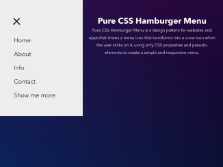
- Responsive Hamburger Menu CSS Only

I code and create web elements for amazing people around the world. I like work with new people. New people new Experiences.
I truly enjoy what I’m doing, which makes me more passionate about web development and coding. I am always ready to do challenging tasks whether it is about creating a custom CMS from scratch or customizing an existing system.