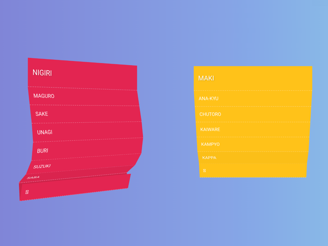

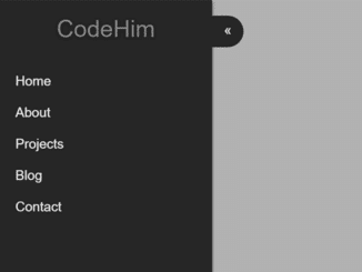
The code enables a CSS 3D folding dropdown animation. It creates a visually appealing dropdown effect. It helps add dynamic, engaging menus or content displays on a webpage. The code leverages CSS transitions and transforms to achieve the animation, providing a smooth and eye-catching user experience.
How to Create CSS 3D Folding Dropdown Animation
1. First of all, load the Google Fonts by adding the following CDN links into the head tag of your HTML document.
<link href='https://fonts.googleapis.com/css?family=Days+One' rel='stylesheet' type='text/css'>
2. Define HTML elements that will constitute your dropdown menu/content. Use appropriate classes and structures as demonstrated in the following code.
<header class="header">
    <hgroup>
        <h1>Makisu</h1>
        <h2>CSS 3D Dropdown Concept</h2>
    </hgroup>
</header>

<section class="demo">

    <dl class="list nigiri">
        <dt>Nigiri</dt>
        <dd><a href="#">Maguro</a></dd>
        <dd><a href="#">Sake</a></dd>
        <dd><a href="#">Unagi</a></dd>
        <dd><a href="#">Buri</a></dd>
        <dd><a href="#">Suzuki</a></dd>
        <dd><a href="#">Saba</a></dd>
        <dd><a href="#">Iwashi</a></dd>
        <dd><a href="#">Kohada</a></dd>
        <dd><a href="#">Hirame</a></dd>
        <dd><a href="#">Tobiwo</a></dd>
    </dl>

    <dl class="list maki">
        <dt>Maki</dt>
        <dd><a href="#">Ana-kyu</a></dd>
        <dd><a href="#">Chutoro</a></dd>
        <dd><a href="#">Kaiware</a></dd>
        <dd><a href="#">Kampyo</a></dd>
        <dd><a href="#">Kappa</a></dd>
        <dd><a href="#">Natto</a></dd>
        <dd><a href="#">Negitoro</a></dd>
        <dd><a href="#">Oshinko</a></dd>
        <dd><a href="#">Otoro</a></dd>
        <dd><a href="#">Tekka</a></dd>
    </dl>

    <dl class="list sashimi">
        <dt>Sashimi</dt>
        <dd><a href="#">Maguro</a></dd>
        <dd><a href="#">Toro</a></dd>
        <dd><a href="#">Ebi</a></dd>
        <dd><a href="#">Saba</a></dd>
        <dd><a href="#">Ika</a></dd>
        <dd><a href="#">Tako</a></dd>
        <dd><a href="#">Tomago</a></dd>
        <dd><a href="#">Kani</a></dd>
        <dd><a href="#">Katsuo</a></dd>
        <dd><a href="#">Maguro</a></dd>
    </dl>

    <a href="#" class="toggle">Toggle</a>

</section>
3. Add the following CSS code between <style> tag or external CSS file to style the dropdown. Adjust the CSS styles to match your website’s design and customize the dropdown’s appearance, transitions, and animations to suit your preferences.
html, body {

    -webkit-font-smoothing: antialiased;
    -moz-font-smoothing: antialiased;

    background: #ffffff;
    background: -moz-radial-gradient(center, ellipse cover,  #ffffff 0%, #ffffff 26%, #f5f5f5 59%, #f5f5f5 77%, #cecece 100%);
    background: -webkit-gradient(radial, center center, 0, center center, 100%, color-stop(0%,#ffffff), color-stop(26%,#ffffff), color-stop(59%,#f5f5f5), color-stop(77%,#f5f5f5), color-stop(100%,#cecece));
    background: -webkit-radial-gradient(center, ellipse cover,  #ffffff 0%,#ffffff 26%,#f5f5f5 59%,#f5f5f5 77%,#cecece 100%);
    background: -o-radial-gradient(center, ellipse cover,  #ffffff 0%,#ffffff 26%,#f5f5f5 59%,#f5f5f5 77%,#cecece 100%);
    background: -ms-radial-gradient(center, ellipse cover,  #ffffff 0%,#ffffff 26%,#f5f5f5 59%,#f5f5f5 77%,#cecece 100%);
    background: radial-gradient(ellipse at center,  #ffffff 0%,#ffffff 26%,#f5f5f5 59%,#f5f5f5 77%,#cecece 100%);
    font-family: 'Days One', sans-serif;
    padding: 0;
    margin: 0;
    height: 100%;
}

a{

    -webkit-transition: all 250ms cubic-bezier(0.230, 1.000, 0.320, 1.000);
    -moz-transition: all 250ms cubic-bezier(0.230, 1.000, 0.320, 1.000);
    -ms-transition: all 250ms cubic-bezier(0.230, 1.000, 0.320, 1.000);
    -o-transition: all 250ms cubic-bezier(0.230, 1.000, 0.320, 1.000);
    transition: all 250ms cubic-bezier(0.230, 1.000, 0.320, 1.000);

    text-decoration: none;
}

.header {

    text-align: center;
    position: absolute;
    z-index: 1;
    color: #333;
    width: 100%;
    top: 5%;
}

.header h1 {

    letter-spacing: -1px;
    text-shadow: -2px -1px 1px #fff, 1px 2px 2px rgba(0, 0, 0, 0.2);
    font-weight: 300;
    font-size: 36px;
    margin: 0;
}

.header h2 {

    text-transform: uppercase;
    text-shadow: -2px -1px 1px #fff, 1px 1px 1px rgba(0, 0, 0, 0.15);
    font-weight: 300;
    font-size: 12px;
    color: rgba(0,0,0,0.7);
    margin: 0;
}

.demo:after {

    box-shadow: 0 1px 16px rgba(0,0,0,0.15);
    background: #1b1b1b;
    position: absolute;
    content: '';
    height: 10px;
    width: 100%;
    top: 0;
}

/* List styles */

.list {

    -webkit-transform-style: preserve-3d;
    -moz-transform-stle: preserve-3d;
    -ms-transform-style: preserve-3d;
    -o-transform-style: preserve-3d;
    transform-style: preserve-3d;

    text-transform: uppercase;
    position: absolute;
    margin-left: -140px;
    top: 20%;
}

.list a {

    display: block;
    color: #fff;
}

.list a:hover {
    text-indent: 20px;
}

.list dt, .list dd {

    text-indent: 10px;
    line-height: 55px;
    background: #E0FBAC;
    margin: 0;
    height: 55px;
    width: 270px;
    color: #fff;
}

.list dt {

    /* Since we're hiding elements behind here, we need it in 3d */
    -webkit-transform: translateZ(0.3px);
    -moz-transform: translateZ(0.3px);
    -ms-transform: translateZ(0.3px);
    -o-transform: translateZ(0.3px);
    transform: translateZ(0.3px);

    text-shadow: 1px 1px 2px rgba(0, 0, 0, 0.2);
    font-size: 15px;
}

.list dd {

    border-top: 1px dashed rgba(255,255,255,0.3);
    line-height: 35px;
    font-size: 11px;
    height: 35px;
    margin: 0;
}

/* UI */

.toggle {

    -webkit-transform: translateZ(100px);
    -moz-transform: translateZ(100px);
    -ms-transform: translateZ(100px);
    -o-transform: translateZ(100px);
    transform: translateZ(100px);

    box-shadow: 0 1px 4px rgba(0,0,0,0.15);
    border-radius: 3px;

    text-transform: uppercase;
    letter-spacing: -1px;
    line-height: 50px;
    margin-left: -70px;
    margin-top: -20px;
    background: #2b2b2b;
    text-align: center;
    font-size: 12px;
    position: absolute;
    z-index: 1;
    height: 50px;
    bottom: 10%;
    width: 140px;
    color: #fff;
    left: 50%;
}

.toggle:hover {

    background: #E42692;
}

/* No CSS 3D support warning */
.warning {

    -webkit-transform: translateZ(2px);
    -moz-transform: translateZ(2px);
    -ms-transform: translateZ(2px);
    -o-transform: translateZ(2px);
    transform: translateZ(2px);

    background: rgba(255,255,255,0.6);
    position: fixed;
    display: none;
    z-index: 999;
    height: 100%;
    width: 100%;
    left: 0;
    top: 0;
}

.warning .message {

    box-shadow: 0 1px 8px rgba(0, 0, 0, 0.6);
    border-radius: 5px;
    text-align: center;
    margin-left: -150px;
    margin-top: -60px;
    line-height: 1.5;
    background: #222;
    font-size: 12px;
    position: absolute;
    padding: 10px;
    width: 280px;
    color: #fff;
    left: 50%;
    top: 50%;
}

.warning .message h1 {

    font-weight: 300;
    font-size: 14px;
}

.warning .message a {

    text-decoration: none;
    color: #73C8A9;
}

/* Individual styles */

.sashimi dt, .sashimi dd, .sashimi a { background: #73C8A9; }
.nigiri dt, .nigiri dd, .nigiri a { background: #E32551; }
.maki dt, .maki dd, .maki a { background: #FFC219; }

.sashimi a:hover { background: #61c19e; }
.nigiri a:hover { background: #d31b46; }
.maki a:hover { background: #ffbb00; }

.nigiri {

    -webkit-transform: perspective(1200px) rotateY(40deg) !important;
    -moz-transform: perspective(1200px) rotateY(40deg) !important;
    -ms-transform: perspective(1200px) rotateY(40deg) !important;
    -o-transform: perspective(1200px) rotateY(40deg) !important;
    transform: perspective(1200px) rotateY(40deg) !important;

    -webkit-transform-origin: 110% 25%;
    -moz-transform-origin: 110% 25%;
    -ms-transform-origin: 110% 25%;
    -o-transform-origin: 110% 25%;
    transform-origin: 110% 25%;

    left: 20%;
}

.maki {

    -webkit-transform: perspective(600px) translateZ(1px) !important;
    -moz-transform: perspective(600px) translateZ(1px) !important;
    -ms-transform: perspective(600px) translateZ(1px) !important;
    -o-transform: perspective(600px) translateZ(1px) !important;
    transform: perspective(600px) translateZ(1px) !important;

    left: 50%;
}

.sashimi {

    -webkit-transform: perspective(1200px) rotateY(-40deg) !important;
    -moz-transform: perspective(1200px) rotateY(-40deg) !important;
    -ms-transform: perspective(1200px) rotateY(-40deg) !important;
    -o-transform: perspective(1200px) rotateY(-40deg) !important;
    transform: perspective(1200px) rotateY(-40deg) !important;

    -webkit-transform-origin: -10% 25%;
    -moz-transform-origin: -10% 25%;
    -ms-transform-origin: -10% 25%;
    -o-transform-origin: -10% 25%;
    transform-origin: -10% 25%;

    left: 80%;
}
4. Load the jQuery JavaScript library by adding the following CDN link just before closing the body tag:
<script src='//cdnjs.cloudflare.com/ajax/libs/jquery/2.1.3/jquery.min.js'></script>
5. Finally, initialize the dropdowns using jQuery and the provided JavaScript functions, specifying parameters like selector, overlap, and speed for each dropdown.
/**
 * Copyright (C) 2012 by Justin Windle
 *
 * Permission is hereby granted, free of charge, to any person obtaining a copy
 * of this software and associated documentation files (the "Software"), to deal
 * in the Software without restriction, including without limitation the rights
 * to use, copy, modify, merge, publish, distribute, sublicense, and/or sell
 * copies of the Software, and to permit persons to whom the Software is
 * furnished to do so, subject to the following conditions:
 *
 * The above copyright notice and this permission notice shall be included in
 * all copies or substantial portions of the Software.
 *
 * THE SOFTWARE IS PROVIDED "AS IS", WITHOUT WARRANTY OF ANY KIND, EXPRESS OR
 * IMPLIED, INCLUDING BUT NOT LIMITED TO THE WARRANTIES OF MERCHANTABILITY,
 * FITNESS FOR A PARTICULAR PURPOSE AND NONINFRINGEMENT. IN NO EVENT SHALL THE
 * AUTHORS OR COPYRIGHT HOLDERS BE LIABLE FOR ANY CLAIM, DAMAGES OR OTHER
 * LIABILITY, WHETHER IN AN ACTION OF CONTRACT, TORT OR OTHERWISE, ARISING FROM,
 * OUT OF OR IN CONNECTION WITH THE SOFTWARE OR THE USE OR OTHER DEALINGS IN
 * THE SOFTWARE.
 */

(function($) {

    // Global initialisation flag
    var initialized = false;

    // For detecting browser prefix and capabilities
    var el = document.createElement( 'div' );
    var re = /^(Moz|(w|W)ebkit|O|ms)(?=[A-Z])/;

    // Establish vendor prefix and CSS 3D support
    var vendor = (function() { for ( var p in el.style ) if( re.test(p) ) return p.match(re)[0]; })() || '';
    var canRun = vendor + 'Perspective' in el.style;
    var prefix = '-' + vendor.toLowerCase() + '-';

    var $this, $root, $base, $kids, $node, $item, $over, $back;
    var wait, anim, last;

    // Public API
    var api = {

        // Toggle open / closed
        toggle: function() {

            $this = $( this );
            $this.makisu( $this.hasClass( 'open' ) ? 'close' : 'open' );
        },

        // Trigger the unfold animation
        open: function( speed, overlap, easing ) {

            // Cache DOM references
            $this = $(this);
            $root = $this.find( '.root' );
            $kids = $this.find( '.node' ).not( $root );

            // Establish values or fallbacks
            speed = utils.resolve( $this, 'speed', speed );
            easing = utils.resolve( $this, 'easing', easing );
            overlap = utils.resolve( $this, 'overlap', overlap );

            $kids.each( function( index, el ) {

                // Establish settings for this iteration
                anim = 'unfold' + ( !index ? '-first' : '' );
                last = index === $kids.length - 1;
                time = speed * ( 1 - overlap );
                wait = index * time;

                // Cache DOM references
                $item = $( el );
                $over = $item.find( '.over' );

                // Element animation
                $item.css(utils.prefix({
                    'transform': 'rotateX(180deg)',
                    'animation': anim + ' ' + speed + 's ' + easing + ' ' + wait + 's 1 normal forwards'
                }));

                // Shading animation happens when the next item starts
                if ( !last ) wait = ( index + 1 ) * time;

                // Shading animation
                $over.css(utils.prefix({
                    'animation': 'unfold-over ' + (speed * 0.45) + 's ' + easing + ' ' + wait + 's 1 normal forwards'
                }));
            });

            // Add momentum to the container
            $root.css(utils.prefix({
                'animation': 'swing-out ' + ( $kids.length * time * 1.4 ) + 's ease-in-out 0s 1 normal forwards'
            }));

            $this.addClass( 'open' );
        },

        // Trigger the fold animation
        close: function( speed, overlap, easing ) {

            // Cache DOM references
            $this = $(this);
            $root = $this.find( '.root' );
            $kids = $this.find( '.node' ).not( $root );

            // Establish values or fallbacks
            speed = utils.resolve( $this, 'speed', speed ) * 0.66;
            easing = utils.resolve( $this, 'easing', easing );
            overlap = utils.resolve( $this, 'overlap', overlap );

            $kids.each( function( index, el ) {

                // Establish settings for this iteration
                anim = 'fold' + ( !index ? '-first' : '' );
                last = index === 0;
                time = speed * ( 1 - overlap );
                wait = ( $kids.length - index - 1 ) * time;

                // Cache DOM references
                $item = $( el );
                $over = $item.find( '.over' );

                // Element animation
                $item.css(utils.prefix({
                    'transform': 'rotateX(0deg)',
                    'animation': anim + ' ' + speed + 's ' + easing + ' ' + wait + 's 1 normal forwards'
                }));

                // Adjust delay for shading
                if ( !last ) wait = ( ( $kids.length - index - 2 ) * time ) + ( speed * 0.35 );

                // Shading animation
                $over.css(utils.prefix({
                    'animation': 'fold-over ' + (speed * 0.45) + 's ' + easing + ' ' + wait + 's 1 normal forwards'
                }));
            });

            // Add momentum to the container
            $root.css(utils.prefix({
                'animation': 'swing-in ' + ( $kids.length * time * 1.0 ) + 's ease-in-out 0s 1 normal forwards'
            }));

            $this.removeClass( 'open' );
        }
    };

    // Utils
    var utils = {

        // Resolves argument values to defaults
        resolve: function( $el, key, val ) {
            return typeof val === 'undefined' ? $el.data( key ) : val;
        },

        // Prefixes a hash of styles with the current vendor
        prefix: function( style ) {

            for ( var key in style ) {
                style[ prefix + key ] = style[ key ];
            }

            return style;
        },

        // Inserts rules into the document styles
        inject: function( rule ) {

            try {

                var style = document.createElement( 'style' );
                style.innerHTML = rule;
                document.getElementsByTagName( 'head' )[0].appendChild( style );

            } catch ( error ) {}
        }
    };

    // Element templates
    var markup = {
        node: '<span class="node"/>',
        back: '<span class="face back"/>',
        over: '<span class="face over"/>'
    };

    // Plugin definition
    $.fn.makisu = function( options ) {

        // Notify if 3D isn't available
        if ( !canRun ) {

            var message = 'Failed to detect CSS 3D support';

            if( console && console.warn ) {

                // Print warning to the console
                console.warn( message );

                // Trigger errors on elements
                this.each( function() {
                    $( this ).trigger( 'error', message );
                });
            }

            return;
        }

        // Fires only once
        if ( !initialized ) {

            initialized = true;

            // Unfold
            utils.inject( '@' + prefix + 'keyframes unfold        {' +

                '0%   {' + prefix + 'transform: rotateX(180deg);  }' +
                '50%  {' + prefix + 'transform: rotateX(-30deg);  }' +
                '100% {' + prefix + 'transform: rotateX(0deg);    }' +

                '}');

            // Unfold (first item)
            utils.inject( '@' + prefix + 'keyframes unfold-first  {' +

                '0%   {' + prefix + 'transform: rotateX(-90deg);  }' +
                '50%  {' + prefix + 'transform: rotateX(60deg);   }' +
                '100% {' + prefix + 'transform: rotateX(0deg);    }' +

                '}');

            // Fold
            utils.inject( '@' + prefix + 'keyframes fold          {' +

                '0%   {' + prefix + 'transform: rotateX(0deg);    }' +
                '100% {' + prefix + 'transform: rotateX(180deg);  }' +

                '}');

            // Fold (first item)
            utils.inject( '@' + prefix + 'keyframes fold-first    {' +

                '0%   {' + prefix + 'transform: rotateX(0deg);    }' +
                '100% {' + prefix + 'transform: rotateX(-180deg); }' +

                '}');

            // Swing out
            utils.inject( '@' + prefix + 'keyframes swing-out     {' +

                '0%   {' + prefix + 'transform: rotateX(0deg);    }' +
                '30%  {' + prefix + 'transform: rotateX(-30deg);  }' +
                '60%  {' + prefix + 'transform: rotateX(15deg);   }' +
                '100% {' + prefix + 'transform: rotateX(0deg);    }' +

                '}');

            // Swing in
            utils.inject( '@' + prefix + 'keyframes swing-in      {' +

                '0%   {' + prefix + 'transform: rotateX(0deg);    }' +
                '50%  {' + prefix + 'transform: rotateX(-10deg);  }' +
                '90%  {' + prefix + 'transform: rotateX(15deg);   }' +
                '100% {' + prefix + 'transform: rotateX(0deg);    }' +

                '}');

            // Shading (unfold)
            utils.inject( '@' + prefix + 'keyframes unfold-over   {' +
                '0%   { opacity: 1.0; }' +
                '100% { opacity: 0.0; }' +
                '}');

            // Shading (fold)
            utils.inject( '@' + prefix + 'keyframes fold-over     {' +
                '0%   { opacity: 0.0; }' +
                '100% { opacity: 1.0; }' +
                '}');

            // Node styles
            utils.inject( '.node {' +
                'position: relative;' +
                'display: block;' +
                '}');

            // Face styles
            utils.inject( '.face {' +
                'pointer-events: none;' +
                'position: absolute;' +
                'display: block;' +
                'height: 100%;' +
                'width: 100%;' +
                'left: 0;' +
                'top: 0;' +
                '}');
        }

        // Merge options & defaults
        var opts = $.extend( {}, $.fn.makisu.defaults, options );

        // Extract api method arguments
        var args = Array.prototype.slice.call( arguments, 1 );

        // Main plugin loop
        return this.each( function () {

            // If the user is calling a method...
            if ( api[ options ] ) {
                return api[ options ].apply( this, args );
            }

            // Store options in view
            $this = $( this ).data( opts );

            // Only proceed if the scene hierarchy isn't already built
            if ( !$this.data( 'initialized' ) ) {

                $this.data( 'initialized', true );

                // Select the first level of matching child elements
                $kids = $this.children( opts.selector );

                // Build a scene graph for elements
                $root = $( markup.node ).addClass( 'root' );
                $base = $root;

                // Process each element and insert into hierarchy
                $kids.each( function( index, el ) {

                    $item = $( el );

                    // Which animation should this node use?
                    anim = 'fold' + ( !index ? '-first' : '' );

                    // Since we're adding absolutely positioned children
                    $item.css( 'position', 'relative' );

                    // Give the item some depth to avoid clipping artefacts
                    $item.css(utils.prefix({
                        'transform-style': 'preserve-3d',
                        'transform': 'translateZ(-0.1px)'
                    }));

                    // Create back face
                    $back = $( markup.back );
                    $back.css( 'background', $item.css( 'background' ) );
                    $back.css(utils.prefix({ 'transform': 'translateZ(-0.1px)' }));

                    // Create shading
                    $over = $( markup.over );
                    $over.css(utils.prefix({ 'transform': 'translateZ(0.1px)' }));
                    $over.css({
                        'background': opts.shading,
                        'opacity': 0.0
                    });

                    // Begin folded
                    $node = $( markup.node ).append( $item );
                    $node.css(utils.prefix({
                        'transform-origin': '50% 0%',
                        'transform-style': 'preserve-3d',
                        'animation': anim + ' 1ms linear 0s 1 normal forwards'
                    }));

                    // Build display list
                    $item.append( $over );
                    $item.append( $back );
                    $base.append( $node );

                    // Use as parent in next iteration
                    $base = $node;
                });

                // Set root transform settings
                $root.css(utils.prefix({
                    'transform-origin': '50% 0%',
                    'transform-style': 'preserve-3d'
                }));

                // Apply perspective
                $this.css(utils.prefix({
                    'transform': 'perspective(' + opts.perspective + 'px)'
                }));

                // Display the scene
                $this.append( $root );
            }
        });
    };

    // Default options
    $.fn.makisu.defaults = {

        // Perspective to apply to rotating elements
        perspective: 1200,

        // Default shading to apply (null => no shading)
        shading: 'rgba(0,0,0,0.12)',

        // Area of rotation (fraction or pixel value)
        selector: null,

        // Fraction of speed (0-1)
        overlap: 0.6,

        // Duration per element
        speed: 0.8,

        // Animation curve
        easing: 'ease-in-out'
    };

    $.fn.makisu.enabled = canRun;

})( jQuery );

// The `enabled` flag will be `false` if CSS 3D isn't available

if ( $.fn.makisu.enabled ) {

    var $sashimi = $( '.sashimi' );
    var $nigiri = $( '.nigiri' );
    var $maki = $( '.maki' );

    // Create Makisus

    $nigiri.makisu({
        selector: 'dd',
        overlap: 0.85,
        speed: 1.7
    });

    $maki.makisu({
        selector: 'dd',
        overlap: 0.6,
        speed: 0.85
    });

    $sashimi.makisu({
        selector: 'dd',
        overlap: 0.2,
        speed: 0.5
    });

    // Open all

    $( '.list' ).makisu( 'open' );

    // Toggle on click

    $( '.toggle' ).on( 'click', function() {
        $( '.list' ).makisu( 'toggle' );
    });

    // Disable all links

    $( '.demo a' ).click( function( event ) {
        event.preventDefault();
    });

} else {

    $( '.warning' ).show();
}
That’s all! hopefully, you have successfully created a CSS 3d Folding Dropdown on your website. If you have any questions or suggestions, feel free to comment below.
Similar Code Snippets:

- 3 Dots Dropdown Menu HTML CSS
- Flyout Menu with Scroll Animation
- Top Fixed Circular Menu in HTML CSS


I code and create web elements for amazing people around the world. I like work with new people. New people new Experiences.
I truly enjoy what I’m doing, which makes me more passionate about web development and coding. I am always ready to do challenging tasks whether it is about creating a custom CMS from scratch or customizing an existing system.