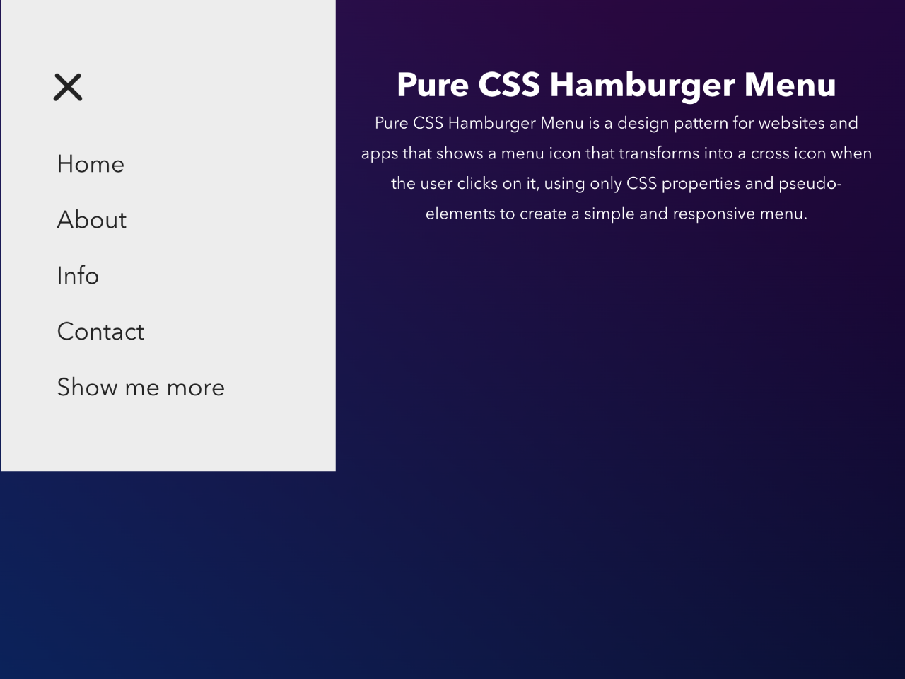

This code implements a stylish and responsive hamburger menu design using only CSS. The menu icon transforms into a cross icon upon user interaction, offering a seamless navigation experience. The menu comes with four positions, top left, top right, bottom left, and bottom right.
Moreover, this CSS-only solution simplifies the implementation of a responsive hamburger menu, ensuring a user-friendly interface without the need for JavaScript.
How to Create Responsive Hamburger Menu
1. Begin by setting up the HTML structure. Place the <header> tag for the menu bar, <nav> elements for different sections, and the main content within <main> element.
Within the <nav> elements, create the menu toggles. These include checkboxes and spans for the hamburger icon lines.
Inside <ul class="menuItem">, list the navigation items using <li> and <a> tags. Customize the links and content for each menu item.
<header>
  <nav class="menu--left" role="navigation">
    <div class="menuToggle">
      <input type="checkbox"/>
      <span></span>
      <span></span>
      <span></span>
      <ul class="menuItem">
        <li><a href="#">Home</a></li>
        <li><a href="#">About</a></li>
        <li><a href="#">Info</a></li>
        <li><a href="#">Contact</a></li>
        <li><a href="#">Show me more</a></li>
      </ul>
    </div>
  </nav>
  <nav class="menu--right" role="navigation">
    <div class="menuToggle">
      <input type="checkbox"/>
      <span></span>
      <span></span>
      <span></span>
      <ul class="menuItem">
        <li><a href="#">Home</a></li>
        <li><a href="#">About</a></li>
        <li><a href="#">Info</a></li>
        <li><a href="#">Contact</a></li>
        <li><a href="#">Show me more</a></li>
      </ul>
    </div>
  </nav>
</header>

<nav class="menu--bottom--left" role="navigation">
  <div class="menuToggle">
    <input type="checkbox"/>
    <span></span>
    <span></span>
    <span></span>
    <ul class="menuItem">
      <li><a href="#">Home</a></li>
      <li><a href="#">About</a></li>
      <li><a href="#">Info</a></li>
      <li><a href="#">Contact</a></li>
      <li><a href="#">Show me more</a></li>
    </ul>
  </div>
</nav>

<nav class="menu--bottom--right" role="navigation">
  <div class="menuToggle">
    <input type="checkbox"/>
    <span></span>
    <span></span>
    <span></span>
    <ul class="menuItem">
      <li><a href="#">Home</a></li>
      <li><a href="#">About</a></li>
      <li><a href="#">Info</a></li>
      <li><a href="#">Contact</a></li>
      <li><a href="#">Show me more</a></li>
    </ul>
  </div>
</nav>

<main class="main">
  <h1>Pure CSS Hamburger Menu</h1>
  <div class="content">
    <p>
      Pure CSS Hamburger Menu is a design pattern for websites and apps that shows a menu icon that transforms into a cross icon when the user clicks on it, using only CSS properties and pseudo-elements to create a simple and responsive menu.
    </p>
  </div>
</main>

<footer>
  <div class="copyright">
    Inspired from "Pure CSS Hamburger fold-out menu" by <a href="https://codepen.io/erikterwan/pen/EVzeRP" target="_blank">Erik Terwan</a>
  </div>
</footer>
2. Now, use the following CSS code or customize it to suit your design preferences. This CSS defines the appearance and behavior of the hamburger menu and its elements.
html {
  box-sizing: border-box;
  overflow-x: hidden;
}

*, *:after, *:before {
  box-sizing: border-box;
}

body {
  display: block !important;
  min-width: 350px;
  min-height: 100vh;
  margin: 0;
  padding: 0;
  color: #fff;
  overflow-x: hidden;
  background: #232323;
  background: linear-gradient(45deg, #042461 0%, rgba(225, 5, 34, 0) 70%), linear-gradient(135deg, #340447 10%, rgba(49, 5, 209, 0) 80%), linear-gradient(225deg, #0f053a 10%, rgba(10, 219, 216, 0) 80%), linear-gradient(315deg, #050813 100%, rgba(9, 245, 5, 0) 70%) !important;
  font-family: "Avenir Next", "Avenir", sans-serif;
}

.main {
  position: relative;
  padding: 60px 30px;
  width: 100%;
}
.main h1 {
  color: #fff;
  text-align: center;
}
.main .content {
  margin: 0 auto;
  width: 100%;
  max-width: 768px;
}
.main .content p {
  line-height: 1.8;
  text-align: center;
}

header {
  display: flex;
  justify-content: space-between;
  flex-flow: row;
  align-items: center;
}

footer {
  position: fixed;
  bottom: 0;
  left: 50%;
  transform: translateX(-50%);
  padding: 30px;
  color: #fff;
}
footer .copyright {
  text-align: center;
}
footer a {
  color: #1BB76E;
  text-decoration: none;
  transition: 0.25s;
}
footer a:hover {
  color: #FF5500;
}

.menuToggle {
  display: block;
  position: relative;
  top: 50px;
  z-index: 1;
  -webkit-user-select: none;
  user-select: none;
}
.menuToggle a {
  text-decoration: none;
  color: #232323;
  transition: all 0.3s ease;
}
.menuToggle a:hover {
  color: tomato;
}
.menuToggle input {
  display: block;
  width: 40px;
  height: 32px;
  position: absolute;
  top: -7px;
  cursor: pointer;
  opacity: 0;
  /* hide this */
  z-index: 2;
  /* and place it over the hamburger */
  -webkit-touch-callout: none;
}
.menuToggle span {
  position: relative;
  display: block;
  width: 33px;
  height: 4px;
  margin-bottom: 5px;
  position: relative;
  background: #cdcdcd;
  border-radius: 3px;
  z-index: 1;
  transform-origin: 4px 0px;
  transition: transform 0.5s cubic-bezier(0.77, 0.2, 0.05, 1), background 0.5s cubic-bezier(0.77, 0.2, 0.05, 1), opacity 0.55s ease;
}
.menuToggle span:first-child {
  transform-origin: 0% 0%;
}
.menuToggle span:nth-last-child(2) {
  transform-origin: 0% 100%;
}

.menuToggle input:checked ~ span {
  opacity: 1;
  transform: rotate(45deg) translate(-2px, -1px);
  background: #232323;
}
.menuToggle input:checked ~ span:nth-last-child(3) {
  opacity: 0;
  transform: rotate(0deg) scale(0.2, 0.2);
}
.menuToggle input:checked ~ span:nth-last-child(2) {
  transform: rotate(-45deg) translate(0, -1px);
}
.menuToggle input:checked ~ .menuItem {
  transform: none;
}

.menuItem {
  position: absolute;
  width: 300px;
  padding: 50px;
  padding-top: 125px;
  background: #ededed;
  list-style-type: none;
  -webkit-font-smoothing: antialiased;
  transform-origin: 0% 0%;
  transition: transform 0.5s cubic-bezier(0.77, 0.2, 0.05, 1);
}
.menuItem li {
  padding: 10px 0;
  font-size: 22px;
}

.menu--left {
  position: relative;
  width: 50%;
}
.menu--left .menuToggle {
  left: 0;
}
.menu--left .menuToggle input {
  left: 50px;
}
.menu--left .menuToggle span {
  left: 50px;
}
.menu--left .menuItem {
  left: 50px;
  margin: -100px 0 0 -50px;
  transform: translate(-100%, 0);
}

.menu--right .menuToggle {
  position: fixed;
  right: 0;
}
.menu--right .menuToggle input {
  right: 50px;
}
.menu--right .menuToggle span {
  right: 50px;
}
.menu--right .menuItem {
  right: 0;
  margin: -100px 0 0 0;
  transform: translate(100%, 0);
}
.menu--right .menuItem li a:hover {
  padding-left: 5px;
}

.menu--bottom--right .menuToggle {
  position: fixed;
  top: auto;
  bottom: 0;
  right: 0;
  z-index: 1;
}
.menu--bottom--right .menuToggle input {
  right: 50px;
  bottom: 50px;
  top: auto;
}
.menu--bottom--right .menuToggle input:checked ~ .menuItem {
  transform: scale(1);
}
.menu--bottom--right .menuToggle input:checked ~ .menuItem li:nth-child(1) {
  -webkit-animation: text-slide-in 0.2s;
  -moz-animation: text-slide-in 0.2s;
  animation: text-slide-in 0.2s;
}
.menu--bottom--right .menuToggle input:checked ~ .menuItem li:nth-child(2) {
  -webkit-animation: text-slide-in 0.3s;
  -moz-animation: text-slide-in 0.3s;
  animation: text-slide-in 0.3s;
}
.menu--bottom--right .menuToggle input:checked ~ .menuItem li:nth-child(3) {
  -webkit-animation: text-slide-in 0.4s;
  -moz-animation: text-slide-in 0.4s;
  animation: text-slide-in 0.4s;
}
.menu--bottom--right .menuToggle input:checked ~ .menuItem li:nth-child(4) {
  -webkit-animation: text-slide-in 0.5s;
  -moz-animation: text-slide-in 0.5s;
  animation: text-slide-in 0.5s;
}
.menu--bottom--right .menuToggle input:checked ~ .menuItem li:nth-child(5) {
  -webkit-animation: text-slide-in 0.6s;
  -moz-animation: text-slide-in 0.6s;
  animation: text-slide-in 0.6s;
}
.menu--bottom--right .menuToggle span {
  right: 50px;
  bottom: 50px;
  top: auto;
}
.menu--bottom--right .menuItem {
  bottom: 0;
  right: 0;
  margin: 0;
  padding-top: 50px;
  padding-bottom: 125px;
  transform-origin: bottom right;
  transform: scale(0);
  -webkit-transition: -webkit-transform 0.3s, visibility 0s 0s;
  -moz-transition: -moz-transform 0.3s, visibility 0s 0s;
  transition: transform 0.3s, visibility 0s 0s;
}
.menu--bottom--right .menuItem li {
  -webkit-backface-visibility: hidden;
  backface-visibility: hidden;
}
.menu--bottom--right .menuItem li a:hover {
  padding-left: 5px;
}

.menu--bottom--left .menuToggle {
  position: fixed;
  top: auto;
  bottom: 0;
  left: 0;
  z-index: 1;
}
.menu--bottom--left .menuToggle input {
  left: 50px;
  bottom: 50px;
  top: auto;
}
.menu--bottom--left .menuToggle input:checked ~ .menuItem {
  transform: scale(1);
}
.menu--bottom--left .menuToggle input:checked ~ .menuItem li:nth-child(1) {
  -webkit-animation: text-slide-in 0.2s;
  -moz-animation: text-slide-in 0.2s;
  animation: text-slide-in 0.2s;
}
.menu--bottom--left .menuToggle input:checked ~ .menuItem li:nth-child(2) {
  -webkit-animation: text-slide-in 0.3s;
  -moz-animation: text-slide-in 0.3s;
  animation: text-slide-in 0.3s;
}
.menu--bottom--left .menuToggle input:checked ~ .menuItem li:nth-child(3) {
  -webkit-animation: text-slide-in 0.4s;
  -moz-animation: text-slide-in 0.4s;
  animation: text-slide-in 0.4s;
}
.menu--bottom--left .menuToggle input:checked ~ .menuItem li:nth-child(4) {
  -webkit-animation: text-slide-in 0.5s;
  -moz-animation: text-slide-in 0.5s;
  animation: text-slide-in 0.5s;
}
.menu--bottom--left .menuToggle input:checked ~ .menuItem li:nth-child(5) {
  -webkit-animation: text-slide-in 0.6s;
  -moz-animation: text-slide-in 0.6s;
  animation: text-slide-in 0.6s;
}
.menu--bottom--left .menuToggle span {
  left: 50px;
  bottom: 50px;
  top: auto;
}
.menu--bottom--left .menuItem {
  bottom: 0;
  left: 0;
  margin: 0;
  padding-top: 50px;
  padding-bottom: 125px;
  transform-origin: bottom left;
  transform: scale(0);
  -webkit-transition: -webkit-transform 0.3s, visibility 0s 0s;
  -moz-transition: -moz-transform 0.3s, visibility 0s 0s;
  transition: transform 0.3s, visibility 0s 0s;
}
.menu--bottom--left .menuItem li {
  -webkit-backface-visibility: hidden;
  backface-visibility: hidden;
}
.menu--bottom--left .menuItem li a:hover {
  padding-left: 5px;
}

@keyframes text-slide-in {
  0% {
    -webkit-transform: translateX(100px);
    -moz-transform: translateX(100px);
    -ms-transform: translateX(100px);
    -o-transform: translateX(100px);
    transform: translateX(100px);
  }
  100% {
    -webkit-transform: translateY(0);
    -moz-transform: translateY(0);
    -ms-transform: translateY(0);
    -o-transform: translateY(0);
    transform: translateY(0);
  }
}
Modify the positioning of menus (left, right, bottom-left, bottom-right) by altering classes like .menu--left, .menu--right, .menu--bottom--left, .menu--bottom--right.
Customize the design and functionality as per your project requirements for an engaging and intuitive navigation system.
That’s all! hopefully, you have successfully created a Responsive Hamburger Menu on your website. If you have any questions or suggestions, feel free to comment below.
Similar Code Snippets:
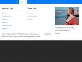
 Sidebar Menu Hover Show/hide Bootstrap 5
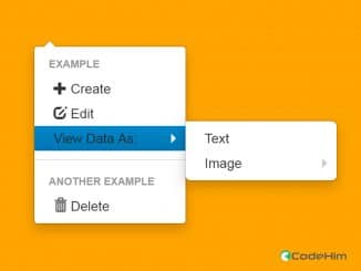
- Pure CSS Stylish Dropdown Menu
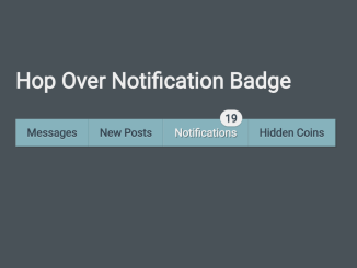
- Horizontal Navbar with Badge On Hover
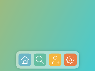
- Dock Navbar Using HTML and CSS


I code and create web elements for amazing people around the world. I like work with new people. New people new Experiences.
I truly enjoy what I’m doing, which makes me more passionate about web development and coding. I am always ready to do challenging tasks whether it is about creating a custom CMS from scratch or customizing an existing system.