
This simple JavaScript code snippet helps you to create a responsive menu that you can show on button click events. The core functionality is toggling the menu’s visibility. It’s helpful for adding a sleek, space-saving menu to your website.
The menu is ideal for navigation menus, saving screen space, and improving the overall design. This code helps create a modern, interactive menu without complex coding.
How to Create Menu and Show On Click Event Using JavaScript
1. First of all, load the Normalize CSS and Font Awesome CSS (for icons) by adding the following CDN links into the head tag of your webpage.
<link rel="stylesheet" href="https://cdnjs.cloudflare.com/ajax/libs/normalize/5.0.0/normalize.min.css">
<link rel='stylesheet' href='https://cdnjs.cloudflare.com/ajax/libs/font-awesome/5.11.2/css/all.min.css'>
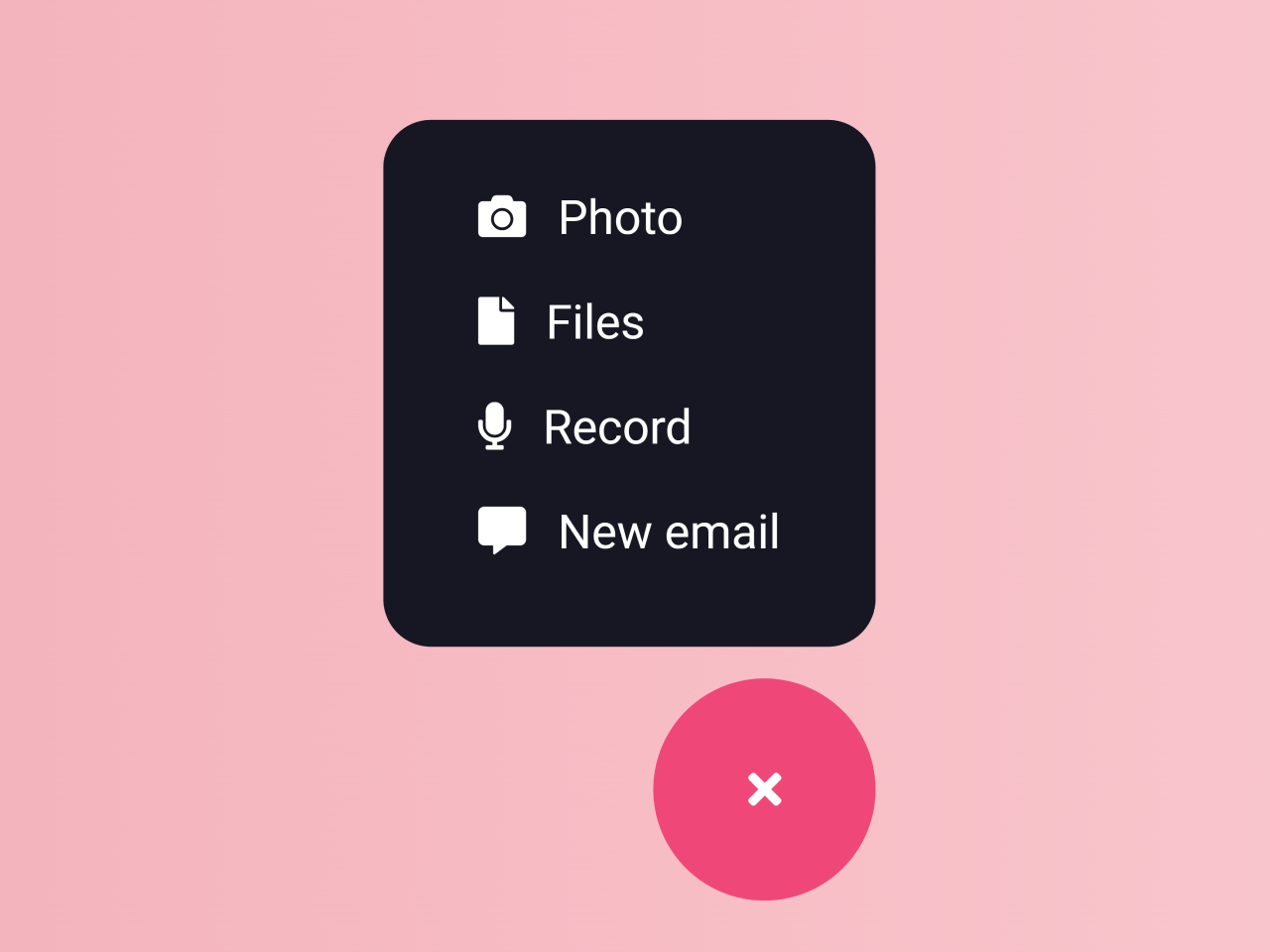
2. Create the basic HTML structure for your menu. Replace the links with your website URLs, you can add as many links as you want.
<div class="wrapper">
  <ul class="list">
    <li class="list-item"><a class="list-link" href="#"><i class="fas fa-camera"></i>Photo</a></li>
    <li class="list-item"><a class="list-link" href="#"><i class="fas fa-file"></i>Files</a></li>
    <li class="list-item"><a class="list-link" href="#"><i class="fas fa-microphone"></i>Record</a></li>
    <li class="list-item"><a class="list-link" href="#"><i class="fas fa-comment-alt"></i>New email</a></li>
  </ul>
  <button type="button"><i class="fas fa-paper-plane"></i><i class="fas fa-times"></i></button>
</div>
3. Now, use the following CSS code to style your menu. It’s responsible for the menu’s appearance and transition effects.
* {
  box-sizing: border-box;
  outline: none;
}

html,
body {
  width: 100%;
  height: 100%;
  margin: 0;
  padding: 0;
}

body {
  display: flex;
  justify-content: center;
  align-items: center;
  background-color: #fcdee7;
}

.wrapper {
  max-width: 70px;
  max-height: 70px;
  position: relative;
  background-color: #161722;
  color: white;
  border-radius: 35px;
  transition: all 0.4s ease-out 0s;
}
.wrapper.active {
  max-width: 500px;
  max-height: 300px;
  border-radius: 15px;
  transition: all 0.7s ease-in 0s;
}
.wrapper.active .list {
  opacity: 1;
  transform: scale(1);
  transition: all 0.3s ease-out 0.2s;
}
.cd__main{
  background: linear-gradient(to right, #ee9ca7, #ffdde1) !important;
  min-height: 720px;
}

.wrapper.active .list-link {
  opacity: 1;
}
.wrapper.active button {
  top: calc(100% + 10px);
  right: 0;
}
.wrapper.active button i.fa-paper-plane {
  top: 0%;
  left: 100%;
  opacity: 0;
  transition: all 0.5s ease-out 0s;
}
.wrapper.active button i.fa-times {
  opacity: 1;
  transform: translate(-50%, -50%) rotate(0);
  transition: all 0.3s ease-in 0.2s;
}

.list {
  list-style: none;
  margin: 0;
  padding: 15px 0;
  overflow: hidden;
  opacity: 0;
  transform: scale(0);
  transition: all 0.5s ease-out 0s;
}
.list-link {
  display: block;
  color: white;
  text-decoration: none;
  padding: 8px 30px;
  opacity: 0;
  transition: all 0.3s ease;
}
.list-link i {
  position: relative;
  left: 0;
  margin-right: 10px;
  transition: all 0.3s ease;
}
.list-link:hover i {
  left: -5px;
  color: #f04779;
}

button {
  width: 70px;
  height: 70px;
  position: absolute;
  top: calc(50% - 35px);
  right: calc(50% - 35px);
  background-color: #f04779;
  color: white;
  font-size: 22px;
  border-radius: 35px;
  border: none;
  overflow: hidden;
  cursor: pointer;
  transition: all 0.5s ease;
}
button:hover {
  background-color: #ee2f68;
}
button i {
  position: absolute;
  top: 50%;
  left: 50%;
}
button i.fa-paper-plane {
  transform: translate(-50%, -50%);
  transition: all 0.2s ease-in 0.2s;
}
button i.fa-times {
  opacity: 0;
  transform: translate(-50%, -50%) rotate(-90deg);
  transition: all 0.3s ease-out 0s;
}
4. Finally, add the following JavaScript code between the <script> tag (or external JS file) just before closing the body element. It handles the menu’s functionality. It toggles the menu’s visibility when the button is clicked.
const button = document.querySelector('button');

const onClickButton = e => {
  e.preventDefault();

  const wrapper = e.currentTarget.closest('.wrapper');

  if (wrapper.classList.contains('active')) {
    wrapper.classList.remove('active');
  } else {
    wrapper.classList.add('active');
  }
};

// Init
const init = () => {
  button.addEventListener('click', onClickButton, false);
};

document.addEventListener('DOMContentLoaded', init);
That’s all! hopefully, you have successfully created a responsive menu that shows on click using JavaScript. If you have any questions or suggestions, feel free to comment below.
Similar Code Snippets:

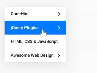
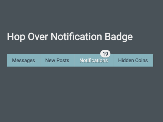
- Horizontal Navbar with Badge On Hover


I code and create web elements for amazing people around the world. I like work with new people. New people new Experiences.
I truly enjoy what I’m doing, which makes me more passionate about web development and coding. I am always ready to do challenging tasks whether it is about creating a custom CMS from scratch or customizing an existing system.