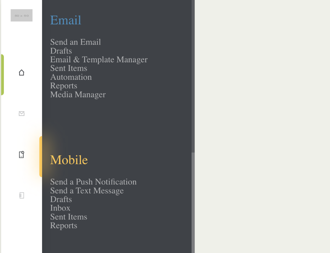

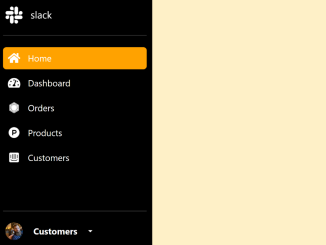
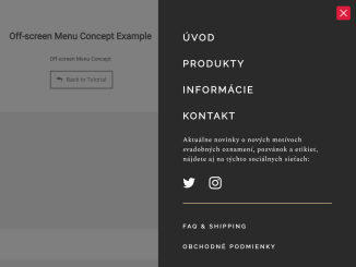
This code creates a responsive sidebar with an animated sub-menus, providing smooth navigation. Hover over the main menu items, and the corresponding sub-menu elegantly scrolls into view. This feature is particularly useful for websites with multiple sections, as it keeps the interface clean and user-friendly. Explore the demo to witness the seamless scroll animation in action.
You can use it for admin dashboards, content-heavy sites, or applications with multiple sections.
How to Create a Flyout Menu with Scroll Animation
1. First of all, load the Reset CSS and Font Awesome CSS by adding the following CDN links into the head tag of your HTML document.
<link rel="stylesheet" href="https://cdnjs.cloudflare.com/ajax/libs/meyer-reset/2.0/reset.min.css">
<link rel='stylesheet' href='https://cdnjs.cloudflare.com/ajax/libs/font-awesome/4.7.0/css/font-awesome.min.css'>
2. Now, copy/paste the following HTML code on your website. Adjust the HTML structure based on your website’s layout. The code assumes a sidebar, sub-menu, and top bar. Customize classes and content to suit your design.
<div class="sidebar"> <div class="logo"> <img src="http://placehold.it/50" alt=""> </div> <div class="menu"> <a href="#" class="menu-item active" data-menu="dashboard"> <div class="indicator"></div> <i class="nrd-home"></i> </a> <a href="#" class="menu-item" data-menu="email"> <div class="indicator"></div> <i class="nrd-email"></i> </a> <a href="#" class="menu-item" data-menu="mobile"> <div class="indicator"></div> <i class="nrd-sms"></i> </a> <a href="#" class="menu-item" data-menu="contacts"> <div class="indicator"></div> <i class="nrd-contacts"></i> </a> </div> </div> <div class="sub-menu"> <div class="menu-item" data-menu="dashboard"> <a href="#" class="menu-link">Home</a> <a href="#" class="menu-link">Approvals</a> <a href="#" class="menu-link">Change Account</a> <a href="#" class="menu-link">Credit Packs</a> <a href="#" class="menu-link">Blog</a> </div> <div class="menu-item" data-menu="email"> <a href="#" class="menu-link">Send an Email</a> <a href="#" class="menu-link">Drafts</a> <a href="#" class="menu-link">Email & Template Manager</a> <a href="#" class="menu-link">Sent Items</a> <a href="#" class="menu-link">Automation</a> <a href="#" class="menu-link">Reports</a> <a href="#" class="menu-link">Media Manager</a> </div> <div class="menu-item" data-menu="mobile"> <a href="#" class="menu-link">Send a Push Notification</a> <a href="#" class="menu-link">Send a Text Message</a> <a href="#" class="menu-link">Drafts</a> <a href="#" class="menu-link">Inbox</a> <a href="#" class="menu-link">Sent Items</a> <a href="#" class="menu-link">Reports</a> </div> <div class="menu-item" data-menu="contacts"> <a href="#" class="menu-link">Add New Contact</a> <a href="#" class="menu-link">Data Entry Form</a> <a href="#" class="menu-link">Upload a CSV</a> <a href="#" class="menu-link">Contacts List</a> <a href="#" class="menu-link">Segments</a> <a href="#" class="menu-link">Data Tags</a> <a href="#" class="menu-link">Data Export</a> <a href="#" class="menu-link">Upload History</a> <a href="#" class="menu-link">Heatmap</a> </div> </div> <div class="topbar"> <!-- <div class="contextual-menu"> <i class="nrd-untitled-1-03"></i> </div> --> <div class="profile"> <img src="http://placehold.it/80" alt=""> <h4>Nord Chetbi</h4> <h5>1234 The Winchester Pub</h5> <div class="caret">▼</div> </div> </div>
3. Now, style the menu using the following CSS code. Customize the CSS styles to match your project’s theme. Modify colors, dimensions, and fonts as needed. Pay attention to the sidebar, sub-menu, and top bar styling for a cohesive look.
Replace the placeholder icons with your preferred icons. Ensure to update the CSS code associated with icon fonts accordingly.
@import url("https://fonts.googleapis.com/css?family=Roboto:300,700");
/* nordchetbicom */
@font-face {
  font-family: "nordchetbicom";
  src: url("https://file.myfontastic.com/NGLcqzzok6DWuamgKiTQrK/fonts/1547029532.eot");
  src: url("https://file.myfontastic.com/NGLcqzzok6DWuamgKiTQrK/fonts/1547029532.eot?#iefix") format("embedded-opentype"), url("https://file.myfontastic.com/NGLcqzzok6DWuamgKiTQrK/fonts/1547029532.woff") format("woff"), url("https://file.myfontastic.com/NGLcqzzok6DWuamgKiTQrK/fonts/1547029532.ttf") format("truetype"), url("https://file.myfontastic.com/NGLcqzzok6DWuamgKiTQrK/fonts/1547029532.svg#1547029532") format("svg");
  font-weight: normal;
  font-style: normal;
}
.cd__main{
   display: block !important;
   position: relative;
   overflow: hidden;

}

[data-icon]:before {
  font-family: "nordchetbicom" !important;
  content: attr(data-icon);
  font-style: normal !important;
  font-weight: normal !important;
  font-variant: normal !important;
  text-transform: none !important;
  speak: none;
  line-height: 1;
  -webkit-font-smoothing: antialiased;
  -moz-osx-font-smoothing: grayscale;
}

[class^=nrd-]:before,
[class*=" nrd-"]:before {
  font-family: "nordchetbicom" !important;
  font-style: normal !important;
  font-weight: normal !important;
  font-variant: normal !important;
  text-transform: none !important;
  speak: none;
  line-height: 1;
  -webkit-font-smoothing: antialiased;
  -moz-osx-font-smoothing: grayscale;
}

.nrd-addons:before {
  content: "i";
}

.nrd-broadcast:before {
  content: "j";
}

.nrd-contacts:before {
  content: "k";
}

.nrd-email:before {
  content: "l";
}

.nrd-home:before {
  content: "m";
}

.nrd-my-addons:before {
  content: "n";
}

.nrd-push:before {
  content: "o";
}

.nrd-scheduler:before {
  content: "p";
}

.nrd-sms:before {
  content: "q";
}

.nrd-social:before {
  content: "r";
}

.nrd-system-addons:before {
  content: "s";
}

.nrd-untitled-1-03:before {
  content: "t";
}

.nrd-untitled-1-04:before {
  content: "u";
}

.nrd-untitled-1-05:before {
  content: "v";
}

.nrd-zonal:before {
  content: "w";
}

body {
  background: #eff0e9;
  color: #3f4247;
  font-family: "Roboto", sans-serif;
  font-size: 16px;
  line-height: 1.75;
  font-weight: 300;
}

div, a {
  display: block;
  box-sizing: border-box;
  text-decoration: none;
}

a {
  color: inherit;
  cursor: pointer;
}

i {
  font-size: 1.5em;
}

.caret {
  transform: scale(1, 0.5);
  font-size: 0.8em;
}

.sidebar {
  width: 75px;
  height: 100vh;
  background: #fff;
  position: relative;
  z-index: 2;
  box-shadow: 0 0 20px rgba(0, 0, 0, 0.1);
}
.sidebar:hover + .sub-menu {
  transform: translate(0, 0);
}
.sidebar .logo {
  height: 75px;
  width: 75px;
}
.sidebar .logo img {
  width: 40px;
  height: 40px;
  margin: 0 auto;
  padding-top: 17.5px;
  display: block;
}
.sidebar .menu {
  position: absolute;
  top: 100px;
  z-index: 2;
}
.sidebar .menu .menu-item {
  position: relative;
  width: 75px;
  height: 75px;
  text-align: center;
  line-height: 73px;
  opacity: 0.3;
  cursor: pointer;
}
.sidebar .menu .menu-item.active {
  opacity: 1;
}
.sidebar .menu .menu-item.active:before {
  display: block;
}
.sidebar .menu .menu-item:before, .sidebar .menu .menu-item:after {
  content: "";
  display: none;
  position: absolute;
  left: 0;
  top: 0;
  height: 100%;
  width: 5px;
  background: #000;
  border-top-right-radius: 5px;
  border-bottom-right-radius: 5px;
  transition: all 0.2s cubic-bezier(0.785, 0.135, 0.15, 0.86);
}
.sidebar .menu .menu-item:after {
  left: 95%;
}
.sidebar .menu .menu-item:hover {
  opacity: 1;
}
.sidebar .menu .menu-item:hover:before {
  display: block;
  left: calc(100% - 5px);
  border-top-right-radius: 0px;
  border-bottom-right-radius: 0px;
  border-top-left-radius: 5px;
  border-bottom-left-radius: 5px;
}
.sidebar .menu .menu-item:hover:after {
  display: block;
  width: 10px;
  filter: blur(15px);
}
.sidebar .menu .menu-item[data-menu=dashboard]:before, .sidebar .menu .menu-item[data-menu=dashboard]:after {
  background: #acc64f;
}
.sidebar .menu .menu-item[data-menu=email]:before, .sidebar .menu .menu-item[data-menu=email]:after {
  background: #4f8dbf;
}
.sidebar .menu .menu-item[data-menu=mobile]:before, .sidebar .menu .menu-item[data-menu=mobile]:after {
  background: #fbca54;
}
.sidebar .menu .menu-item[data-menu=contacts]:before, .sidebar .menu .menu-item[data-menu=contacts]:after {
  background: #fc575e;
}

.sub-menu {
  box-sizing: border-box;
  display: block;
  position: absolute;
  top: 0;
  left: 75px;
  background: #3f4247;
  width: 300px;
  height: 100vh;
  max-height: 100vh;
  padding: 500px 35px 300px;
  color: #fff;
  overflow-y: scroll;
  overflow-x: hidden;
  z-index: 1;
  transform: translate(-100%, 0);
  transition: transform 0.2s ease-out;
}
.sub-menu:hover {
  transform: translate(0, 0);
}
.sub-menu::-webkit-scrollbar-track {
  -webkit-box-shadow: inset 0 0 6px rgba(0, 0, 0, 0.3);
  background-color: rgba(255, 255, 255, 0.1);
}
.sub-menu::-webkit-scrollbar {
  width: 6px;
  background-color: rgba(255, 255, 255, 0.1);
}
.sub-menu::-webkit-scrollbar-thumb {
  background-color: rgba(255, 255, 255, 0.2);
}
.sub-menu .menu-item {
  margin-bottom: 100px;
}
.sub-menu .menu-item:before {
  content: attr(data-menu);
  display: block;
  font-size: 1.5em;
  text-transform: capitalize;
  margin-bottom: 20px;
}
.sub-menu .menu-item[data-menu=dashboard]:before {
  color: #acc64f;
}
.sub-menu .menu-item[data-menu=email]:before {
  color: #4f8dbf;
}
.sub-menu .menu-item[data-menu=mobile]:before {
  color: #fbca54;
}
.sub-menu .menu-item[data-menu=contacts]:before {
  color: #fc575e;
}
.sub-menu .menu-item .menu-link {
  opacity: 0.6;
}
.sub-menu .menu-item .menu-link:hover {
  opacity: 1;
}

.topbar {
  position: absolute;
  top: 0;
  right: 0;
  width: calc(100vw - 75px);
  height: 75px;
  display: block;
  padding: 17.5px;
}
.topbar > div {
  float: right;
}
.topbar .contextual-menu {
  display: block;
  width: 40px;
  height: 40px;
  text-align: center;
  line-height: 47px;
  cursor: pointer;
  font-size: 1.2em;
  transition: all 0.1s ease-out;
}
.topbar .contextual-menu:hover {
  color: #acc64f;
}
.topbar .profile {
  display: block;
  width: 190px;
  position: relative;
  cursor: pointer;
}
.topbar .profile h4, .topbar .profile h5 {
  white-space: nowrap;
  overflow: hidden;
  text-overflow: ellipsis;
  max-width: 120px;
}
.topbar .profile h4 {
  text-transform: uppercase;
  font-weight: 700;
  font-size: 0.8em;
  margin-bottom: -5px;
  padding-bottom: 0;
}
.topbar .profile h5 {
  font-size: 0.8em;
}
.topbar .profile img {
  width: 40px;
  height: 40px;
  border-radius: 100%;
  float: left;
  margin-right: 10px;
}
.topbar .profile .caret {
  position: absolute;
  right: 0;
  bottom: 1px;
}
4. Load the jQuery and TweenMax by adding the following CDN links before closing the body element:
<script src='https://cdnjs.cloudflare.com/ajax/libs/jquery/3.3.1/jquery.min.js'></script>
<script src='https://cdnjs.cloudflare.com/ajax/libs/gsap/2.0.2/TweenMax.min.js'></script>
5. Finally, add the following JavaScript function between <script> tag or external JS file to enable menu functionality.
var items = $('.sub-menu .menu-item');
$.each(items, function(){
	var self   = $(this);
	var m      = self.data('menu');
	var menu   = $('.menu .menu-item[data-menu="'+m+'"]');
	var p      = menu.offset().top;
	var offset = self.offset().top;
	offset     = offset - p - 20;
	self.attr('data-position',offset);
});
$('.menu .menu-item').hover(function(){

	var m = $(this).data('menu');
	var item = $('.sub-menu .menu-item[data-menu="'+m+'"]');
	var offset = item.data('position');
	TweenMax.to('.sub-menu',0.3,{
		scrollTop: offset,
		ease: Power2.easeOut
	})

},function(){
	// Not hovering anymore 🙁
});

$('.profile').click(function(event){

})
That’s all! hopefully, you have successfully created a Flyout Menu With Scroll Animation on your website. If you have any questions or suggestions, feel free to comment below.
Similar Code Snippets:

- Horizontal Navbar with Badge On Hover
- Super Simple Image Comparison Slider in HTML
- Sidebar Menu Hover Show/hide Bootstrap 5
- Off Canvas Menu using JavaScript
- Horizontal Menu Bar in HTML with Hover Effect

I code and create web elements for amazing people around the world. I like work with new people. New people new Experiences.
I truly enjoy what I’m doing, which makes me more passionate about web development and coding. I am always ready to do challenging tasks whether it is about creating a custom CMS from scratch or customizing an existing system.