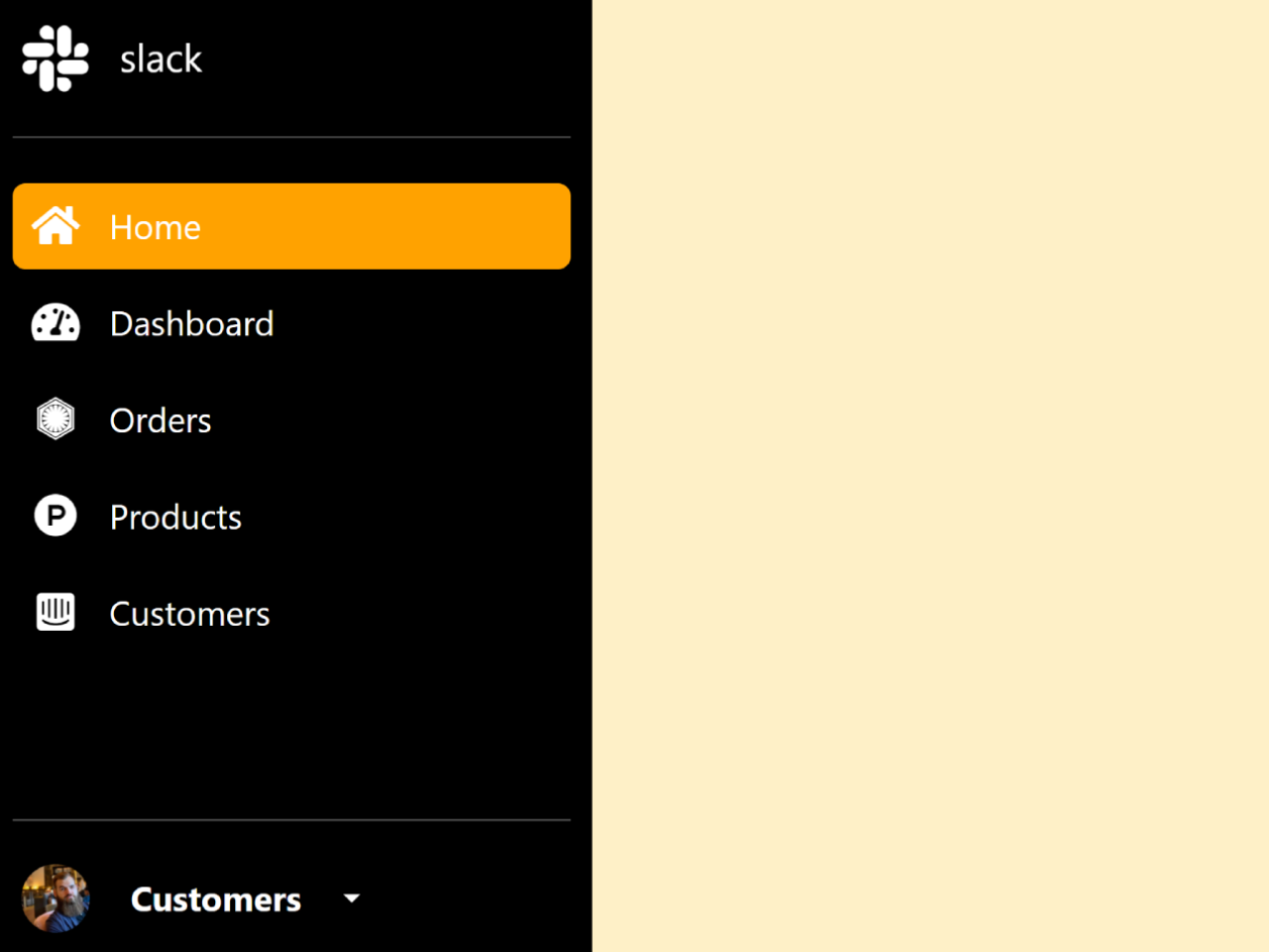

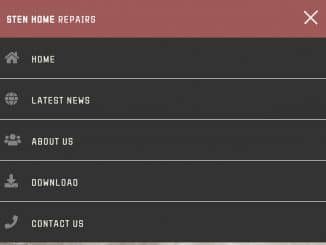
This Bootstrap 5 code snippet helps you to create a sidebar menu that show/hide on hover. When you hover over the sidebar, it expands from a narrow strip to a wider menu, revealing navigation links and icons. The main functionality of this code is to provide an interactive and space-saving sidebar navigation solution for web applications.
How to Create a Sidebar Menu that Show/hide on Hover using Bootstrap 5
1. First of all, load the Bootstrap 5 and Font Awesome CSS by adding the following CDN links into the head tag of your HTML document.
<link rel='stylesheet' href='https://cdn.jsdelivr.net/npm/bootstrap@5.2.3/dist/css/bootstrap.min.css'>
<link rel='stylesheet' href='https://cdnjs.cloudflare.com/ajax/libs/font-awesome/5.15.4/css/all.min.css'>
2. After that, create the HTML structure for your sidebar menu. You can copy and paste the following code into your HTML file:
 <header>
        <div class="d-flex flex-column flex-shrink-0 sidebar-wrap">
            <a href="/" class="text-decoration-none logo-wrap">
                <div class="icon-wrap"><i class="fab fa-slack"></i></div> <span>slack</span>
            </a>
            <hr>
            <ul class="nav nav-pills flex-column mb-auto">
                <li class="nav-item">
                    <a href="#" class="nav-link active" aria-current="page">
                        <div class="icon-wrap">
                            <i class="fas fa-home"></i>
                        </div>
                        <span> Home</span>
                    </a>
                </li>
                <li>
                    <a href="#" class="nav-link">
                        <div class="icon-wrap">
                            <i class="fas fa-tachometer-alt"></i>
                        </div>
                        <span>Dashboard</span>
                    </a>
                </li>
                <li>
                    <a href="#" class="nav-link">
                        <div class="icon-wrap">
                            <i class="fab fa-first-order"></i>
                        </div>
                        <span>Orders</span>
                    </a>
                </li>
                <li>
                    <a href="#" class="nav-link">
                        <div class="icon-wrap">
                            <i class="fab fa-product-hunt"></i>
                        </div>
                        <span>Products</span>
                    </a>
                </li>
                <li>
                    <a href="#" class="nav-link">
                        <div class="icon-wrap">
                            <i class="fab fa-intercom"></i>
                        </div>

                        <span>Customers</span>
                    </a>
                </li>
            </ul>
            <hr>
            <div class="dropdown">
                <a href="#" class="text-decoration-none dropdown-toggle  dropdown-wrap" id="dropdownUser2"
                    data-bs-toggle="dropdown" aria-expanded="false">
                    <div class="icon-wrap">
                        <img src="https://github.com/mdo.png" alt="" width="32" height="32" class="rounded-circle">
                    </div>
                    <strong>Customers</strong>
                </a>
                <ul class="dropdown-menu text-small shadow" aria-labelledby="dropdownUser2">
                    <li><a class="dropdown-item" href="#">New project...</a></li>
                    <li><a class="dropdown-item" href="#">Settings</a></li>
                    <li><a class="dropdown-item" href="#">Profile</a></li>
                    <li>
                        <hr class="dropdown-divider">
                    </li>
                    <li><a class="dropdown-item" href="#">Sign out</a></li>
                </ul>
            </div>
        </div>
    </header>
Inside the <div class="sidebar-wrap"> element, you can customize the sidebar’s content. You can add your logo, navigation links, and a dropdown menu. Customize the icons and text to match your application’s needs.
3. Next, add the CSS styles to make the sidebar responsive and create the hover effect. You can copy and paste the provided CSS code into your project’s stylesheet or within a <style> tag in the HTML file.
.sidebar-wrap {
  width: 60px;
  height: 100vh;
  background-color: #000;
  color: #fff;
  padding: 10px;
  transition: 0.8s;
}
.sidebar-wrap:hover {
  width: 280px;
}
.sidebar-wrap:hover .logo-wrap span {
  display: flex;
}
.sidebar-wrap:hover .nav li .nav-link span {
  display: flex;
}
.sidebar-wrap:hover .dropdown-wrap strong {
  display: flex;
}
.sidebar-wrap:hover .dropdown-wrap::after {
  display: inline-block;
}
.sidebar-wrap:hover .dropdown-wrap {
  justify-content: flex-start;
}
.sidebar-wrap .logo-wrap {
  color: #fff;
  font-size: 35px;
  display: flex;
  align-items: center;
  gap: 10px;
}
.sidebar-wrap .logo-wrap span {
  font-size: 18px;
}
.sidebar-wrap .logo-wrap .icon-wrap {
  display: flex;
  align-items: center;
  justify-content: center;
  height: 40px;
  min-width: 40px;
}
.sidebar-wrap .nav {
  height: 100%;
  overflow-x: hidden;
  overflow-y: auto;
  flex-wrap: nowrap;
}
.sidebar-wrap .nav::-webkit-scrollbar-track {
  -webkit-box-shadow: inset 0 0 6px rgba(0, 0, 0, 0.3);
  border-radius: 5px;
  background-color: #f5f5f5;
}
.sidebar-wrap .nav::-webkit-scrollbar {
  width: 5px;
  background-color: #f5f5f5;
  border-radius: 5px;
}
.sidebar-wrap .nav::-webkit-scrollbar-thumb {
  border-radius: 5px;
  -webkit-box-shadow: inset 0 0 6px rgba(0, 0, 0, 0.3);
  background-color: #9b9b9b;
}
.sidebar-wrap .nav li {
  margin-top: 5px;
}
.sidebar-wrap .nav li .nav-link {
  color: #fff;
  padding: 0;
  font-size: 20px;
  display: flex;
  align-items: center;
  gap: 5px;
}
.sidebar-wrap .nav li .nav-link .icon-wrap {
  display: flex;
  align-items: center;
  justify-content: center;
  height: 40px;
  min-width: 40px;
}
.sidebar-wrap .nav li .nav-link span {
  font-size: 16px;
}
.sidebar-wrap .nav li .nav-link.active {
  background-color: #ffa200;
}
.sidebar-wrap .nav li .nav-link:hover {
  background-color: #ffa200;
}
.sidebar-wrap .dropdown-wrap {
  display: flex;
  align-items: center;
  color: #fff;
  gap: 15px;
  font-size: 16px;
}
.sidebar-wrap .dropdown-wrap .icon-wrap {
  min-width: 40px;
  height: 40px;
  display: flex;
  align-items: center;
  justify-content: center;
}
4. To enable dropdown functionality in the sidebar, include the Bootstrap JavaScript library. Add the following scripts at the bottom of your HTML file, just before the closing </body> tag:
<script src='https://cdn.jsdelivr.net/npm/@popperjs/core@2.9.2/dist/umd/popper.min.js'></script>
<script src='https://cdnjs.cloudflare.com/ajax/libs/bootstrap/5.2.3/js/bootstrap.min.js'></script>
That’s it! You’ve successfully created a responsive sidebar menu with a hover effect using Bootstrap 5. You can further customize the content and styling to match your project’s requirements. This navigation menu is a space-efficient and user-friendly addition to web applications.
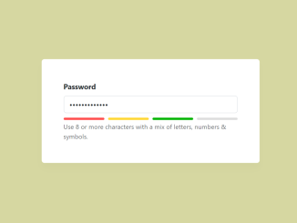
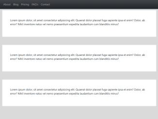
Similar Code Snippets:

- Bootstrap 5 Password Strength Meter
- Responsive Sticky Navbar in Bootstrap 5
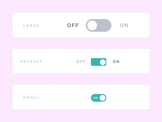
- 15+ Bootstrap Toggle Switch With Text
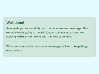
- Bootstrap 5 Alert Auto Close
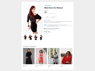
- Bootstrap 5 Product Details Page
- Bootstrap Email Subscription Form
- Animated Curved Nav Using JavaScript


I code and create web elements for amazing people around the world. I like work with new people. New people new Experiences.
I truly enjoy what I’m doing, which makes me more passionate about web development and coding. I am always ready to do challenging tasks whether it is about creating a custom CMS from scratch or customizing an existing system.