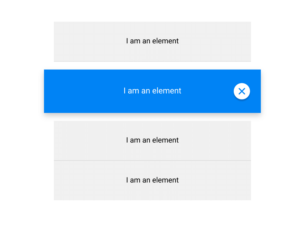

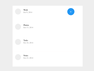
This code snippet helps you to create Material Design like list popup on click event. It utilizes Material Design for styling. Clicking an item activates it and displays a close button. Clicking the close button or outside the list deactivates the pop-up list. The code uses jQuery to handle the click events and CSS transitions for visual effects.
How to Create List Popup On Click Using Material Design
1. First of all, insert the following HTML structure into your document. Customize the content inside the .item divs as needed.
<div class="wrapper">
  <div class="item">
    I am an element

    <div class="close"></div>
  </div>

  <div class="item">
    I am an element

    <div class="close"></div>
  </div>

  <div class="item">
    I am an element

    <div class="close"></div>
  </div>

  <div class="item last">
    I am an element

    <div class="close"></div>
  </div>
</div>
2. Copy the following CSS styles into your stylesheet or within a <style> tag in the document’s head. This styling ensures the Material Design appearance of the popup list.
@font-face {
  font-family: 'Lato';
  font-style: normal;
  font-weight: 400;
  src: url(https://fonts.gstatic.com/s/lato/v24/S6uyw4BMUTPHjx4wWw.ttf) format('truetype');
}
body {
  background-color: #e6e6e9;
  font-family: 'Lato', sans-serif;
}
.wrapper {
  width: 400px;
  margin: 0 auto;
  padding: 40px 0;
}
.wrapper.active .item {
  background-color: #f0f0f0;
}
.wrapper.active .item.active {
  background-color: #0083F5;
  color: white;
}
.item {
  border-bottom: 1px solid rgba(0, 0, 0, 0.1);
  background-color: white;
  width: 400px;
  height: 50px;
  transition-duration: 0.5s;
  position: relative;
  padding-top: 30px;
  text-align: center;
}
.item:hover {
  cursor: pointer;
  background-color: #f5f5f5;
}
.item .close {
  display: none;
  width: 30px;
  height: 30px;
  border-radius: 15px;
  background-color: white;
  position: absolute;
  right: 20px;
  top: 50%;
  margin-top: -15px;
  box-shadow: 0 3px 2px rgba(0, 0, 0, 0.2);
}
.item .close:hover {
  box-shadow: 0 3px 2px rgba(0, 0, 0, 0.4);
  cursor: pointer;
}
.item .close:hover:before {
  transform: rotate(-135deg);
  -webkit-transform: rotate(-135deg);
}
.item .close:hover:after {
  transform: rotate(135deg);
  -webkit-transform: rotate(135deg);
}
.item .close:before,
.item .close:after {
  width: 16px;
  height: 2px;
  border-radius: 2px;
  background-color: #0083F5;
  position: absolute;
  content: "";
  top: 14px;
  left: 7px;
  transition-duration: 0.33s;
}
.item .close:before {
  -webkit-transform: rotate(45deg);
  transform: rotate(45deg);
}
.item .close:after {
  -webkit-transform: rotate(-45deg);
  transform: rotate(-45deg);
}
.item.last {
  border-bottom: none;
}
.item.margin {
  margin-bottom: 20px;
  margin-top: 20px;
}
.item.active {
  box-shadow: 0px 5px 10px rgba(0, 0, 0, 0.2);
  border-bottom: none;
  color: black;
  transition-delay: 0.5s;
  transform: scale(1.1, 1.1);
  -webkit-transition-delay: 0.5s;
  -webkit-transform: scale(1.1, 1.1);
}
3. Now, load the jQuery JavaScript library by adding the following CDN link just before closing the <body> tag:
<script src='//cdnjs.cloudflare.com/ajax/libs/jquery/2.1.3/jquery.min.js'></script>
4. Finally, add the following JavaScript code to handle click events and animations. This code activates and deactivates the popup, along with the close button.
$('.item').click(function (){
  $('.wrapper').addClass('active');
  $('.item').removeClass('active').removeClass('margin');
  $('.close').fadeOut(300);
  $(this).addClass('active').addClass('margin');
  $('.close', this).delay(700).fadeIn(300);
});

$('.close').click(function (event){
  event.stopPropagation();
  $('.wrapper').removeClass('active');
  $('.item').removeClass('active').removeClass('margin');
  $('.close').fadeOut(300);
});
Feel free to customize the styles and animations to match your website’s design. Adjust the content inside each .item div according to your application’s requirements.
That’s all! hopefully, you have successfully created a List Popup on click event on your web/app project. If you have any questions or suggestions, feel free to comment below.
Similar Code Snippets:
 Material Design Toggle Button Using CSS
- Material Design Buttons with Ripple Effect
- Material Design Input Field Using CSS
- Elastic SVG Sidebar Using Material Design
- Material Design Flip Card On Click
- Material Design Interface Transition Effect
- Material UI Alarm Clock App Interface

I code and create web elements for amazing people around the world. I like work with new people. New people new Experiences.
I truly enjoy what I’m doing, which makes me more passionate about web development and coding. I am always ready to do challenging tasks whether it is about creating a custom CMS from scratch or customizing an existing system.