
This code creates a Material Design Interface Transition Effect. It manipulates CSS for visual transitions. The JavaScript triggers the effect with a click. This effect can enhance interface interactions.
How to Create Material Design Interface Transition Effect
1. First of all, load the Google Fonts and Reset CSS by adding the following CDN links into the head tag of your HTML document.
<link href="https://fonts.googleapis.com/css?family=RobotoDraft:300,400" rel="stylesheet">
<link rel="stylesheet" href="https://cdnjs.cloudflare.com/ajax/libs/meyer-reset/2.0/reset.min.css">
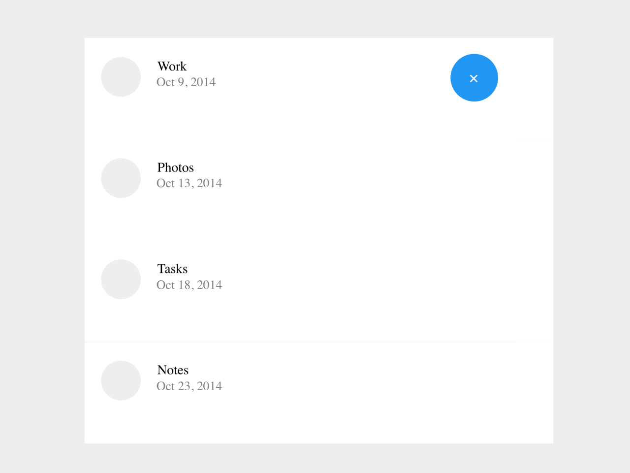
2. Ensure your HTML has the necessary structure for the transition to occur. Include a container with the class container-view and an element with the id view-1, as demonstrated in the code.
<body>


			 <div class="container-view">


					<span id="view-1" class="button-circ c-1"> <i> </i> </span>


					<div class="main-view">

							<ul class="list-tabs">
								<li>  <h2> Work </h2>
									  <h3> Oct 9, 2014  </h3>

								</li>
								<li>  <h2> Photos </h2>
									  <h3> Oct 13, 2014 </h3>

								</li>
								<li>  	<h2> Tasks</h2>
										<h3>Oct 18, 2014 </h3>


								</li>
								<li> 	 <h2>Notes</h2>
										<h3> Oct 23, 2014 </h3>

								</li>

							</ul>

					 </div>


			 </div>


    </body>
3. Now, add the following CSS between <style> tag or external CSS file to style the basic interface for transition effect. You can modify the CSS code according to your needs.
html {
  height: 100%;
}

body{
  background: #eee important;
  min-height: 740px;
  height: 100%;
  font-family: "RobotoDraft", sans-serif;
  font-weight: 400;
  overflow: hidden;
  position: relative;
}

*,
*:before,
*:after {
  box-sizing: border-box;
}

.container-view {
  position: relative;
  background: #fff;
  height: 500px;
  width: 600px;
  margin: 0 auto;
  margin-top: -250px;
  top: 50%;
}

.button-circ {
  background: #2196F3;
  color: #fff;
  text-align: center;
  font-size: 1.500em;
  line-height: 60px;
  cursor: pointer;
  z-index: 500;
  position: absolute;
  width: 60px;
  height: 60px;
  border-radius: 50%;
  left: 50%;
  top: 50%;
  transform: translate(-50%, -50%);
  transition: all 500ms cubic-bezier(0.23, 1, 0.32, 1);
}

.button-circ i:before {
  content: '+';
  display: inline-block;
  color: #fff;
  z-index: 500;
}

.container-view.view_1 span.button-circ i:before {
  transform: rotate(45deg);
  transition: all 400ms cubic-bezier(0.23, 1, 0.32, 1);
  transition-delay: 0.6s;
}

.main-view {
  background: #FF5252;
  z-index: 200;
  position: absolute;
  width: 3px;
  height: 3px;
  left: 50%;
  top: 50%;
  transform: translate(-50%, -50%);
  transition: all 400ms cubic-bezier(0.23, 1, 0.32, 1);
}

.container-view.view_1 .main-view {
  width: 100%;
  height: 100%;
  transition: all 800ms cubic-bezier(0.23, 1, 0.32, 1);
}

.container-view.view_1 #view-1 {
  left: 100%;
  top: 10%;
  transform: translate(-136%, -50%);
  transition: all 700ms cubic-bezier(0.66, -0.2, 0.425, 0.945);
  /* custom */
}

ul.list-tabs {
  visibility: hidden;
  background: #fff;
  z-index: 300;
}

ul.list-tabs li {
  visibility: hidden;
  display: block;
  font-size: 1.063em;
  line-height: 1;
  /*transform*/
  transform: translate3D(0, 160px, 0);
}

.container-view ul.list-tabs {
  height: 0%;
}

.container-view.view_1 ul.list-tabs {
  height: 75%;
  visibility: visible;
  transition: all 1000ms cubic-bezier(0.23, 1, 0.32, 1);
  /* easeOutQuint */
  /* Safari */
  transition-delay: 0.1s;
}

.container-view.view_1 ul.list-tabs li {
  visibility: visible;
  padding: 1.4em;
  position: relative;
  width: 100%;
  background: #fff;
  min-height: 80px;
  /*transform*/
  transform: translate3D(0px, 0, 0);
  transition: all 500ms cubic-bezier(0.23, 1, 0.32, 1);
  /* easeOutQuint */
  /* Safari */
  transition-delay: 0.5s;
}

.container-view ul.list-tabs li:before {
  content: '';
  display: block;
  position: absolute;
  border-radius: 50%;
  margin-left: -3px;
  width: 50px;
  height: 50px;
  background: #eee;
}

.container-view ul.list-tabs li h2, h3 {
  padding: 0 4em;
  line-height: 1.4;
}

.container-view ul.list-tabs li h3 {
  font-size: 0.938em;
  padding: 0 4.2em;
  color: grey;
}

.container-view.view_1 ul.list-tabs li:nth-child(2) {
  transition: all 600ms cubic-bezier(0.23, 1, 0.32, 1);
  /* easeOutQuint */
  /* Safari */
  transition-delay: 0.5s;
}

.container-view.view_1 ul.list-tabs li:nth-child(3) {
  transition: all 600ms cubic-bezier(0.23, 1, 0.32, 1);
  /* easeOutQuint */
  /* Safari */
  transition-delay: 0.5s;
}

.container-view.view_1 ul.list-tabs li:nth-child(3) {
  transition: all 600ms cubic-bezier(0.23, 1, 0.32, 1);
  /* easeOutQuint */
  /* Safari */
  transition-delay: 0.5s;
}

.container-view.view_1 ul.list-tabs li:nth-child(4) {
  transition: all 600ms cubic-bezier(0.23, 1, 0.32, 1);
  /* easeOutQuint */
  /* Safari */
  transition-delay: 0.5s;
}
4. Load the jQuery by adding the following CDN link before closing the body tag:
<script src='https://cdnjs.cloudflare.com/ajax/libs/jquery/2.1.3/jquery.min.js'></script>
5. Finally, add the following JavaScript function. You can trigger the interface transition effect by clicking on the element with the id view-1. Customize the content inside this element to suit your application.
$('#view-1' ).bind( 'click', function(e) {

		$( this ).toggleClass( 'active' );
		e.preventDefault();


		$( '.container-view' ).toggleClass( 'view_1' );


});
Feel free to customize the CSS properties within the code to match your project’s design. You can also expand the functionality by adding more views or modifying the transition effects according to your preferences.
That’s all! hopefully, you have successfully created the interface transition effect on your webpage. If you have any questions or suggestions, feel free to comment below.
Similar Code Snippets:
 Material Design Tiles Layout
- Material Design Flip Card On Click
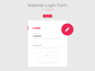
- Animated Login Form Using Material Design
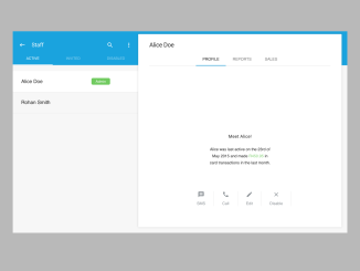
- Material Design Team Member Profile UI
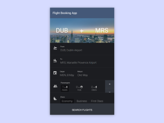
- Flight Reservation Form HTML Code
- Material Design Typography in CSS
- Material Design File Upload Input

I code and create web elements for amazing people around the world. I like work with new people. New people new Experiences.
I truly enjoy what I’m doing, which makes me more passionate about web development and coding. I am always ready to do challenging tasks whether it is about creating a custom CMS from scratch or customizing an existing system.