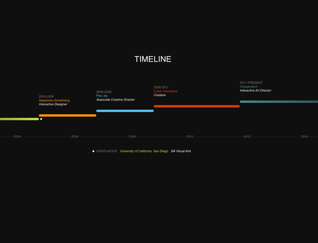

This code generates a vertical scrolling timeline template using CSS3. It organizes events by years, displaying professional milestones and experiences. This template is helpful for showcasing a career journey or project history with a visually appealing timeline layout.
It’s perfect for personal portfolios or business websites. One benefit is its simplicity in displaying information chronologically, aiding in presenting achievements.
How to Create Vertical Scrolling Timeline in HTML and CSS3
1. First of all, utilize the following HTML code to structure the timeline. Customize events by altering the dates, job positions, and associated details. Customize the timeline’s years by adjusting the <li> elements under the .timelines-years class to fit your event years.
If using a legend, update the <span> under the .timeline-event-legend class to showcase specific meanings or categories associated with the events.
<h1>Timeline</h1>
<ul class="timeline-events">
	<li class="timeline-event-years-6-5 timeline-event-legend">
		<span>
			<i></i>
			<h2>Graduation</h2>
			<h3>University of California, San Diego</h3>
			<h4>BA Visual Arts</h4>
		</span>
		<i></i>
	</li>
	<li class="timeline-event-years-2">
		<h2>2004-2006</h2>
		<h3>Ideaworks Advertising</h3>
		<h4>Interactive Designer</h4>
	</li>
	<li class="timeline-event-years-2">
		<h2>2006-2008</h2>
		<h3>Pint, Inc</h3>
		<h4>Associate Creative Director</h4>
	</li>
	<li class="timeline-event-years-3">
		<h2>2008-2011</h2>
		<h3>Cuker Interactive</h3>
		<h4>Creative</h4>
	</li>
	<li class="timeline-event-years-7">
		<h2>2011-Present</h2>
		<h3>Independent</h3>
		<h4>Interactive Art Director</h4>
	</li>
</ul>
<ul class="timelines-years">
	<li>2000</li>
	<li>2002</li>
	<li>2004</li>
	<li>2006</li>
	<li>2008</li>
	<li>2010</li>
	<li>2012</li>
	<li>2014</li>
	<li>2016</li>
	<li>2018</li>
</ul>
2. Style the timeline using the following CSS styles. It defines the timeline layout, positioning, colors, and responsive design. You can modify fonts, colors, and dimensions as needed to match your website’s theme.
body {
  font-family: sans-serif;
  margin: 0;
  padding: 0;
  background: #0F0F0F;
  background-image: url('data:image/svg+xml;base64,PD94bWwgdmVyc2lvbj0iMS4wIiBlbmNvZGluZz0idXRmLTgiPz4gPHN2ZyB2ZXJzaW9uPSIxLjEiIHhtbG5zPSJodHRwOi8vd3d3LnczLm9yZy8yMDAwL3N2ZyI+PGRlZnM+PGxpbmVhckdyYWRpZW50IGlkPSJncmFkIiBncmFkaWVudFVuaXRzPSJvYmplY3RCb3VuZGluZ0JveCIgeDE9IjAuMCIgeTE9IjAuNSIgeDI9IjEuMCIgeTI9IjAuNSI+PHN0b3Agb2Zmc2V0PSIwJSIgc3RvcC1jb2xvcj0iIzBmMGYwZiIvPjxzdG9wIG9mZnNldD0iOTklIiBzdG9wLWNvbG9yPSIjMGYwZjBmIi8+PHN0b3Agb2Zmc2V0PSIxMDAlIiBzdG9wLWNvbG9yPSIjMDAwMDAwIi8+PC9saW5lYXJHcmFkaWVudD48L2RlZnM+PHJlY3QgeD0iMCIgeT0iMCIgd2lkdGg9IjEwMCUiIGhlaWdodD0iMTAwJSIgZmlsbD0idXJsKCNncmFkKSIgLz48L3N2Zz4g');
  background-size: 100%;
  background-image: -moz-linear-gradient(0deg, #0f0f0f 0%, #0f0f0f 99px, #000000 100px);
  background-image: -webkit-linear-gradient(0deg, #0f0f0f 0%, #0f0f0f 99px, #000000 100px);
  background-image: linear-gradient(90deg, #0f0f0f 0%, #0f0f0f 99px, #000000 100px);
  background-size: 100px 100px;
  position: relative;
  min-height: 720px;
  overflow: auto;
}

h1 {
  position: absolute;
  top: 20px;
  left: 935px;
  color: #fff;
  font-weight: normal;
  font-size: 28px;
  text-transform: uppercase;
}

/* Timeline - Years */
.timelines-years {
  position: absolute;
  top: 300px;
  padding: 0 0 0 200px;
  margin: 0;
  white-space: nowrap;
  border-top: 1px solid #282828;
  list-style: none;
  /* Fix display: inline-block spacing issue */
  font-size: 0;
}

.timelines-years li {
  position: relative;
  top: -6px;
  display: inline-block;
  width: 200px;
  color: #868686;
  font-size: 11px;
  line-height: 11px;
  text-indent: -12px;
}

/* Display last year */
.timelines-years li:last-child {
  width: 100px;
}

/* Timeline - Events */
.timeline-events {
  position: absolute;
  top: 170px;
  padding: 0;
  list-style: none;
  white-space: nowrap;
  /* Fix display: inline-block spacing issue */
  font-size: 0;
}

.timeline-events h2,
.timeline-events h3,
.timeline-events h4 {
  margin: 0 0 1px 0;
  font-weight: normal;
  font-size: 11px;
}

.timeline-events h2 {
  color: #777;
  text-transform: uppercase;
}

.timeline-events h4 {
  color: #fff;
  font-style: italic;
}

.timeline-events li {
  position: relative;
  display: inline-block;
}

.timeline-events li:before {
  position: absolute;
  left: 0;
  bottom: -36px;
  height: 8px;
  border-radius: 8px;
  content: '';
}

.timeline-events li:nth-child(1) {
  bottom: 0px;
}

.timeline-events li:nth-child(2) {
  bottom: 16px;
}

.timeline-events li:nth-child(3) {
  bottom: 32px;
}

.timeline-events li:nth-child(4) {
  bottom: 48px;
}

.timeline-events li:nth-child(5) {
  bottom: 64px;
}

/* Timeline - Events - Colours */
/* Grey/Green */
.timeline-events li:nth-child(1):before {
  background: #C2E34E;
  background-image: url('data:image/svg+xml;base64,PD94bWwgdmVyc2lvbj0iMS4wIiBlbmNvZGluZz0idXRmLTgiPz4gPHN2ZyB2ZXJzaW9uPSIxLjEiIHhtbG5zPSJodHRwOi8vd3d3LnczLm9yZy8yMDAwL3N2ZyI+PGRlZnM+PGxpbmVhckdyYWRpZW50IGlkPSJncmFkIiBncmFkaWVudFVuaXRzPSJvYmplY3RCb3VuZGluZ0JveCIgeDE9IjAuMCIgeTE9IjAuNSIgeDI9IjEuMCIgeTI9IjAuNSI+PHN0b3Agb2Zmc2V0PSIwJSIgc3RvcC1jb2xvcj0iIzBmMGYwZiIvPjxzdG9wIG9mZnNldD0iMTAwJSIgc3RvcC1jb2xvcj0iI2MyZTM0ZSIvPjwvbGluZWFyR3JhZGllbnQ+PC9kZWZzPjxyZWN0IHg9IjAiIHk9IjAiIHdpZHRoPSIxMDAlIiBoZWlnaHQ9IjEwMCUiIGZpbGw9InVybCgjZ3JhZCkiIC8+PC9zdmc+IA==');
  background-size: 100%;
  background-image: -webkit-gradient(linear, 0% 50%, 100% 50%, color-stop(0%, #0f0f0f), color-stop(100%, #c2e34e));
  background-image: -moz-linear-gradient(left, #0f0f0f 0%, #c2e34e 100%);
  background-image: -webkit-linear-gradient(left, #0f0f0f 0%, #c2e34e 100%);
  background-image: linear-gradient(to right, #0f0f0f 0%, #c2e34e 100%);
  border-radius: 0 6px 6px 0;
}

.timeline-events li:nth-child(1) h3 {
  color: #C2E34E;
}

/* Orange */
.timeline-events li:nth-child(2):before {
  background: #FF9704;
}

.timeline-events li:nth-child(2) h3 {
  color: #FF9704;
}

/* Blue */
.timeline-events li:nth-child(3):before {
  background: #56C2F3;
}

.timeline-events li:nth-child(3) h3 {
  color: #56C2F3;
}

/* Red */
.timeline-events li:nth-child(4):before {
  background: #DD3D01;
}

.timeline-events li:nth-child(4) h3 {
  color: #DD3D01;
}

/* Aqua/Grey */
.timeline-events li:nth-child(5):before {
  background: #4A8B8F;
  background-image: url('data:image/svg+xml;base64,PD94bWwgdmVyc2lvbj0iMS4wIiBlbmNvZGluZz0idXRmLTgiPz4gPHN2ZyB2ZXJzaW9uPSIxLjEiIHhtbG5zPSJodHRwOi8vd3d3LnczLm9yZy8yMDAwL3N2ZyI+PGRlZnM+PGxpbmVhckdyYWRpZW50IGlkPSJncmFkIiBncmFkaWVudFVuaXRzPSJvYmplY3RCb3VuZGluZ0JveCIgeDE9IjAuMCIgeTE9IjAuNSIgeDI9IjEuMCIgeTI9IjAuNSI+PHN0b3Agb2Zmc2V0PSIwJSIgc3RvcC1jb2xvcj0iIzRhOGI4ZiIvPjxzdG9wIG9mZnNldD0iMTAwJSIgc3RvcC1jb2xvcj0iIzBmMGYwZiIvPjwvbGluZWFyR3JhZGllbnQ+PC9kZWZzPjxyZWN0IHg9IjAiIHk9IjAiIHdpZHRoPSIxMDAlIiBoZWlnaHQ9IjEwMCUiIGZpbGw9InVybCgjZ3JhZCkiIC8+PC9zdmc+IA==');
  background-size: 100%;
  background-image: -webkit-gradient(linear, 0% 50%, 100% 50%, color-stop(0%, #4a8b8f), color-stop(100%, #0f0f0f));
  background-image: -moz-linear-gradient(left, #4a8b8f 0%, #0f0f0f 100%);
  background-image: -webkit-linear-gradient(left, #4a8b8f 0%, #0f0f0f 100%);
  background-image: linear-gradient(to right, #4a8b8f 0%, #0f0f0f 100%);
  border-radius: 6px 0 0 6px;
}

.timeline-events li:nth-child(5) h3 {
  color: #4A8B8F;
}

/* Timeline - Events - Grid */
/* X years */
.timeline-event-years-0,
.timeline-event-years-0:before {
  width: 0px;
}

/* X.5 years */
.timeline-event-years-0-5,
.timeline-event-years-0-5:before {
  width: 50px;
}

/* X years */
.timeline-event-years-1,
.timeline-event-years-1:before {
  width: 100px;
}

/* X.5 years */
.timeline-event-years-1-5,
.timeline-event-years-1-5:before {
  width: 150px;
}

/* X years */
.timeline-event-years-2,
.timeline-event-years-2:before {
  width: 200px;
}

/* X.5 years */
.timeline-event-years-2-5,
.timeline-event-years-2-5:before {
  width: 250px;
}

/* X years */
.timeline-event-years-3,
.timeline-event-years-3:before {
  width: 300px;
}

/* X.5 years */
.timeline-event-years-3-5,
.timeline-event-years-3-5:before {
  width: 350px;
}

/* X years */
.timeline-event-years-4,
.timeline-event-years-4:before {
  width: 400px;
}

/* X.5 years */
.timeline-event-years-4-5,
.timeline-event-years-4-5:before {
  width: 450px;
}

/* X years */
.timeline-event-years-5,
.timeline-event-years-5:before {
  width: 500px;
}

/* X.5 years */
.timeline-event-years-5-5,
.timeline-event-years-5-5:before {
  width: 550px;
}

/* X years */
.timeline-event-years-6,
.timeline-event-years-6:before {
  width: 600px;
}

/* X.5 years */
.timeline-event-years-6-5,
.timeline-event-years-6-5:before {
  width: 650px;
}

/* X years */
.timeline-event-years-7,
.timeline-event-years-7:before {
  width: 700px;
}

/* X.5 years */
.timeline-event-years-7-5,
.timeline-event-years-7-5:before {
  width: 750px;
}

/* X years */
.timeline-event-years-8,
.timeline-event-years-8:before {
  width: 800px;
}

/* X.5 years */
.timeline-event-years-8-5,
.timeline-event-years-8-5:before {
  width: 850px;
}

/* Timeline - Legend */
.timeline-event-legend {
  position: relative;
}

.timeline-event-legend span {
  position: absolute;
  bottom: -150px;
  left: 850px;
}

.timeline-event-legend h2,
.timeline-event-legend h3,
.timeline-event-legend h4 {
  display: inline;
  margin-right: 10px;
}

.timeline-event-legend i {
  position: absolute;
  width: 0;
  height: 0;
  border: 4px solid transparent;
  border-bottom-color: #fff;
}

.timeline-event-legend i:after {
  content: '';
  position: absolute;
  width: 0;
  height: 0;
  border: 4px solid transparent;
  border-top-color: #fff;
}

.timeline-event-legend > i {
  bottom: -32px;
  right: -12px;
}

.timeline-event-legend > i:after {
  left: -4px;
  bottom: -12px;
}

.timeline-event-legend span > i {
  top: -1px;
  left: -14px;
}

.timeline-event-legend span > i:after {
  left: -4px;
  bottom: -12px;
}
This guide helps you quickly implement a vertical scrolling timeline on your website, enhancing the visual appeal of your career journey or project milestones. The smooth scrolling effect and distinct colors make the information presentation engaging for visitors.
That’s all! hopefully, you have successfully created a Vertical Scrolling Timeline on your website. If you have any questions or suggestions, feel free to comment below.
Similar Code Snippets:
 Toggle Button in CSS With Stretchable Elastic Effect
- CSS3 Buttons With Interactive Hover Effect
- Pure CSS Candle Flame Animation
- Animated Project Download Button UI
- HTML5 Canvas Draw Straight Line with Mouse
- CSS Background Color Only Behind Text


I code and create web elements for amazing people around the world. I like work with new people. New people new Experiences.
I truly enjoy what I’m doing, which makes me more passionate about web development and coding. I am always ready to do challenging tasks whether it is about creating a custom CMS from scratch or customizing an existing system.