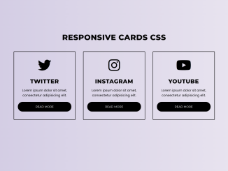
This HTML & CSS code snippet helps you to create a responsive card with captivating hover effects. When you hover over these cards, they undergo a color transformation, providing an engaging visual feedback experience.
You can integrate these cards into your project to showcase products, services, or team members. Similarly, you can arrange your content inside these cards to make your website appearance more appealing.
How to Create Simple CSS Card with Hover Effects
1. First of all, load the Font Awesome CSS by adding the following CDN link into the head tag of your HTML document. (Optional)
<link rel="stylesheet" href="https://cdnjs.cloudflare.com/ajax/libs/font-awesome/5.15.3/css/all.min.css"/>
2. Create the HTML structure for your responsive cards. You can use the following HTML code as a template. Replace the card’s content with your own. Likewise, change the Font Awesome icon class, title, description, and link as needed.
<div class="cards">
         <h2 class="header">
            Responsive Cards CSS
         </h2>
         <div class="services">
            <div class="content content-1">
               <div class="fab fa-twitter"></div>
               <h2>
                  Twitter
               </h2>
               <p>
                  Lorem ipsum dolor sit amet, consectetur adipisicing elit.
               </p>
               <a href="#">Read More</a>
            </div>
            <div class="content content-2">
               <div class="fab fa-instagram"></div>
               <h2>
                  Instagram
               </h2>
               <p>
                  Lorem ipsum dolor sit amet, consectetur adipisicing elit.
               </p>
               <a href="#">Read More</a>
            </div>
            <div class="content content-3">
               <div class="fab fa-youtube"></div>
               <h2>
                  Youtube
               </h2>
               <p>
                  Lorem ipsum dolor sit amet, consectetur adipisicing elit.
               </p>
               <a href="#">Read More</a>
            </div>
         </div>
      </div>
3. Finally, let’s apply the following CSS code to style our cards. Make sure to save this CSS code in a file called styles.css and link it in the HTML file.
@import url('https://fonts.googleapis.com/css?family=Montserrat:400,800|Poppins&display=swap');
*{
  margin: 0;
  padding: 0;
  box-sizing: border-box;
  font-family: 'Montserrat',sans-serif;
}
.cards{
  max-width: 1100px;
  margin: 0 auto;
  text-align: center;
  padding: 30px;
}
.cards h2.header{
  font-size: 40px;
  margin: 0 0 30px 0;
  text-transform: uppercase;
  letter-spacing: 1px;
}
.services{
  display: flex;
  align-items: center;
}
.content{
  display: flex;
  flex-wrap: wrap;
  flex: 1;
  margin: 20px;
  padding: 20px;
  border: 2px solid black;
  border-radius: 4px;
  transition: all .3s ease;
}
.content .fab{
  font-size: 70px;
  margin: 16px 0;
}
.content > *{
  flex: 1 1 100%;
}
.content:hover{
  color: white;
}
.content:hover a{
  border-color: white;
  background: white;
}
.content-1:hover{
  border-color: #1DA1F2;
  background: #1DA1F2;
}
.content-1:hover a{
  color: #1DA1F2;
}
.content-2:hover{
  border-color: #E1306C;
  background: #E1306C;
}
.content-2:hover a{
  color: #E1306C;
}
.content-3:hover{
  border-color: #ff0000;
  background: #ff0000;
}
.content-3:hover a{
  color: #ff0000;
}
.content h2{
  font-size: 30px;
  margin: 16px 0;
  letter-spacing: 1px;
  text-transform: uppercase;
}
.content p{
  font-size: 17px;
  font-family: 'Poppins',sans-serif;
}
.content a{
  margin: 22px 0;
  background: black;
  color: white;
  text-decoration: none;
  text-transform: uppercase;
  border: 1px solid black;
  padding: 15px 0;
  border-radius: 25px;
  transition: .3s ease;
}
.content a:hover{
  border-radius: 4px;
}
@media (max-width: 900px) {
  .services{
    display: flex;
    flex-direction: column;
  }
}
The above CSS code includes hover effects. When you hover over a card (e.g., .content-1), it will change its background color and text color to create an interactive effect. Customize the colors according to your design preferences.
That’s it! You’ve created responsive CSS cards with hover effects for your website. If you have any questions or suggestions, feel free to comment below.
Similar Code Snippets:

I code and create web elements for amazing people around the world. I like work with new people. New people new Experiences.
I truly enjoy what I’m doing, which makes me more passionate about web development and coding. I am always ready to do challenging tasks whether it is about creating a custom CMS from scratch or customizing an existing system.

