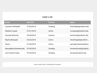
This HTML and CSS code helps you to create a responsive table with auto adjust column width. It creates a clean, organized, and visually appealing table by styling various elements such as borders, fonts, colors, and spacing. It ensures that the table adjusts well to different screen sizes and maintains a consistent design across browsers.
How to Create HTML Table Column Width Auto Adjust
1. First of all, load the Google Fonts by adding the following CDN link to the head tag of your HTML document.
<link rel='stylesheet' href='https://fonts.googleapis.com/css?family=Open+Sans'>
2. Create the HTML structure for your table. You can copy the following code and customize it to suit your data:
<table>
  <caption>User List</caption>
  <thead>
    <tr>
      <th scope="col">Name</th>
      <th scope="col">Created</th>
      <th scope="col">Status</th>
      <th scope="col">Email</th>
    </tr>
  </thead>
  <tbody>
    <tr>
      <td scope="row">Leonard Hofstadter</td>
      <td>07/06/2016</td>
      <td>Pending</td>
      <td>lhofstadter@caltech.edu</td>
    </tr>
    <tr>
      <td scope="row">Sheldon Cooper</td>
      <td>07/01/2016</td>
      <td>Active</td>
      <td>scooper@@caltech.edu</td>
    </tr>
    <tr>
      <td scope="row">Howard Wolowitz</td>
      <td>06/05/2016</td>
      <td>Inactive</td>
      <td>hwolowitz@caltech.edu</td>
    </tr>
    <tr>
      <td scope="row">Raj Koothrappali</td>
      <td>06/20/2016</td>
      <td>Active</td>
      <td>rkoothrappali@caltech.edu</td>
    </tr>
    <tr>
      <td scope="row">Penny</td>
      <td>07/06/2016</td>
      <td>Active</td>
      <td>penny@cheesecakefactory.com</td>
    </tr>
    <tr>
      <td scope="row">Bernadette Rostenkowski</td>
      <td>07/05/2016</td>
      <td>Pending</td>
      <td>brostenkowski@caltech.edu</td>
    </tr>
    <tr>
      <td scope="row">Amy Farrah Fowler</td>
      <td>07/05/2016</td>
      <td>Pending</td>
      <td>afowler@caltech.edu</td>
    </tr>
  </tbody>
</table>
3. Now, let’s style the table with CSS to achieve the auto-adjusting column widths and an appealing layout. Copy the following CSS code and add it to your HTML file or an external stylesheet:
body {
  font-family: "Open Sans", sans-serif;
  line-height: 1.25;
}
table {
  border: 1px solid #ccc;
  border-collapse: collapse;
  table-layout: fixed;
  width: 100%;
}
table caption {
  font-size: 1.5em;
  margin: .5em 0 .75em;
}
table tr {
  border: 1px solid #ddd;
  padding: .35em;
}
table tr:nth-child(even) {
  background: #f8f8f8;
}
table th,
table td {
  padding: .625em;
  text-align: left;
}
table th {
  background: #999;
  color: #fff;
  font-size: .85em;
  letter-spacing: .1em;
  text-transform: uppercase;
}
table td {
  white-space: nowrap;
  overflow: hidden;
  text-overflow: ellipsis;
}
This CSS code provides a clean and responsive design for your table. It sets a fixed table layout, ensures proper spacing, and styles the headers and data rows.
That’s all! hopefully, you’ve successfully created an HTML table with auto-adjusting column widths using CSS. This technique will help you present your tabular data effectively and maintain a responsive design on your website. If you have any questions or suggestions, feel free to comment below.
Similar Code Snippets:

I code and create web elements for amazing people around the world. I like work with new people. New people new Experiences.
I truly enjoy what I’m doing, which makes me more passionate about web development and coding. I am always ready to do challenging tasks whether it is about creating a custom CMS from scratch or customizing an existing system.

