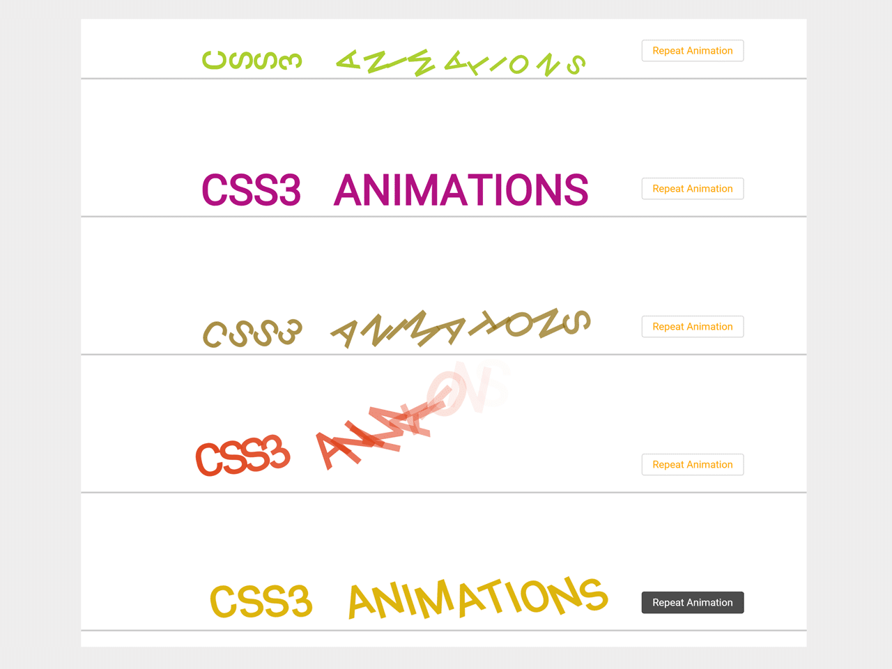

This CSS code snippet comes with seven attractive animations to make your text animated. It uses CSS3 animation keyframes and animation-delay to animates each character of a single word.
It provides a simple way to animate words or lines. You can use this animated text CSS library to make attractive visualization of your special text.
How to Create Animated Text
1. In the first step, create the HTML structure for your text as follows:
<div class="container">
<!--<div class="take-input">
<input type="text" placeholder="Write any text" />
<a href="javascript:void(0);">Enter Text</a>
</div>-->
<div class="animate seven">
<span>c</span><span>s</span><span>s</span><span>3</span>
<span>a</span><span>n</span><span>i</span><span>m</span><span>a</span><span>t</span><span>i</span><span>o</span><span>n</span><span>s</span>
<a class="repeat" href="javascript:void(0);">Repeat Animation</a>
</div>
<div class="animate one">
<span>c</span><span>s</span><span>s</span><span>3</span>
<span>a</span><span>n</span><span>i</span><span>m</span><span>a</span><span>t</span><span>i</span><span>o</span><span>n</span><span>s</span>
<a class="repeat" href="javascript:void(0);">Repeat Animation</a>
</div>
<div class="animate two">
<span>c</span><span>s</span><span>s</span><span>3</span>
<span>a</span><span>n</span><span>i</span><span>m</span><span>a</span><span>t</span><span>i</span><span>o</span><span>n</span><span>s</span>
<a class="repeat" href="javascript:void(0);">Repeat Animation</a>
</div>
<div class="animate three">
<span>c</span><span>s</span><span>s</span><span>3</span>
<span>a</span><span>n</span><span>i</span><span>m</span><span>a</span><span>t</span><span>i</span><span>o</span><span>n</span><span>s</span>
<a class="repeat" href="javascript:void(0);">Repeat Animation</a>
</div>
<div class="animate four">
<span>c</span><span>s</span><span>s</span><span>3</span>
<span>a</span><span>n</span><span>i</span><span>m</span><span>a</span><span>t</span><span>i</span><span>o</span><span>n</span><span>s</span>
<a class="repeat" href="javascript:void(0);">Repeat Animation</a>
</div>
<div class="animate five">
<span>c</span><span>s</span><span>s</span><span>3</span>
<span>a</span><span>n</span><span>i</span><span>m</span><span>a</span><span>t</span><span>i</span><span>o</span><span>n</span><span>s</span>
<a class="repeat" href="javascript:void(0);">Repeat Animation</a>
</div>
<div class="animate six">
<span>c</span><span>s</span><span>s</span><span>3</span>
<span>a</span><span>n</span><span>i</span><span>m</span><span>a</span><span>t</span><span>i</span><span>o</span><span>n</span><span>s</span>
<a class="repeat" href="javascript:void(0);">Repeat Animation</a>
</div>
</div>
2. After that, add the following CSS styles to use the text animations.
@import url('https://fonts.googleapis.com/css?family=Lato:100,100i,300,300i,400,400i,700,700i,900,900i');

*
{
	margin: 0;
	padding: 0;
}

body
{
	font-family: 'Lato', sans-serif;
	font-size: 14px;
	color: #999999;
	word-wrap:break-word;
}

p
{
	margin: 0 0 10px;
}

ul
{
	list-style: none;
}

.container {
	width: 100%;
	margin: auto;
	font-weight: 900;
	text-transform: uppercase;
	text-align: center;
	padding: 0 0 200px;
}

/*.take-input {
  margin: 50px 0 0;
}

.take-input input {
  width: 400px;
  height: 35px;
  padding: 0 10px;
  border-radius: 5px;
  border: 1px solid #ececec;
  margin: 0 15px 0 0;
  font-size: 15px;
}*/

a, a:link, a:visited {
  text-decoration: none;
  padding: 9px 15px;
  border: 1px solid #ececec;
  border-radius: 5px;
  color: gray;
}

.animate {
	font-size: 50px;
	margin: 100px 0 0;
	border-bottom: 2px solid #ccc;
}

.animate span {
	display: inline-block;
}

a.repeat {
  display: inline-block;
  font-size: 12px;
  text-transform: none;
  text-decoration: none;
  color: orange;
  padding: 5px 12px;
  border: 1px solid rgba(0, 0, 0, 0.15);
  font-weight: normal;
  margin: 0 0 0 50px;
  border-radius: 3px;
  position: relative;
  bottom: 15px;
}

a.repeat:hover {
  background: rgba(0, 0, 0, 0.7);
  color: white;
}

.animate span:nth-of-type(2) {
	animation-delay: .05s;
}
.animate span:nth-of-type(3) {
	animation-delay: .1s;
}
.animate span:nth-of-type(4) {
	animation-delay: .15s;
}
.animate span:nth-of-type(5) {
	animation-delay: .2s;
}
.animate span:nth-of-type(6) {
	animation-delay: .25s;
}
.animate span:nth-of-type(7) {
	animation-delay: .3s;
}
.animate span:nth-of-type(8) {
	animation-delay: .35s;
}
.animate span:nth-of-type(9) {
	animation-delay: .4s;
}
.animate span:nth-of-type(10) {
	animation-delay: .45s;
}
.animate span:nth-of-type(11) {
	animation-delay: .5s;
}
.animate span:nth-of-type(12) {
	animation-delay: .55s;
}
.animate span:nth-of-type(13) {
	animation-delay: .6s;
}
.animate span:nth-of-type(14) {
	animation-delay: .65s;
}
.animate span:nth-of-type(15) {
	animation-delay: .7s;
}
.animate span:nth-of-type(16) {
	animation-delay: .75s;
}
.animate span:nth-of-type(17) {
	animation-delay: .8s;
}
.animate span:nth-of-type(18) {
	animation-delay: .85s;
}
.animate span:nth-of-type(19) {
	animation-delay: .9s;
}
.animate span:nth-of-type(20) {
	animation-delay: .95s;
}


/* Animation One */

.one span {
	color: #24a8e6;
	opacity: 0;
	transform: translate(-150px, -50px) rotate(-180deg) scale(3);
	animation: revolveScale .4s forwards;
}

@keyframes revolveScale {
	60% {
		transform: translate(20px, 20px) rotate(30deg) scale(.3);
	}

	100% {
		transform: translate(0) rotate(0) scale(1);
		opacity: 1;
	}
}


/* Animation Two */

.two span {
	color: #a5cb21;
	opacity: 0;
	transform: translate(200px, -100px) scale(2);
	animation: ballDrop .3s forwards;
}

@keyframes ballDrop {
	60% {
		transform: translate(0, 20px) rotate(-180deg) scale(.5);
	}

	100% {
		transform: translate(0) rotate(0deg) scale(1);
		opacity: 1;
	}
}


/* Animation Three */


.three span {
	color: #b10e81;
	opacity: 0;
	transform: translate(-300px, 0) scale(0);
	animation: sideSlide .5s forwards;
}

@keyframes sideSlide {
	60% {
		transform: translate(20px, 0) scale(1);
		color: #b10e81;
	}

	80% {
		transform: translate(20px, 0) scale(1);
		color: #b10e81;
	}

	99% {
		transform: translate(0) scale(1.2);
		color: #00f0ff;
	}

	100% {
		transform: translate(0) scale(1);
		opacity: 1;
		color: #b10e81;
	}
}


/* Animation Four */


.four span {
	color: #8d6a00;
	opacity: 0;
	transform: translate(0, -100px) rotate(360deg) scale(0);
	animation: revolveDrop .3s forwards;
}


@keyframes revolveDrop {
	30% {
		transform: translate(0, -50px) rotate(180deg) scale(1);
	}

	60% {
		transform: translate(0, 20px) scale(.8) rotate(0deg);
	}

	100% {
		transform: translate(0) scale(1) rotate(0deg);
		opacity: 1;
	}
}


/* Animation Five */


.five span {
	color: #dd3f0f;
	opacity: 0;
	transform: translate(0, -100px) rotate(360deg) scale(0);
	animation: dropVanish .5s forwards;
}


@keyframes dropVanish {
	30% {
		transform: translate(0, -50px) rotate(180deg) scale(1);
	}

	50% {
		transform: translate(0, 20px) scale(.8) rotate(0deg);
		opacity: 1;
	}

	80% {
		transform: translate(-100px, -100px) scale(1.5) rotate(-180deg);
		opacity: 0;
	}

	100% {
		transform: translate(0) scale(1) rotate(0deg);
		opacity: 1;
	}
}


/* Animation Six */


.six span {
	color: #ddb40f;
	opacity: 0;
	transform: rotate(-180deg) translate(150px, 0);
	animation: twister .5s forwards;
}


@keyframes twister {
	10% {
		opacity: 1;
	}
	100% {
		transform: rotate(0deg) translate(0);
		opacity: 1;
	}
}


/* Animation Seven */


.seven span {
	color: #348c04;
	opacity: 0;
	transform: translate(-150px, 0) scale(.3);
	animation: leftRight .5s forwards;
}


@keyframes leftRight {
	40% {
		transform: translate(50px, 0) scale(.7);
		opacity: 1;
		color: #348c04;
	}

	60% {
		color: #0f40ba;
	}

	80% {
		transform: translate(0) scale(2);
		opacity: 0;
	}

	100% {
		transform: translate(0) scale(1);
		opacity: 1;
	}
}
That’s all! hopefully, you have successfully integrated animated text CSS into your project. If you have any questions or suggestions, feel free to comment below.
Similar Code Snippets:

- Simple Landing Page HTML CSS Code
- Table Background Image in HTML
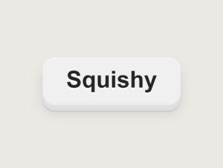
- CSS Squishy Button With Smooth Transition
- HTML Table Column width Auto Adjust


I code and create web elements for amazing people around the world. I like work with new people. New people new Experiences.
I truly enjoy what I’m doing, which makes me more passionate about web development and coding. I am always ready to do challenging tasks whether it is about creating a custom CMS from scratch or customizing an existing system.