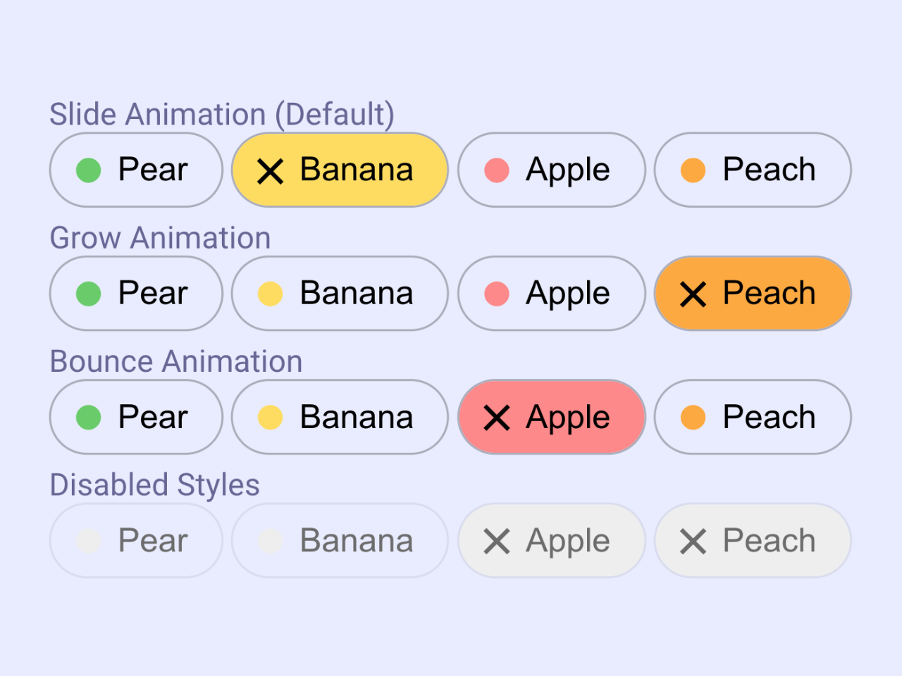

This CSS code snippet helps you to create animated toggle pills using HTML checkbox inputs. Choose from default, grow, or bounce animations, and even disabled styles. Easily integrate these animated toggle pills into your project for a sleek and engaging user experience.
How to Create Animated Toggle Pills Using CSS
1. Include the provided HTML code within the <body> tags of your HTML document. Customize the <fieldset> elements and their respective <legend> as needed for your specific content.
<fieldset>
  <legend>Slide Animation (Default)</legend>
  <input type="checkbox" class="chip" role="switch" value="Pear" aria-label="Pear" />
  <input type="checkbox" class="chip" role="switch" value="Banana" aria-label="Banana" style="--color: #fd5" checked />
  <input type="checkbox" class="chip" role="switch" value="Apple" aria-label="Apple" style="--color:#f88" />
  <input type="checkbox" class="chip" role="switch" value="Peach" aria-label="Peach" style="--color:#fa3" />
</fieldset>

<fieldset>
  <legend>Grow Animation</legend>
  <input type="checkbox" class="chip grow" role="switch" value="Pear" aria-label="Pear" />
  <input type="checkbox" class="chip grow" role="switch" value="Banana" aria-label="Banana" style="--color: #fd5" />
  <input type="checkbox" class="chip grow" role="switch" value="Apple" aria-label="Apple" style="--color:#f88" />
  <input type="checkbox" class="chip grow" role="switch" value="Peach" aria-label="Peach" style="--color:#fa3" checked />
</fieldset>

<fieldset>
  <legend>Bounce Animation</legend>
  <input type="checkbox" class="chip bounce" role="switch" value="Pear" aria-label="Pear"  />
  <input type="checkbox" class="chip bounce" role="switch" value="Banana" aria-label="Banana" style="--color: #fd5" />
  <input type="checkbox" class="chip bounce" role="switch" value="Apple" aria-label="Apple" style="--color:#f88" checked />
  <input type="checkbox" class="chip bounce" role="switch" value="Peach" aria-label="Peach" style="--color:#fa3" />
</fieldset>

<fieldset>
  <legend>Disabled Styles</legend>
  <input type="checkbox" class="chip bounce" role="switch" value="Pear" aria-label="Pear" disabled />
  <input type="checkbox" class="chip bounce" role="switch" value="Banana" aria-label="Banana" style="--color: #fd5" disabled/>
  <input type="checkbox" class="chip bounce" role="switch" value="Apple" aria-label="Apple" style="--color:#f88" checked disabled />
  <input type="checkbox" class="chip bounce" role="switch" value="Peach" aria-label="Peach" style="--color:#fa3" checked disabled />
</fieldset>
2. Add the CSS code to customize the appearance and animation of the toggle pills. Adjust the colors, sizes, and animation styles according to your design preferences. Each <input> element has a style attribute where you can set the --color variable and customize individual styles.
Copy the entire CSS code and paste it into your existing stylesheet or within <style> tags in the <head> of your HTML document.
input:where(.chip[type="checkbox"]) {
  --color: #6c6;
  font-size: 1rem;
  appearance: none;
  position: relative;
  padding: 0.5em 1em 0.5em 2em;
  border: 1px solid #0004;
  border-radius: 100em;
  overflow: hidden;
  margin: 0;
  display: inline-block;

  &::after {
    content: attr(value);
    white-space: pre;
    line-height: 1;
    position: relative;
  }

  &::before {
    content: "";
    display: inline-block;
    width: 0.75em;
    aspect-ratio: 1;
    background: linear-gradient(currentcolor 0 0), linear-gradient(currentcolor 0 0);
    background-position: -200% -2em, 2em -200%, 50% 50%;
    background-size: 1em 0.125em, 0.125em 1em;
    background-repeat: no-repeat;
    background-color: var(--color);
    border-radius: 50%;
    position: absolute;
    top: 50%;
    left: 1.125em;
    translate: -50% -50%;
    rotate: 45deg;
    transition: width 0.25s, background-position 0.5s;
  }

  &.grow, &.bounce {
    &::before {
      background-position: 50% 50%, 50% 50%, 50% 50%;
      background-size: 0 0, 0 0;
      transition: width 0.25s, background-size 0.5s;
    }
  }

  &.bounce {
    &::before {
      transition-timing-function: ease-in-out, cubic-bezier(0.75, 0, 0.5, 2);
    }
  }

  &:checked {
    &::before {
      width: 200%;
      background-position: 50% 50%, 50% 50%, 50% 50%;
      background-size: 1em 0.125em, 0.125em 1em;
    }
  }

  &:disabled {
    --color: #eee !important;
    color: #6c6c6c;
    border-color: #0001;
  }

  &:hover:not(:disabled) {
    border-color: #000a;
    background-color: rgb(from var(--color) r g b / 10%);
    transition: 0.4s;
  }
}

@media print {
  input:where(.chip[type="checkbox"]) {
    &, &::before, &::after {
      -webkit-print-color-adjust: exact;
      print-color-adjust: exact;
    }
  }
}

@media (prefers-reduced-motion) {
  input:where(.chip[type="checkbox"]) {
    &, &::before, &::after {
      transition: none !important;
    }
  }
}


/* DEMO - START */
body {
  margin: 0;
  min-height: 100vh;
  display: flex;
  align-items: center;
  justify-content: center;
  flex-wrap: wrap;
  flex-direction: column;
  gap: 3em;
  font-family: Roboto, Helvetica, Arial, sans-serif;
}

fieldset {
  border-color: #0000;

  & legend {
    color: #666696;
    font-weight: 500;
  }
}
/* DEMO - END */
With the HTML and CSS in place, your toggle pills are ready to shine. Open your HTML file in a web browser, and you’ll witness the delightful slide, grow, and bounce animations. You can experiment further and adapt these pills to suit the unique style of your web project.
That’s all! hopefully, you have successfully created Animated Toggle Pills Using CSS. If you have any questions or suggestions, feel free to comment below.
Similar Code Snippets:
 Slide Image on Hover Using a CSS Transition
- Product Comparison Template in HTML & CSS
- Infinite Scrolling Animation CSS
- Skew Header with Background Image CSS
- HTML Table Row Color Based on Value
- Wrap Text Around Centered Image CSS

I code and create web elements for amazing people around the world. I like work with new people. New people new Experiences.
I truly enjoy what I’m doing, which makes me more passionate about web development and coding. I am always ready to do challenging tasks whether it is about creating a custom CMS from scratch or customizing an existing system.