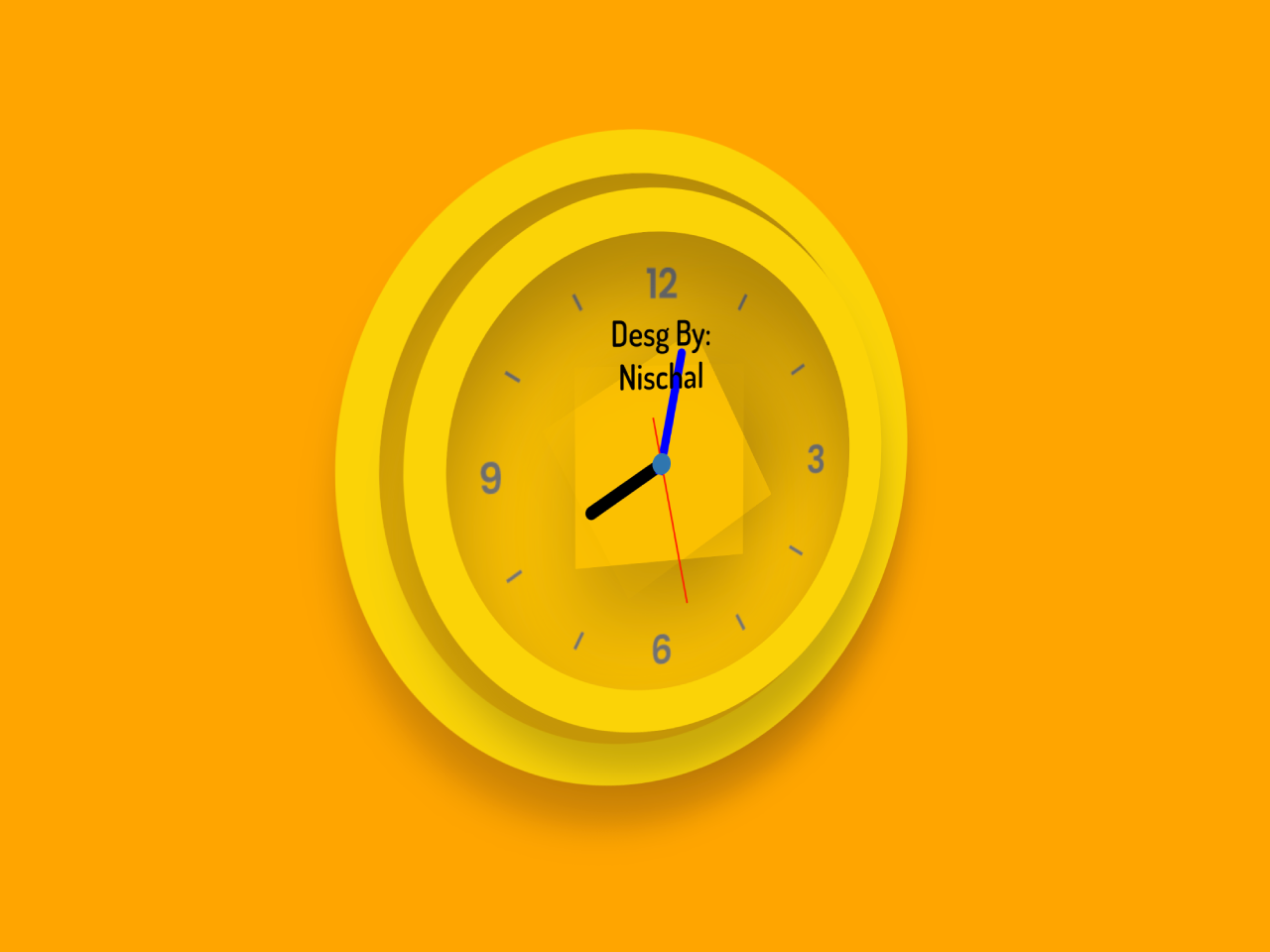

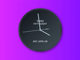
This code creates a beautiful 3D analog clock widget in HTML. It uses JavaScript to manage the clock’s movement based on the current time. The clock’s hands move dynamically to display the hour, minute, and second accurately. This widget offers a visually appealing way to showcase the time on a webpage.
This widget is easy to implement and can be customized to match your website’s design effortlessly. Moreover, you can customize the clock widget with additional CSS.
How to Create a Beautiful 3D Analog Clock Widget In HTML
1. First of all, load the jQuery and Tilt JS by adding the following CDN links into the head tag of your HTML document.
<script src="https://cdnjs.cloudflare.com/ajax/libs/jquery/3.7.1/jquery.min.js" integrity="sha512-v2CJ7UaYy4JwqLDIrZUI/4hqeoQieOmAZNXBeQyjo21dadnwR+8ZaIJVT8EE2iyI61OV8e6M8PP2/4hpQINQ/g==" crossorigin="anonymous" referrerpolicy="no-referrer"></script>
  <script src="https://cdnjs.cloudflare.com/ajax/libs/vanilla-tilt/1.8.1/vanilla-tilt.babel.js" integrity="sha512-ZAvevQxALZBNwEI5fZU3eeyF/GkebNgShMzzHELv8zG/Jk19BlgdLhSl3N8VU11O8epHBrOizz64OFbYDGGlaQ==" crossorigin="anonymous" referrerpolicy="no-referrer"></script>
2. After that, create the HTML structure to define the clock widget. Include the necessary div elements and classes.
<div data-tilt data-tilt-full-page-listening data-tilt-reset="true" data-tilt-max="215" data-tilt-speed="400" data-tilt-scale="1.1" class="clck">
    <div class="clock front">
      <span class="text">Desg By: <br />Nischal</span>
      <div class="hour">
        <div class="hr"></div>
      </div>
      <div class="minute">
        <div class="min"></div>
      </div>
      <div class="second">
        <div class="sec"></div>
      </div>
    </div>
    <div class="rim">
      <span class="hole"></span>
      <span class="hole"></span>
    </div>
    <div class="clock-back">

    </div>

  </div>
3. Now, use the following CSS code or customize it to style the clock’s appearance. Adjust colors, sizes, and positioning to suit your design preferences.
@import url("https://fonts.googleapis.com/css2?family=Dosis:wght@600&display=swap");
* {
  box-sizing: border-box;
  padding: 0;
  margin: 0;
}

body {
  cursor: pointer;
  width: 100vw;
  height: 100vh;
  display: flex;
  justify-content: center;
  align-items: center;
  background: orange !important;
}
.clck {
  cursor: move;
  display: flex;
  justify-content: center;
  align-items: center;
  position: relative;
  transform-style: preserve-3d;
  z-index: 60;
  transform: translateZ(45px);
  transform: perspective(2000px);
}

/* the front should show by default  */
.clock {
  box-sizing: border-box;
  transform-style: preserve-3d;
  position: absolute;
  z-index: 55;
  transform: translateZ(25px);
  margin: 0px auto;
  display: flex;
  align-items: center;
  justify-content: center;
  height: 280px;
  min-width: 285px;
  background: url("https://i.imgur.com/jTq94k2.png") #fbc000;
  background-size: cover;
  border-radius: 50%;
  box-shadow: inset rgba(0, 0, 0, 0.3) 0px 30px 45px,
    rgba(0, 0, 0, 0.2) 1px 22px 18px;
  border: 22px solid #fbd309;
  overflow: hidden;
}

.rim {
  box-sizing: border-box;
  display: flex;
  gap: 5px;
  flex-wrap: wrap;
  align-items: center;
  position: absolute;
  padding: 15px;
  width: 100px;
  border-radius: 10%;
  background-color: #fbd309;
}

.hole {
  margin: 0 auto;
  box-shadow: inset rgba(0, 0, 0, 0.3) 0px 30px 45px,
    rgba(0, 0, 0, 0.2) 1px 22px 18px;
  border-radius: 50%;
  width: 20px;
  height: 23px;
  background: rgba(0, 0, 3, 9);
  background-color: transparent;
  opacity: 0 - 1;
  z-index: 150;
  transform: translateZ(35px);
}

/* the back face   */
.clock-back {
  z-index: 2;
  transform: translateZ(12px);
  margin: 0px auto;
  position: absolute;
  height: 297px;
  min-width: 299px;
  background: url("https://i.imgur.com/8rMtgzY.png") #fbc000;
  background-size: 105%;
  background-position: center;
  background-size: contain;
  background-repeat: no-repeat;
  border-radius: 50%;
  box-shadow: inset rgba(0, 0, 0, 0.3) 0px 30px 45px,
    rgba(0, 0, 0, 0.2) 1px 22px 18px;
  border: 22px solid #fbd309;
  overflow: hidden;
}
.clock::before {
  content: "";
  position: absolute;
  width: 11px;
  height: 11px;
  background: #42a5f5;
  border-radius: 50%;
  z-index: 15;
  box-shadow: inset rgba(0, 0, 0, 0.3) 0px 30px 45px;
}

.hour,
.minute,
.second {
  position: absolute;
}

.hour,
.hr {
  box-shadow: rgba(0, 0, 0, 0.2) 0px 30px 45px;
  height: 101px;
  width: 101px;
  justify-content: center;
  display: flex;
}
.hr::before {
  content: "";
  position: absolute;
  width: 7px;
  height: 51px;
  background: black;
  border-radius: 6px 6px 0 0;
}

.minute,
.min {
  height: 120px;
  width: 120px;
  justify-content: center;
  display: flex;
}
.min::before {
  content: "";
  position: absolute;
  width: 5px;
  height: 66px;
  background: blue;
  border-radius: 6px 6px 0 0;
}

.second,
.sec {
  height: 151px;
  width: 151px;
  justify-content: center;
  display: flex;
}
.sec::before {
  content: "";
  position: absolute;
  width: 1.2px;
  height: 100px;
  background: red;
  border-radius: 6px 6px 0 0;
}
.text {
  position: absolute;
  top: 40px;
  left: 91px;
  text-align: center;
  margin: 0 auto;
  font-size: 18px;
  font-weight: 950;
  z-index: 5;
  font-family: "Dosis", sans-serif;
}
4. Finally, add the following JavaScript code to your project. It manages the clock’s movement based on the current time. It rotates the clock hands to display the hour, minute, and second.
const hr = document.querySelector(".hr");
const min = document.querySelector(".min");
const sec = document.querySelector(".sec");
setInterval(() => {
  let today = new Date();
  let hours = today.getHours() * 30;
  let mins = today.getMinutes() * 6;
  let secs = today.getSeconds() * 6;

  hr.style.transform = `rotateZ(${hours + mins / 12}deg)`;
  min.style.transform = `rotateZ(${mins}deg)`;
  sec.style.transform = `rotateZ(${secs}deg)`;
});
That’s all! hopefully, you have successfully created a Beautiful 3D Analog Clock Widget on your website. If you have any questions or suggestions, feel free to comment below.
Similar Code Snippets:
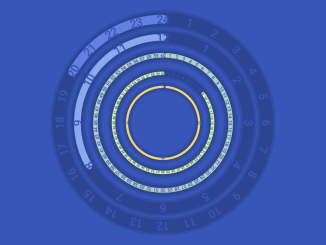
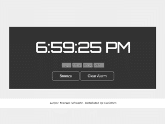
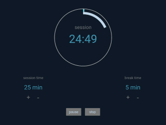
 Circular Clock With Progress Countdown

I code and create web elements for amazing people around the world. I like work with new people. New people new Experiences.
I truly enjoy what I’m doing, which makes me more passionate about web development and coding. I am always ready to do challenging tasks whether it is about creating a custom CMS from scratch or customizing an existing system.