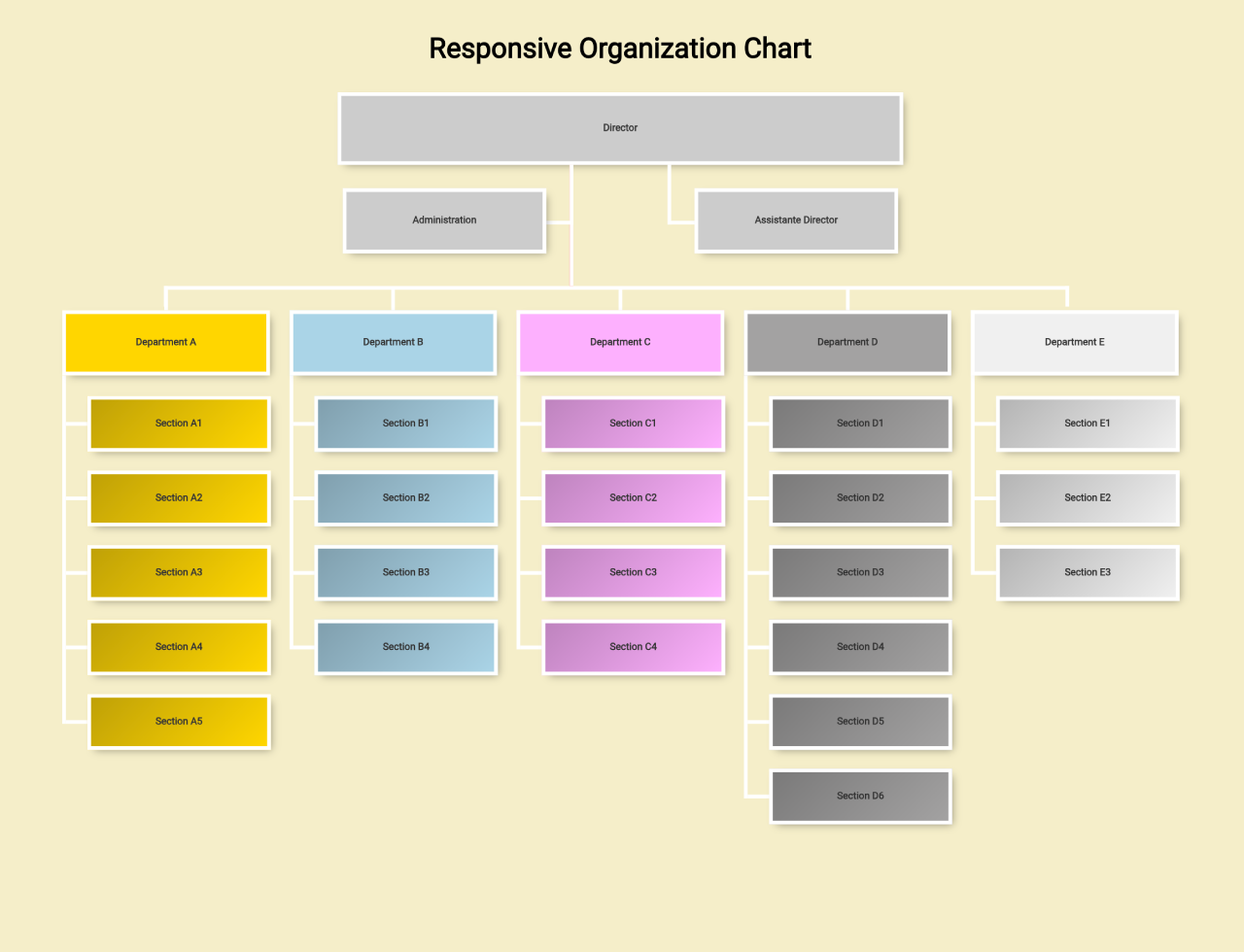

This pure CSS code snippet helps you to create a responsive organization chart. The chart is responsive, adapting to various screen sizes. It visually represents the hierarchical structure of an organization, from directors to departments and sections. Each element is designed with clickable links for easy navigation. Helpful for showcasing team structures on websites, it enhances user experience with a clean and professional design.
How to Create a Responsive Organization Chart Using Pure CSS
1. First of all, load the Modernizr JS and Normalize CSS by adding the following CDN links into the head tag of your HTML document.
<script src="https://cdnjs.cloudflare.com/ajax/libs/modernizr/2.8.3/modernizr.min.js" type="text/javascript"></script>
<link rel="stylesheet" href="https://cdnjs.cloudflare.com/ajax/libs/normalize/5.0.0/normalize.min.css">
2. Create the HTML structure for your organization chart. Use nested lists to represent the hierarchy, and each list item should contain a link with a span for the text. Customize the content based on your organization’s structure.
<div class="content">
  <h1>Responsive Organization Chart</h1>
  <figure class="org-chart cf">
    <ul class="administration">
      <li>
        <ul class="director">
          <li>
            <a href="#"><span>Director</span></a>
            <ul class="subdirector">
              <li><a href="#"><span>Assistante Director</span></a></li>
            </ul>
            <ul class="departments cf">
              <li><a href="#"><span>Administration</span></a></li>

              <li class="department dep-a">
                <a href="#"><span>Department A</span></a>
                <ul class="sections">
                  <li class="section"><a href="#"><span>Section A1</span></a></li>
                  <li class="section"><a href="#"><span>Section A2</span></a></li>
                  <li class="section"><a href="#"><span>Section A3</span></a></li>
                  <li class="section"><a href="#"><span>Section A4</span></a></li>
                  <li class="section"><a href="#"><span>Section A5</span></a></li>
                </ul>
              </li>
              <li class="department dep-b">
                <a href="#"><span>Department B</span></a>
                <ul class="sections">
                  <li class="section"><a href="#"><span>Section B1</span></a></li>
                  <li class="section"><a href="#"><span>Section B2</span></a></li>
                  <li class="section"><a href="#"><span>Section B3</span></a></li>
                  <li class="section"><a href="#"><span>Section B4</span></a></li>
                </ul>
              </li>
              <li class="department dep-c">
                <a href="#"><span>Department C</span></a>
                <ul class="sections">
                  <li class="section"><a href="#"><span>Section C1</span></a></li>
                  <li class="section"><a href="#"><span>Section C2</span></a></li>
                  <li class="section"><a href="#"><span>Section C3</span></a></li>
                  <li class="section"><a href="#"><span>Section C4</span></a></li>
                </ul>
              </li>
              <li class="department dep-d">
                <a href="#"><span>Department D</span></a>
                <ul class="sections">
                  <li class="section"><a href="#"><span>Section D1</span></a></li>
                  <li class="section"><a href="#"><span>Section D2</span></a></li>
                  <li class="section"><a href="#"><span>Section D3</span></a></li>
                  <li class="section"><a href="#"><span>Section D4</span></a></li>
                  <li class="section"><a href="#"><span>Section D5</span></a></li>
                  <li class="section"><a href="#"><span>Section D6</span></a></li>
                </ul>
              </li>
              <li class="department dep-e">
                <a href="#"><span>Department E</span></a>
                <ul class="sections">
                  <li class="section"><a href="#"><span>Section E1</span></a></li>
                  <li class="section"><a href="#"><span>Section E2</span></a></li>
                  <li class="section"><a href="#"><span>Section E3</span></a></li>
                </ul>
              </li>
            </ul>
          </li>
        </ul>
      </li>
    </ul>
  </figure>
</div>
3. Now, let’s add the CSS styling to make the organization chart visually appealing and responsive. The following CSS code includes styles for different levels, departments, and sections. Customize the colors and adjust the layout according to your organization’s branding.
*{
	-webkit-box-sizing: border-box;
	-moz-box-sizing: border-box;
	box-sizing: border-box;
	position: relative;
}

.cf:before,
.cf:after {
    content: " "; /* 1 */
    display: table; /* 2 */
}

.cf:after {
    clear: both;
}

/**
 * For IE 6/7 only
 * Include this rule to trigger hasLayout and contain floats.
 */
.cf {
    *zoom: 1;
}

/* Generic styling */

body{
	background: #F5EEC9;
}

.content{
	width: 100%;
	max-width: 1142px;
	margin: 0 auto;
	padding: 0 20px;
}

a:focus{
	outline: 2px dashed #f7f7f7;
}

@media screen and (max-width: 767px){
	.content{
		padding: 0 20px;
	}
}

ul{
	padding: 0;
	margin: 0;
	list-style: none;
}

ul a{
	display: block;
	background: #ccc;
	border: 4px solid #fff;
	text-align: center;
	overflow: hidden;
	font-size: .7em;
	text-decoration: none;
	font-weight: bold;
	color: #333;
	height: 70px;
	margin-bottom: -26px;
	box-shadow: 4px 4px 9px -4px rgba(0,0,0,0.4);
	-webkit-transition: all linear .1s;
	-moz-transition: all linear .1s;
	transition: all linear .1s;
}

@media print {
    ul a{
        border: 4px solid #000;
    }
}

@media screen and (max-width: 767px){
	ul a{
		font-size: 1em;
	}
}


ul a span{
	top: 50%;
	margin-top: -0.7em;
	display: block;
}

/*

 */

.administration > li > a{
	margin-bottom: 25px;
}

.director > li > a{
	width: 50%;
	margin: 0 auto 0px auto;
}

.subdirector:after{
	content: "";
	display: block;
	width: 0;
	height: 130px;
	background: red;
	border-left: 4px solid #fff;
	left: 45.45%;
	position: relative;
}

@media print {
    .subdirector:after{
        border-left: 4px solid #000;
    }
}

.subdirector,
.departments{
	position: absolute;
	width: 100%;
}

.subdirector > li:first-child,
.departments > li:first-child{
	width: 18.59894921190893%;
	height: 64px;
	margin: 0 auto 92px auto;
	padding-top: 25px;
	border-bottom: 4px solid white;
	z-index: 1;
}

@media print {
    .subdirector > li:first-child,
    .departments > li:first-child{
        border-bottom: 4px solid #000;
    }
}

.subdirector > li:first-child{
	float: right;
	right: 27.2%;
	border-left: 4px solid white;
}

@media print {
    .subdirector > li:first-child{
	    border-left: 4px solid black;
    }
}

.departments > li:first-child{
	float: left;
	left: 27.2%;
	border-right: 4px solid white;
}

@media print {
    .departments > li:first-child{
        border-right: 4px solid black;
    }
}

.subdirector > li:first-child a,
.departments > li:first-child a{
	width: 100%;
}

.subdirector > li:first-child a{
	left: 25px;
}

@media screen and (max-width: 767px){
	.subdirector > li:first-child,
	.departments > li:first-child{
		width: 40%;
	}

	.subdirector > li:first-child{
		right: 10%;
		margin-right: 2px;
	}

	.subdirector:after{
		left: 49.8%;
	}

	.departments > li:first-child{
		left: 10%;
		margin-left: 2px;
	}
}


.departments > li:first-child a{
	right: 25px;
}

.department:first-child,
.departments li:nth-child(2){
	margin-left: 0;
	clear: left;
}

.departments:after{
	content: "";
	display: block;
	position: absolute;
	width: 81.1%;
	height: 22px;
	border-top: 4px solid #fff;
	border-right: 4px solid #fff;
	border-left: 4px solid #fff;
	margin: 0 auto;
	top: 130px;
	left: 9.1%
}

@media print {
    .departments:after{
        border-top: 4px solid #000;
        border-right: 4px solid #000;
        border-left: 4px solid #000;
    }
}

@media screen and (max-width: 767px){
	.departments:after{
		border-right: none;
		left: 0;
		width: 49.8%;
	}
}

@media screen and (min-width: 768px){
	.department:first-child:before,
   .department:last-child:before{
    border:none;
  }
}

.department:before{
	content: "";
	display: block;
	position: absolute;
	width: 0;
	height: 22px;
	border-left: 4px solid white;
	z-index: 1;
	top: -22px;
	left: 50%;
	margin-left: -4px;
}

@media print {
    .department:before{
        border-left: 4px solid black;
    }
}

.department{
	border-left: 4px solid #fff;
	width: 18.59894921190893%;
	float: left;
	margin-left: 1.751313485113835%;
	margin-bottom: 60px;
}

@media print {
    .department{
	    border-left: 4px solid #000;
    }
}

.lt-ie8 .department{
	width: 18.25%;
}

@media screen and (max-width: 767px){
	.department{
		float: none;
		width: 100%;
		margin-left: 0;
	}

	.department:before{
		content: "";
		display: block;
		position: absolute;
		width: 0;
		height: 60px;
		border-left: 4px solid white;
		z-index: 1;
		top: -60px;
		left: 0%;
		margin-left: -4px;
	}

	.department:nth-child(2):before{
		display: none;
	}
}

.department > a{
	margin: 0 0 -26px -4px;
	z-index: 1;
}

.department > a:hover{
	height: 80px;
}

.department > ul{
	margin-top: 0px;
	margin-bottom: 0px;
}

.department li{
	padding-left: 25px;
	border-bottom: 4px solid #fff;
	height: 80px;
}

@media print {
    .department li{
        border-bottom: 4px solid #000;
    }
}

.department li a{
	background: #fff;
	top: 48px;
	position: absolute;
	z-index: 1;
	width: 90%;
	height: 60px;
	vertical-align: middle;
	right: -1px;
	background-image: url(data:image/svg+xml;base64,PD94bWwgdmVyc2lvbj0iMS4wIiA/Pgo8c3ZnIHhtbG5zPSJodHRwOi8vd3d3LnczLm9yZy8yMDAwL3N2ZyIgd2lkdGg9IjEwMCUiIGhlaWdodD0iMTAwJSIgdmlld0JveD0iMCAwIDEgMSIgcHJlc2VydmVBc3BlY3RSYXRpbz0ibm9uZSI+CiAgPGxpbmVhckdyYWRpZW50IGlkPSJncmFkLXVjZ2ctZ2VuZXJhdGVkIiBncmFkaWVudFVuaXRzPSJ1c2VyU3BhY2VPblVzZSIgeDE9IjAlIiB5MT0iMCUiIHgyPSIxMDAlIiB5Mj0iMTAwJSI+CiAgICA8c3RvcCBvZmZzZXQ9IjAlIiBzdG9wLWNvbG9yPSIjMDAwMDAwIiBzdG9wLW9wYWNpdHk9IjAuMjUiLz4KICAgIDxzdG9wIG9mZnNldD0iMTAwJSIgc3RvcC1jb2xvcj0iIzAwMDAwMCIgc3RvcC1vcGFjaXR5PSIwIi8+CiAgPC9saW5lYXJHcmFkaWVudD4KICA8cmVjdCB4PSIwIiB5PSIwIiB3aWR0aD0iMSIgaGVpZ2h0PSIxIiBmaWxsPSJ1cmwoI2dyYWQtdWNnZy1nZW5lcmF0ZWQpIiAvPgo8L3N2Zz4=);
	background-image: -moz-linear-gradient(-45deg,  rgba(0,0,0,0.25) 0%, rgba(0,0,0,0) 100%) !important;
	background-image: -webkit-gradient(linear, left top, right bottom, color-stop(0%,rgba(0,0,0,0.25)), color-stop(100%,rgba(0,0,0,0)))!important;
	background-image: -webkit-linear-gradient(-45deg,  rgba(0,0,0,0.25) 0%,rgba(0,0,0,0) 100%)!important;
	background-image: -o-linear-gradient(-45deg,  rgba(0,0,0,0.25) 0%,rgba(0,0,0,0) 100%)!important;
	background-image: -ms-linear-gradient(-45deg,  rgba(0,0,0,0.25) 0%,rgba(0,0,0,0) 100%)!important;
	background-image: linear-gradient(135deg,  rgba(0,0,0,0.25) 0%,rgba(0,0,0,0) 100%)!important;
	filter: progid:DXImageTransform.Microsoft.gradient( startColorstr='#40000000', endColorstr='#00000000',GradientType=1 );
}

.department li a:hover{
	box-shadow: 8px 8px 9px -4px rgba(0,0,0,0.1);
	height: 80px;
	width: 95%;
	top: 39px;
	background-image: none!important;
}

/* Department/ section colors */
.department.dep-a a{ background: #FFD600; }
.department.dep-b a{ background: #AAD4E7; }
.department.dep-c a{ background: #FDB0FD; }
.department.dep-d a{ background: #A3A2A2; }
.department.dep-e a{ background: #f0f0f0; }
Update the colors of departments by modifying the background color in the CSS code. Adjust the names and links to match your organization’s departments and sections.
That’s all! hopefully, you have successfully created a Responsive Organization Chart on your website. If you have any questions or suggestions, feel free to comment below.
Similar Code Snippets:
 SVG Circle Progress With Percentage Value
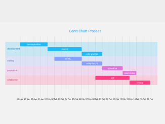
- Interactive Gantt Chart Using D3 JS
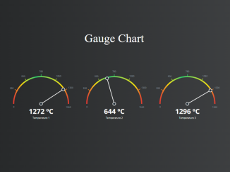
- Gauge Chart With Needle in JavaScript
- Cryptocurrency Price Widget for Website
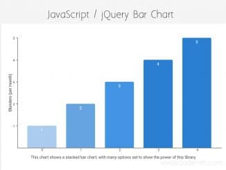
- HTML Horizontal Bar Chart


I code and create web elements for amazing people around the world. I like work with new people. New people new Experiences.
I truly enjoy what I’m doing, which makes me more passionate about web development and coding. I am always ready to do challenging tasks whether it is about creating a custom CMS from scratch or customizing an existing system.