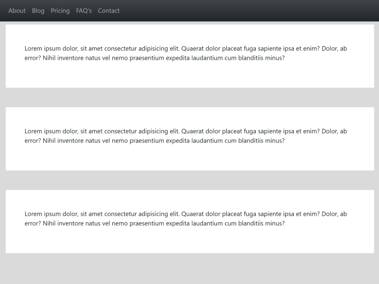

A sticky navbar is a great way to improve the usability of your website. This code snippet helps you to create a responsive sticky navbar for your Bootstrap 5 projects. It uses Bootstrap native navbar with sticky classes. The navbar will remain at the top of the page as you scroll, making it easy for users to navigate your website.
How to Create Responsive Sticky Navbar Bootstrap 5
1. Start by including the Bootstrap 5 CSS file in your HTML. Copy and paste the following link in the <head> section of your HTML document.
<link rel="stylesheet" href="https://cdn.jsdelivr.net/npm/bootstrap@5.0.0-beta1/dist/css/bootstrap.min.css">
2. In the <body> section, create a top header to add a professional touch to your website. Add a responsive and sticky navbar to your website using the code below. Place it after the top header.
<!-- Top Header -->
<div class="top-header py-4">
  <div class="container">
    <h1>Web Zone</h1>
  </div>
</div>

<!-- Navbar  -->
<nav class="navbar sticky-top navbar-expand-lg navbar-dark bg-dark bg-gradient">
  <div class="container">
    <ul class="navbar-nav">
      <li class="nav-item">
        <a href="#" class="nav-link">About</a>
      </li>
      <li class="nav-item">
        <a href="#" class="nav-link">Blog</a>
      </li>
      <li class="nav-item">
        <a href="#" class="nav-link">Pricing</a>
      </li>
      <li class="nav-item">
        <a href="#" class="nav-link">FAQ's</a>
      </li>
      <li class="nav-item">
        <a href="#" class="nav-link">Contact</a>
      </li>
    </ul>
  </div>
</nav>

<!-- Main Content -->
<div class="main">
  <div class="container">
    <div class="box border mt-5 p-5">
      <p>
        Lorem ipsum dolor, sit amet consectetur adipisicing elit. Quaerat
        dolor placeat fuga sapiente ipsa et enim? Dolor, ab error? Nihil
        inventore natus vel nemo praesentium expedita laudantium cum
        blanditiis minus?
      </p>
    </div>
  </div>
</div>
Within the <ul> tag of the navbar, add your navigation links. Update the href attributes to point to the relevant sections of your website.
3. If needed, you can add custom CSS styles to modify the appearance.
.navbar{
    /* Your custom CSS styles goes here */
}
That’s all! hopefully, You’ve successfully implemented a responsive sticky navbar on your website. Customize it further to suit your website’s theme and content. This navigation enhancement ensures a seamless user experience, making your website more accessible and visually appealing.
If you have any questions or suggestions, feel free to comment below.
Similar Code Snippets:

- Bootstrap 5 Animated Cards Slider
- Bootstrap 5 Product Details Page
- OTP Input Field Using Bootstrap 5
- Stop Watch with Milliseconds Using Bootstrap 5
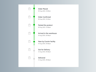
- Bootstrap 5 Order Tracking Vertical Timeline
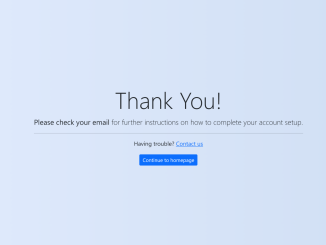
- Bootstrap 5 Thank You Page Template

I code and create web elements for amazing people around the world. I like work with new people. New people new Experiences.
I truly enjoy what I’m doing, which makes me more passionate about web development and coding. I am always ready to do challenging tasks whether it is about creating a custom CMS from scratch or customizing an existing system.