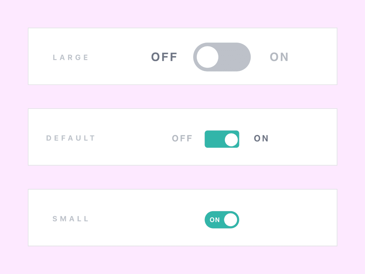

This code snippet showcases a Bootstrap-based toggle switch with text, offering an on/off functionality. The switch comes in different sizes (large, default, small, and mini) and two color options (default and secondary). It provides an interactive way to toggle between options or states.
The code is easy to integrate and customize according to your project’s needs, making it a valuable addition for implementing intuitive and user-friendly switches on your website or application.
How to Create Bootstrap Toggle Switch With Text
1. First of all, load the Bootstrap CSS by adding the following CDN link into the head tag of your HTML document.
<link rel='stylesheet' href='https://cdnjs.cloudflare.com/ajax/libs/twitter-bootstrap/4.0.0-alpha.6/css/bootstrap.min.css'>
2. Now, create the HTML structure for the toggle button. You can customize the toggle button by combining different size and color classes to achieve the desired appearance. For example, to create a small toggle button with the brand secondary color, add both btn-sm and btn-secondary classes to the button:
<button type="button" class="btn btn-toggle btn-sm btn-secondary" data-toggle="button" aria-pressed="false" autocomplete="off">
3. Use the following CSS code to style the toggle buttons.
.btn-toggle {
  margin: 0 4rem;
  padding: 0;
  position: relative;
  border: none;
  height: 1.5rem;
  width: 3rem;
  border-radius: 1.5rem;
  color: #6b7381;
  background: #bdc1c8;
}
.btn-toggle:focus,
.btn-toggle.focus,
.btn-toggle:focus.active,
.btn-toggle.focus.active {
  outline: none;
}
.btn-toggle:before,
.btn-toggle:after {
  line-height: 1.5rem;
  width: 4rem;
  text-align: center;
  font-weight: 600;
  font-size: 0.75rem;
  text-transform: uppercase;
  letter-spacing: 2px;
  position: absolute;
  bottom: 0;
  transition: opacity 0.25s;
}
.btn-toggle:before {
  content: 'Off';
  left: -4rem;
}
.btn-toggle:after {
  content: 'On';
  right: -4rem;
  opacity: 0.5;
}
.btn-toggle > .handle {
  position: absolute;
  top: 0.1875rem;
  left: 0.1875rem;
  width: 1.125rem;
  height: 1.125rem;
  border-radius: 1.125rem;
  background: #fff;
  transition: left 0.25s;
}
.btn-toggle.active {
  transition: background-color 0.25s;
}
.btn-toggle.active > .handle {
  left: 1.6875rem;
  transition: left 0.25s;
}
.btn-toggle.active:before {
  opacity: 0.5;
}
.btn-toggle.active:after {
  opacity: 1;
}
.btn-toggle.btn-sm:before,
.btn-toggle.btn-sm:after {
  line-height: -0.5rem;
  color: #fff;
  letter-spacing: 0.75px;
  left: 0.4125rem;
  width: 2.325rem;
}
.btn-toggle.btn-sm:before {
  text-align: right;
}
.btn-toggle.btn-sm:after {
  text-align: left;
  opacity: 0;
}
.btn-toggle.btn-sm.active:before {
  opacity: 0;
}
.btn-toggle.btn-sm.active:after {
  opacity: 1;
}
.btn-toggle.btn-xs:before,
.btn-toggle.btn-xs:after {
  display: none;
}
.btn-toggle:before,
.btn-toggle:after {
  color: #6b7381;
}
.btn-toggle.active {
  background-color: #29b5a8;
}
.btn-toggle.btn-lg {
  margin: 0 5rem;
  padding: 0;
  position: relative;
  border: none;
  height: 2.5rem;
  width: 5rem;
  border-radius: 2.5rem;
}
.btn-toggle.btn-lg:focus,
.btn-toggle.btn-lg.focus,
.btn-toggle.btn-lg:focus.active,
.btn-toggle.btn-lg.focus.active {
  outline: none;
}
.btn-toggle.btn-lg:before,
.btn-toggle.btn-lg:after {
  line-height: 2.5rem;
  width: 5rem;
  text-align: center;
  font-weight: 600;
  font-size: 1rem;
  text-transform: uppercase;
  letter-spacing: 2px;
  position: absolute;
  bottom: 0;
  transition: opacity 0.25s;
}
.btn-toggle.btn-lg:before {
  content: 'Off';
  left: -5rem;
}
.btn-toggle.btn-lg:after {
  content: 'On';
  right: -5rem;
  opacity: 0.5;
}
.btn-toggle.btn-lg > .handle {
  position: absolute;
  top: 0.3125rem;
  left: 0.3125rem;
  width: 1.875rem;
  height: 1.875rem;
  border-radius: 1.875rem;
  background: #fff;
  transition: left 0.25s;
}
.btn-toggle.btn-lg.active {
  transition: background-color 0.25s;
}
.btn-toggle.btn-lg.active > .handle {
  left: 2.8125rem;
  transition: left 0.25s;
}
.btn-toggle.btn-lg.active:before {
  opacity: 0.5;
}
.btn-toggle.btn-lg.active:after {
  opacity: 1;
}
.btn-toggle.btn-lg.btn-sm:before,
.btn-toggle.btn-lg.btn-sm:after {
  line-height: 0.5rem;
  color: #fff;
  letter-spacing: 0.75px;
  left: 0.6875rem;
  width: 3.875rem;
}
.btn-toggle.btn-lg.btn-sm:before {
  text-align: right;
}
.btn-toggle.btn-lg.btn-sm:after {
  text-align: left;
  opacity: 0;
}
.btn-toggle.btn-lg.btn-sm.active:before {
  opacity: 0;
}
.btn-toggle.btn-lg.btn-sm.active:after {
  opacity: 1;
}
.btn-toggle.btn-lg.btn-xs:before,
.btn-toggle.btn-lg.btn-xs:after {
  display: none;
}
.btn-toggle.btn-sm {
  margin: 0 0.5rem;
  padding: 0;
  position: relative;
  border: none;
  height: 1.5rem;
  width: 3rem;
  border-radius: 1.5rem;
}
.btn-toggle.btn-sm:focus,
.btn-toggle.btn-sm.focus,
.btn-toggle.btn-sm:focus.active,
.btn-toggle.btn-sm.focus.active {
  outline: none;
}
.btn-toggle.btn-sm:before,
.btn-toggle.btn-sm:after {
  line-height: 1.5rem;
  width: 0.5rem;
  text-align: center;
  font-weight: 600;
  font-size: 0.55rem;
  text-transform: uppercase;
  letter-spacing: 2px;
  position: absolute;
  bottom: 0;
  transition: opacity 0.25s;
}
.btn-toggle.btn-sm:before {
  content: 'Off';
  left: -0.5rem;
}
.btn-toggle.btn-sm:after {
  content: 'On';
  right: -0.5rem;
  opacity: 0.5;
}
.btn-toggle.btn-sm > .handle {
  position: absolute;
  top: 0.1875rem;
  left: 0.1875rem;
  width: 1.125rem;
  height: 1.125rem;
  border-radius: 1.125rem;
  background: #fff;
  transition: left 0.25s;
}
.btn-toggle.btn-sm.active {
  transition: background-color 0.25s;
}
.btn-toggle.btn-sm.active > .handle {
  left: 1.6875rem;
  transition: left 0.25s;
}
.btn-toggle.btn-sm.active:before {
  opacity: 0.5;
}
.btn-toggle.btn-sm.active:after {
  opacity: 1;
}
.btn-toggle.btn-sm.btn-sm:before,
.btn-toggle.btn-sm.btn-sm:after {
  line-height: -0.5rem;
  color: #fff;
  letter-spacing: 0.75px;
  left: 0.4125rem;
  width: 2.325rem;
}
.btn-toggle.btn-sm.btn-sm:before {
  text-align: right;
}
.btn-toggle.btn-sm.btn-sm:after {
  text-align: left;
  opacity: 0;
}
.btn-toggle.btn-sm.btn-sm.active:before {
  opacity: 0;
}
.btn-toggle.btn-sm.btn-sm.active:after {
  opacity: 1;
}
.btn-toggle.btn-sm.btn-xs:before,
.btn-toggle.btn-sm.btn-xs:after {
  display: none;
}
.btn-toggle.btn-xs {
  margin: 0 0;
  padding: 0;
  position: relative;
  border: none;
  height: 1rem;
  width: 2rem;
  border-radius: 1rem;
}
.btn-toggle.btn-xs:focus,
.btn-toggle.btn-xs.focus,
.btn-toggle.btn-xs:focus.active,
.btn-toggle.btn-xs.focus.active {
  outline: none;
}
.btn-toggle.btn-xs:before,
.btn-toggle.btn-xs:after {
  line-height: 1rem;
  width: 0;
  text-align: center;
  font-weight: 600;
  font-size: 0.75rem;
  text-transform: uppercase;
  letter-spacing: 2px;
  position: absolute;
  bottom: 0;
  transition: opacity 0.25s;
}
.btn-toggle.btn-xs:before {
  content: 'Off';
  left: 0;
}
.btn-toggle.btn-xs:after {
  content: 'On';
  right: 0;
  opacity: 0.5;
}
.btn-toggle.btn-xs > .handle {
  position: absolute;
  top: 0.125rem;
  left: 0.125rem;
  width: 0.75rem;
  height: 0.75rem;
  border-radius: 0.75rem;
  background: #fff;
  transition: left 0.25s;
}
.btn-toggle.btn-xs.active {
  transition: background-color 0.25s;
}
.btn-toggle.btn-xs.active > .handle {
  left: 1.125rem;
  transition: left 0.25s;
}
.btn-toggle.btn-xs.active:before {
  opacity: 0.5;
}
.btn-toggle.btn-xs.active:after {
  opacity: 1;
}
.btn-toggle.btn-xs.btn-sm:before,
.btn-toggle.btn-xs.btn-sm:after {
  line-height: -1rem;
  color: #fff;
  letter-spacing: 0.75px;
  left: 0.275rem;
  width: 1.55rem;
}
.btn-toggle.btn-xs.btn-sm:before {
  text-align: right;
}
.btn-toggle.btn-xs.btn-sm:after {
  text-align: left;
  opacity: 0;
}
.btn-toggle.btn-xs.btn-sm.active:before {
  opacity: 0;
}
.btn-toggle.btn-xs.btn-sm.active:after {
  opacity: 1;
}
.btn-toggle.btn-xs.btn-xs:before,
.btn-toggle.btn-xs.btn-xs:after {
  display: none;
}
.btn-toggle.btn-secondary {
  color: #6b7381;
  background: #bdc1c8;
}
.btn-toggle.btn-secondary:before,
.btn-toggle.btn-secondary:after {
  color: #6b7381;
}
.btn-toggle.btn-secondary.active {
  background-color: #ff8300;
}
4. Finally, load the jQuery and Bootstrap JS to activate the toggle functionality.
<script src='https://cdnjs.cloudflare.com/ajax/libs/jquery/3.1.1/jquery.min.js'></script>
<script src='https://cdnjs.cloudflare.com/ajax/libs/twitter-bootstrap/4.0.0-alpha.6/js/bootstrap.min.js'></script>
You can customize the toggle switch further by adjusting the Bootstrap classes and CSS styles to match your project’s design requirements. Additionally, you can modify the text labels, button sizes, colors, and positioning to suit your specific needs.
That’s it! hopefully, you have successfully created Bootstrap Toggle Switch With Text. If you have any questions or suggestions, feel free to comment below.
Similar Code Snippets:

- Summernote Editor Compatible With Bootstrap 5
- Dynamic Cascading Dropdown Bootstrap
- Bootstrap Collapsible Sidebar With Icons
- Resizable Column in Bootstrap Table

I code and create web elements for amazing people around the world. I like work with new people. New people new Experiences.
I truly enjoy what I’m doing, which makes me more passionate about web development and coding. I am always ready to do challenging tasks whether it is about creating a custom CMS from scratch or customizing an existing system.