

This code is a Bootstrap 5 Creative Header Template. It creates a responsive header with a logo and a menu. It uses CSS for styling and JavaScript to enable a dynamic effect when you move your mouse or touch the screen. The header is designed to improve the visual appeal of a webpage.
How to Create Bootstrap 5 Creative Header
1. Start by including the Bootstrap 5 CSS in the <head> section of your HTML file. This will provide the necessary styling for your header.
<link rel='stylesheet' href='https://cdn.jsdelivr.net/npm/bootstrap@5.0.2/dist/css/bootstrap.min.css'>
2. Next, create the HTML structure for your header. This template consists of a navigation bar with a logo and a menu. You can copy and paste the following code into your HTML file:
<nav>
        <div class="container">
            <div class="row">
                <div class="col-md-4 col-6">
                    <div class="logo d-flex justify-content-start">
                        <a href="#">Joourney
                            <!-- <i class="ri-moon-clear-line"></i> -->
                        </a>
                    </div>
                </div>
                <div class="col-md-8 col-6 d-flex justify-content-end p-0 align-items-center">
                    <div class="menu-wrapper">
                        <ul>
                            <li><a href="#">Home</a></li>
                            <li><a href="#">About</a></li>
                            <li><a href="#">Manifesto</a></li>
                            <li><a href="#">Contacts</a></li>
                        </ul>
                    </div>
                </div>
            </div>
        </div>
    </nav>

    <div id="leftSide" class="side">
        <h2 class="title">
            Let’s begin<br> the <span class="fancy">adventure</span> 🚀
        </h2>
    </div>

    <div id="rightSide" class="side">
        <h2 class="title">
            Let’s begin<br> the <span class="fancy">experience</span> 🪐
        </h2>
    </div>
3. Copy the following CSS code and include it in a separate CSS file (e.g., styles.css). This code is responsible for the styling of the header and the dynamic effect. You can customize the colors and fonts to match your website’s design.
@import url("https://fonts.googleapis.com/css2?family=DM+Sans:wght@400;700&display=swap");
body {
  -moz-osx-font-smoothing: grayscale;
  -webkit-font-smoothing: antialiased;
  text-rendering: geometricprecision;
  text-rendering: optimizeLegibility;
  text-align: center;
  font-family: "DM Sans", sans-serif;
}
.side {
  width: 100vw;
  height: 100%;
  display: grid;
  place-items: center;
  overflow: hidden;
  position: absolute;
}
.side .title {
  font-family: "DM Sans", sans-serif;
  font-weight: 600;
  font-size: 8vw;
  margin: 0 15vw;
  width: 70vw;
}

#leftSide {
  background-color: #DC3535;
  color: #3B3486;
  z-index: 2;
}
#leftSide .fancy {
  color: #f4d35e;
}

#rightSide {
  background-color: #3B3486;
  color: #DC3535;
}
#rightSide .fancy {
  color: #f4d35e;
}

nav {
  padding: 15px 0;
  margin-bottom: -78px;
  position: relative;
  z-index: 30;
}
nav .logo a {
  font-family: "DM Sans", sans-serif;
  font-weight: 600;
  font-size: 32px;
  color: #fff;
  text-decoration: none;
}
nav .logo i {
  font-size: 24px;
  margin-bottom: -5px;
}
nav .menu-wrapper {
  display: flex;
  justify-content: end;
  align-items: center;
}
nav .menu-wrapper ul {
  margin: 0;
  padding: 0;
  list-style: none;
  display: flex;
  justify-content: end;
  align-items: center;
}
nav .menu-wrapper ul li {
  margin-left: 2vw;
}
nav .menu-wrapper ul li a {
  font-family: "DM Sans", sans-serif;
  padding: 10px 20px;
  background-color: rgba(255, 255, 255, 0.102);
  border-radius: 5em;
  font-weight: 400;
  font-size: 18px;
  color: #fff;
  text-decoration: none;
  transition: all 0.15s ease-in-out;
}
nav .menu-wrapper ul li a:hover {
  background-color: rgba(255, 255, 255, 0);
}
4. Now, load the Bootstrap JS by adding the following CDN link just before closing the body tag.
<script src='https://cdn.jsdelivr.net/npm/bootstrap@5.0.2/dist/js/bootstrap.bundle.min.js'></script>
5. Finally, add the following JavaScript code between <script> tag just after the Bootstrap JS. This code makes the header dynamic, with a sliding effect based on mouse or touch movement.
const left  = document.getElementById("leftSide");

const handleOnMove = e => {
    const p = e.clientX / window.innerWidth * 100;

    left.style.width = `${p}%`;
}

document.onmousemove = e => handleOnMove (e);
document.ontouchmove = e => handleOnMove (e.touches[0]);
That’s all! hopefully, you have successfully integrated this Bootstrap 5 Creative Header Template into your project. If you have any questions or suggestions, feel free to comment below.
Similar Code Snippets:
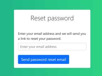
 Reset Password Form Bootstrap 5
- Bootstrap Vertical Tabs Code with Example
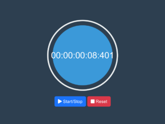
- Stop Watch with Milliseconds Using Bootstrap 5
- Overlapping Images Using Bootstrap 5
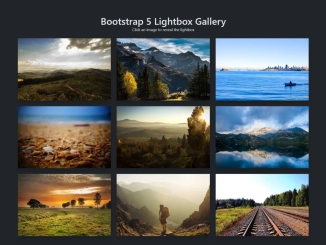
- Bootstrap 5 Gallery With Lightbox
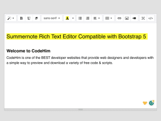
- Summernote Editor Compatible With Bootstrap 5
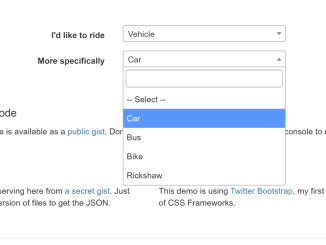
- Dynamic Cascading Dropdown Bootstrap


I code and create web elements for amazing people around the world. I like work with new people. New people new Experiences.
I truly enjoy what I’m doing, which makes me more passionate about web development and coding. I am always ready to do challenging tasks whether it is about creating a custom CMS from scratch or customizing an existing system.