
This code snippet provides a simple and effective way to implement vertical tabs using Bootstrap. The primary functionality of the code is to ensure that the height of the tab panes adjusts dynamically based on the content. By doing so, it ensures that the vertical tabs remain visually aligned with the content they display.
When you use this code, you can create a user-friendly vertical tab layout that neatly organizes your content and provides a smooth user experience. Whether you are designing a complex dashboard or a sleek profile page, these tabs will prove helpful in presenting information in a structured and accessible manner.
The code achieves this by calculating the height of the tallest tab pane and setting all other tab panes to match that height, resulting in a consistent and aesthetically pleasing layout.
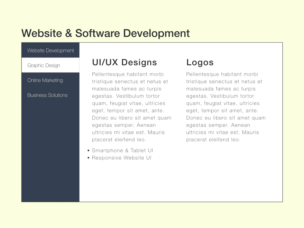
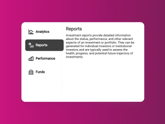
How to Create Bootstrap Vertical Tabs
1. First of all, load the Bootstrap CSS and Font Awesome by adding the following CDN links to the head tag of your webpage.
<link rel='stylesheet' href='//maxcdn.bootstrapcdn.com/bootstrap/3.3.5/css/bootstrap.min.css'>
<link rel='stylesheet' href='https://s3-us-west-2.amazonaws.com/s.cdpn.io/85807/font-awesome.css'>
2. After that, create the HTML structure for vertical tabs and add your content inside it as follows:
<div class="container"> <div class="row"> <div class="col-sm-12"> <h2>Website & Software Development</h2> <div class="tab-container"> <ul class="nav nav-tabs nav-tabs-left nav-centered" role="tablist"> <li role="presentation" class="active"> <a href="#web-dev" data-toggle="tab" role="tab"> Website Development </a> </li> <li role="presentation"> <a href="#graphic" data-toggle="tab" role="tab"> Graphic Design </a> </li> <li role="presentation"> <a href="#marketing" data-toggle="tab" role="tab"> Online Marketing </a> </li> <li role="presentation"> <a href="#business" data-toggle="tab" role="tab"> Business Solutions </a> </li> </ul> <div id="my_side_tabs" class="tab-content side-tabs side-tabs-left"> <div class="tab-pane fade in active" id="web-dev" role="tabpanel"> <div class="col-sm-6"> <h3>Custom Web Design</h3> <p>Pellentesque habitant morbi tristique senectus et netus et malesuada fames ac turpis egestas. Vestibulum tortor quam, feugiat vitae, ultricies eget, tempor sit amet, ante. Donec eu libero sit amet quam egestas semper. Aenean ultricies mi vitae est. Mauris placerat eleifend leo.</p> <ul> <li>Responsive</li> <li>Search Engine Optimization (SEO)</li> <li>W3C Compliant</li> <li>Custom CMS</li> <li>Hosting</li> <li>Webmaster Services</li> <li>Content Writing</li> </ul> </div> <div class="col-sm-6"> <h3>eCommerce</h3> <p>Pellentesque habitant morbi tristique senectus et netus et malesuada fames ac turpis egestas. Vestibulum tortor quam, feugiat vitae, ultricies eget, tempor sit amet, ante. Donec eu libero sit amet quam egestas semper. Aenean ultricies mi vitae est. Mauris placerat eleifend leo.</p> <ul> <li>Shopify</li> <li>WordPress</li> <li>Paypal</li> </ul> </div> <div class="col-sm-6"> </div> </div> <div class="tab-pane fade" id="graphic" role="tabpanel"> <div class="col-sm-6"> <h3>UI/UX Designs</h3> <p>Pellentesque habitant morbi tristique senectus et netus et malesuada fames ac turpis egestas. Vestibulum tortor quam, feugiat vitae, ultricies eget, tempor sit amet, ante. Donec eu libero sit amet quam egestas semper. Aenean ultricies mi vitae est. Mauris placerat eleifend leo.</p> <ul> <li>Smartphone & Tablet UI</li> <li>Responsive Website UI</li> </ul> </div> <div class="col-sm-6"> <h3>Logos</h3> <p>Pellentesque habitant morbi tristique senectus et netus et malesuada fames ac turpis egestas. Vestibulum tortor quam, feugiat vitae, ultricies eget, tempor sit amet, ante. Donec eu libero sit amet quam egestas semper. Aenean ultricies mi vitae est. Mauris placerat eleifend leo.</p> </div> </div> <div class="tab-pane fade" id="marketing" role="tabpanel"> <div class="col-sm-6"> <h3>Online Advertising</h3> <p>Pellentesque habitant morbi tristique senectus et netus et malesuada fames ac turpis egestas. Vestibulum tortor quam, feugiat vitae, ultricies eget, tempor sit amet, ante. Donec eu libero sit amet quam egestas semper. Aenean ultricies mi vitae est. Mauris placerat eleifend leo.</p> <ul> <li>Facebook</li> <li>Google AdWords</li> <li>YouTube Ads</li> <li>Custom Ads</li> </ul> </div> <div class="col-sm-6"> <h3>Social Media</h3> <p>Pellentesque habitant morbi tristique senectus et netus et malesuada fames ac turpis egestas. Vestibulum tortor quam, feugiat vitae, ultricies eget, tempor sit amet, ante. Donec eu libero sit amet quam egestas semper. Aenean ultricies mi vitae est. Mauris placerat eleifend leo.</p> <ul> <li>Blogging</li> <li>Facebook</li> <li>Twitter</li> <li>LinkedIn</li> <li>Instagram</li> <li>Pinterest</li> </ul> </div> <div class="col-sm-6"> <h3>Fundraising</h3> <p>Pellentesque habitant morbi tristique senectus et netus et malesuada fames ac turpis egestas. Vestibulum tortor quam, feugiat vitae, ultricies eget, tempor sit amet, ante. Donec eu libero sit amet quam egestas semper. Aenean ultricies mi vitae est. Mauris placerat eleifend leo.</p> </div> </div> <div class="tab-pane fade" id="business" role="tabpanel"> <div class="col-sm-6"> <h3>Consulting</h3> <p>Pellentesque habitant morbi tristique senectus et netus et malesuada fames ac turpis egestas. Vestibulum tortor quam, feugiat vitae, ultricies eget, tempor sit amet, ante. Donec eu libero sit amet quam egestas semper. Aenean ultricies mi vitae est. Mauris placerat eleifend leo.</p> <ul> <li>Company Branding</li> <li>Website Security</li> <li>Computer IT & Repair</li> <li>Data Storage</li> </ul> </div> <div class="col-sm-6"> <h3>Analytics & Reporting</h3> <p>Pellentesque habitant morbi tristique senectus et netus et malesuada fames ac turpis egestas. Vestibulum tortor quam, feugiat vitae, ultricies eget, tempor sit amet, ante. Donec eu libero sit amet quam egestas semper. Aenean ultricies mi vitae est. Mauris placerat eleifend leo.</p> </div> </div> </div> </div> </div> </div>
3. Customize the tabs with the CSS styles below, and feel free to define your own CSS to tailor these tabs to your specific requirements.
.tab-container {
	background: #344152;
	padding: 0;
	border: solid 1px #444;
	height: 440px;
	overflow: hidden;
	width: 100%;
}
.nav-tabs.nav-tabs-left {
  float: left;
  border-right: 0;
}
.nav-tabs.nav-tabs-left li a {
  margin-right: 0;
	border-radius: 0;
  border-right: none;
}
.nav-tabs.nav-tabs-left {
  border-bottom: 0;
  max-width: 33%;
}
.nav-tabs.nav-tabs-left li {
  float: none;
  margin: 0;
	text-align: left;
}
.nav-tabs.nav-tabs-left li a,
.nav-tabs.nav-tabs-right li a {
  background-color: #344152;
  color: #fff;
}
.nav-tabs.nav-tabs-left li a:hover,
.nav-tabs.nav-tabs-right li a:hover {
  background-color: rgba(255,255,255,0.9);
  border-color: rgba(255,255,255,0.9);
  color: #444;
}
.nav-tabs.nav-tabs-left li.active a,
.nav-tabs.nav-tabs-right li.active a,
.nav-tabs.nav-tabs-left li.active .glyphicon,
.nav-tabs.nav-tabs-right li.active .glyphicon {
  color: #333;
}
.nav-tabs.nav-tabs-left li.active a:hover,
.nav-tabs.nav-tabs-right li.active a:hover,
.nav-tabs.nav-tabs-left li.active .glyphicon:hover,
.nav-tabs.nav-tabs-right li.active .glyphicon:hover {
  color: #444;
}
.nav-tabs.nav-tabs-left li.active a,
.nav-tabs.nav-tabs-right li.active a,
.nav-tabs.nav-tabs-left li.active a:hover,
.nav-tabs.nav-tabs-right li.active a:hover,
.nav-tabs.nav-tabs-left li.active a:focus,
.nav-tabs.nav-tabs-right li.active a:focus {
  background-color: #fff;
}
.nav-tabs.nav-tabs-left li:not(:last-of-type),
.nav-tabs.nav-tabs-right li:not(:last-of-type) {
  margin-bottom: -1px;
}
.tab-content {
	background: #fff;
	height: 440px;
	overflow-y: scroll;
}
.tab-content.side-tabs .tab-pane {
  display: none;
  padding: 20px;
  overflow-y: auto;
}
.tab-content.side-tabs-left {
  margin-left: 45px;
}
.tab-content.side-tabs-left .tab-pane {
  border-radius: 0;
}
.tab-content.side-tabs-left .tab-pane.active {
  display: block;
  background-color: #fff;
  border-color: #fff;
  color: #333;
  font-weight: 300;
  letter-spacing: 0.1em;
}
.tab-content.side-tabs-right {
  margin-right: 45px;
}
.tab-content.side-tabs-right .tab-pane {
  border-radius: 4px 0 0 4px;
}
main > .row:not(:first-of-type) {
  margin-top: 1.1em;
}
col.time,
col.repname {
  width: 12em;
}
col.did {
  width: 9em;
}
.nav-tabs>li>a,.nav-tabs>li.active>a, .nav-tabs>li.active>a:focus, .nav-tabs>li.active>a:hover {
	border: none;
}
4. Now, load the jQuery, Bootstrap JS, and Modernizr JS by adding the following CDN links just before closing the <body> tag:
<script src='//cdnjs.cloudflare.com/ajax/libs/jquery/2.1.3/jquery.min.js'></script>
<script src='//maxcdn.bootstrapcdn.com/bootstrap/3.3.5/js/bootstrap.min.js'></script>
<script src='https://s.codepen.io/assets/libs/modernizr.js'></script>
5. Finally, add the following JavaScript code to your project enable tabs functionality.
(function () {
	'use strict';

	var sideTabsPaneHeight = function() {
		var navHeight = $('.nav-tabs.nav-tabs-left').outerHeight() || $('.nav-tabs.nav-tabs-right').outerHeight() || 0;

		var paneHeight = 0;

		$('.tab-content.side-tabs .tab-pane').each(function(idx) {
			paneHeight = $(this).outerHeight() > paneHeight ? $(this).outerHeight() : paneHeight;
		});

		$('.tab-content.side-tabs .tab-pane').each(function(idx) {
			$(this).css('min-height', navHeight + 'px');
		});
	};

  $(function() {
    sideTabsPaneHeight();

		$( window ).resize(function() {
			sideTabsPaneHeight();
		});

		$( '.nav-tabs.nav-tabs-left' ).resize(function() {
			sideTabsPaneHeight();
		});
	});
}());
That’s all! hopefully, you have successfully integrated Bootstrap Vertical Tabs using this code. If you have any questions or suggestions, feel free to comment below.
Similar Code Snippets:

- Bootstrap 5 Toast Dynamic Message
- Expand and Collapse Table Rows in HTML CSS
- Bootstrap 5 Popover with HTML Content
- Bootstrap 5 Animated Cards Slider
- Bootstrap 5 Success & Error Modal Popup


I code and create web elements for amazing people around the world. I like work with new people. New people new Experiences.
I truly enjoy what I’m doing, which makes me more passionate about web development and coding. I am always ready to do challenging tasks whether it is about creating a custom CMS from scratch or customizing an existing system.