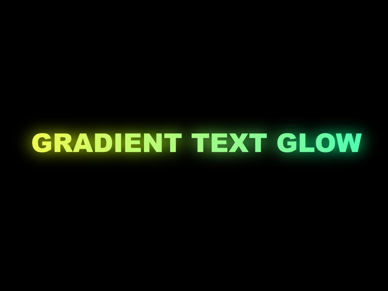

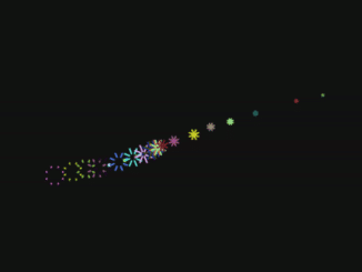
This code creates a gradient text glow effect using CSS. It animates the text color smoothly. It helps add eye-catching text effects.
You can use this code on your website’s headings or banners to make text stand out. It adds visual appeal and draws attention to important information. This effect can enhance the overall design and user experience.
How to Create Gradient Text Glow Effect In Css
1. First of all, load the Prefixfree JS by adding the following CDN link into the head tag of your HTML document.
<script src="https://cdnjs.cloudflare.com/ajax/libs/prefixfree/1.0.7/prefixfree.min.js"></script>
2. Inside the body tag of your HTML file, add an <h1> element with a class of “gr-text”. This will be the text element where the gradient glow effect will be applied. Copy the SVG code provided in the following example and paste it at the beginning of your HTML file. This SVG element contains the filter that generates the glow effect.
<svg width="0" height="0">
  <filter id="f" x="-50%" y="-200%" width="200%" height="500%" primitiveUnits="objectBoundingBox">
    <feGaussianBlur stdDeviation=".025 .2"></feGaussianBlur>
    <feColorMatrix type="saturate" values="1.3"></feColorMatrix>
    <feBlend in="SourceGraphic"></feBlend>
  </filter>
</svg>
<h1 class="gr-text">gradient text glow</h1>
3. In your linked CSS file, define the .gr-text class. This class contains the styles for the gradient text glow effect. Key properties include:
background: Creates a linear gradient background for the text.background-clip: Sets the background to be clipped to the text.color: Sets the text color to transparent.filter: Applies the SVG filter for the glow effect.animation: Animates the gradient transition.
@property --k {
  syntax: "<number>";
  initial-value: 0;
  inherits: false;
}
html, body {
  display: grid;
}

html {
  height: 100%;
}

body{
   background: #000;
   min-height: 720px;
}

svg[height="0"] {
  position: absolute;
}

.gr-text {
  /* no pseudo needed */
  --k: 0;
  place-self: center;
  background: linear-gradient(90deg, hsl(calc(var(--k)*1turn), 95%, 65%), hsl(calc(var(--k)*1turn + 90deg), 95%, 65%));
  -webkit-background-clip: text;
  background-clip: text;
  color: transparent;
  font: 900 clamp(.875em, 7.25vw, 5em) arial black, sans-serif;
  filter: url(#f);
  text-align: center;
  text-transform: uppercase;
  /* needs support for animating custom properties */
  /* Firefox not quite there yet, but it's coming */
  animation: k 4s linear infinite;
}

@keyframes k {
  to {
    --k: 1 ;
  }
}
That’s all! hopefully, you have successfully created the Gradient Text Glow Effect on your website. If you have any questions or suggestions, feel free to comment below.
Similar Code Snippets:

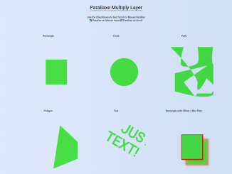
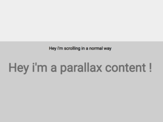
- Multi Layer Parallax Effect in JavaScript
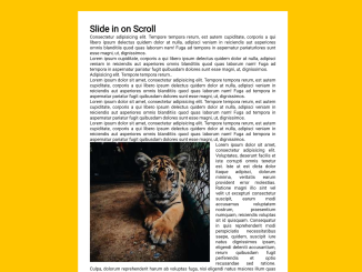
- Animate when Scrolled into View JavaScript
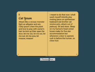
- 3D Booklet Animation Effect Using CSS
- 3D Tilt Effect on Hover Using Vanilla JS

I code and create web elements for amazing people around the world. I like work with new people. New people new Experiences.
I truly enjoy what I’m doing, which makes me more passionate about web development and coding. I am always ready to do challenging tasks whether it is about creating a custom CMS from scratch or customizing an existing system.