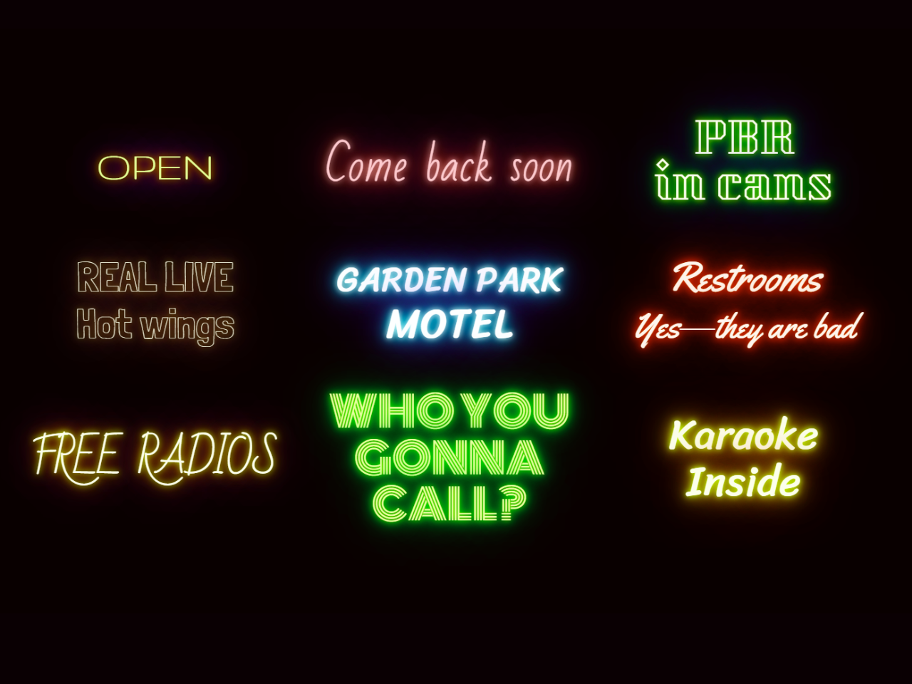

This code creates a stylish neon text shadow effect using CSS. It applies colorful, glowing text shadows to a set of text elements, giving them a dynamic flickering appearance. This code works by defining CSS styles for different text elements and using JavaScript to randomize the animation intervals, creating an eye-catching neon effect. It’s helpful for adding attention-grabbing typography to web pages.
You can use this code in your website’s headings, banners, or promotional messages to add a vibrant neon text effect. It instantly captures visitors’ attention.
How to Create CSS Text Shadow Neon Effect
1. First of all, load the Google Fonts by adding the following CDN links into the head tag of your HTML document.
<link href='https://fonts.googleapis.com/css?family=League+Script' rel='stylesheet' type='text/css'>
<link rel='stylesheet' href='https://fonts.googleapis.com/css?family=Bad+Script|Gruppo|Kumar+One+Outline|League+Script|Londrina+Outline|Monoton|Sriracha|Yellowtail&text=ABCDEFGHIJKLMNOPQRSTUVWXYZabcdefghijklmnopqrstuvwxyz0123456789?+'>
2. After that, create the HTML structure for the text elements you want to apply the neon effect to. Wrap each text element in a <x-sign> tag like this:
<x-sign> OPEN </x-sign> <x-sign> Come back soon </x-sign> <x-sign> PBR<br>in cans </x-sign> <x-sign> REAL LIVE<br>Hot wings </x-sign> <x-sign> <small>GARDEN PARK</small><br>MOTEL </x-sign> <x-sign> Restrooms <br><small>Yes—they are bad</small> </x-sign> <x-sign> FREE RADIOS </x-sign> <x-sign> WHO YOU GONNA CALL? </x-sign> <x-sign> Karaoke Inside </x-sign>
3. In your CSS file, define the styles for the neon effect by targeting the <x-sign> elements. Customize the colors and fonts according to your preference. Ensure you include the animation and text-shadow properties:
html {
  background: #090000;
  line-height: 1.1;
  text-align: center;
}

body {
  display: grid;
  grid-gap: 1em;
  grid-template-columns: repeat(auto-fit, minmax(0, 12ch));
  align-items: center;
  align-content: center;
  justify-content: center;
}

x-sign {
  --interval: 1s;
  display: block;
  text-shadow:
    0 0 10px var(--color1),
    0 0 20px var(--color2),
    0 0 40px var(--color3),
    0 0 80px var(--color4);
  will-change: filter, color;
  filter: saturate(60%);
  animation: flicker steps(100) var(--interval) 1s infinite;
  line-height: 1.6;
}

x-sign:nth-of-type(1) {
  color: yellow;
  --color1: goldenrod;
  --color2: orangered;
  --color3: mediumblue;
  --color4: purple;
  font-family: Gruppo;
}

x-sign:nth-of-type(2) {
  color: lightpink;
  --color1: pink;
  --color2: orangered;
  --color3: red;
  --color4: magenta;
  font-family: Bad Script;
}

x-sign:nth-of-type(3) {
  color: lightyellow;
  --color1: yellow;
  --color2: lime;
  --color3: green;
  --color4: mediumblue;
  font-family: Kumar One Outline;
}

x-sign:nth-of-type(4) {
  color: lightyellow;
  --color1: gold;
  --color2: firebrick;
  --color3: pink;
  --color4: red;
  font-family: Londrina Outline;
}


x-sign:nth-of-type(5) {
  color: azure;
  --color1: azure;
  --color2: aqua;
  --color3: dodgerblue;
  --color4: blue;
  font-family: Sriracha;
}

x-sign:nth-of-type(6) {
  color: tomato;
  --color1: orangered;
  --color2: firebrick;
  --color3: maroon;
  --color4: darkred;
  font-family: Yellowtail;
}

x-sign:nth-of-type(7) {
  color: lightyellow;
  --color1: yellow;
  --color2: orange;
  --color3: brown;
  --color4: purple;
  font-family: Bad Script;
}

x-sign:nth-of-type(8) {
  color: yellow;
  --color1: yellow;
  --color2: lime;
  --color3: green;
  --color4: darkgreen;
  font-family: Monoton;
}

x-sign:nth-of-type(9) {
  color: lightyellow;
  --color1: yellow;
  --color2: gold;
  --color3: orange;
  --color4: darkred;
  font-family: Sriracha;
}

@keyframes flicker {
  50% {
    color: white;
    filter: saturate(200%) hue-rotate(20deg);
  }
}
4. In your JavaScript file, add the following code to randomize the animation intervals:
const signs = document.querySelectorAll('x-sign')
const randomIn = (min, max) => (
  Math.floor(Math.random() * (max - min + 1) + min)
)

const mixupInterval = el => {
  const ms = randomIn(2000, 4000)
  el.style.setProperty('--interval', `${ms}ms`)
}

signs.forEach(el => {
  mixupInterval(el)
  el.addEventListener('webkitAnimationIteration', () => {
    mixupInterval(el)
  })
})
That’s all! hopefully, you’ve successfully created a neon text-shadow effect. This dynamic effect adds a visually appealing element to your web design. If you have any questions or suggestions, feel free to comment below.
Similar Code Snippets:

- Contenteditable on Double Click in JavaScript
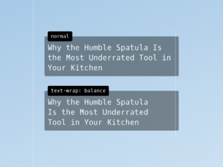
- Text-wrap Balance CSS Example
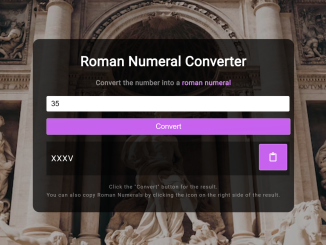
- Roman Numeral Converter Using JavaScript


I code and create web elements for amazing people around the world. I like work with new people. New people new Experiences.
I truly enjoy what I’m doing, which makes me more passionate about web development and coding. I am always ready to do challenging tasks whether it is about creating a custom CMS from scratch or customizing an existing system.