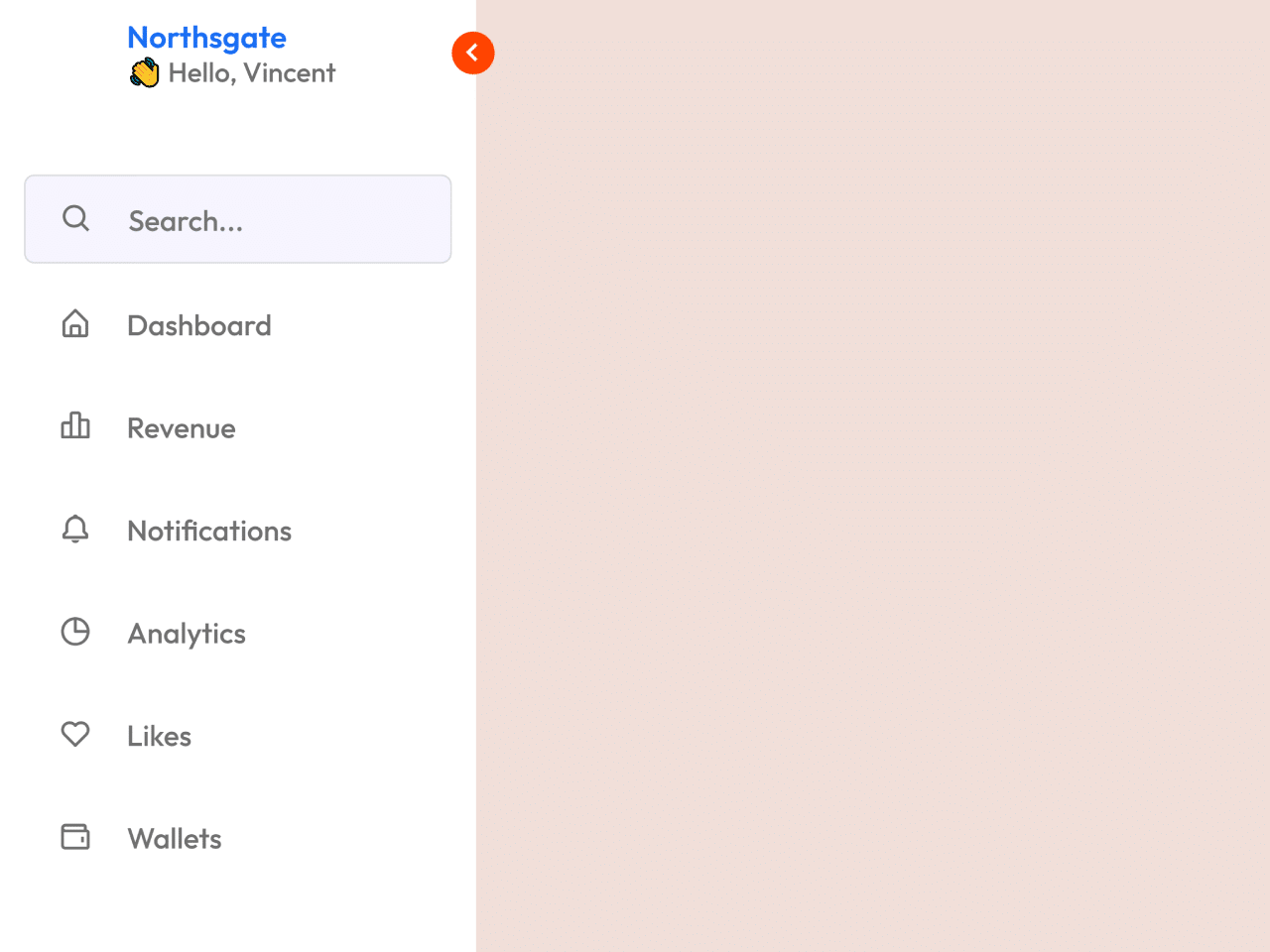

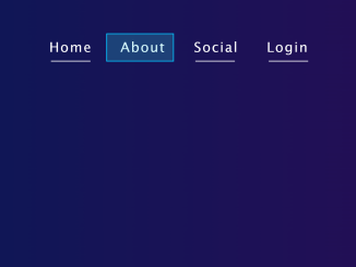
This code provides a Vertical Navigation Bar CSS Template. It allows you to create a sidebar menu with toggles for dark and light modes. The main functionalities include toggling the sidebar’s visibility and switching between dark and light modes.
Moreover, you can use this code in web projects to add a sleek vertical navigation bar with a toggle for dark and light modes. It benefits by enhancing user navigation, saving screen space, and providing a stylish design with easy mode switching.
How to Create Vertical Navigation Bar in HTML & CSS
1. First of all, load the Box Icons CSS, Font Awesome, and Google Fonts by adding the following CDN links into the head tag of your HTML document.
<link rel='stylesheet' href='https://unpkg.com/boxicons@2.1.1/css/boxicons.min.css'> <link rel='stylesheet' href='https://pro.fontawesome.com/releases/v6.0.0-beta3/css/all.css'> <link rel='stylesheet' href='https://fonts.googleapis.com/css2?family=Outfit:wght@100;200;300;400;500;600;700;800;900&display=swap'>
2. Include the following HTML code in your web page. This code sets up the basic structure of the vertical navigation bar, including the header and menu items. You can customize the links and icons to match your website’s content.
<nav class="sidebar close">
  <header>
    <div class="image-text"> <a href="#" class="text-logo-a">
        <span class="image">
          <img src="#" alt="">
        </span>
        <div class="text logo-text">
          <span class="name">Northsgate</span>
      </a>
      <span class="profession">👋 Hello, Vincent</span>
    </div>
    </div>
    <i class='bx bx-chevron-right toggle'></i>
  </header>
  <div class="menu-bar">
    <div class="menu">
      <li class="search-box">
        <i class='bx bx-search icon'></i>
        <input type="text" placeholder="Search...">
      </li>
      <ul class="menu-links">
        <li class="nav-link">
          <a href="#">
            <i class='bx bx-home-alt icon'></i>
            <span class="text nav-text">Dashboard</span>
          </a>
        </li>
        <li class="nav-link">
          <a href="#">
            <i class='bx bx-bar-chart-alt-2 icon'></i>
            <span class="text nav-text">Revenue</span>
          </a>
        </li>
        <li class="nav-link">
          <a href="#">
            <i class='bx bx-bell icon'></i>
            <span class="text nav-text">Notifications</span>
          </a>
        </li>
        <li class="nav-link">
          <a href="#">
            <i class='bx bx-pie-chart-alt icon'></i>
            <span class="text nav-text">Analytics</span>
          </a>
        </li>
        <li class="nav-link">
          <a href="#">
            <i class='bx bx-heart icon'></i>
            <span class="text nav-text">Likes</span>
          </a>
        </li>
        <li class="nav-link">
          <a href="#">
            <i class='bx bx-wallet icon'></i>
            <span class="text nav-text">Wallets</span>
          </a>
        </li>
      </ul>
    </div>
    <div class="bottom-content">
      <li class="">
        <a href="#">
          <i class='bx bx-log-out icon'></i>
          <span class="text nav-text">Logout</span>
        </a>
      </li>
      <li class="mode">
        <div class="sun-moon">
          <i class='bx bx-moon icon moon'></i>
          <i class='bx bx-sun icon sun'></i>
        </div>
        <span class="mode-text text">Dark mode</span>
        <div class="toggle-switch">
          <span class="switch"></span>
        </div>
      </li>
    </div>
  </div>
</nav>

<h2> This page demonstrates a vertical navigation menu </h2>
3. The following CSS code defines the styles for the navigation bar. You can customize the colors, fonts, and other styles by modifying the CSS variables in the :root section. Adjust the design to match your website’s theme.
* {
  margin: 0;
  padding: 0;
  box-sizing: border-box;
  font-family: outfit, sans-serif;
}
:root {
  --body-color: #e7e7e7;
  --sidebar-color: #fff;
  --primary-color: #ff4500;
  --primary-color-light: #f6f5ff;
  --toggle-color: #ddd;
  --text-color: #707070;
  --tran-03: all 0.2s ease;
  --tran-03: all 0.3s ease;
  --tran-04: all 0.3s ease;
  --tran-05: all 0.3s ease;
}
body {
  min-height: 100vh;
  background-color: var(--body-color);
  transition: var(--tran-05);
}
::selection {
  background-color: var(--primary-color);
  color: #fff;
}
body.dark {
  --body-color: #18191a;
  --sidebar-color: #242526;
  --primary-color: #3a3b3c;
  --primary-color-light: #3a3b3c;
  --toggle-color: #fff;
  --text-color: #ccc;
}
.sidebar {
  position: fixed;
  top: 0;
  left: 0;
  height: 100%;
  width: 250px;
  padding: 10px 14px;
  background: var(--sidebar-color);
  transition: var(--tran-05);
  z-index: 100;
}
.sidebar.close {
  width: 60px;
}
.sidebar li {
  height: 50px;
  list-style: none;
  display: flex;
  align-items: center;
  margin-top: 10px;
}
.sidebar header .image,
.sidebar .icon {
  min-width: 60px;
  border-radius: 6px;
}
.sidebar .icon {
  min-width: 60px;
  border-radius: 6px;
  height: 100%;
  display: flex;
  align-items: center;
  justify-content: center;
  font-size: 20px;
}
.sidebar .text,
.sidebar .icon {
  color: var(--text-color);
  transition: var(--tran-03);
}
.sidebar .text {
  font-size: 17px;
  font-weight: 500;
  white-space: nowrap;
  opacity: 1;
}
.sidebar.close .text {
  opacity: 0;
}
.sidebar header {
  position: relative;
}
.sidebar header .image-text {
  display: flex;
  align-items: center;
}
.sidebar header .logo-text {
  display: flex;
  flex-direction: column;
}
header .image-text .name {
  margin-top: 2px;
  font-size: 18px;
  font-weight: 600;
}
header .image-text .profession {
  font-size: 16px;
  margin-top: -2px;
  display: block;
}
.sidebar header .image {
  display: flex;
  align-items: center;
  justify-content: center;
}
.sidebar header .image img {
  width: 40px;
  border-radius: 6px;
}
.sidebar header .toggle {
  position: absolute;
  top: 50%;
  right: -25px;
  transform: translateY(-50%) rotate(180deg);
  height: 25px;
  width: 25px;
  background-color: var(--primary-color);
  color: var(--sidebar-color);
  border-radius: 50%;
  display: flex;
  align-items: center;
  justify-content: center;
  font-size: 22px;
  cursor: pointer;
  transition: var(--tran-05);
}
body.dark .sidebar header .toggle {
  color: var(--text-color);
}
.sidebar.close .toggle {
  transform: translateY(-50%) rotate(0deg);
}
.sidebar .menu {
  margin-top: 40px;
}
.sidebar li.search-box {
  border-radius: 6px;
  background-color: var(--primary-color-light);
  cursor: pointer;
  border: 1px solid #dadce0;
  transition: var(--tran-05);
}
.sidebar li.search-box input {
  height: 100%;
  width: 100%;
  outline: none;
  border: none;
  background-color: var(--primary-color-light);
  color: var(--text-color);
  border-radius: 6px;
  font-size: 17px;
  font-weight: 500;
  transition: var(--tran-05);
}
.sidebar li a {
  list-style: none;
  height: 100%;
  background-color: transparent;
  display: flex;
  align-items: center;
  height: 100%;
  width: 100%;
  border-radius: 6px;
  text-decoration: none;
  transition: var(--tran-03);
}
.sidebar li a:hover {
  background-color: var(--primary-color);
}
.sidebar li a:hover .icon,
.sidebar li a:hover .text {
  color: var(--sidebar-color);
}
body.dark .sidebar li a:hover .icon,
body.dark .sidebar li a:hover .text {
  color: var(--text-color);
}
.sidebar .menu-bar {
  height: calc(100% - 55px);
  display: flex;
  flex-direction: column;
  justify-content: space-between;
  overflow-y: scroll;
}
.menu-bar::-webkit-scrollbar {
  display: none;
}
.sidebar .menu-bar .mode {
  border-radius: 6px;
  background-color: var(--primary-color-light);
  position: relative;
  transition: var(--tran-05);
}
.menu-bar .mode .sun-moon {
  height: 50px;
  width: 60px;
}
.mode .sun-moon i {
  position: absolute;
}
.mode .sun-moon i.sun {
  opacity: 0;
}
body.dark .mode .sun-moon i.sun {
  opacity: 1;
}
body.dark .mode .sun-moon i.moon {
  opacity: 0;
}
.menu-bar .bottom-content .toggle-switch {
  position: absolute;
  right: 0;
  height: 100%;
  min-width: 60px;
  display: flex;
  align-items: center;
  justify-content: center;
  border-radius: 6px;
  cursor: pointer;
}
.toggle-switch .switch {
  position: relative;
  height: 22px;
  width: 40px;
  border-radius: 25px;
  background-color: var(--toggle-color);
  transition: var(--tran-05);
}
.switch::before {
  content: "";
  position: absolute;
  height: 15px;
  width: 15px;
  border-radius: 50%;
  top: 50%;
  left: 5px;
  transform: translateY(-50%);
  background-color: var(--sidebar-color);
  transition: var(--tran-04);
}
body.dark .switch::before {
  left: 20px;
}
.home {
  position: absolute;
  top: 0;
  top: 0;
  left: 250px;
  height: 100vh;
  width: calc(100% - 250px);
  background-color: var(--body-color);
  transition: var(--tran-05);
}
.home .text {
  font-size: 30px;
  font-weight: 500;
  color: var(--text-color);
  padding: 12px 60px;
}
.sidebar.close ~ .home {
  left: 78px;
  height: 100vh;
  width: calc(100% - 78px);
}
body.dark .home .text {
  color: var(--text-color);
}
.text-logo-a {
  text-decoration: none !important;
  color: #1b6ff3;
}
4. Finally, add the following JavaScript function to activate the toggle functionality and light/dark mode of the navigation bar.
const body = document.querySelector("body"),
  sidebar = body.querySelector("nav"),
  toggle = body.querySelector(".toggle"),
  searchBtn = body.querySelector(".search-box"),
  modeSwitch = body.querySelector(".toggle-switch"),
  modeText = body.querySelector(".mode-text");
toggle.addEventListener("click", () => {
  sidebar.classList.toggle("close");
});
searchBtn.addEventListener("click", () => {
  sidebar.classList.remove("close");
});
modeSwitch.addEventListener("click", () => {
  body.classList.toggle("dark");
  if (body.classList.contains("dark")) {
    modeText.innerText = "Light mode";
  } else {
    modeText.innerText = "Dark mode";
  }
});
That’s it! You’ve successfully implemented a Vertical Navigation Bar with Dark/Light Mode switching using the provided code. Customize it further to suit your specific project’s needs and design preferences.
Similar Code Snippets:

- Horizontal Menu Bar in HTML with Hover Effect
- Overlay Hamburger Menu Code with Example
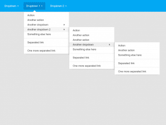
- Pure CSS Stylish Dropdown Menu

I code and create web elements for amazing people around the world. I like work with new people. New people new Experiences.
I truly enjoy what I’m doing, which makes me more passionate about web development and coding. I am always ready to do challenging tasks whether it is about creating a custom CMS from scratch or customizing an existing system.