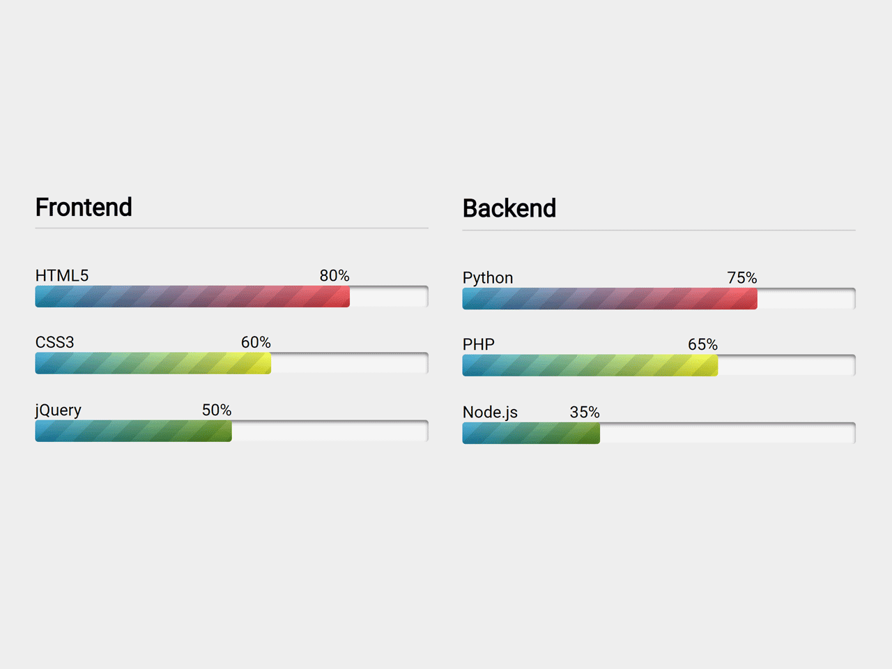

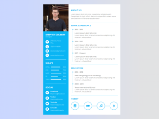
This HTML and CSS code snippet helps you to create progressbar for skill set for your portfolio. The progress bar comes with beautiful gradient colors, label and percentage values. You can set the filled value according to your grip on specific skill to visualize your expertise.
How to Create Skill Progressbar using HTML CSS
1. First of all, load the prefix-free JS into the head tag of your HTML document.
<script src="https://cdnjs.cloudflare.com/ajax/libs/prefixfree/1.0.7/prefixfree.min.js"></script>
2. After that, create the HTML5 progress element with style attribute and define CSS width property with respect to data-value attribute. Alternatively, create a div element with a class name “progress-bar” and place a span element with style attribute inside it.
<ul>
	<li>
		<h2>Frontend</h2>

		<!-- HTML5 -->
    <p style="width:80%" data-value="80">HTML5</p>
		<progress max="100" value="80" class="html5">
			<!-- Browsers that support HTML5 progress element will ignore the html inside `progress` element. Whereas older browsers will ignore the `progress` element and instead render the html inside it. -->
		<div class="progress-bar">
				<span style="width: 80%">80%</span>
			</div>
		</progress>

		<!-- CSS3 -->
    <p style="width:60%" data-value="60">CSS3</p>
		<progress max="100" value="60" class="css3">
			<!-- Browsers that support HTML5 progress element will ignore the html inside `progress` element. Whereas older browsers will ignore the `progress` element and instead render the html inside it. -->
			<div class="progress-bar">
				<span style="width: 60%">60%</span>
			</div>
		</progress>

		<!-- jQuery -->
    <p style="width:50%" data-value="50">jQuery</p>
		<progress max="100" value="50" class="jquery">
			<!-- Browsers that support HTML5 progress element will ignore the html inside `progress` element. Whereas older browsers will ignore the `progress` element and instead render the html inside it. -->
			<div class="progress-bar">
				<span style="width: 50%">50%</span>
			</div>
		</progress>

	</li>
	<li>
		<h2>Backend</h2>

    <!-- Python -->
    <p style="width:75%" data-value="75">Python</p>
		<progress max="100" value="75" class="python">
			<!-- Browsers that support HTML5 progress element will ignore the html inside `progress` element. Whereas older browsers will ignore the `progress` element and instead render the html inside it. -->
			<div class="progress-bar">
				<span style="width: 75%">75%</span>
			</div>
		</progress>

		<!-- PHP -->
    <p style="width:65%" data-value="65">PHP</p>
		<progress max="100" value="65" class="php">
			<!-- Browsers that support HTML5 progress element will ignore the html inside `progress` element. Whereas older browsers will ignore the `progress` element and instead render the html inside it. -->
			<div class="progress-bar">
				<span style="width: 65%">65%</span>
			</div>
		</progress>

		<!-- Node.js -->
    <p style="width:35%" data-value="35">Node.js</p>
    <progress max="100" value="35" class="node-js">
			<!-- Browsers that support HTML5 progress element will ignore the html inside `progress` element. Whereas older browsers will ignore the `progress` element and instead render the html inside it. -->
			<div class="progress-bar">
				<span style="width: 35%">35%</span>
			</div>
		</progress>

	</li>
</ul>
3. Style the progress bar using the following CSS:
@import url(https://fonts.googleapis.com/css?family=Expletus+Sans);

/* Basic resets */

* {
	margin:0; padding:0;
	box-sizing: border-box;
}
li {
       min-width: 360px;
	list-style-type: none;
	padding-right: 5.3333333%;
}

li:nth-child(even) { margin-bottom: 5em;}

h2 {
	margin: 0 0 1.5em;
	border-bottom: 1px solid #ccc;
	padding: 0 0 .25em;
}

/* Styling an indeterminate progress bar */

progress:not(value) {
	/* Add your styles here. As part of this walkthrough we will focus only on determinate progress bars. */
}

/* Styling the determinate progress element */

progress[value] {
	/* Get rid of the default appearance */
	appearance: none;

	/* This unfortunately leaves a trail of border behind in Firefox and Opera. We can remove that by setting the border to none. */
	border: none;

	/* Add dimensions */
	width: 100%; height: 20px;

	/* Although firefox doesn't provide any additional pseudo class to style the progress element container, any style applied here works on the container. */
	  background-color: whiteSmoke;
	  border-radius: 3px;
	  box-shadow: 0 2px 3px rgba(0,0,0,.5) inset;

	/* Of all IE, only IE10 supports progress element that too partially. It only allows to change the background-color of the progress value using the 'color' attribute. */
	color: royalblue;

	position: relative;
	margin: 0 0 1.5em;
}

/*
Webkit browsers provide two pseudo classes that can be use to style HTML5 progress element.
-webkit-progress-bar -> To style the progress element container
-webkit-progress-value -> To style the progress element value.
*/

progress[value]::-webkit-progress-bar {
	background-color: whiteSmoke;
	border-radius: 3px;
	box-shadow: 0 2px 3px rgba(0,0,0,.5) inset;
}

progress[value]::-webkit-progress-value {
	position: relative;

	background-size: 35px 20px, 100% 100%, 100% 100%;
	border-radius:3px;

	/* Let's animate this */
	animation: animate-stripes 5s linear infinite;
}

@keyframes animate-stripes { 100% { background-position: -100px 0; } }

/* Let's spice up things little bit by using pseudo elements. */

progress[value]::-webkit-progress-value:after {
	/* Only webkit/blink browsers understand pseudo elements on pseudo classes. A rare phenomenon! */
	content: '';
	position: absolute;

	width:5px; height:5px;
	top:7px; right:7px;

	background-color: white;
	border-radius: 100%;
}

/* Firefox provides a single pseudo class to style the progress element value and not for container. -moz-progress-bar */

progress[value]::-moz-progress-bar {
	/* Gradient background with Stripes */
	background-image:
	-moz-linear-gradient( 135deg,
													 transparent,
													 transparent 33%,
													 rgba(0,0,0,.1) 33%,
													 rgba(0,0,0,.1) 66%,
													 transparent 66%),
    -moz-linear-gradient( top,
														rgba(255, 255, 255, .25),
														rgba(0,0,0,.2)),
     -moz-linear-gradient( left, #09c, #f44);

	background-size: 35px 20px, 100% 100%, 100% 100%;
	border-radius:3px;

	/* Firefox doesn't support CSS3 keyframe animations on progress element. Hence, we did not include animate-stripes in this code block */
}

/* Fallback technique styles */
.progress-bar {
	background-color: whiteSmoke;
	border-radius: 3px;
	box-shadow: 0 2px 3px rgba(0,0,0,.5) inset;

	/* Dimensions should be similar to the parent progress element. */
	width: 100%; height:20px;
}

.progress-bar span {
	background-color: royalblue;
	border-radius: 3px;

	display: block;
	text-indent: -9999px;
}

p[data-value] {

  position: relative;
}

/* The percentage will automatically fall in place as soon as we make the width fluid. Now making widths fluid. */

p[data-value]:after {
	content: attr(data-value) '%';
	position: absolute; right:0;
}


.html5::-webkit-progress-value,
.python::-webkit-progress-value  {
	/* Gradient background with Stripes */
	background-image:
	-webkit-linear-gradient( 135deg,
													 transparent,
													 transparent 33%,
													 rgba(0,0,0,.1) 33%,
													 rgba(0,0,0,.1) 66%,
													 transparent 66%),
    -webkit-linear-gradient( top,
														rgba(255, 255, 255, .25),
														rgba(0,0,0,.2)),
     -webkit-linear-gradient( left, #09c, #f44);
}

.css3::-webkit-progress-value,
.php::-webkit-progress-value
{
	/* Gradient background with Stripes */
	background-image:
	-webkit-linear-gradient( 135deg,
													 transparent,
													 transparent 33%,
													 rgba(0,0,0,.1) 33%,
													 rgba(0,0,0,.1) 66%,
													 transparent 66%),
    -webkit-linear-gradient( top,
														rgba(255, 255, 255, .25),
														rgba(0,0,0,.2)),
     -webkit-linear-gradient( left, #09c, #ff0);
}

.jquery::-webkit-progress-value,
.node-js::-webkit-progress-value
{
	/* Gradient background with Stripes */
	background-image:
	-webkit-linear-gradient( 135deg,
													 transparent,
													 transparent 33%,
													 rgba(0,0,0,.1) 33%,
													 rgba(0,0,0,.1) 66%,
													 transparent 66%),
    -webkit-linear-gradient( top,
														rgba(255, 255, 255, .25),
														rgba(0,0,0,.2)),
     -webkit-linear-gradient( left, #09c, #690);
}

/* Similarly, for Mozillaa. Unfortunately combining the styles for different browsers will break every other browser. Hence, we need a separate block. */

.html5::-moz-progress-bar,
.php::-moz-progress-bar {
	/* Gradient background with Stripes */
	background-image:
	-moz-linear-gradient( 135deg,
													 transparent,
													 transparent 33%,
													 rgba(0,0,0,.1) 33%,
													 rgba(0,0,0,.1) 66%,
													 transparent 66%),
    -moz-linear-gradient( top,
														rgba(255, 255, 255, .25),
														rgba(0,0,0,.2)),
     -moz-linear-gradient( left, #09c, #f44);
}

.css3::-moz-progress-bar,
.php::-moz-progress-bar {
{
	/* Gradient background with Stripes */
	background-image:
	-moz-linear-gradient( 135deg,
													 transparent,
													 transparent 33%,
													 rgba(0,0,0,.1) 33%,
													 rgba(0,0,0,.1) 66%,
													 transparent 66%),
    -moz-linear-gradient( top,
														rgba(255, 255, 255, .25),
														rgba(0,0,0,.2)),
     -moz-linear-gradient( left, #09c, #ff0);
}

.jquery::-moz-progress-bar,
.node-js::-moz-progress-bar {
	/* Gradient background with Stripes */
	background-image:
	-moz-linear-gradient( 135deg,
													 transparent,
													 transparent 33%,
													 rgba(0,0,0,.1) 33%,
													 rgba(0,0,0,.1) 66%,
													 transparent 66%),
    -moz-linear-gradient( top,
														rgba(255, 255, 255, .25),
														rgba(0,0,0,.2)),
     -moz-linear-gradient( left, #09c, #690);
}

/* Now we are good to duplicate html code for other skills and then add the css code for the new skill based on data-skill */


/* THE END */
4. Finally, load the HTML 5 Progress Polyfill JS by adding the following CDN link before closing the body tag:
<script src='https://raw.github.com/LeaVerou/HTML5-Progress-polyfill/master/progress-polyfill.min.js'></script>
That’s all! hopefully, you have successfully created skill progressbar. If you have any questions or suggestions, feel free to comment below.
Similar Code Snippets:

- 15+ Background Image With Text Overlay
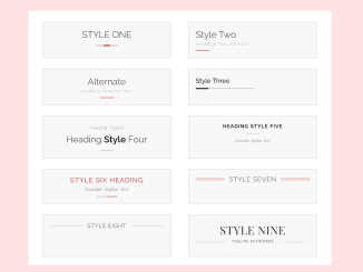
- 15+ CSS Heading Styles Examples
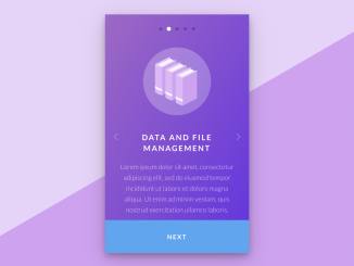
- Onboarding Screen Using Html CSS and JavaScript
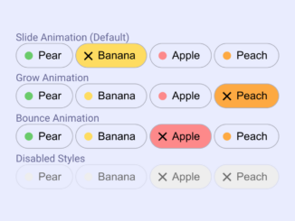
- Animated Toggle Pills Using CSS
- HTML Code for Resume with Picture


I code and create web elements for amazing people around the world. I like work with new people. New people new Experiences.
I truly enjoy what I’m doing, which makes me more passionate about web development and coding. I am always ready to do challenging tasks whether it is about creating a custom CMS from scratch or customizing an existing system.