
This code provides a CSS solution for adding sale ribbon and badge to product cards. It works by positioning badges with different styles on top of product cards. Moreover, it is helpful for enhancing the visual presentation of products on an e-commerce website by highlighting items on sale.
It enhances the overall user experience by providing a clear indication of special offers and promotions. You can use this code on your e-commerce website to visually emphasize products on sale, making it easier for customers to spot discounted items.
How to Create Sale & Discount Ribbon And Badge In Css
1. First, create an HTML structure for your product images. Each product should be enclosed within an <li> element with an associated <figure> for the image and a <div class="badge-overlay"> for the badge.
<div class="products">

    <ul>
        <!-- Product block LI start here-->
        <li>
            <!-- Product Image-->
            <figure><img src="https://images.pexels.com/photos/667838/pexels-photo-667838.jpeg?auto=compress&cs=tinysrgb&h=350" alt="product01"></figure>
            <!-- Badge overlay DIV -->
            <div class="badge-overlay">
                <!-- Change Badge Position, Color, Text here-->
                <span class="top-left badge orange">Sale 50% Off</span>
            </div>
        </li>
        <!-- Product block LI end here-->

        <li>
            <figure><img src="https://images.pexels.com/photos/1090638/pexels-photo-1090638.jpeg?auto=compress&cs=tinysrgb&h=350" alt="product02"></figure>
            <div class="badge-overlay">
                <span class="top-right badge red">Sale</span>
            </div>
        </li>
        <li>
            <figure><img src="https://images.pexels.com/photos/707581/pexels-photo-707581.jpeg?auto=compress&cs=tinysrgb&h=350" alt="product03"></figure>
            <div class="badge-overlay">
                <span class="bottom-left badge blue">Sale 50% Off</span>
            </div>
        </li>
        <li>
            <figure><img src="https://images.pexels.com/photos/259580/pexels-photo-259580.jpeg?auto=compress&cs=tinysrgb&h=350" alt="product04"></figure>
            <div class="badge-overlay">
                <span class="bottom-right badge pink">75% OFF</span>
            </div>
        </li>
        <li>
            <figure><img src="https://images.pexels.com/photos/1267857/pexels-photo-1267857.jpeg?auto=compress&cs=tinysrgb&h=350" alt="product07"></figure>
            <div class="badge-overlay">
                <span class="top-full badge green">SALE 75% OFF</span>
            </div>
        </li>
        <li>
            <figure><img src="https://images.pexels.com/photos/276528/pexels-photo-276528.jpeg?auto=compress&cs=tinysrgb&h=350" alt="product07"></figure>
            <div class="badge-overlay">
                <span class="middle-full badge red">SALE 75% OFF</span>
            </div>
        </li>
        <li>
            <figure><img src="https://images.pexels.com/photos/776538/pexels-photo-776538.jpeg?auto=compress&cs=tinysrgb&h=350" alt="product07"></figure>
            <div class="badge-overlay">
                <span class="bottom-full badge orange">SALE 75% OFF</span>
            </div>
        </li>
    </ul>
</div>
2. Copy and paste the provided CSS code into your website’s stylesheet. This CSS code defines the positioning, styles, and transitions for the sale badges.
*, html {
  -webkit-box-sizing: border-box;
  -moz-box-sizing: border-box;
  box-sizing: border-box;
}

figure {
  margin: 0px;
}

img {
  max-width: 100%;
}

/* ================== Badge Products CSS ========================*/
.products {
  max-width: 100%;
  margin: 0 auto;
}

.products ul {
  margin: 0px;
  text-align: center;
}

.products ul li {
  width: 320px;
  height: 213px;
  background: #f8f8f8;
  display: inline-block;
  position: relative;
  margin: 15px;
  padding: 0px;
  box-sizing: border-box;
}

/* ================== Badge Overlay CSS ========================*/
.badge-overlay {
  position: absolute;
  left: 0%;
  top: 0px;
  width: 100%;
  height: 100%;
  overflow: hidden;
  pointer-events: none;
  z-index: 100;
  -webkit-transition: width 1s ease, height 1s ease;
  -moz-transition: width 1s ease, height 1s ease;
  -o-transition: width 1s ease, height 1s ease;
  transition: width 0.4s ease, height 0.4s ease;
}

/* ================== Badge CSS ========================*/
.badge {
  margin: 0;
  padding: 0;
  color: white;
  padding: 10px 10px;
  font-size: 15px;
  font-family: Arial, Helvetica, sans-serif;
  text-align: center;
  line-height: normal;
  text-transform: uppercase;
  background: #ed1b24;
}

.badge::before, .badge::after {
  content: "";
  position: absolute;
  top: 0;
  margin: 0 -1px;
  width: 100%;
  height: 100%;
  background: inherit;
  min-width: 55px;
}

.badge::before {
  right: 100%;
}

.badge::after {
  left: 100%;
}

/* ================== Badge Position CSS ========================*/
.top-left {
  position: absolute;
  top: 0;
  left: 0;
  -ms-transform: translateX(-30%) translateY(0%) rotate(-45deg);
  -webkit-transform: translateX(-30%) translateY(0%) rotate(-45deg);
  transform: translateX(-30%) translateY(0%) rotate(-45deg);
  -ms-transform-origin: top right;
  -webkit-transform-origin: top right;
  transform-origin: top right;
}

.top-right {
  position: absolute;
  top: 0;
  right: 0;
  -ms-transform: translateX(30%) translateY(0%) rotate(45deg);
  -webkit-transform: translateX(30%) translateY(0%) rotate(45deg);
  transform: translateX(30%) translateY(0%) rotate(45deg);
  -ms-transform-origin: top left;
  -webkit-transform-origin: top left;
  transform-origin: top left;
}

.bottom-left {
  position: absolute;
  bottom: 0;
  left: 0;
  -ms-transform: translateX(-30%) translateY(0%) rotate(45deg);
  -webkit-transform: translateX(-30%) translateY(0%) rotate(45deg);
  transform: translateX(-30%) translateY(0%) rotate(45deg);
  -ms-transform-origin: bottom right;
  -webkit-transform-origin: bottom right;
  transform-origin: bottom right;
}

.bottom-right {
  position: absolute;
  bottom: 0;
  right: 0;
  -ms-transform: translateX(30%) translateY(0%) rotate(-45deg);
  -webkit-transform: translateX(30%) translateY(0%) rotate(-45deg);
  transform: translateX(30%) translateY(0%) rotate(-45deg);
  -ms-transform-origin: bottom left;
  -webkit-transform-origin: bottom left;
  transform-origin: bottom left;
}

.top-full {
  position: absolute;
  top: 0;
  left: 0;
  width: 100%;
  text-align: center;
}

.middle-full {
  position: absolute;
  top: 50%;
  left: 0;
  width: 100%;
  text-align: center;
  -ms-transform: translateX(0%) translateY(-50%) rotate(0deg);
  -webkit-transform: translateX(0%) translateY(-50%) rotate(0deg);
  transform: translateX(0%) translateY(-50%) rotate(0deg);
}

.bottom-full {
  position: absolute;
  bottom: 0;
  left: 0;
  width: 100%;
  text-align: center;
}

/* ================== Badge color CSS ========================*/
.badge.red {
  background: #ed1b24;
}

.badge.orange {
  background: #fa7901;
}

.badge.pink {
  background: #ee2b8b;
}

.badge.blue {
  background: #00adee;
}

.badge.green {
  background: #b4bd00;
}
- To add a badge to a product, simply include a
<span>element within the<div class="badge-overlay">element. Customize the badge by giving it a class like “top-left,” “top-right,” “bottom-left,” or “bottom-right” for different positions. - Adjust the badge text and color according to your needs. You can customize the badge content by changing the text inside the
<span>element and selecting a desired badge color class (e.g., “badge orange” for orange).
That’s all! hopefully, you have successfully created a Sale & Discount Ribbon And Badge In CSS. If you have any questions or suggestions, feel free to comment below.
Similar Code Snippets:
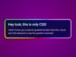
 CSS Stylish Box with Animated Gradient Border
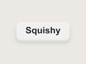
- CSS Squishy Button With Smooth Transition
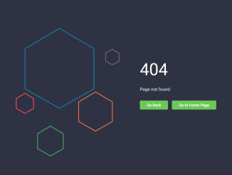
- 404 Error Page Template in HTML CSS
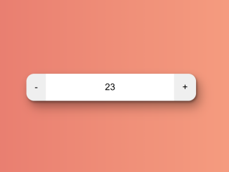
- Increment and Decrement Button in HTML


I code and create web elements for amazing people around the world. I like work with new people. New people new Experiences.
I truly enjoy what I’m doing, which makes me more passionate about web development and coding. I am always ready to do challenging tasks whether it is about creating a custom CMS from scratch or customizing an existing system.