
This code snippet helps you to expand image on hover and show caption. It expands images on hover to reveal captions. It helps display profiles with engaging hover effects.
You can use this code on websites showcasing profiles or portfolios. It enhances user experience with interactive hover effects. It adds visual appeal and engagement to your web content.
How to Expand Image On Hover and Show Caption
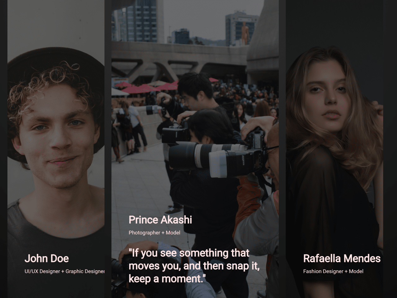
1. Start by creating a new HTML file and open it in your text editor. Within the <body> tags, create a <section> element with a class of “container”. Inside the container, create individual profile card divs using the <div> element with a class of “content”. Each card will contain an image, profile details, and a quote.
Within each “content” div, add <img> tags for profile images and any other details you want to display, like the name and profession. Wrap the profile details in a <div> with a class of “profile_detail” for styling purposes. Include a <div> with a class of “wrapper” around the profile quote for the hover effect.
<!-- quick fix to load assets from github -->
<base href="https://rawcdn.githack.com/MuhammadHasann/component-frontend/7e3a0bced6f1b050e8d0b621f2a3a6e7b1cb06d3/section/category%20card-2/" />
<!-- lazy dog credit note -->
<dialog open>Reply to <a href="https://twitter.com/asanagih/status/1764194084435181573" target="_blank"> tweet</a> by <a href="https://hasanmolla.vercel.app/" target="_blank">HASAN MOLLA</a></dialog>

<section class="container">
	<div class="category_container">
		<div class="content">
			<img src="assets/UI UX Designer.jpg" class="professio_image" alt="Profession" />
			<img src="assets/John Doe.jpg" class="profile_image" alt="Profile" />
			<div class="profile_detail">
				<span>John Doe</span>
				<p>UI/UX Designer + Graphic Designer</p>
			</div>

			<div class="wrapper">
				<div class="profile_quote">
					<p>"UI is the saddle, the stirrups, & the reins. UX is the feeling you get being able to ride the horse."</p>
				</div>
			</div>

		</div>
		<div class="content">
			<img src="assets/Photographer.jpg" class="profession_image" alt="Profession" />
			<img src="assets/Prince Akashi.jpg" class="profile_image" alt="Profile" />
			<div class="profile_detail">
				<span>Prince Akashi</span>
				<p>Photographer + Model</p>
			</div>
			<div class="wrapper">
				<div class="profile_quote">
					<p>"If you see something that moves you, and then snap it, you keep a moment."</p>
				</div>
			</div>
		</div>
		<div class="content">
			<img src="assets/Fashion Designer.jpg" class="profession_image" alt="Profession" />
			<img src="assets/Rafaella Mendes.jpg" class="profile_image" alt="Profile" />
			<div class="profile_detail">
				<span>Rafaella Mendes</span>
				<p>Fashion Designer + Model</p>
			</div>
			<div class="wrapper">
				<div class="profile_quote">
					<p>"My mission in life is not merely to survive, but to thrive and to do so with some passion, some compassion, some humor, and some style."</p>
				</div>
			</div>
		</div>
	</div>
</section>
2. Now, let’s style the profile cards to create the hover effect. In your CSS file, target the “content” class to set the initial styling for the profile cards. Use the :hover pseudo-class to define styles that will be applied when hovering over the profile cards. Transition properties like width, opacity, and transform to achieve smooth hover effects. Adjust the grid layout within the “wrapper” class to expand the profile quote when hovered over.
@import url("https://fonts.googleapis.com/css2?family=Inter:wght@100..900&display=swap");
* {
  padding: 0;
  margin: 0;
  box-sizing: border-box;
}

body {
  font-family: "Inter", sans-serif;
}

:root {
  --light: #ffe6e6;
  --dark: #0c0c0c;
}

.container {
  --bg-color: radial-gradient(
  	circle at 50% 0%,
  	rgba(50, 50, 50, 1) 0%,
  	rgba(12, 12, 12, 1) 100%
  );
  overflow: clip;
  position: relative;
  display: flex;
  justify-content: center;
  align-items: center;
  padding: 2rem 5rem;
  width: 100%;
  height: 100dvh;
  background-image: var(--bg-color);
}

.category_container {
  --gap: 0.5rem;
  display: flex;
  justify-content: space-between;
  align-items: center;
  flex-wrap: nowrap;
  gap: calc(var(--gap) * 2);
  width: 100%;
  height: 100%;
}

.content {
  --active: 0;
  cursor: pointer;
  overflow: clip;
  position: relative;
  z-index: 10;
  display: flex;
  flex-direction: column;
  justify-content: flex-end;
  gap: 1.5rem;
  padding: 2.5rem;
  width: calc((100% / 3) - var(--gap));
  height: 100%;
  border-radius: 1rem;
  transition: width 0.5s ease-in-out;
}

.content:hover {
  --active: 1;
  width: calc(70% - var(--gap));
}

.content::before {
  content: "";
  position: absolute;
  z-index: -10;
  top: 0;
  left: 0;
  width: 100%;
  height: 100%;
  background-color: var(--dark);
  opacity: 0.6;
}

.content img {
  position: absolute;
  z-index: -20;
  top: 0;
  left: 0;
  width: 100%;
  height: 100%;
  -o-object-fit: cover;
     object-fit: cover;
  -o-object-position: center;
     object-position: center;
}

.content .profile_image {
  opacity: calc(1 - var(--active));
  transition: opacity 0.3s ease-in-out;
}

.profile_detail {
  display: flex;
  flex-direction: column;
  gap: 0.5rem;
  width: 12rem;
  transition: transform 0.5s cubic-bezier(0.23, 0.93, 0.77, 1) 0.01s;
}

.profile_detail span {
  font-size: 1.5rem;
  font-weight: 600;
  color: var(--light);
  text-wrap: nowrap;
}

.profile_detail p {
  font-size: 0.75rem;
  font-weight: 500;
  color: var(--light);
}

.profile_quote {
  width: 22rem;
  transform: translate(0, calc((1 - var(--active)) * (100% + 2.5rem)));
}

.profile_quote p {
  font-size: 1.5rem;
  font-weight: 600;
  color: var(--light);
  transform: translate(0, calc((1 - var(--active)) * (100% + 2.5rem)));
  transition: transform 0.5s cubic-bezier(0.23, 0.93, 0.77, 1) 0.1s;
}

.wrapper {
  display: grid;
  grid-template-rows: 0fr;
  overflow: hidden;
  transition: grid-template-rows 0.5s cubic-bezier(0.23, 0.93, 0.77, 1) 0.01s;
  transition: grid-template-rows 0.5s cubic-bezier(0.23, 0.93, 0.77, 1) 0.01s, -ms-grid-rows 0.5s cubic-bezier(0.23, 0.93, 0.77, 1) 0.01s;
}

.profile_quote {
  min-height: 0;
  transform: translateY(50%);
  opacity: 0;
  transition: opacity 0.8s ease-in-out, transform 0.8s cubic-bezier(0.23, 0.93, 0.77, 1) 0.01s;
}

.content:hover .wrapper {
  grid-template-rows: 1fr;
}

.content:hover .profile_quote {
  transform: none;
  opacity: 1;
}

dialog {
  position: absolute;
  z-index: 1;
  background: none;
  color: white;
  border: 0;
  font-size: 0.8rem;
  padding: 0.5em;
}

dialog a {
  color: whitesmoke;
}
That’s all! hopefully, you have successfully created an Expand Image On Hover And Show Caption. If you have any questions or suggestions, feel free to comment below.
Similar Code Snippets:
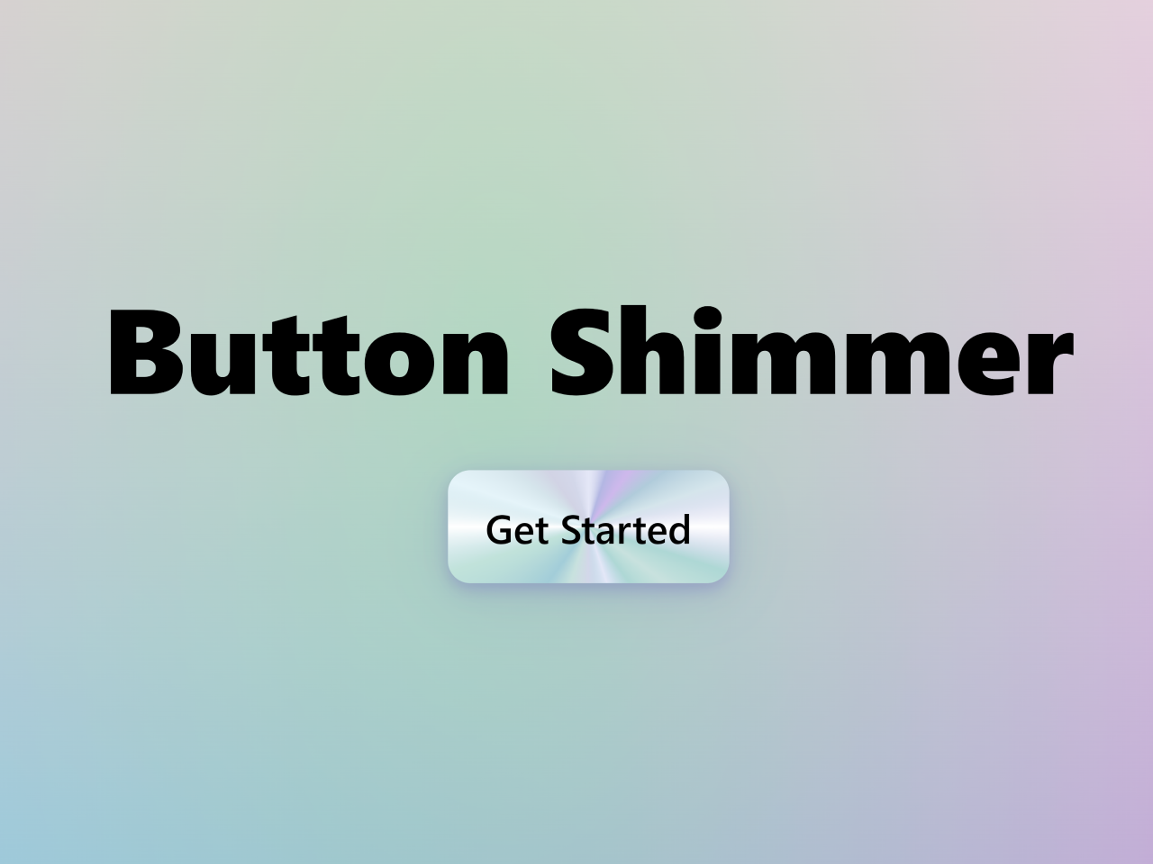
 Button Shimmer Effect on Hover Using CSS
- CSS Background Color Only Behind Text
- Word Cloud HTML CSS Code
- Padlock Toggle Switch in CSS
- Full Screen Video Background in HTML5
- HTML Tabs Example with Code
- SMS Conversation UI Using HTML CSS
- Toggle Button in CSS With Stretchable Elastic Effect

I code and create web elements for amazing people around the world. I like work with new people. New people new Experiences.
I truly enjoy what I’m doing, which makes me more passionate about web development and coding. I am always ready to do challenging tasks whether it is about creating a custom CMS from scratch or customizing an existing system.