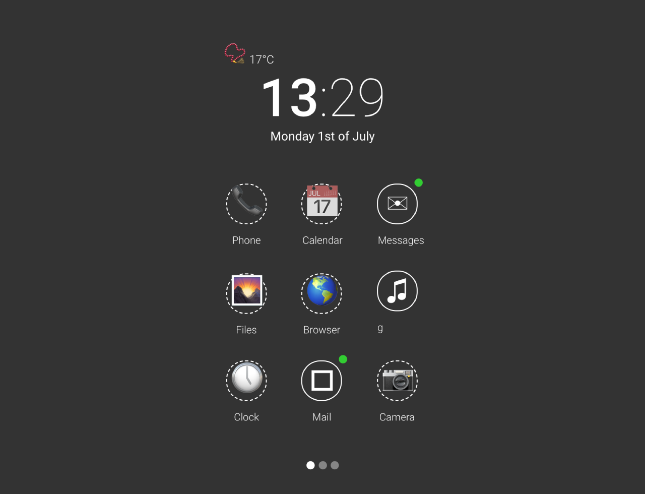

This code creates a visually appealing mobile apps grid menu UI using HTML and CSS. The main functionality involves styling elements like icons, clock, date, and pagination with smooth animations. The CSS code defines the layout, colors, and transitions. The JavaScript code blurs the background images and adds a loading animation. This code helps design modern and interactive mobile app interfaces with a clean and dynamic appearance.
How to Create Mobile Apps Grid Menu Ui Using Html Css
1. First of all, load PreFixfree JS by adding the following CDN link into the head tag of your HTML document.
<script src="https://cdnjs.cloudflare.com/ajax/libs/prefixfree/1.0.7/prefixfree.min.js"></script>
2. Set up your HTML file. Create a container with the class “screen-wrapper” to hold the entire grid menu UI. Inside this container, add elements for the clock, date, icons, and pagination.
<div class="loading"></div>
<canvas class="blur" src="http://7-themes.com/data_images/out/36/6894141-blurred.jpg" width="1680" height="1050"></canvas>
<div class="screen-wrapper">
<div class="weather">
<span class="entypo">📿</span>
<span class="degree">17°C</span>
</div>
<div class="clock"><b>13</b>:29</div>
<div class="date">
<span class="week">Monday</span>
<span class="day">1st of</span>
<span class="month">July</span>
</div>
<a href="#" class="phone-icon icon">
<span class="entypo">📞</span>
<div class="title">Phone</div>
</a>
<a href="#" class="cal-icon icon">
<span class="entypo">📅</span>
<div class="title">Calendar</div>
</a>
<a href="#" class="sms-icon icon notify">
<span class="entypo">✉</span>
<div class="title">Messages</div>
</a>
<a href="#" class="files-icon icon">
<span class="entypo">🌄</span>
<div class="title">Files</div>
</a>
<a href="#" class="browser-icon icon">
<span class="entypo">🌎</span>
<div class="title">Browser</div>
</a>
<a href="#" class="music-icon icon active">
<span class="entypo">♫</span>
<div class="title">
<span class="entypo">▶</span>
Now playing: Fineshrine - Purity Ring
</div>
<svg width="250" height="250" viewbox="0 0 250 250">
<path id="border" transform="translate(125, 125)"/>
<path id="loader" transform="translate(125, 125)"/>
</svg>
</a>
<a href="#" class="clock-icon icon">
<span class="entypo">🕔</span>
<div class="title">Clock</div>
</a>
<a href="#" class="mail-icon icon notify">
<span class="entypo"></span>
<div class="title">Mail</div>
</a>
<!--<a href="#" class="contacts-icon icon">
<span class="entypo">👤</span>
<div class="title">Contacts</div>
</a>-->
<a href="#" class="cam-icon icon">
<span class="entypo">📷</span>
<div class="title">Camera</div>
</a>
<!--<a href="#" class="map-icon icon">
<span class="entypo"></span>
<div class="title">Maps</div>
</a>-->
<ul class="pagination">
<li class="page current"><a href="#"></a></li>
<li class="page"><a href="#"></a></li>
<li class="page"><a href="#"></a></li>
</ul>
</div>
3. Copy the following CSS code into your stylesheet. This code defines the layout, colors, and animations. It’s designed to create a modern and dynamic user interface. Ensure that you include the Roboto font and the Entypo icon font in your project for the complete styling.
@import url(https://fonts.googleapis.com/css?family=Roboto:400,100,300,500,700,900);
@font-face {
  font-family: 'entypo';
  src: url("http://entypo.com/css/entypo.eot");
  src: url("http://entypo.com/css/entypo.eot?#iefix") format("embedded-opentype"), url("http://entypo.com/css/entypo.woff") format("woff"), url("http://entypo.com/css/entypo.ttf") format("truetype");
}

.entypo {
  margin-left: 1px;
  font-family: entypo;
  font-size: 200%;
  font-weight: normal;
  font-style: normal;
  line-height: 38px;
}

* {
  user-select: none;
  -moz-box-sizing: border-box;
  -webkit-box-sizing: border-box;
  box-sizing: border-box;
}

html {
  overflow: -moz-scrollbars-vertical;
  overflow-y: scroll;
}

body {
  font-family: 'Roboto', sans-serif;
  font-weight: 300;
  background-color: #333;
  color: white;
}

a {
  color: white;
  text-decoration: none;
  transition: all .2s ease-out;
}

.loading,
.blur {
  width: 100%;
  height: 100%;
  position: fixed;
  top: 0;
  left: 0;
}

.loading {
  background-color: black;
  z-index: 999;
  text-align: center;
  opacity: 0.0;
  pointer-events: none;
  animation: loading 1.5s ease-out 1;
}

.blur {
  opacity: 0.75;
  transform: scale(1.3);
  animation: zoom 0.7s ease-out 0s 1;
}

.screen-wrapper {
  width: 14.5em;
  position: absolute;
  top: 50%;
  left: 50%;
  transform: translate(-50%, -50%);
}

.weather {
  margin-left: 1em;
  margin-bottom: -0.7em;
  animation: zoom-in 0.7s ease-out 0.25s 1, small-appear 0.7s ease-out 0.25s 1;
}

.clock,
.date {
  text-align: center;
}

.clock {
  font-size: 340%;
  font-weight: 100;
  animation: zoom-in 0.7s ease-out 0s 1, small-appear 0.7s ease-out 0s 1;
}
.clock b {
  font-weight: 500;
}

.weather {
  font-size: 75%;
}

.date {
  margin-bottom: 1.35em;
  font-size: 80%;
  font-weight: 400;
  animation: zoom-in 0.7s ease-out 0.25s 1, small-appear 0.7s ease-out 0.25s 1;
}

.icon {
  margin: 1.5em 1em;
  display: inline-block;
  position: relative;
  width: 2.5em;
  height: 2.5em;
  border-radius: 1.25em;
  border: 1px dashed white;
  text-align: center;
  animation: appear 0.7s ease-out 0s 1;
}
.icon:hover {
  background-color: rgba(255, 255, 255, 0.15);
}
.icon.notify, .icon.active {
  border-style: solid;
}
.icon.notify:before, .icon.active:before {
  content: '';
  display: block;
  position: absolute;
  right: -6px;
  top: -6px;
  width: 8px;
  height: 8px;
  background-color: limegreen;
  border-radius: 8px;
}
.icon.active:before {
  background-color: transparent;
}
.icon .title {
  margin-top: 10px;
  font-size: 10px;
  animation: appear 0.7s ease-out 0.25s 1;
}
.icon .title .entypo {
  line-height: 0;
}

.music-icon .title {
  width: 100%;
  white-space: nowrap;
  overflow: hidden;
  animation: marquee 8s linear infinite;
}
.music-icon .title:hover {
  animation-play-state: paused;
}
.music-icon .title .entypo {
  display: inline-block;
  margin-bottom: 4px;
}

.pagination {
  margin-top: 2em;
  padding: 0;
  text-align: center;
}
.pagination .page {
  display: inline-block;
}
.pagination .page a {
  display: block;
  width: 8px;
  height: 8px;
  background-color: rgba(255, 255, 255, 0.4);
  border-radius: 8px;
}
.pagination .current a,
.pagination a:hover {
  background-color: white;
}

svg {
  display: block;
  position: absolute;
  top: -1px;
  left: -1px;
  width: 2.5em;
  height: 2.5em;
}
svg #border {
  fill-opacity: 0.0;
}
svg #loader {
  fill: #FFF;
  fill-opacity: 0.35;
}

@keyframes loading {
  from {
    opacity: 1.0;
  }
  to {
    opacity: 0.0;
  }
}
@keyframes zoom {
  from {
    transform: scale(2.05);
  }
  to {
    transform: scale(1.3);
  }
}
@keyframes zoom-in {
  from {
    transform: scale(0.6);
  }
  to {
    transform: scale(1);
  }
}
@keyframes small-appear {
  from {
    opacity: 0;
    margin-top: 150px;
  }
  to {
    opacity: 1;
    margin-top: 0;
  }
}
@keyframes appear {
  from {
    margin-top: 1000px;
  }
  to {
    margin-top: 1.5em;
  }
}
@keyframes marquee {
  0% {
    text-indent: 5em;
  }
  100% {
    text-indent: -20em;
  }
}
4. Now, load the jQuery by adding the following CDN link just before closing the body tag:
<script src='//cdnjs.cloudflare.com/ajax/libs/jquery/2.1.3/jquery.min.js'></script>
5. To achieve the blurred background effect, make sure to include the JavaScript code in your project. This code uses the Canvas API to create a blurred version of the background images. Ensure your background images have the class blur for the script to identify and process them.
// Blurred background
var CanvasImage = function (e, t) {
  this.image = t,
  this.element = e,
  this.element.width = this.image.width,
  this.element.height = this.image.height;
  var n = navigator.userAgent.toLowerCase().indexOf("chrome") > -1,
      r = navigator.appVersion.indexOf("Mac") > -1;
  n && r && (this.element.width = Math.min(this.element.width, 1680), this.element.height = Math.min(this.element.height, 1050)),
  this.context = this.element.getContext("2d"),
  this.context.drawImage(this.image, 0, 0)
};
CanvasImage.prototype = {
  blur: function (e) {
    this.context.globalAlpha = .5;
    for (var t = -e; t <= e; t += 2)
    for (var n = -e; n <= e; n += 2)
    this.context.drawImage(this.element, n, t),
    n >= 0 && t >= 0 && this.context.drawImage(this.element, -(n - 1), -(t - 1));
    this.context.globalAlpha = 1
  }
},

$(function () {
  var image, canvasImage, canvas;
  $(".blur").each(function () {
    canvas = this,
    image = new Image,
    image.onload = function () {
      canvasImage = new CanvasImage(canvas, this),
      canvasImage.blur(4)
    },
    image.src = $(this).attr("src");
  });
});


// Loader
var loader = document.getElementById('loader')
  , border = document.getElementById('border')
  , α = 0
  , π = Math.PI
  , t = 180;

(function draw() {
  α++;
  α %= 360;
  var r = ( α * π / 180 )
    , x = Math.sin( r ) * 125
    , y = Math.cos( r ) * - 125
    , mid = ( α > 180 ) ? 1 : 0
    , anim = 'M 0 0 v -125 A 125 125 1 '
           + mid + ' 1 '
           +  x  + ' '
           +  y  + ' z';

  loader.setAttribute( 'd', anim );
  border.setAttribute( 'd', anim );

  setTimeout(draw, t); // Redraw
})();
That’s all! hopefully, you have successfully integrated this Mobile Apps Grid Menu into your web/app project. If you have any questions or suggestions, feel free to comment below.
Similar Code Snippets:

- Pure CSS Percentage Circle
- SMS Conversation UI Using HTML CSS
- Expand Text on Hover Using CSS

I code and create web elements for amazing people around the world. I like work with new people. New people new Experiences.
I truly enjoy what I’m doing, which makes me more passionate about web development and coding. I am always ready to do challenging tasks whether it is about creating a custom CMS from scratch or customizing an existing system.