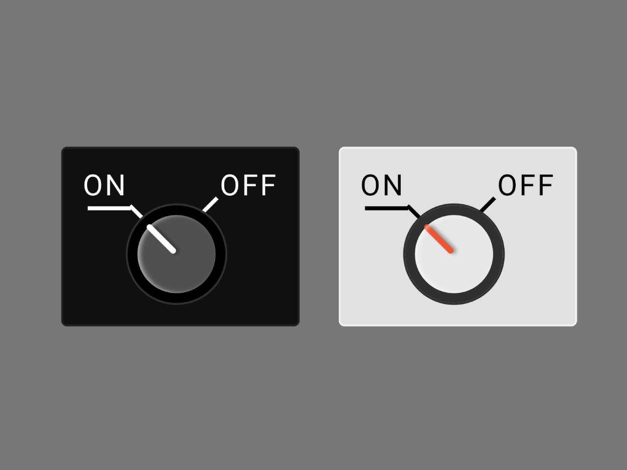

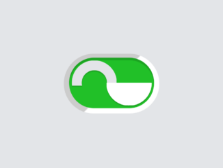
This code creates a toggle button styled like a knob. It uses CSS to display an interactive switch. The knob visually indicates ‘on’ and ‘off’ states. It’s helpful for controlling settings or options visually.
You can use this code to create toggle switches in your web projects. It provides a visually appealing way to control options or settings.
How to Create Knob Toggle Button Using Css
1. First of all, insert the following HTML code into your web page where you want the toggle button to appear. The checkbox input inside the .control-knob div controls the knob’s state. When checked, the knob moves to the ‘on’ position visually.
<div class="control-knob">
  <input type="checkbox">
  <div class="control-position on">
    <span>On</span>
  </div>
  <div class="control-position off">
    <span>Off</span>
  </div>
  <div class="knob">
    <div class="knob-center"></div>
  </div>
</div>
<div class="control-knob dark">
  <input type="checkbox" checked>
  <div class="control-position on">
    <span>On</span>
  </div>
  <div class="control-position off">
    <span>Off</span>
  </div>
  <div class="knob">
    <div class="knob-center"></div>
  </div>
</div>
2. Copy the following CSS code into your stylesheet or embed it within the <style> tags in your HTML file. This CSS is responsible for styling the toggle knob. Modify the CSS variables like colors or dimensions to match your website’s theme or preferences. The code uses variables for easy customization.
@import url(https://fonts.googleapis.com/css?family=Barlow+Semi+Condensed:600);

:root {
  --white: #fff;
  --black: #000;
  --baseColor: #101010;
  --baseColorBorder: #202020;
  --knobBorder: #000;
  --knobColor: #505050;
  --knobHightlight: #fff;
}

.dark {
    --white: #000;
    --black: #fff;
    --baseColor: #e1e1e1;
    --baseColorBorder: #f1f1f1;
    --knobBorder: #303030;
    --knobColor: #e8e8e8;
    --knobHightlight: #ee5529;
  }


body {
  background-color: black;
  font-family: 'Barlow Semi Condensed';
  text-rendering: geometricPrecision;
  margin: 0;
  padding: 0;
  height: 100vh;
  display: flex;
  align-items: center;
  justify-content: center;
}

.control-knob {
  background-color: var(--baseColor);
  padding: 10px;
  display: flex;
  position: relative;
  flex-wrap: wrap;
  justify-content: space-between;
  width: 100px;
  height: 70px;
  border: 1px solid var(--baseColorBorder);
  border-radius: 3px;
  &:first-child {
    margin-right: 20px;
  }
  & input {
    position: absolute;
    width: 100%;
    height: 100%;
    left: 0;
    top: 0;
    opacity: 0;
    cursor: pointer;
    z-index: 10;
    &:checked ~ .knob .knob-center {
      transform: rotate(40deg);
      &:after {
        transform: rotate(-90deg)
      }
    }
  }
  & .knob {
    display: flex;
    width: 100%;
    justify-content: center;
    & .knob-center {
      width: 40px;
      height: 40px;
      background-color: var(--knobColor);
      border-radius: 100%;
      z-index: 2;
      position: relative;
      left: -2px;
      border: 5px solid var(--knobBorder);
      outline: 1px solid #303030;
      transform: rotate(-45deg);
      transition: all 0.1s ease;
      &:before {
        content: "";
        height: 50%;
        width: 3px;
        display: block;
        position: absolute;
        top: -1px;
        left: 50%;
        transform: translateX(-50%);
        border-radius: 3px;
        box-shadow: 1px 1px 2px rgba(0,0,0,0.4);
        background-color: var(--knobHightlight);
      }
      &:after {
        content: "";
        display: block;
        position: absolute;
        left: 0;
        top: 0;
        width: 100%;
        height: 100%;
        background-color: transparent;
        border-radius: 100%;
        box-shadow: inset 1px 1px 2px rgba(255,255,255,0.5);
        transition: all 0.1s ease;
      }
    }
  }
  & .control-position {
    width: 50%;
    color: var(--white);
    text-transform: uppercase;
    position: relative;
    font-weight: 500;
    letter-spacing: 1px;
    &.on {
      & span {
        position: relative;
        padding-bottom: 3px;
        &:before {
          content: "";
          position: absolute;
          display: block;
          width: 2px;
          height: 15px;
          background-color: var(--white);
          transform: rotate(-45deg);
          bottom: -0.75em;
          right: -0.5em;
        }
        &:after {
          content: "";
          position: absolute;
          display: block;
          width: 22px;
          height: 0px;
          background-color: var(--white);
          border-top: 2px solid var(--white);
          box-shadow: inset 0px -0.03em 0px black;
          bottom: -0.05em;
          right: -0.1em;
          z-index: 3;
        }
      }
    }
    &.off {
      text-align: right;
      & span {
        position: relative;
        &:before {
          content: "";
          position: absolute;
          display: block;
          width: 2px;
          height: 15px;
          background-color: var(--white);
          transform: rotate(45deg);
          bottom: -0.7em;
          left: -0.5em;
        }
      }
    }
  }
}
If needed, you can expand on this code by adding additional features or animations to further enhance the toggle button’s appearance or functionality.
That’s all! hopefully, you have successfully created Knob Toggle Button Using Css. If you have any questions or suggestions, feel free to comment below.
Similar Code Snippets:
 HTML5 Flat Design Color Palette
- HTML5 Canvas Examples with Source Code
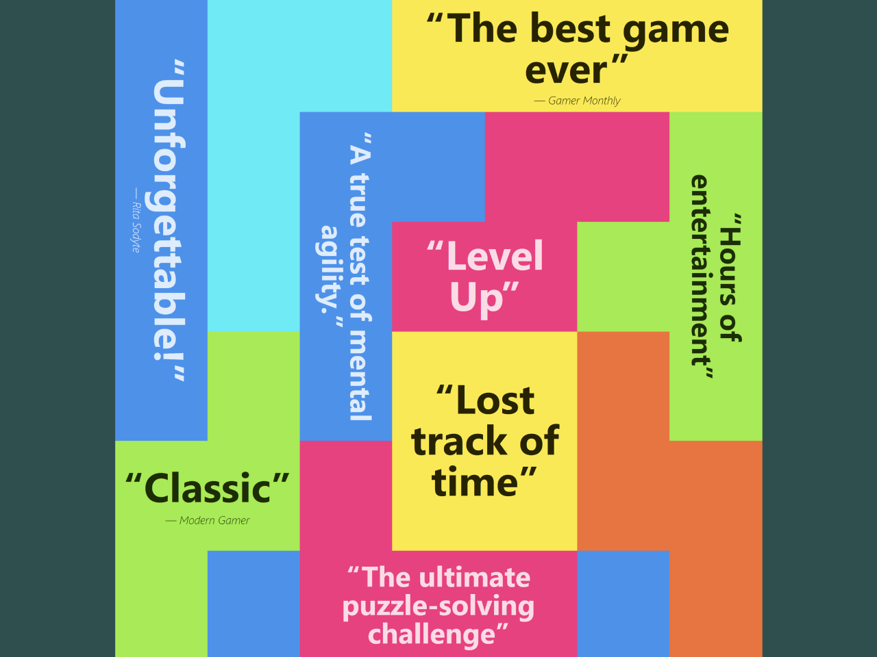
- Testimonial Quotes Cloud in HTML CSS
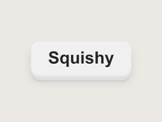
- CSS Squishy Button With Smooth Transition
- Padlock Toggle Switch in CSS
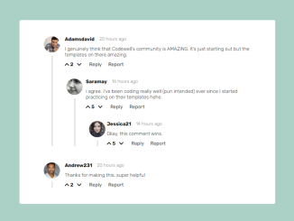
- Blog Comment Section Design
- HTML5 Canvas Draw Straight Line with Mouse


I code and create web elements for amazing people around the world. I like work with new people. New people new Experiences.
I truly enjoy what I’m doing, which makes me more passionate about web development and coding. I am always ready to do challenging tasks whether it is about creating a custom CMS from scratch or customizing an existing system.