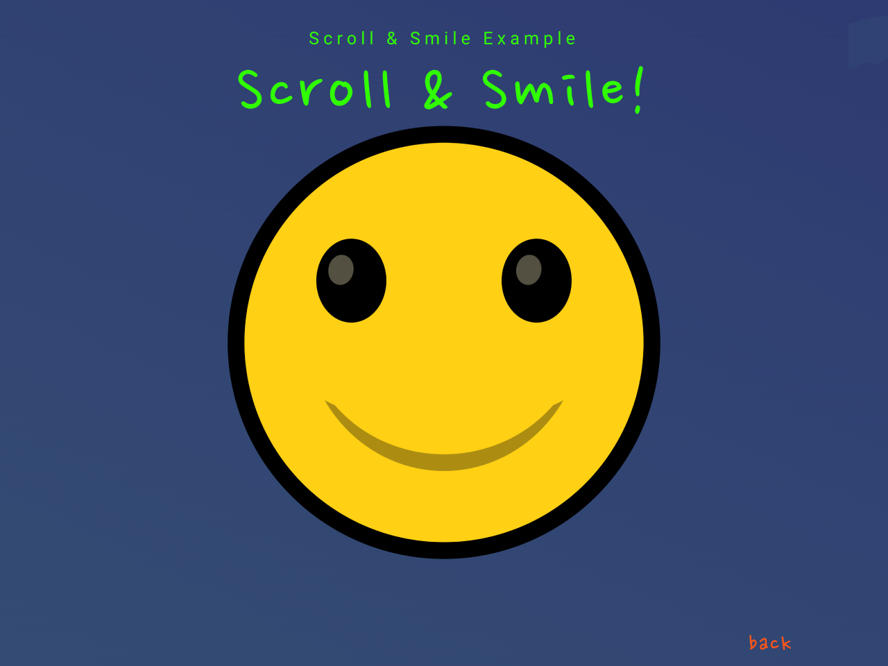

This CSS code snippet helps you to create an attractive emoji animation on the scroll event. It uses CSS and JavaScript to change the face’s emotions based on scrolling. The emoji’s eyes, smile, and other elements change their visibility and size as you scroll. It’s a fun visual effect for a webpage.
You can integrate this animation on your website to add a playful scrolling effect. It offers a quirky way to engage visitors and make your webpage more interactive.
How to Create Emoji Animation On Scroll Using CSS
1. First of all, copy the following HTML structure and paste it into your webpage’s HTML file. This structure includes elements like <h1>, <div> for the emoji face, and an anchor tag for the back-to-top link.
  <h1>Scroll & Smile!</h1>

  <div class="face">
    <div class="eye lefteye"></div>
    <div class="eye righteye"></div>
    <div class="eyewhite eyewhite-left"></div>
    <div class="eyewhite eyewhite-right"></div>
    <div class="smile"></div>
    <div class="bigsmile bigsmile-left"></div>
    <div class="bigsmile bigsmile-right"></div>
    <div class="smilecover"></div>
    <div class="nosmile"></div>
  </div>
  <a class="back-link" href="#top">back</a>
2. Now, include the following CSS code in your webpage’s CSS file or within <style> tags in the HTML file. It contains styles for the emoji elements, defining their appearance, positioning, and transitions. Customize the CSS rules in order to get the desired output.
@import url("https://fonts.googleapis.com/css2?family=Nanum+Pen+Script&display=swap");

* {
  scroll-behavior: smooth;
}

body{
  background: rgb(0, 0, 0);
  background: -webkit-linear-gradient(
    25deg,
    rgb(36, 140, 36),
    rgb(41, 43, 114)
  );
  background: linear-gradient(25deg, rgb(65, 118, 116), rgb(41, 43, 114)) !important;
  background-repeat: no-repeat;
  border: 0;
  font-family: "Nanum Pen Script", cursive;
  height: 600vh;
  margin: 0;
  max-width: 100vw;
}

h1 {
  color: rgb(47, 255, 0);
  font-size: 10vmin;
  font-weight: 400;
  letter-spacing: 0.6vmin;
  margin: 0;
  padding: 0;
  position: fixed;
  text-align: center;
  top: 9%;
  width: 100vw;
  z-index: 10;
}

.face {
  aspect-ratio: 1/1;
  background-color: rgb(255, 208, 19);
  border: 2.4vmin solid black;
  border-radius: 50%;
  left: 50%;
  position: fixed;
  top: 22%;
  transform: translate(-50%);
  width: 60vmin;
}

.eye {
  aspect-ratio: 1 / 1.2;
  background-color: black;
  border-radius: 50%;
  position: fixed;
  top: 24%;
  transition: background-color 2s;
  width: 10vmin;
  z-index: 10;
}

.lefteye {
  left: 18%;
}

.righteye {
  right: 18%;
}

.eyewhite {
  aspect-ratio: 1/1.2;
  background-color: rgb(255, 244, 200);
  border-radius: 50%;
  position: fixed;
  rotate: 10deg;
  top: 28%;
  width: 3.6vmin;
  z-index: 20;
}

.eyewhite-left {
  left: 21%;
  opacity: 0;
}

.eyewhite-right {
  opacity: 0;
  right: 25.6%;
}

.smile {
  aspect-ratio: 1/1;
  background-color: rgb(255, 208, 19);
  border-bottom: 2.4vmin solid black;
  border-bottom-left-radius: 50%;
  border-bottom-right-radius: 50%;
  border-top-left-radius: 50%;
  border-top-right-radius: 50%;
  left: 50%;
  opacity: 0;
  position: fixed;
  top: 45%;
  transform: translate(-50%, -50%);
  width: 40vmin;
  z-index: 5;
}

.bigsmile {
  background-color: rgb(46, 46, 46);
  border-radius: 50%;
  height: 0.4vmin;
  opacity: 0;
  position: fixed;
  top: 63%;
  transition: 0.5s;
  width: 4vmin;
  z-index: 30;
}

.bigsmile-left {
  left: 16.5%;
  rotate: -46deg;
}

.bigsmile-right {
  right: 16.5%;
  rotate: 46deg;
}

.smilecover {
  background-color: rgb(255, 208, 19);
  border-radius: 50%;
  height: 32vmin;
  left: 50%;
  position: fixed;
  top: 15%;
  transform: translate(-50%);
  width: 52.6vmin;
  z-index: 7;
}

.nosmile {
  background-color: rgb(0, 0, 0);
  border-radius: 30%;
  height: 2vmin;
  left: 50%;
  position: fixed;
  rotate: -7deg;
  top: 76.5%;
  transform: translate(-20%);
  transition: 0.4s;
  width: 8vmin;
}

.back-link {
  background-color: transparent;
  bottom: 2vh;
  color: rgb(255, 85, 23);
  cursor: unset;
  display: inline-block;
  font-family: "Nanum Pen Script", cursive;
  font-size: clamp(26px, 5vw, 36px);
  right: -200vw;
  letter-spacing: 2px;
  margin: 0;
  max-width: 80vw;
  opacity: 0;
  padding: 0;
  position: fixed;
  text-decoration: none;
  transition: 1s;
}
3. Finally, insert the following JavaScript code into your webpage’s JavaScript file or within <script> tags at the end of the HTML file, just before the closing </body> tag. It enables the emoji animation based on scrolling.
window.addEventListener("load", () => {
  const SMILE = document.querySelector(".smile");
  const EYEWHITE = document.querySelectorAll(".eyewhite");
  const BIGSMILE = document.querySelectorAll(".bigsmile");
  const NOSMILE = document.querySelector(".nosmile");
  const BACK_LINK = document.querySelector(".back-link");

  const scrollAndSmile = () => {
    currentScroll =
      window.scrollY /
      (document.documentElement.offsetHeight - window.innerHeight);
    SMILE.style.opacity = currentScroll;

    EYEWHITE.forEach((eye) => {
      eye.style.opacity = currentScroll;
    });

    if (currentScroll > 0.01) {
      NOSMILE.style.opacity = "0";
      NOSMILE.style.width = "0";
    } else {
      NOSMILE.style.opacity = "1";
      NOSMILE.style.width = "8vmin";
    }

    BIGSMILE.forEach((e) => {
      if (currentScroll < 0.97) {
        e.style.opacity = "0";
        e.style.width = "0";
      } else {
        e.style.opacity = "1";
        e.style.width = "4vmin";
      }
    });

    if (currentScroll > 0.1) {
      BACK_LINK.style.opacity = 1;
      BACK_LINK.style.cursor = "pointer";
      BACK_LINK.style.right = "15%";
    } else {
      BACK_LINK.style.opacity = 0;
      BACK_LINK.style.cursor = "unset";
      BACK_LINK.style.right = "-200vw";
    }
  };

  window.addEventListener("scroll", scrollAndSmile);
});
That’s all! hopefully, you have successfully created an emoji animation on the scroll event using HTML, CSS, and JavaScript. If you have any questions or suggestions, feel free to comment below.
Similar Code Snippets:

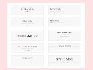
- 15+ CSS Heading Styles Examples
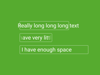
- CSS Text Overflow Scroll Animation
- Team Page Template in HTML CSS
- Toggle Button in CSS With Stretchable Elastic Effect
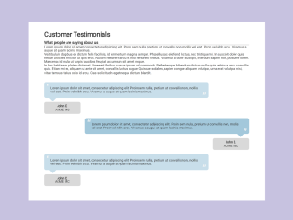
- Customer Testimonials in HTML CSS
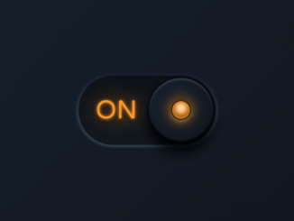
- Padlock Toggle Switch in CSS


I code and create web elements for amazing people around the world. I like work with new people. New people new Experiences.
I truly enjoy what I’m doing, which makes me more passionate about web development and coding. I am always ready to do challenging tasks whether it is about creating a custom CMS from scratch or customizing an existing system.