
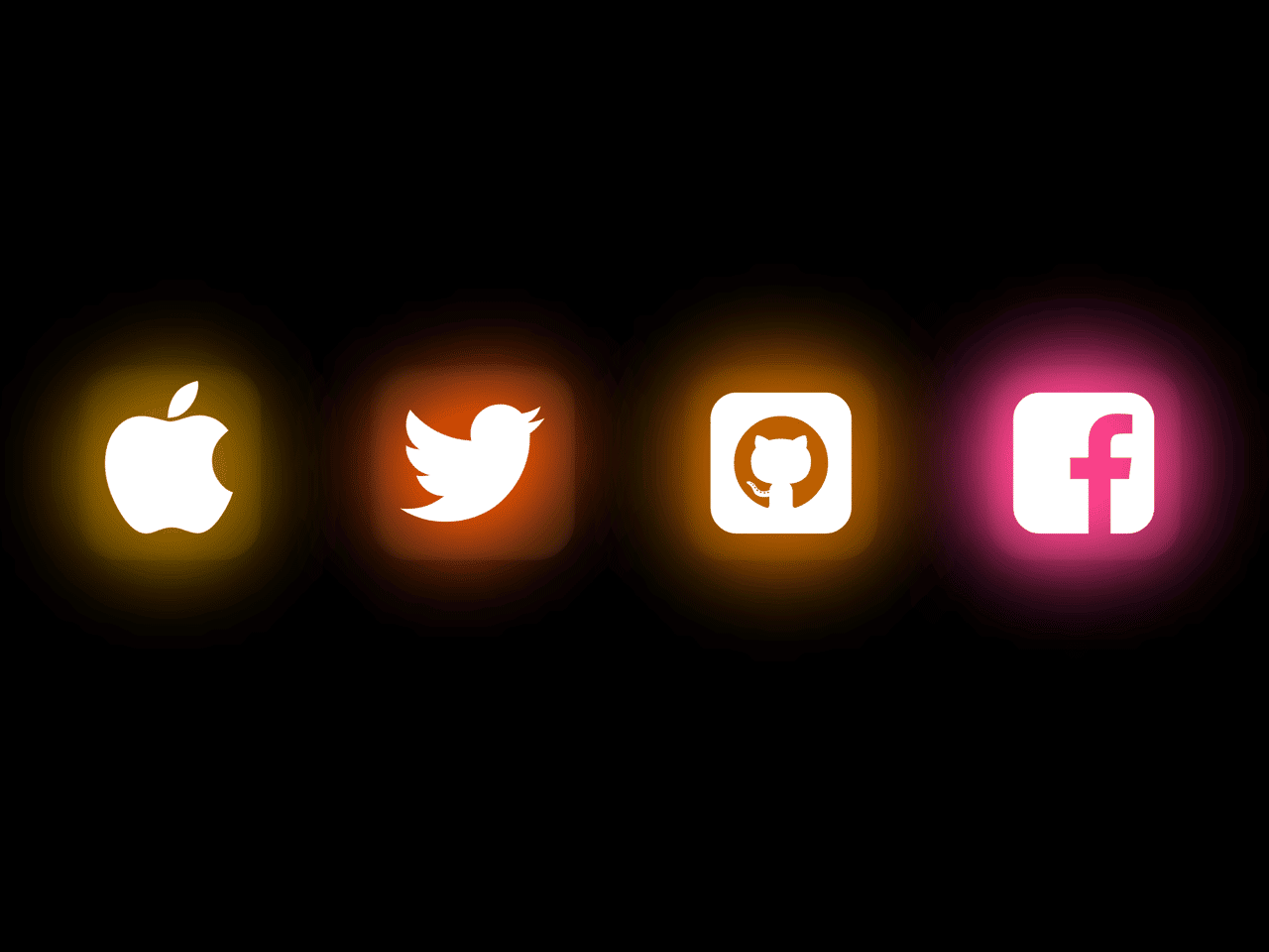
This simple CSS code snippet helps you to create animated glowing social icons. It uses CSS box-shadow property for glowing effect and Font Awesome CSS for icons. You can use these icons for your social sharing project or link to your social profiles.
How to Create CSS Animated Glowing Social Icons
1. First of all, load the the Font Awesome CSS into the head tag of your webpage.
<link rel="stylesheet" href="https://cdnjs.cloudflare.com/ajax/libs/font-awesome/4.7.0/css/font-awesome.min.css" integrity="sha512-SfTiTlX6kk+qitfevl/7LibUOeJWlt9rbyDn92a1DqWOw9vWG2MFoays0sgObmWazO5BQPiFucnnEAjpAB+/Sw==" crossorigin="anonymous" referrerpolicy="no-referrer" />
2. After that, create the HTML structure for social icons as follows:
 <link rel="stylesheet" href="style.css">
  <link rel="stylesheet" href="">
  <div class="container">
    <i class="fa fa-apple" id="apple"></i>
    <i class="fa fa-twitter" id="twitter"></i>
    <i class="fa fa-github-square github" id="github"></i>
    <i class="fa fa-facebook-square" id="facebook"></i>
  </div>
3. Finally, style the social icons using the following CSS:
* {
  margin: 0;
  padding: 0;
}
body {
  height: 100vh;
  width: 100vw;
}
.cd_main{
   background: #444;
}
.container {
  display: flex;
  justify-content: center;
  align-items: center;
  height: 100vh;
  width: 100vw;
}
#apple,
#twitter,
#github,
#facebook {
  font-size: 8em;
  background-color: #18191f;
  color: #fff;
  box-shadow: 2px 2px 2px #00000080, 10px 1px 12px #00000080,
    2px 2px 10px #00000080, 2px 2px 3px #00000080, inset 2px 2px 10px #00000080,
    inset 2px 2px 10px #00000080, inset 2px 2px 10px #00000080,
    inset 2px 2px 10px #00000080;
  border-radius: 29px;
  padding: 11px 19px;
  margin: 0 40px;
  animation: animate 3s linear infinite;
  text-shadow: 0 0 50px #0072ff, 0 0 100px #0072ff, 0 0 150px #0072ff,
    0 0 200px #0072ff;
}
#twitter {
  animation-delay: 0.3s;
}
#facebook {
  animation-delay: 0.7s;
}
#github {
  animation-delay: 0.1s;
}

@keyframes animate {
  from {
    filter: hue-rotate(0deg);
  }
  to {
    filter: hue-rotate(360deg);
  }
}
That’s all! hopefully, you have successfully created animated glowing social icons. If you have any questions or suggestions, feel free to comment below.
Similar Code Snippets:

- Poll UI using HTML and CSS
- HTML5 Flat Design Color Palette
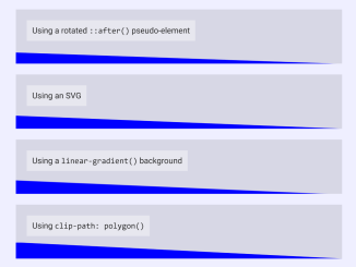
- CSS Diagonal Section Divider
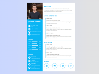
- HTML Code for Resume with Picture
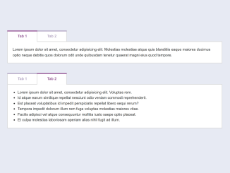
- HTML Tabs Example with Code
- Simple Landing Page HTML CSS Code
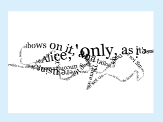
- Drawing with Text Using HTML5 Canvas


I code and create web elements for amazing people around the world. I like work with new people. New people new Experiences.
I truly enjoy what I’m doing, which makes me more passionate about web development and coding. I am always ready to do challenging tasks whether it is about creating a custom CMS from scratch or customizing an existing system.