
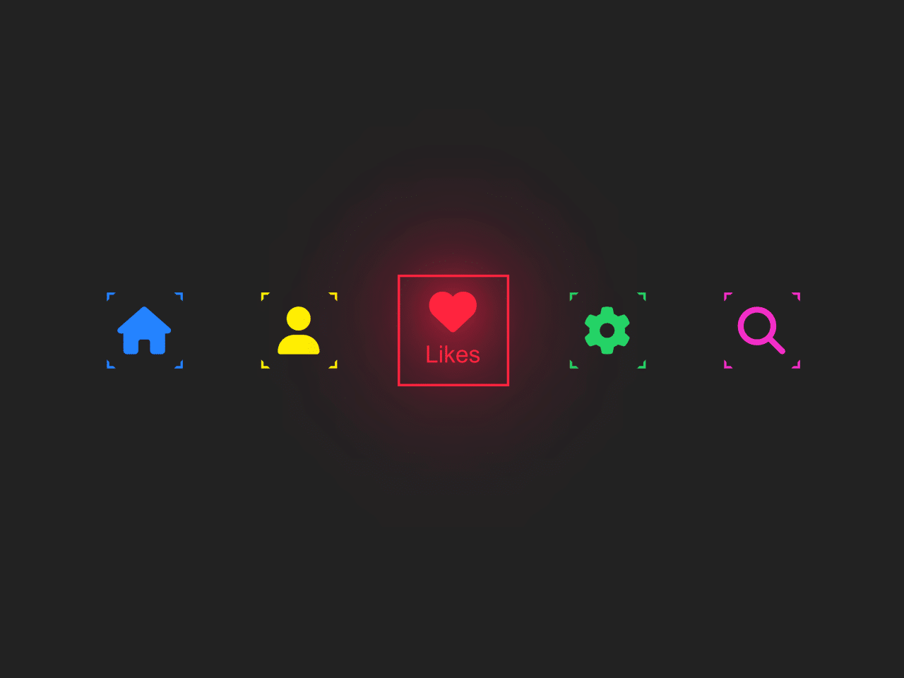
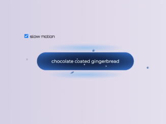
This code creates an icon hover effect using CSS. It applies animated color and shadow transitions on hover. It helps enhance website interactivity and visual appeal.
You can use this code for enhancing navigation menus on your website with engaging hover effects. It adds visual appeal and interactivity, making your site more engaging for visitors. Additionally, it’s easy to customize to match your website’s branding and style preferences.
How to Create Icon Hover Effect Using CSS
1. First of all, load the Reset CSS and Font Awesome by adding the following CDN link into the head tag of your HTML document.
<link rel="stylesheet" href="https://cdnjs.cloudflare.com/ajax/libs/meyer-reset/2.0/reset.min.css">
<link rel='stylesheet' href='https://cdnjs.cloudflare.com/ajax/libs/font-awesome/6.5.1/css/all.min.css'>
2. Set up the HTML structure. Create an unordered list (<ul>) to hold the navigation items. Each list item (<li>) will contain an anchor (<a>) tag with an icon and a text label.
<ul>
   <li style="--clr:#2483ff;">
    <a href="#">
      <i class="fa-solid fa-house"></i>
      <span>Home</span>
    </a>
  </li>

  <li style="--clr:#fff200;">
    <a href="#">
      <i class="fa-solid fa-user"></i>
      <span>Profile</span>
    </a>
  </li>

  <li style="--clr:#ff253f;">
    <a href="#">
      <i class="fa-solid fa-heart"></i>
      <span>Likes</span>
    </a>
  </li>

  <li style="--clr:#25d366;">
    <a href="#">
      <i class="fa-solid fa-gear"></i>
      <span>Settings</span>
    </a>
  </li>

  <li style="--clr:#f32ec8;">
    <a href="#">
      <i class="fa-solid fa-magnifying-glass"></i>
      <span>Search</span>
    </a>
  </li>

 </ul>
3. Next, apply CSS styles to create the hover effect. Set up styles for the list items, icons, and text labels. Feel free to customize the colors, sizes, and animations to match your website’s theme and design. You can also expand upon this code to add more interactive elements and effects as needed.
* {
   margin: 0;
   padding: 0;
   box-sizing: border-box;
}
:root {
   --bg: #222;
   --clr: #fff;
}

body {
   display: flex;
   justify-content: center;
   align-items: center;
   min-height: 100vh;
   background: var(--bg);
}
ul {
   position: relative;
   display: flex;
   gap: 50px;
}
ul li {
   position: relative;
   list-style: none;
   width: 80px;
   height: 80px;
   display: flex;
   justify-content: center;
   align-items: center;
   cursor: pointer;
   transition: 0.5s;
}
ul li::before {
   content: &singleQuote;&singleQuote;;
   position: absolute;
   inset: 30px;
   box-shadow: 0 0 0 10px var(--clr),
               0 0 0 20px var(--bg),
               0 0 0 22px var(--clr);
   transition: 0.5s;
}
ul li:hover::before {
   inset: 15px;
}
ul li::after {
   content: &singleQuote;&singleQuote;;
   position: absolute;
   inset: 0;
   background: var(--bg);
   transform: rotate(45deg);
   transition: 0.5s;
}
ul li:hover::after {
   inset: 0px;
   transform: rotate(0deg);
}
ul li a {
   position: relative;
   text-decoration: none;
   z-index: 10;
   display: flex;
   justify-content: center;
   align-items: center;
}
ul li a i {
   font-size: 2em;
   transition: 0.5s;
   color: var(--clr);
   opacity: 1;
}
ul li:hover a i {
   color: var(--clr);
   transform: translateY(-40%);
}
ul li a span {
   position: absolute;
   font-family: sans-serif;
   color: var(--clr);
   opacity: 0;
   transition: 0.5s;
   transform: scale(0) translateY(200%);
}
ul li:hover a span {
   opacity: 1;
   transform: scale(1) translateY(100%);
}
ul li:hover a i,
ul li a span {
   filter: drop-shadow(0 0 20px var(--clr)) drop-shadow(0 0 40px var(--clr)) drop-shadow(0 0 60px var(--clr));
}
That’s all! hopefully, you have successfully created the Icon Hover Effect in your web/app project. If you have any questions or suggestions, feel free to comment below.
Similar Code Snippets:
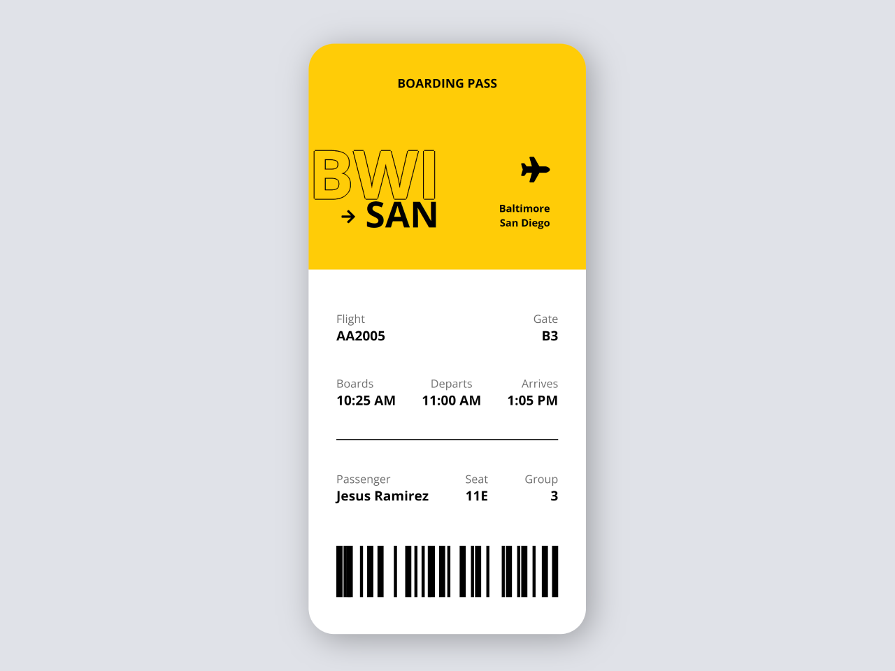
 International Airline Ticket in HTML CSS
- Pricing Table with CSS Switch Toggle
- Gravity Button Using Pure CSS
- Order Summary Report UI Using HTML CSS
- CSS Diagonal Section Divider
- Simple Messaging Ui in HTML CSS with Example
- CSS Star Rating Radio Buttons


I code and create web elements for amazing people around the world. I like work with new people. New people new Experiences.
I truly enjoy what I’m doing, which makes me more passionate about web development and coding. I am always ready to do challenging tasks whether it is about creating a custom CMS from scratch or customizing an existing system.