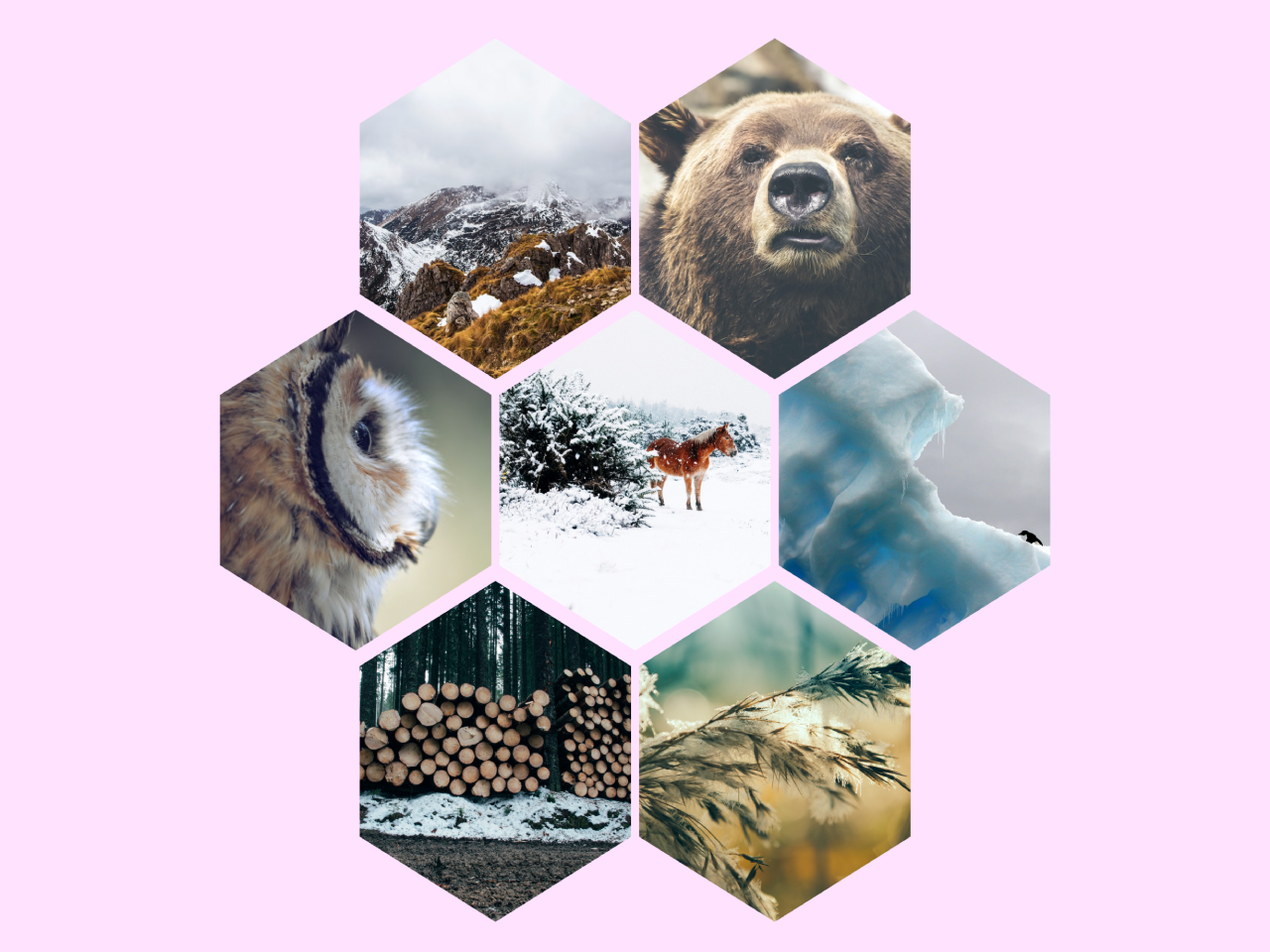

This code creates an easy to use hexagon shaped grid image gallery. It utilizes CSS to position and style images within hexagonal containers. When you hover over an image, it reveals additional information about the image. This code is helpful for showcasing images in a unique and engaging way on your website.
You can use this code in various web development projects, particularly when you want to showcase a collection of images in a visually striking and unique manner.
How to Create Hexagon Grid Image Gallery in CSS
1. First of all, load the following assets into the head tag of your HTML document.
<link rel='stylesheet' href='https://s3-us-west-2.amazonaws.com/s.cdpn.io/80729/helpers.css'>
<link rel='stylesheet' href='https://s3-us-west-2.amazonaws.com/s.cdpn.io/80729/atc-fonts.css'>
<script src="https://cdnjs.cloudflare.com/ajax/libs/prefixfree/1.0.7/prefixfree.min.js"></script>
2. Create the structure for your hexagonal image gallery. You can customize the content and add more grid items as needed. Here’s a basic example:
<h1>Hexagon Grid</h1>
<div class='grid'>
<div class='grid--item'>
<div class='img' style='background-image: url(https://images.unsplash.com/photo-1417436026361-a033044d901f?ixlib=rb-0.3.5&q=80&fm=jpg&crop=entropy&w=1080&fit=max&s=faa4e192f33e0d6b7ce0e54f15140e42);'></div>
<div class='container'>
<h2>Snowy Hills</h2>
<div class='desc'>Photo by Ales Krivec</div>
</div>
</div>
<div class='grid--item'>
<div class='img' style='background-image: url(https://images.unsplash.com/44/MIbCzcvxQdahamZSNQ26_12082014-IMG_3526.jpg?ixlib=rb-0.3.5&q=80&fm=jpg&crop=entropy&w=1080&fit=max&s=49dab7a5e4b2e28b5707bc2db974c94b);'></div>
<div class='container'>
<h2>Bear</h2>
<div class='desc'>Photo by Thomas Lefebvre</div>
</div>
</div>
<div class='grid--item'>
<div class='img' style='background-image: url(https://images.unsplash.com/photo-1425668273332-3a46ab26b161?ixlib=rb-0.3.5&q=80&fm=jpg&crop=entropy&w=1080&fit=max&s=d453ab3dec298c43415526458b360fa6);'></div>
<div class='container'>
<h2>Owl</h2>
<div class='desc'>Photo by photostockeditor</div>
</div>
</div>
<div class='grid--item'>
<div class='img' style='background-image: url(https://images.unsplash.com/photo-1423145369430-a9ea0de096cd?crop=entropy&fit=crop&fm=jpg&h=1375&ixjsv=2.1.0&ixlib=rb-0.3.5&q=80&w=1725);'></div>
<div class='container'>
<h2>Horse</h2>
<div class='desc'>Photo by Annie Spratt</div>
</div>
</div>
<div class='grid--item'>
<div class='img' style='background-image: url(https://images.unsplash.com/photo-1432887382605-0abf9cc49e8f?crop=entropy&fit=crop&fm=jpg&h=1375&ixjsv=2.1.0&ixlib=rb-0.3.5&q=80&w=1725);'></div>
<div class='container'>
<h2>Ice & Penguin</h2>
<div class='desc'>Photo by Teodor Bjerrang</div>
</div>
</div>
<div class='grid--item'>
<div class='img' style='background-image: url(https://images.unsplash.com/photo-1417026846249-f31f7e43fc35?crop=entropy&fit=crop&fm=jpg&h=1375&ixjsv=2.1.0&ixlib=rb-0.3.5&q=80&w=1725);'></div>
<div class='container'>
<h2>Pile of Logs</h2>
<div class='desc'>Photo by Ales Krivec</div>
</div>
</div>
<div class='grid--item'>
<div class='img' style='background-image: url(https://images.unsplash.com/uploads/14122811862445bc266cf/931448f2?crop=entropy&fit=crop&fm=jpg&h=1375&ixjsv=2.1.0&ixlib=rb-0.3.5&q=80&w=1725);'></div>
<div class='container'>
<h2>Winter Tree</h2>
<div class='desc'>Photo by Mikael Kristenson</div>
</div>
</div>
</div>
Replace your-image-url with the URL of your image. Modify Title and Description to your desired title and description for each grid item.
2. Make sure to include the following CSS code in a separate “styles.css” file (or another name of your choice) and link it in your HTML file.
@import url(https://fonts.googleapis.com/css?family=Arapey:400italic);
body {
  background: #dedede;
  -webkit-font-smoothing: antialiased;
  min-width: 1200px;
}

.grid {
  padding: 60px;
  margin: 0 auto;
  max-width: 1200px;
}

.grid--item {
  position: relative;
  margin-top: -90px;
  margin-right: 5px;
  margin-left: 5px;
  width: calc(33.33% - 10px);
  float: left;
  transition: all 0.5s;
  overflow: hidden;
  -webkit-clip-path: polygon(50% 0, 100% 25%, 100% 75%, 50% 100%, 0 75%, 0 25%);
  clip-path: polygon(50% 0, 100% 25%, 100% 75%, 50% 100%, 0 75%, 0 25%);
  -webkit-shape-outside: polygon(50% 0, 100% 25%, 100% 75%, 50% 100%, 0 75%, 0 25%);
}
.grid--item:before {
  display: block;
  padding-top: 112.5%;
  content: "";
}
.grid--item:nth-child(1), .grid--item:nth-child(2) {
  margin-top: 0;
}
.grid--item:nth-child(7n-1), .grid--item:nth-child(1) {
  margin-left: 185px;
}

.img {
  position: absolute;
  top: 0;
  right: 0;
  bottom: 0;
  left: 0;
  background-position: center center;
  background-size: cover;
  overflow: hidden;
  -webkit-clip-path: polygon(50% 0, 100% 25%, 100% 75%, 50% 100%, 0 75%, 0 25%);
  clip-path: polygon(50% 0, 100% 25%, 100% 75%, 50% 100%, 0 75%, 0 25%);
}
.img:before, .img:after {
  position: absolute;
  top: 0;
  right: 0;
  bottom: 0;
  left: 0;
  content: "";
  opacity: 0;
  transition: opacity 0.5s;
}
.img:before {
  background: rgba(128, 0, 128, 0.25);
}
.img:after {
  background: linear-gradient(to top, transparent, rgba(0, 0, 0, 0.5), transparent);
}

.container {
  position: absolute;
  top: 50%;
  left: 50%;
  width: 100%;
  opacity: 0;
  text-align: center;
  color: white;
  will-change: transform;
  backface-visibility: hidden;
  transform: translate(-50%, -50%) scale(0.9);
  transition: all 0.5s;
  -webkit-shape-outside: polygon(50% 0, 100% 25%, 100% 75%, 50% 100%, 0 75%, 0 25%);
  shape-outside: polygon(50% 0, 100% 25%, 100% 75%, 50% 100%, 0 75%, 0 25%);
}

h1,
h2 {
  font-family: "Arapey";
  font-style: italic;
  font-weight: 400;
}

h1 {
  margin-top: 90px;
  text-align: center;
  font-size: 56px;
  color: #242424;
}

h2 {
  font-size: 32px;
}
h2:before, h2:after {
  display: inline-block;
  margin: 0 0.5em;
  width: 0.75em;
  height: 0.03em;
  background: turquoise;
  content: "";
  vertical-align: middle;
  transition: all 0.3s;
}

.desc {
  margin: 1em 0 0;
  font-family: "ATC Overlook";
  letter-spacing: 0.1em;
  text-transform: uppercase;
  font-weight: bold;
  font-size: 11px;
  line-height: 1.5;
  color: turquoise;
}

.grid--item:hover .img:before,
.grid--item:hover .img:after,
.grid--item:hover .container {
  opacity: 1;
}
.grid--item:hover .container {
  transform: translate(-50%, -50%) scale(1);
}
That’s it! hopefully, you have successfully created CSS hexagon grid image gallery on your website. You can expand and enhance it by adding more images and adjusting the styling to suit your project’s requirements.
Similar Code Snippets:

- Stylish Photo Gallery Grid in HTML CSS
- Flex Panels Image Gallery Using JavaScript
- Slideshow JavaScript with Buttons


I code and create web elements for amazing people around the world. I like work with new people. New people new Experiences.
I truly enjoy what I’m doing, which makes me more passionate about web development and coding. I am always ready to do challenging tasks whether it is about creating a custom CMS from scratch or customizing an existing system.